Page 4 of 15
Re: MEXICO V5 [I] [VACATION]
Posted: Fri Jun 06, 2008 7:46 pm
by t-o-m
RjBeals wrote:You have the psd (or raw) file and are going to do graphics updates? You have complete control of the progress? Or are you going to work through fund.?
he is a little busy right now, i have the PSD and i will keep in close contact with him and talk to him about the key points. i think he'll probably pop along now and again.
EDIT:
i dont plan to see this through to quench if it gets there, but if fund. is still busy and things go well then sure i will, but im just trying to keep it alive at the moment because i love this map
so we need comments.
Re: MEXICO V5 [I] [VACATION]
Posted: Fri Jun 06, 2008 9:02 pm
by RjBeals
The mountains could you some work.
The ocean is a little bland.
I like the textures in the lands. Leave those be.
But I would like to see a little more depth, if possible,to the entire land area. Not a hard bevel, but something to make it stand out a little more.
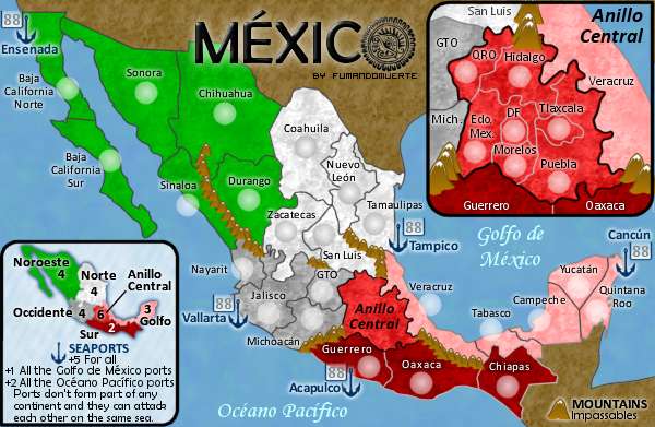
Why are there 88's next to all the seaport anchors?
fonts look good. Colors are superb. This map screams mexico.
Re: MEXICO V5 [I] [VACATION]
Posted: Sat Jun 07, 2008 7:54 am
by t-o-m
RjBeals wrote:The mountains could you some work.
yes, they look like bird droppings at the moment, hehe
RjBeals wrote:The ocean is a little bland.
yes, maybe a filter or two? maybe another colour in there would to the trick?
RjBeals wrote:I like the textures in the lands. Leave those be.
...love the textures...
RjBeals wrote:But I would like to see a little more depth, if possible,to the entire land area. Not a hard bevel, but something to make it stand out a little more.
hmm...yes i agree - a bevel would not suit thhis map but im strugging for ideas on what would make it stand out? maybe an outer glow on the land? i dont know...
RjBeals wrote:Why are there 88's next to all the seaport anchors?
no idea! oh they have terit names on the anchors so im guessing that theyre a terit? thats a little confusing...
RjBeals wrote:fonts look good. Colors are superb. This map screams mexico.
yes - i think fund has done very well with this so far,
Re: MEXICO V5 [I] [VACATION]
Posted: Sat Jun 07, 2008 8:08 am
by RjBeals
O I guess the 88's are just a visual sample of where the army's will go. I see they are territs.
Re: MEXICO V5 [I] [VACATION]
Posted: Sat Jun 07, 2008 9:31 am
by t-o-m
yeh - i had the same problem as you at 1st. i wasnt sure if they were terits.
ok ive taken a look at the PSD, took about half an hour to figure things out - no groupings, a lot of the layers were merged to not easy to edit in detail - but things will work out, and of course the language barrier didnt help

all of the layers are in mexian, but im slowly translating them.
i was thinking of this for the land to stand out a bit more Rj:

p.s please ignore other details such as the mini map not being there.
Re: MEXICO V5 [I] [VACATION]
Posted: Thu Jun 12, 2008 7:52 am
by sam_levi_11
if u giot rid of the uneeded non playable areas and enlarged the map slightly the red cont could be done better
Re: MEXICO V5 [I] [VACATION]
Posted: Thu Jun 12, 2008 9:21 am
by RjBeals
sam_levi_11 wrote:if u giot rid of the uneeded non playable areas and enlarged the map slightly the red cont could be done better
Agree. But the small map may be a problem.
I like the outer glow - but I don't like the dolphin & palm trees.
You left the legend out also.
Re: MEXICO V5 [I] [VACATION]
Posted: Thu Jun 12, 2008 10:09 am
by t-o-m
RjBeals wrote:sam_levi_11 wrote:if u giot rid of the uneeded non playable areas and enlarged the map slightly the red cont could be done better
Agree. But the small map may be a problem.
I like the outer glow - but I don't like the dolphin & palm trees.
You left the legend out also.
yes i know, i agree but the map playable area does stretch to almost the whole map, so im not sure if there's room
of course, i do not have much time to do much on this either, but when i do i hope to help fund on this. but for the minute, sadly, i dont have time.
Re: MEXICO V5 [I] [VACATION]
Posted: Thu Jul 24, 2008 9:10 am
by gimil
moving to the heap! Just a PM if you want it back on track.
Re: MEXICO V5 [I] [VACATION]
Posted: Thu Sep 04, 2008 5:54 pm
by Lightning-Man
this looks like it would be a great map
Re: MEXICO V5 [I] [VACATION]
Posted: Wed Dec 17, 2008 4:15 pm
by ckalimero
muy bueno el mapa. Yo soy de España, pero espero que me dejen jugar con ustedes.
Un saludo.
Re: MEXICO V5 [I] [VACATION]
Posted: Wed Dec 31, 2008 6:00 am
by ckalimero
MUY BUENO. VIVA MEJICO LINDO
Re: MEXICO V5 [I] [VACATION]
Posted: Mon Jan 05, 2009 2:21 pm
by fumandomuerte
I hope the project keeps alive... Not by me of course.
ckalimero wrote:MUY BUENO. VIVA MEJICO LINDO
Gracias por las flores Caliquero, saluos a España.
Re: MEXICO V5 [I] [VACATION]
Posted: Sun May 03, 2009 3:26 pm
by MrBenn
fumandomuerte wrote:I hope the project keeps alive... Not by me of course.
After some discussion with fumandomuerte, I'll be taking over the development of this map.
I'll have to rework some of the graphical elements, and the gameplay is still very much up for discussion... I'll post my update in due course...
Re: MEXICO v5 p1/6 -- New Cartographer
Posted: Mon May 04, 2009 4:36 pm
by AndyDufresne
This map may help you, if you need any reference or place names. And it's Zoomable!
http://www.ngmapcollection.com/product.aspx?pid=15726--Andy
Re: MEXICO v5 p1/6 -- New Cartographer
Posted: Mon May 04, 2009 5:26 pm
by MrBenn
Thanks Andy, that'll be helpful I'm sure

Here's my first update... I've resized to work on the large image first. Several of the layers had been flattened from fumandomuerte's working image, and I think he was using different software in any case.
The text layers were all rasterised, so I've taken the liberty of changing the font (it was very blurry when I resized it). I've added something of a traditional Mexican art feeling to the map by adding a border and and a motif to the sea texture. I think the sea now helps to lift the map a little.
I've moved the inset and minimap around, but still have a bit of work to do to get them up to scratch. Likewise, the mountains will need a bit of a revamp too.
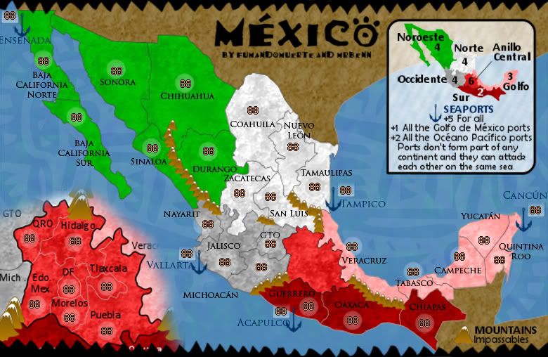
Before I spend too much time redoing graphics etc, I'd like to get the gameplay hammered out. The bonuses feel balanced between the North and the South, and I think the values are about right. What I'm not too keen on are the numbers of borders in/out of Anillo Centro (the red region on the inset). So,
Discussion Requested = GameplayOh, and [
moved] back into the foundry.
Re: MEXICO [D] p1/7 --May 4th-- New Cartographer
Posted: Mon May 04, 2009 6:24 pm
by LED ZEPPELINER
i like it, but i think the texture is a little to big, if you could scale it down some i think that would be great
Re: MEXICO [D] p1/7 --May 4th-- New Cartographer
Posted: Tue May 05, 2009 2:41 pm
by Merciless Wong
Name the seas for clarity...
Plan ahead on objections raised on starting with all of the ports on one side or the other
for a bonus in 1v1 or 1v1v1 ?
Do your terits to defend, terits and bonus analysis. .. difference in bonus Occidente and Sur don't make much sense
Clarity of what territories border the inset in question?
On originality, isn't this just another territorial subdivision with a slight flavor element in the ports?
Re: MEXICO [D] p1/7 --May 4th-- New Cartographer
Posted: Tue May 05, 2009 3:12 pm
by sailorseal
I like the idea and the set up:
Is there a reason for the all caps MEXICO? Just wondering.
The style seems to be a cross between Mexican tiling and Mexican painting, maybe lean more towards the tile side?
Re: MEXICO [D] p1/7 --May 4th-- New Cartographer
Posted: Tue May 05, 2009 3:16 pm
by LED ZEPPELINER
i think it is too easy to gain control over the north region, then the south
Re: MEXICO [D] p1/7 --May 4th-- New Cartographer
Posted: Tue May 05, 2009 4:41 pm
by mibi
Pretty sweet map. I like the colors, textures and theme. Keep it up.
Re: MEXICO [D] p1/7 --May 4th-- New Cartographer
Posted: Tue May 05, 2009 6:13 pm
by fumandomuerte
sailorseal wrote:Is there a reason for the all caps MEXICO?
Is just a beginning. On my last version of the map there were no caps at all so it's just a matter of time for the fonts and name to get clarified.
LED ZEPPELINER wrote:i think it is too easy to gain control over the north region, then the south
About that I kind of agree. Maybe MrBenn should inlcude the ports as part of the continents and remove the ports bonuses.
On the first post you can find the last version of the map before MrBenn re-took the project, but I'll post it here so everybody can see it.
Small version:
[bigimg]http://img90.imageshack.us/img90/9766/mexicosv5nr9.png[/bigimg]
Re: MEXICO [D] p1/7 --May 4th-- New Cartographer
Posted: Wed May 06, 2009 3:44 pm
by whitestazn88
very glad to see this map back in progress. it was one of the best i'd seen in a while when it came out, and the gameplay is simple, but with the addition of mexico city, makes for an interesting twist.
i look forward to seeing where you take this one benn
Re: MEXICO [D] p1/7 --May 4th-- New Cartographer
Posted: Sat May 09, 2009 12:57 am
by laci_mae
Nice looking revision for sure.
I think the inset definitely needs a little more clarity. Perhaps a type of "magnification" would help. Something like holding a magnifying glass over the map or showing it lifted somehow. Perhaps the inset and legend should be switched in relative location to facilitate.
Best,
Laci
Re: MEXICO [D] p1/7 --May 4th-- New Cartographer
Posted: Sat May 09, 2009 10:38 am
by Kaplowitz
looking great but you should have updated it May 5th, not May 4th.