MÉXICO [BETA] p1/18 --Sep 11th--

Care to peruse completed maps? Take a stroll through the Atlas.

Moderator: Cartographers

Forum rules
Please read the Community Guidelines before posting.
Post Reply
User avatar
MrBenn
Posts: 6880
Joined: Wed Nov 21, 2007 9:32 am
Location: Off Duty

MÉXICO [BETA] p1/18 --Sep 11th--

Post by MrBenn »

Map Title: México
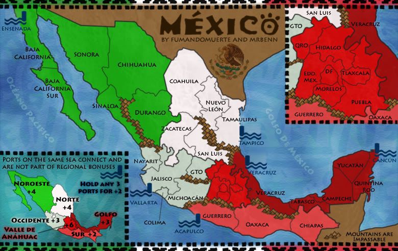
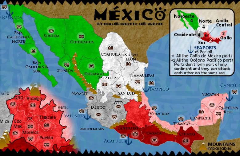
Mapmakers: MrBenn and fumandomuerte
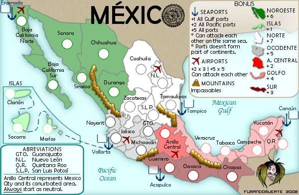
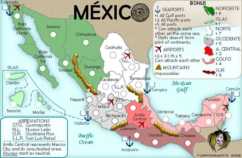
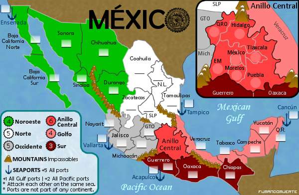
Territory Count: 30 starts + 5 neutral ports
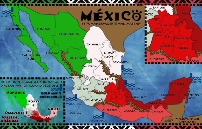
Bonuses: 6 regions
Gameplay: A map based on the actual political division of México with some important ports on both international waters. No new elements are added to the classical risk gameplay.

Foundry Stamps
Image Image Image

Latest File Links
XML: http://www.fileden.com/files/2009/1/9/2259283//Mexico1.xml
Small Image: http://i275.photobucket.com/albums/jj320/bpawley/mexico/Mexico14s.jpg
Large Image: http://i275.photobucket.com/albums/jj320/bpawley/mexico/Mexico14.jpg

Latest Version - 11th September 2010
[bigimg]http://i275.photobucket.com/albums/jj320/bpawley/mexico/Mexico14.jpg[/bigimg]

[bigimg]http://i275.photobucket.com/albums/jj320/bpawley/mexico/Mexico14s.jpg[/bigimg]

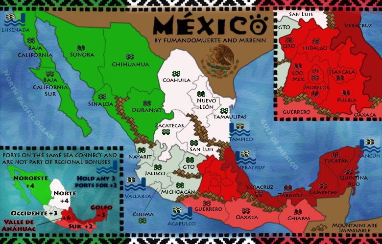
    Here are the (hopefully) final images!

[url]http://i275.photobucket.com/albums/jj320/bpawley/mexico/Mexico13L.jpg]Previous Version[/url] - 3rd September 2010
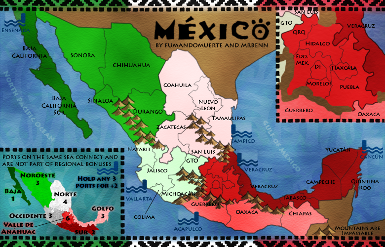
    I've added some (more) texture to the coastline, darkened the border lines, and added a new texture to the land (which I still feel ambiguous about, but could live with this one).
    Do people prefer this version or the previous version?

Previous Versions- 2nd September 2010
Small Map: http://i275.photobucket.com/albums/jj320/bpawley/mexico/Mexico12S.jpg
Large Map: http://i275.photobucket.com/albums/jj320/bpawley/mexico/Mexico12L.jpg
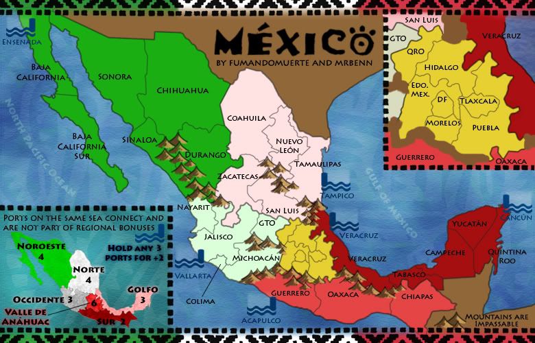
    The Bison King wrote:
    natty_dread wrote:This is just me, but I wouldn't mind seeing a little bit of texture on the land.

    He had texture on there earlier but had decided to remove it.

    Yep - nothing quite looked right, and I like the contrast between the land and the water.
    thenobodies80 wrote:The only two things that i see are:
    - finish the veracruz coast line in the top right inset
    - Make better T letters in the phrase " ports on the same sea connect......" in the other inset

    Fixed them both; also joined up a line in the Central region on the main map, where I had removed a mountain at some point
    RedBaron0 wrote:and the small map.

    Voila....

    Are we all done?

Previous Version- 31st August 2010
    Here's another quick update. I've made some minor tweaks to colours and some name placements. The sea names are now in Spanish too.

Previous Version - 25th August 2010

Previous Version - 6th August 2010
  • I've played around with the colour scheme a little bit, and am happy with it the way it was originally (with some minor tweaks to the paler central regions).
  • The mountains have been redrawn, and I'm actually quite happy with them, which makes a change for me - I've also filled in the gaps so it's much more obvious where the impassables actually are.
  • The only obvious thing I can see that I still need to finalise is the minimap... unless anybody else can tell me otherwise? :P

Previous Version - 1st July 2010
Here are the changes:
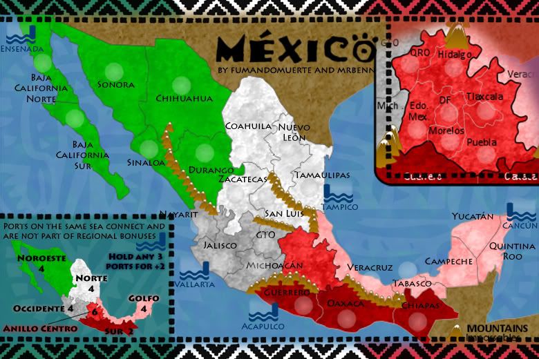
  • I've taken on board most of the suggestions; I've opened up the mountains between San Luis and Tamaulipas to make that area not so linear.
  • The mountains between Michoacan and Edo. Mex. have similarly been removed to open up the Central region a little more.
  • I've removed the Baja +1 bonus, and bumped Noroeste back up to 4, although I could be persuaded to drop it back down to three as it feels like it should be 3.5!
  • Graphically, I've made the central area more yellow, and to be honest I preferred it red. The Eagle on the Mexico flag is much more brown than yellow, but brown looked even worse (and too similar to the unplayable areas).
  • I've taken off the texture from the land, and actually like the sleek modern look it gives the map.
  • As for the port icons, I really don't want to switch to an anchor; the icon I've designed doubles up really nicely as an army circle, and (in my opinion) fits the map quite nicely.

Previous Version - 25th June 2010
    I've had another look at the bonus regions, and think the map works slightly better with two in the middle. With that in mind, I've added in some more impassable mountains in sensible places, and tweaked some of the bonus values. Thoughts?

Previous Version - 27th May 2009
    The borders have more of a Mexican/Aztec feel to them now, and I've incorporated the colours from the national flag too. I've extended some of the mountain ranges towards the middle of the map, and have redrawn the Ports/Docks; I've tried to create a motif that vaguely fits the theme, but is distinctly port-esque.
    To Do:
    -The borders and Anillo Centro inset need to be redrawn; to make it more clear what goes where.
    -Once the location of the mountains has been confirmed, they need to be redrawn to.
    -It would be nice to add a third port on the West side to balance out the ports bonus.
    Any and all feedback is welcome ;-)

Previous Version - 4th May 2009
    Here's my first update... I've resized to work on the large image first. Several of the layers had been flattened from fumandomuerte's working image, and I think he was using different software in any case.
    The text layers were all rasterised, so I've taken the liberty of changing the font (it was very blurry when I resized it). I've added something of a traditional Mexican art feeling to the map by adding a border and and a motif to the sea texture. I think the sea now helps to lift the map a little.
    I've moved the inset and minimap around, but still have a bit of work to do to get them up to scratch. Likewise, the mountains will need a bit of a revamp too.
    Before I spend too much time redoing graphics etc, I'd like to get the gameplay hammered out. The bonuses feel balanced between the North and the South, and I think the values are about right. What I'm not too keen on are the numbers of borders in/out of Anillo Centro (the red region on the inset). So, Discussion Requested = Gameplay


[spoiler=fumandomerte 1st post]Title: MEXICO
http://i462.photobucket.com/albums/qq350/Gimil_02/Map%20Foundry%20Stamps/Foundry%20Stamps%20Version%201/draft.png
A map based on the actual political division of México with some important ports on both international waters. No new elements are added to the classical risk gameplay.

VERSION 5 Updated 17/Mar/08
SMALL 600x391
[bigimg]http://img90.imageshack.us/img90/9766/mexicosv5nr9.png[/bigimg]
30 Terits
5 Seaports
7 Continents
2 Sub continents
-Changed the bonus for the Anillo Central region from 5 to 6.
-Translated the sea names to the spanish form.
-Added some texture to the land.
-A little touch-up to some graphic elements like the terits names.
-The neutrals are shown (ports).

Is the gameplay OK or should I make a major change?
Have fun and keep coming to the map foundry, Vladi (fumandomuerte).

VERSION 4 (Small)
Image
35 Territories
9 Continents (2 sub)
-Adjusted the bonuses.
-Added a mini-map for the bonuses.
-Renamed some terits:
EM > Edo. Mex.
México > DF
SL > San Luis
NL > Nuevo León
QR > Quintana Roo

VERSION 3 (Small)
Image
6 Land Continents
2 Sub-continents
-Removed the airports.
-Brought back the "Anillo Central" zoom with detailed borders.
-Eliminated the isles system.
-Deleted the abbreviations box.
-Updated the bonus.

VERSION 2.1 (LARGE)
http://img120.imageshack.us/my.php?image=mexicolv22ci4.png
# Territories: 32
Seaports and anillo central start neutral.
-Fixed the border between Coahuila-Nuevo León (NL)-Tamaulipas
-Merged Colima, Aguascalientes (AGS.) & Jalisco into one territory named Jalisco.
-Made more legible territory names.
-Changed some graphical aspects such as the armies containers, the bonus frame and other stuff.
-Added a little mountain system to the border between Zacatecas-Guanajuato (GTO)-San Luis Potosi (SLP)-Jalisco to make easy to see who attacks who.
-Seaports keep starting neutral.
-Anillo central start neutral and with some extra defense (maybe 6).
-Got the XML, but lets wait more opinions and suggestions :).

VERSION 2 (LARGE)
http://img513.imageshack.us/my.php?image=mexicolv21tl9.jpg
# Territories: 32
VERSION 1 (LARGE)
http://img530.imageshack.us/my.php?image=mexicolxl7.jpg
# Territories: 40
Ports start neutral[/spoiler]
Last edited by MrBenn on Mon May 04, 2009 5:38 pm, edited 15 times in total.
User avatar
Sven Hassel
Posts: 163
Joined: Thu Jul 26, 2007 3:15 pm
Gender: Male
Location: Romania, the land where anything can happen

Post by Sven Hassel »

good draft, but new maps go to map ideas first :wink:


And the map will be moved in 3...,2...,1...
"Bullets kill, grenades kill, bayonets kill, the cold kills. Death has a thousand faces. The worst of them all: the Court Martial."
Image
User avatar
fumandomuerte
Posts: 620
Joined: Sat Dec 29, 2007 1:27 am
Gender: Male
Location: The Cinderella of the Pacific

Post by fumandomuerte »

I knew something was wrong. Thanks for the note man.
Can some administrator delete this topic?
I've already published it on the Map Ideas area.

#-o
User avatar
gimil
Posts: 8599
Joined: Sat Mar 03, 2007 12:42 pm
Gender: Male
Location: United Kingdom (Scotland)

Post by gimil »

Moved :)
What do you know about map making, bitch?

natty_dread wrote:I was wrong


Top Score:2403
User avatar
InkL0sed
Posts: 2370
Joined: Sat Jun 23, 2007 4:06 pm
Gender: Male
Location: underwater
Contact:

Post by InkL0sed »

I don't like that red continent that you blew up. I think you should merge some territories within it so you don't need an expanded version. Everything is just too hectic as it is.
User avatar
Sir. Ricco
Posts: 4555
Joined: Tue Oct 02, 2007 2:33 pm
Gender: Male
Location: Making kingdoms burn and bloodshed start.
Contact:

Post by Sir. Ricco »

I thin kyou have a good start. But I agree with ink. The red part does crowd it.
Image
Image
Image
Ogrecrusher
Posts: 250
Joined: Thu Aug 16, 2007 2:55 pm

Post by Ogrecrusher »

I like this!
User avatar
Keredrex
Posts: 400
Joined: Sun Jan 14, 2007 1:41 am
Gender: Male
Location: New York

Post by Keredrex »

Awesome.....
User avatar
Coleman
Posts: 5402
Joined: Tue Jan 02, 2007 10:36 pm
Gender: Male
Location: Midwest

Post by Coleman »

I don't like that effect you have inside the army circles right now. With the dot in the center that fades out.

The dashed line from GTO. to Queretaro is awkward as is the Puebla to Oaxaca line. Maybe you could consider connecting them with a symbol instead.

It might be a pain but you could make the map a bit taller and extend the legend down to explain this.

I'll give feedback on what I think the continent bonuses should be later. Also you get the [Adv. Topic] tag, this means I think people should look at your topic and give it more attention than other topics in this sea of suggestions.
Grooveman2007
Posts: 333
Joined: Wed Oct 31, 2007 7:08 pm
Location: Minnesota

Post by Grooveman2007 »

InkL0sed wrote:I don't like that red continent that you blew up. I think you should merge some territories within it so you don't need an expanded version. Everything is just too hectic as it is.


I actually think that the blown up central region would make for some nice stratagies. Besides, I wouldn't seem right if the area around the capital wasn't it's own territory. Mabey you could make mexico city worth one on its own and get rid of the red.
Lone.prophet
Posts: 1467
Joined: Thu Oct 12, 2006 4:37 pm
Location: Your basement Muahaha

Post by Lone.prophet »

looks good though i must say the legend doesnt appeal much as a legend and the army circels arent circels more like oxagonals (which isnt reallly nice)
Image
User avatar
edbeard
Posts: 2501
Joined: Thu Mar 29, 2007 12:41 am

Re: MEXICO Map [Adv. Idea]

Post by edbeard »

very good start!

A few suggestions and questions

1. Since you explained that ports connect to each other on the same ocean, you do not need to have the dashed lines showing the connection.

2. I might be alone on this, but I don't think you need the dashed lines from to show where the larger image of centro connects to the smaller one. Maybe downsize it a bit and put it inside a box. That way it can be put more into the corner. At the moment all the dashed lines are very distracting.

3. Could you give those mountains another go? At the moment they do not look quite like mountains. Are there any rivers that could serve as impassable areas?

4. The legend in the bottom left seems quite weird. I don't understand why there is all sorts of brown underneath serving as the background. The shape is quite strange as well. Something more symmetric/square-like would probably be better. I think you have a bit of space that you could add to the bottom of the map. Though Maybe this would add more dead space that would detract from the overall image of the map.
WidowMakers
Posts: 2774
Joined: Mon Nov 20, 2006 9:25 am
Gender: Male
Location: Detroit, MI

Post by WidowMakers »

Great map. I love the look and the enlarged red region is great. similar to the Iraq map.

I think that the map could be a little taller to allow for a better looking legend.

But the small map is what will setup the layout. I would suggest setting up the small map first and figure out how to get everything you want. After that is done, the large map is basically finished.

WM
Image
User avatar
fumandomuerte
Posts: 620
Joined: Sat Dec 29, 2007 1:27 am
Gender: Male
Location: The Cinderella of the Pacific

Post by fumandomuerte »

México 2.0
I insist, apologize my english :).

SMALL 600x391
Image

LARGE 800x521
Image

Changes:

-Reduced from 40 to 32 territories by:

a) Merged the "Centro" continent to one territory ('Anillo Central' or 'Central Ring'), wich will play a more important role since it will give an extra bonus of +2. It will be attacked by 6 surrounding territories and 4 Airports. That corresponds to the Mexican Chaotic Centralism. It will start as a neutral zone with an amount of armies not yet defined (>=6 I was thinking).

b) Removed Colima and Aguascalientes (AGS.) because of their size.

-Added the main 5 International Mexican Airports to their respective territories.

-Ports doesn't start as neutral.

-Smoothed the armies circles.

-Removed the innecesary sea routs between Ensenada-Vallarta-Acapulco-Tampico-Cancún.

-The apparience of the Bonus menu.

-Added the containers for the ports armies.

-Included the tentative bonuses for continents on the frame (Top-Right)

Pending:

-Retouch that mountains...

-Start working on that XML...

I like the map with this number o territories, but if someone has any good idea of how to increment the territories with some properly extra lands its wellcome.
User avatar
edbeard
Posts: 2501
Joined: Thu Mar 29, 2007 12:41 am

Post by edbeard »

I'm not too fond of having airports in the map but that's just a personal preference so don't pay too much attention unless you get a lot of people telling you they don't like them either.


Many of the territory names are a bit hard to read because they cross over borders. I'd suggest trying out different fonts and boldness to see if that makes the words more clear.

The text problem also affects the border at GTO and SLP. It looks like a 4-way border. You don't want those because we don't know if you can attack across the corners. So, either an impassable at the center or changing the borders slightly can clear this up.

Next to Puerto Vallarta there's a small territory which has no name or army circle. I'm assuming this is just an issue with how you drew the border?

Can you change that border between Coahuila and Tamaulipas? What I mean is, the tiny stretch of NL that goes in between them could confuse people into thinking there's actually a border between Coa-Tam.


I did like the Anillo Central before when it was quite a few territories, but the way you've made it now works well too. I think the advantage of this layout is that it gives you more space for other things like the legend.
User avatar
fumandomuerte
Posts: 620
Joined: Sat Dec 29, 2007 1:27 am
Gender: Male
Location: The Cinderella of the Pacific

Post by fumandomuerte »

Thanks for the comments, I made some changes based on them :).
I did like the anillo central unmerged, but it could be a problem during the game causing some confussion.

I added the airports to connect all with Anillo Central, as if it was the real wolrd... Centralism.
Image
Thanks to the CC staff for the perma-ban on [player]۩░▒▓₪№™℮₪▓▒░۩[/player]!
User avatar
militant
Posts: 923
Joined: Mon Jul 30, 2007 1:25 pm
Location: Playing Mafia

Post by militant »

I really like the bonuses for the ports, especially the pacific and Gulf ports, i agree with edbeard that the airports need to be removed, if not removed then change the symbol, they look a lttle cramped. I really like the map overall though.
Guys I am intentionally lurking. Discuss; Play mafia, it is good.
Image
Oderint Dum Metuant says: Don't confuse the easily confused!
User avatar
iancanton
Foundry Foreman
Foundry Foreman
Posts: 2451
Joined: Fri Jun 01, 2007 5:40 am
Location: europe

Post by iancanton »

this map looks great, but i like the original version, with the df and expanded six-territory anillo central, even more.

mexico is a very centralised country and we need the large area around mexico city to show how important the capital city is. this means a lot of the action will be in the mexico city area, just like real life. bring back the expanded anillo central! don't worry about confusing people because some maps use this technique already, for example bamboo jack.

where to put anillo central? delete the three islas (and move the abbreviations). having no native population, the islas are of no importance.

ian. :)
User avatar
wcaclimbing
Posts: 5598
Joined: Fri May 12, 2006 10:09 pm
Location: In your quantum box....Maybe.
Contact:

Post by wcaclimbing »

where it says "ports doesnt form parts of continents", it should say "ports are not part of any continent".
Image
User avatar
fumandomuerte
Posts: 620
Joined: Sat Dec 29, 2007 1:27 am
Gender: Male
Location: The Cinderella of the Pacific

Version 3

Post by fumandomuerte »

VERSION 3
Details on first post---> GO
SMALL
Image
Image
Thanks to the CC staff for the perma-ban on [player]۩░▒▓₪№™℮₪▓▒░۩[/player]!
User avatar
Skittles!
Posts: 14575
Joined: Wed Jan 03, 2007 2:18 am
Gender: Male

Post by Skittles! »

With Anillo Central, does QRO attack SLP and GTO and Mich? And all that other territories that border other territories?
KraphtOne wrote:when you sign up a new account one of the check boxes should be "do you want to foe colton24 (it is highly recommended) "
User avatar
fumandomuerte
Posts: 620
Joined: Sat Dec 29, 2007 1:27 am
Gender: Male
Location: The Cinderella of the Pacific

Post by fumandomuerte »

Skittles! wrote:With Anillo Central, does QRO attack SLP and GTO and Mich? And all that other territories that border other territories?


I think it's very clear that QRO attacks SLP, GTO, Mich. (Michoacán), Hidalgo and EM.
I don't understand the second question, can u be more specific? :D
Image
Thanks to the CC staff for the perma-ban on [player]۩░▒▓₪№™℮₪▓▒░۩[/player]!
User avatar
Skittles!
Posts: 14575
Joined: Wed Jan 03, 2007 2:18 am
Gender: Male

Post by Skittles! »

fumandomuerte wrote:
Skittles! wrote:With Anillo Central, does QRO attack SLP and GTO and Mich? And all that other territories that border other territories?


I think it's very clear that QRO attacks SLP, GTO, Mich. (Michoacán), Hidalgo and EM.
I don't understand the second question, can u be more specific? :D

Ahkay, that answers my question. I was just wondering because I wanted clarification. thanks. :) it's look pretty good.
KraphtOne wrote:when you sign up a new account one of the check boxes should be "do you want to foe colton24 (it is highly recommended) "
User avatar
edbeard
Posts: 2501
Joined: Thu Mar 29, 2007 12:41 am

Post by edbeard »

I love the new update. I think this map is ready for the main foundry.

I think your bonuses are a bit too high in a few places.

My recommendations

Sur - 2
Norte - 4
Golfo - 3
Occidente - 4

the rest I think are probably fine.
User avatar
Coleman
Posts: 5402
Joined: Tue Jan 02, 2007 10:36 pm
Gender: Male
Location: Midwest

Post by Coleman »

Not to make it look like I just do what edbeard says :roll: but...

Image
Post Reply

Return to “The Atlas”