Page 2 of 18
Re: Denmark map draft
Posted: Sun Aug 21, 2011 10:07 am
by natty dread
Flapcake wrote:Iam using high-quality JEPG and it looks fine when called from my hard drive but from imageshack it looks reduced.
Do you have an account at imageshack?
Flapcake wrote:i did use pencil 1pix but did a 0.4 blur at the end.
That's no good. Blur is not a replacement for anti-aliasing, it simply blends near pixels together...
Flapcake wrote:im trying a brush as you recomend but 3pix seems heavy, du you reduce picture size at the end ?
It's only a recommendation. You can do the land/bonus borders with 2px and territory borders with 1px. Or 2,5px and 2px.
Re: Denmark map draft
Posted: Sun Aug 21, 2011 10:50 am
by Flapcake
natty_dread wrote:Flapcake wrote:Iam using high-quality JEPG and it looks fine when called from my hard drive but from imageshack it looks reduced.
Do you have an account at imageshack?
Flapcake wrote:i did use pencil 1pix but did a 0.4 blur at the end.
That's no good. Blur is not a replacement for anti-aliasing, it simply blends near pixels together...
Flapcake wrote:im trying a brush as you recomend but 3pix seems heavy, du you reduce picture size at the end ?
It's only a recommendation. You can do the land/bonus borders with 2px and territory borders with 1px. Or 2,5px and 2px.
yes i have an account at imageshack, now i tryed to safe in PNG (makes the file larger) and it looks quite better.
Re: Denmark map draft
Posted: Sun Aug 21, 2011 10:53 am
by Flapcake
Borders have been leveled out again, this time with a 3pix brush, they are thicker now, but also softer.
I have added a little decoration so the map is not so boring blank to look at, it is too much with the Queen?
[bigimg]http://img269.imageshack.us/img269/5513/dk011760x760imp.png[/bigimg]
Re: Denmark map draft
Posted: Sun Aug 21, 2011 12:06 pm
by isaiah40
This is looking better. Question. Are you putting everything in separate layers so that you can edit one part of the map instead of the whole map? You're gonna kill me, but the outlines of the map and the bonus regions could be reduced down to 2px. you can keep the territory borders the same. The Queen looks fine where you have her.
Anyways looking forward to your next update.
Edit: If not, I can help you with getting it sorted out so it will be easier for you.
Re: Denmark map draft
Posted: Sun Aug 21, 2011 12:09 pm
by natty dread
isaiah40 wrote: Are you putting everything in separate layers so that you can edit one part of the map instead of the whole map?
Good point. This, I would argue, is
the most important rule of graphics design: Always Everything On Their Own Layers.
Re: Denmark map draft
Posted: Sun Aug 21, 2011 12:40 pm
by Flapcake
isaiah40 wrote:This is looking better. Question. Are you putting everything in separate layers so that you can edit one part of the map instead of the whole map? You're gonna kill me, but the outlines of the map and the bonus regions could be reduced down to 2px. you can keep the territory borders the same. The Queen looks fine where you have her.
Anyways looking forward to your next update.
Edit: If not, I can help you with getting it sorted out so it will be easier for you.
i do use many layers, but i have borders and territorys in same layer ( i know crap) working on 34 layers now, its not that im lazy, but i think its looks nice with 3px borders, thers no doubth where the territorys are, but i wouldent mind if you would take a look at it, in sure i always can learn some thing

Re: Denmark map draft
Posted: Sun Aug 21, 2011 1:45 pm
by natty dread
i have borders and territorys in same layer
Unfortunately, that means you're going to have to redo both... territory colours and borders need to be kept on their own layers, otherwise you'll just run into problems later on. It's better to fix it now, early on.
Re: Denmark map draft
Posted: Sun Aug 21, 2011 2:50 pm
by Flapcake
natty_dread wrote:i have borders and territorys in same layer
Unfortunately, that means you're going to have to redo both... territory colours and borders need to be kept on their own layers, otherwise you'll just run into problems later on. It's better to fix it now, early on.
i know, it wont be that difficult, i got another version where the borders are in its one layer
Edit: thats it, borders seperated from territorys

Re: Denmark map draft
Posted: Mon Aug 22, 2011 6:02 am
by isaiah40
I forgot to mention flapcake to name each layer, this way you can easily find what you are looking for.
Re: Denmark map draft
Posted: Mon Aug 22, 2011 7:19 am
by Flapcake
isaiah40 wrote:I forgot to mention flapcake to name each layer, this way you can easily find what you are looking for.
You maby forgot to mention it, but you did name all of your new layes so i just follow your work
Re: Denmark map draft
Posted: Mon Aug 22, 2011 10:41 am
by Flapcake
just to show which direction the map is on the way to, thank you isaiah40 to have pushed it that way, I really thought that it begins to look like something now.
1st Boundaries smoothed
2nd Areas of color adjusted
3rd Legend polished
Things to do:
1 Naming the rest of the areas
2 Troop patches
3 Hmm'll be able to find something more with time.
[bigimg]http://img854.imageshack.us/img854/3389/dk012840x840a.png[/bigimg]
Re: Denmark map draft
Posted: Mon Aug 22, 2011 3:59 pm
by isaiah40
First of all, Dette ser meget bedre! (Hope its close to This looks much better!)
A few things:
1. Swap the colors of Ost jylland and the non playable areas around. Make all the non playable area a darker gray with no inner glow.
2. I don't think the sailing ship fits with the theme, so I think you can remove it.
3. For the territory names a size 12 or 13 font will work the best for readability.
4. For the city banners, do what I showed you on the Coat of arms and the flag, that very slight drop shadow I think will do wonders for them.
5. While we are on drop shadows, I think the bridges need to utilize the drop shadow as well.
6. IMHO, I think the compass can do with the drop shadow. Maybe find a different compass to put in it's place.
7. I think remove that guy in the legend and do something like [player]Bruceswar[/player] is doing on
Baltic States, here:
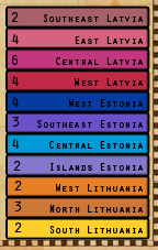
You can even copy over the blending from the bonus region so it will be consistent and easy to tell what bonuses are what.
I think this is a long enough list of to-do items to last you the night!

SO we'll be looking forward to your next update.
Re: Denmark map draft
Posted: Mon Aug 22, 2011 4:11 pm
by natty dread
isaiah40 wrote:For the territory names a size 12 or 13 font will work the best for readability.
That depends on the font somewhat. Size 12 on one font is not necessarily the same as size 12 on another.
For territory labels, it's usually good when your lower case letters are around 7-8 pixels high.
Re: Denmark map draft
Posted: Mon Aug 22, 2011 7:38 pm
by Flapcake
isaiah40 wrote:First of all, Dette ser meget bedre! (Hope its close to This looks much better!)
A few things:
1. Swap the colors of Ost jylland and the non playable areas around. Make all the non playable area a darker gray with no inner glow.
2. I don't think the sailing ship fits with the theme, so I think you can remove it.
3. For the territory names a size 12 or 13 font will work the best for readability.
4. For the city banners, do what I showed you on the Coat of arms and the flag, that very slight drop shadow I think will do wonders for them.
5. While we are on drop shadows, I think the bridges need to utilize the drop shadow as well.
6. IMHO, I think the compass can do with the drop shadow. Maybe find a different compass to put in it's place.
7. I think remove that guy in the legend and do something like [player]Bruceswar[/player] is doing on
Baltic States, here:
You can even copy over the blending from the bonus region so it will be consistent and easy to tell what bonuses are what.
I think this is a long enough list of to-do items to last you the night!
SO we'll be looking forward to your next update.
He He well yes the list is not that long, its easy to work with the layers now after it got sorted out.
The dude is Tordenskjold, the most famous war hero in danish history

but ok well thers about 500 years between the queen and him

I like the legend from baltic crusade, with a litte modification its could work.
Re: Denmark map draft
Posted: Mon Aug 22, 2011 7:50 pm
by Flapcake
natty_dread wrote:isaiah40 wrote:For the territory names a size 12 or 13 font will work the best for readability.
That depends on the font somewhat. Size 12 on one font is not necessarily the same as size 12 on another.
For territory labels, it's usually good when your lower case letters are around 7-8 pixels high.
some of the territorys are not so big, im working for the bedst result rigth now
Re: Denmark map draft
Posted: Tue Aug 23, 2011 10:12 am
by Victor Sullivan
isaiah40 wrote:7. I think remove that guy in the legend and do something like [player]Bruceswar[/player] is doing on
Baltic States, here:
I think you may be mixing up your maps, old man, TheBastard and thenobodies are doing Baltic Crusades, Bruceswar is doing Baltic States
1 point Sully
-Sully
Re: Denmark map draft
Posted: Tue Aug 23, 2011 11:15 am
by Bruceswar
Victor Sullivan wrote:isaiah40 wrote:7. I think remove that guy in the legend and do something like [player]Bruceswar[/player] is doing on
Baltic States, here:
I think you may be mixing up your maps, old man, TheBastard and thenobodies are doing Baltic Crusades, Bruceswar is doing Baltic States
1 point Sully
-Sully
This map is getting there. BTW thanks sully.
Re: Denmark map draft
Posted: Tue Aug 23, 2011 12:17 pm
by Flapcake
A quick update.
Territories are named.
there are shadows here and there.
Things that are missing.
troop fields.
bonus legend
it was all for today: P
[bigimg]http://img820.imageshack.us/img820/222/dk013800x800a.png[/bigimg]
Re: Denmark map draft
Posted: Tue Aug 23, 2011 3:10 pm
by natty dread
Looks good, except for the sea... which looks kinda cheap, like it was done with some standard PS filter. Also, some territory names could be moved a bit to accommodate the army numbers better.
Re: Denmark map draft
Posted: Tue Aug 23, 2011 7:00 pm
by Flapcake
natty_dread wrote:Looks good, except for the sea... which looks kinda cheap, like it was done with some standard PS filter. Also, some territory names could be moved a bit to accommodate the army numbers better.
¨ is actually, the background (sea) a great picture of the ocean, but given a few times a blur to make it more cartoony, I think it looks very good,
it is still a draft and the names will be adjusted when I make troop spots
Re: Denmark map draft
Posted: Wed Aug 24, 2011 7:48 am
by isaiah40
Victor Sullivan wrote:isaiah40 wrote:7. I think remove that guy in the legend and do something like [player]Bruceswar[/player] is doing on
Baltic States, here:
I think you may be mixing up your maps, old man, TheBastard and thenobodies are doing Baltic Crusades, Bruceswar is doing Baltic States
1 point Sully
-Sully
I have no idea what you're talking about. Your eyes are playing tricks on you again Sully.
Re: Denmark map draft
Posted: Wed Aug 24, 2011 1:54 pm
by isaiah40
Okay, the banners need the shadow going in the same direction as the coat of arms and picture frame. Here's what you do, select the coat of arms layer and right click, then go down towards the bottom and click on "Copy Layer Style". Then select the banners - select all of them by pressing and holding the CTL key and clicking on each banner layer (as long as you have all the layers open). Then right click and click on "Paste Layer Style". Do this for all the banners, picture frame, and bridges.
Also, what happened to the title!???
Re: Denmark map draft
Posted: Wed Aug 24, 2011 2:57 pm
by Flapcake
the title got twisted, its already corrected
il take a look at the shadows, it dont look good

Re: Denmark map draft
Posted: Wed Aug 24, 2011 3:34 pm
by Victor Sullivan
isaiah40 wrote:Victor Sullivan wrote:isaiah40 wrote:7. I think remove that guy in the legend and do something like [player]Bruceswar[/player] is doing on
Baltic States, here:
I think you may be mixing up your maps, old man, TheBastard and thenobodies are doing Baltic Crusades, Bruceswar is doing Baltic States
1 point Sully
-Sully
I have no idea what you're talking about. Your eyes are playing tricks on you again Sully.
Curse your modly editing powers!
-Sully
Re: Denmark map draft
Posted: Wed Aug 24, 2011 7:07 pm
by cairnswk
[bigimg]http://img820.imageshack.us/img820/222/dk013800x800a.png[/bigimg]
I am really impressed with how you've come along with your map Flapcake.

1. I like bridges... a little different from what we've seem previously
2. it is looking quite clear and for me the sea texture looks good also.
3. try to give your bonus legend a Danish flavour / design...i like the Queen added for Royal Touch (but where are Mary and Frederick LOL)
4. You have two four-way borders around Nyborg and Ringsted...they will have to be resolved somehow as they are a no-no and only confuse people.
Encouragement!