[Abandoned] Xiangqi
Moderator: Cartographers
Forum rules
Please read the Community Guidelines before posting.
Please read the Community Guidelines before posting.
-
generalhead
- Posts: 806
- Joined: Mon Apr 26, 2010 10:09 pm
Re: Xiangqi [2 player map] [20/10] [P1/4] [V6]
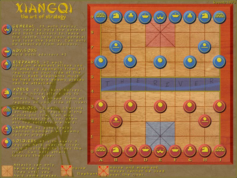
Is there a way you can have the river the way it was before and just have the lines land between the letters. It doesn't look right now.
- koontz1973
- Posts: 6960
- Joined: Thu Jan 01, 2009 10:57 am
Re: Xiangqi [2 player map] [20/10] [P1/4] [V6]
Not at the moment, I am working on a solution. That is my fall back though.generalhead wrote:Is there a way you can have the river the way it was before and just have the lines land between the letters. It doesn't look right now.

Re: Xiangqi [2 player map] [20/10] [P1/4] [V6]
Any resolution on the River situation? 
- koontz1973
- Posts: 6960
- Joined: Thu Jan 01, 2009 10:57 am
Re: Xiangqi [2 player map] [20/10] [P1/4] [V6]
Still working on it. Something like this can take me a long time, it all depends on what gives me an idea. Right now I know it is bad and will not be keeping it.DearCyrus wrote:Any resolution on the River situation?

- dolomite13
- Posts: 1379
- Joined: Mon Aug 18, 2008 5:54 pm
Re: Xiangqi [2 player map] [20/10] [P1/4] [V6]
Honestly I would take the river text off the board area and add it to the key, you have space on bottom right to show a image sample and put the words "The River".
Have you tested this with 88's to see if they are even readable? I love the graphic look of this and would hate to see you go through all this work only to have to make major changes down the line to accommodate troop numbers.
Also are your blue and red colors colorblind safe? I am very curious about that.
Great Job btw this looks like it might be quite fun. And I am not much of a 1v1 player.
=D13=
=D13=
Where Have I Been? ... Testing a prototype board game that I co-designed called Alien Overrun!
- koontz1973
- Posts: 6960
- Joined: Thu Jan 01, 2009 10:57 am
Re: Xiangqi [2 player map] [20/10] [P1/4] [V6]
This was the way I was leaning but again I am not sure of it. This is going to bug me all the way through development till I get it just right.dolomite13 wrote:Honestly I would take the river text off the board area and add it to the key, you have space on bottom right to show a image sample and put the words "The River".
Done and dusted when I made the current version of the pieces. The army numbers will sit slightly lower than on the crossroads.dolomite13 wrote:Have you tested this with 88's to see if they are even readable? I love the graphic look of this and would hate to see you go through all this work only to have to make major changes down the line to accommodate troop numbers.
I have and I would say they are OK but this is something on my to do list to make double sure of.dolomite13 wrote:Also are your blue and red colors colorblind safe? I am very curious about that.
Thanks. I am also looking forward to some Q-bot games as well. Lets hope nobodies notices us both and moves us up.dolomite13 wrote:Great Job btw this looks like it might be quite fun. And I am not much of a 1v1 player.

Re: Xiangqi [2 player map] [20/10] [P1/4] [V6]
The font is not the easiest to read. It's thin, the shadow makes it harder I think, and yellow makes it harder too.
- koontz1973
- Posts: 6960
- Joined: Thu Jan 01, 2009 10:57 am
Re: Xiangqi [2 player map] [20/10] [P1/4] [V6]
Thanks chap, will have a look at it today I think, if not tomorrow at the latest. Should hopfully of solved the river issue as well.chapcrap wrote:The font is not the easiest to read. It's thin, the shadow makes it harder I think, and yellow makes it harder too.

Re: Xiangqi [2 player map] [20/10] [P1/4] [V6]
I think this has been hanging around the drafting room too long, so here's at you!!


-
ManBungalow
- Posts: 3431
- Joined: Sun Jan 13, 2008 7:02 am
- Location: On a giant rock orbiting a star somewhere
Re: Xiangqi [2 player map] [20/10] [P1/4] [V6]
For the wooden texture of the board, I recommend finding a nice one on a site of public domain images.
- koontz1973
- Posts: 6960
- Joined: Thu Jan 01, 2009 10:57 am
Re: Xiangqi [2 player map] [20/10] [P1/4] [V6]
So what do you think I did then.ManBungalow wrote:For the wooden texture of the board, I recommend finding a nice one on a site of public domain images.

-
generalhead
- Posts: 806
- Joined: Mon Apr 26, 2010 10:09 pm
Re: Xiangqi [2 player map] [20/10] [P1/4] [V6]
I thought you took a picture of a piece of 2x4 building lumber in your back yard.koontz1973 wrote:So what do you think I did then.ManBungalow wrote:For the wooden texture of the board, I recommend finding a nice one on a site of public domain images.
or maybe you drew it by hand, now that would be talent.
Sorry for the sarcasm..... I think it looks good.
- koontz1973
- Posts: 6960
- Joined: Thu Jan 01, 2009 10:57 am
Re: Xiangqi [2 player map] [20/10] [P1/4] [V6]
OK guys, think I got all the things raised up. If not, let me know. But one thing I did add back was the generals. I missed them and they sat nicely for me.

-
generalhead
- Posts: 806
- Joined: Mon Apr 26, 2010 10:09 pm
Re: Xiangqi [2 player map] [22/11] [P1/5] [V7]
I think the black lettering is even harder to read than the yellow was. Maybe a yellow with a black offset or a black with a yellow offset.

The drop shadow you have around the letters are a little too fuzzy.
I like the look of growing the object by 1 too and adding a color behind. This is one at differing opacities.


The drop shadow you have around the letters are a little too fuzzy.
I like the look of growing the object by 1 too and adding a color behind. This is one at differing opacities.

-
generalhead
- Posts: 806
- Joined: Mon Apr 26, 2010 10:09 pm
Re: Xiangqi [2 player map] [22/11] [P1/5] [V7]
Is there a way you can crop out the heads of the advisors on the board, because behind their heads the board color has appeared to have changed.
- koontz1973
- Posts: 6960
- Joined: Thu Jan 01, 2009 10:57 am
Re: Xiangqi [2 player map] [22/11] [P1/5] [V7]
Can do. I think I prefered the yellow anyway.generalhead wrote:I think the black lettering is even harder to read than the yellow was. Maybe a yellow with a black offset or a black with a yellow offset.
The drop shadow you have around the letters are a little too fuzzy.
I like the look of growing the object by 1 too and adding a color behind. This is one at differing opacities.
Will get that sorted later todsy as this is an easy fix.generalhead wrote:Is there a way you can crop out the heads of the advisors on the board, because behind their heads the board color has appeared to have changed.

Re: Xiangqi [2 player map] [22/11] [P1/5] [V7]
I agree with general heads points, and look forward to what that will produce. Could I suggest a version which combines the colored castles with the generals images. I think it could look good.
- koontz1973
- Posts: 6960
- Joined: Thu Jan 01, 2009 10:57 am
Re: Xiangqi [2 player map] [22/11] [P1/5] [V7]
Can you explain please.DearCyrus wrote:Could I suggest a version which combines the colored castles with the generals images.

-
generalhead
- Posts: 806
- Joined: Mon Apr 26, 2010 10:09 pm
Re: Xiangqi [2 player map] [22/11] [P1/5] [V7]
I think what he means is to leave the Generals faces on the board but bring the highlighted castles back.koontz1973 wrote:Can you explain please.DearCyrus wrote:Could I suggest a version which combines the colored castles with the generals images.
- koontz1973
- Posts: 6960
- Joined: Thu Jan 01, 2009 10:57 am
Re: Xiangqi [2 player map] [22/11] [P1/5] [V7]
Thanks, now I understand.generalhead wrote:I think what he means is to leave the Generals faces on the board but bring the highlighted castles back.koontz1973 wrote:Can you explain please.DearCyrus wrote:Could I suggest a version which combines the colored castles with the generals images.

Re: Xiangqi [2 player map] [22/11] [P1/5] [V7]
Exactly what I was thinking. Thanks GH!
- koontz1973
- Posts: 6960
- Joined: Thu Jan 01, 2009 10:57 am
Xiangqi
Can I please have this map moved over to vacation please. I see no reason to make a map to only have it stopped at the final hurdle by the administrators. This affects all my maps within the foundry and I have posted this in all threads. I will no longer take part in a process that is being held hostage by the whims of a few.
My sincerest apologies to all who have taken the time to look at this map.
koontz1973
My sincerest apologies to all who have taken the time to look at this map.
koontz1973

Re: Xiangqi
[Moved]
At the request of the mapmaker, this map has been placed on vacation for a period of 6 months. After the 6 months the map will be considered Abandoned. If the mapmaker wants to continue with the map, then one of the Cartographer Assistants will be able to help put the thread back into the Foundry system, after an update has been made.
isaiah40

