Aleena wrote:What is the actual % of color blind players we have?
CC's policy is even 1 player is enough to warrant a change. I do not know the actual numbers
Moderator: Cartographers
Aleena wrote:What is the actual % of color blind players we have?


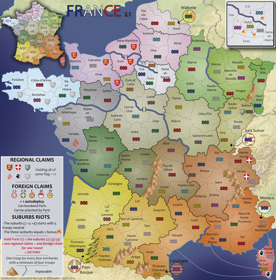


RjBeals wrote:I still think this will help and satisfy everyone. Keep the current mountains but work on the cast shadow.RjBeals wrote:To keep the mountains from looking like clipart, try adding a shadow to the land. There's already a light direction on the mountains themselves, just add some dark areas to the ground beside them - see graphic. Also - nice map
isaiah40 wrote:Okay I have studied the mountains some and have come to conclusion that what is making the mountains "float" on the map is the shadow. To make it easier for you and to not delay this much longer, remove the shadows. The right side of the mountains look good, it's just that left side just looks blah.


I agree. The shadows are a must, but just need a little touching up using cairns' and the above advice.RedBaron0 wrote:Are you just using the shadow filter/enhancement on the mountain layer? That's what it looks like to me. You gotta add another layer, blank, just beneath the mountains, and above the rest of the map. Then use the suggestions from cairns and Rj to draw in the shadows, and you should have a much better look, instead of the separated/floating mountains you have currently.


NZ was done in Illustrator also, but the mountains were done in another package that was more useful for drawing.pamoa wrote:he already told you
the map is done in ILLUSTRATOR
and shadow are not as easy as in photoshop
Like i have had to do...they have to be learned to achieve something worthwhilepamoa wrote:As I understood the skills are the issue