Graphics Changes Only:
- Toned down the outer border
- Removed all of the fold marks
- Added a burn hole, thoughts?
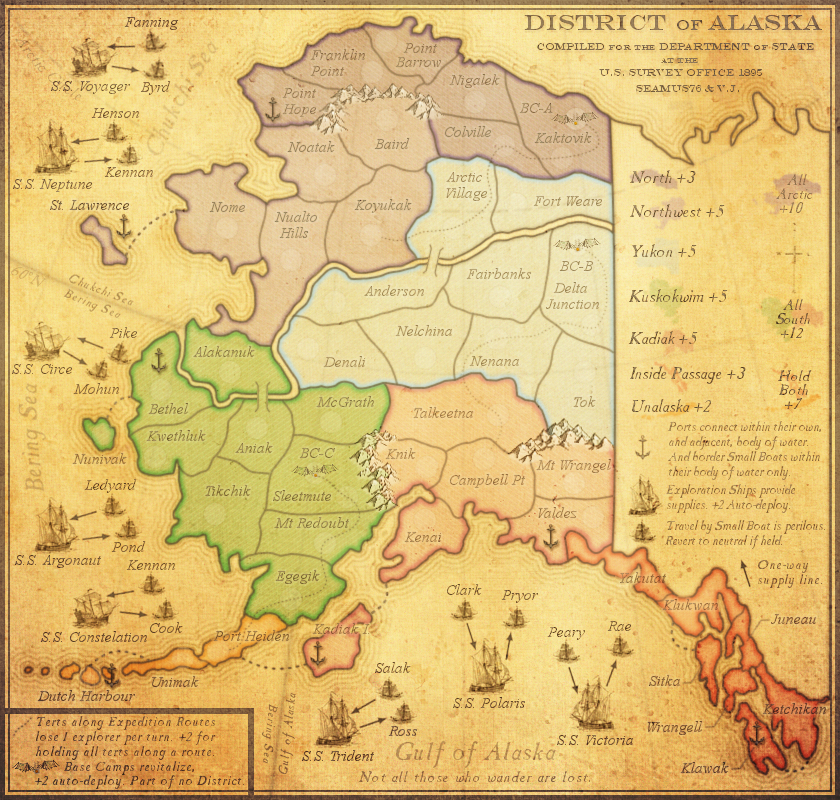
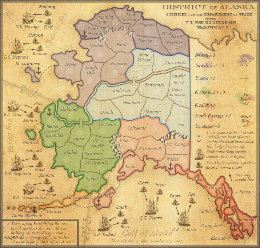
CURRENT MAP VERSION
v11.0 - Large (840x800)
- Click image to enlarge.

Moderator: Cartographers


 or
or  or if I wanted to really express myself, I could go as far as this:

Ouch. Personally I think it's just as good as Cairo.koontz1973 wrote:Burn hole =

Even I can see Cairo is bad apart from a few elements. Hence the reason I binned it.Seamus76 wrote:Ouch. Personally I think it's just as good as Cairo.


Yeah you're right, I can fix all of that, and saw those in particular as well. Thanks as always for the feedback. I think this will be a fun one.iAmCaffeine wrote:I'm wondering how hard it will be for some people to read the region names? Ketchikan, Kadiak I for example.. At least I think that's what they say?The faint look works for me but I'm young, I still have good eyes.


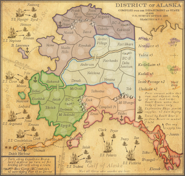
Thanks Isaiah. BC can be added easily.isaiah40 wrote:I have a few items that need to be addressed:
1. Along with making the region names darker, I would make the text in both legends darker and the lines from the region names to the regions themselves darker as well.
2. In the Expedition Route legend, the picture of the Base Camp needs some outer glow to bring it out from the background.
3. Put the abbreviation of base Camp in the legend as well, considering you have the abbreviation on the playable area. So it should read Base Camps (BC) revitilize ...
4. The Expedition routes need to be darker as well as there are a coupe of them I am having trouble seeing.
5. The bonus mini-maps need to be a tad darker, especially Yukon as that is a little hard to see.
6. Make the base camps on the map a tad darker as well.
Remember that this will be saved as a jpeg, and we know how that will turn out.
That's it from me for now!
Yes it looks better, maybe move the antique overlays under the text and mini-maps and see how it looks.Seamus76 wrote:Thanks Isaiah. BC can be added easily.isaiah40 wrote:I have a few items that need to be addressed:
1. Along with making the region names darker, I would make the text in both legends darker and the lines from the region names to the regions themselves darker as well.
2. In the Expedition Route legend, the picture of the Base Camp needs some outer glow to bring it out from the background.
3. Put the abbreviation of base Camp in the legend as well, considering you have the abbreviation on the playable area. So it should read Base Camps (BC) revitilize ...
4. The Expedition routes need to be darker as well as there are a coupe of them I am having trouble seeing.
5. The bonus mini-maps need to be a tad darker, especially Yukon as that is a little hard to see.
6. Make the base camps on the map a tad darker as well.
Remember that this will be saved as a jpeg, and we know how that will turn out.
That's it from me for now!
The other stuff seems to be more from when I added the antique overlays, everything got a lot lighter and more yellow-ish. Do me a favor and take a look at version v11.1 in the OP, and let me know if you like that better. You'll see how much darker everything is.
Maybe just my preference...but the older versions work better for me...i examined V7 and V8.Seamus76 wrote:...
The other stuff seems to be more from when I added the antique overlays, everything got a lot lighter and more yellow-ish. Do me a favor and take a look at version v11.1 in the OP, and let me know if you like that better. You'll see how much darker everything is.
Thanks, I agree. Now go get some sleep cairns.cairnswk wrote:For me, this looks much better
+1cairnswk wrote:For me, this looks much better
Thank you sir. Will do!!isaiah40 wrote:+1cairnswk wrote:For me, this looks much better
Now go and start getting the small, 888 test, and CB tests done!
Slow.isaiah40 wrote:How are the updates coming along?