Condensed Map Ideas
Moderator: Cartographers
Forum rules
Please read the Community Guidelines before posting.
Please read the Community Guidelines before posting.
-
luckiekevin

- Posts: 272
- Joined: Fri Oct 13, 2006 10:08 pm
- Location: California
-
PerkinsRooster
- Posts: 90
- Joined: Wed Feb 21, 2007 11:05 pm
- Gender: Male
- Location: Canada

-
[BK] Doomheit
- Posts: 10
- Joined: Tue May 01, 2007 8:15 pm
France concept
The latest version...
Original post continues below.
-----------------------------------------------------------------------------

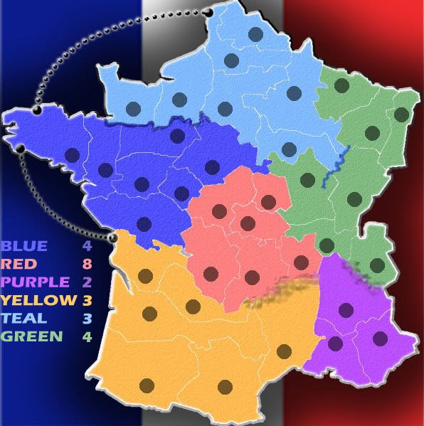
28 territories, 6 regions
So I know there is another France map in development, but I think this one is different enough to be worth a look. It's a lot more open, and is going to be a quicker play. It's essentially a battle for the middle. It's missing some of the elements, but I'll post it now and incorporate the feedback if there is enough response to merit further development.
Visual Resources
http://commons.wikimedia.org/wiki/Image ... France.png
http://en.wikipedia.org/wiki/Image:Flag_of_France.svg
Original post continues below.
-----------------------------------------------------------------------------
28 territories, 6 regions
So I know there is another France map in development, but I think this one is different enough to be worth a look. It's a lot more open, and is going to be a quicker play. It's essentially a battle for the middle. It's missing some of the elements, but I'll post it now and incorporate the feedback if there is enough response to merit further development.
Visual Resources
http://commons.wikimedia.org/wiki/Image ... France.png
http://en.wikipedia.org/wiki/Image:Flag_of_France.svg
Last edited by [BK] Doomheit on Sun May 13, 2007 12:02 am, edited 3 times in total.

-
Risktaker17

- Posts: 1495
- Joined: Sun Apr 01, 2007 8:09 am

-
Evil DIMwit

- Posts: 1616
- Joined: Thu Mar 22, 2007 1:47 pm
- Gender: Male
- Location: Philadelphia, NJ
Spockers wrote:wow a first time map that does not entirely suck.
Nice work.
I think you should get rid of those boat routes or whatever they are. It would be better to adjust the territory borders than have these in.
I don't mind the one in the channel, but the western route, I think, should definitely be replaced by adjusted borders.
-
funkeymunkey
- Posts: 523
- Joined: Tue Mar 27, 2007 3:05 pm

Not Necessarily
Spockers wrote:Far too symmetrical. It would be chinese checkers on a larger scale, and thats not a good thing.
It doesn't have to be symmetrical.... As long as you break up the areas the right way


KEYOGI wrote:Ok, first thing to do is scrap your first two ideas. Then get your hands on a decent image editing program. Once you've learned some skills with your program of choice, come up with a decent map and then come back to the Foundry and show us what you can do.
follow his suggestion
Romania-i tara mea, si buna si rea
O iubesc, ma mandresc ca m-am nascut in ea,

O iubesc, ma mandresc ca m-am nascut in ea,
-
Ruben Cassar

- Posts: 2160
- Joined: Thu Nov 16, 2006 6:04 am
- Gender: Male
- Location: Civitas Invicta, Melita, Evropa


Some pretty big territories - divide them up and have a few more, perhaps 36. And a bonus of 9 for the middle region? While it may be difficult to hold I still don't think it would be worth that. Other than that, it looks good
Highest Score: 2437nmhunate wrote:Speak English... It is the language that God wrote the bible in.
Highest Place: 84
hmmm... well
first off the army circles are too small and and aren't actually round for some reason o.0 also i'd get rid of the drop shaddow on them.
the ship routes aren't really needed, you could change the bottom one by adjusting the borders, and if you want to keep the one in the channel then please make it look a little better, perhaps just a line?
also the yellow territory the ship route goes to is very small...
the impassible borders look a little dodgy, you should defenitely change the mountains and the top left river mergers with the blue continent a bit, easiest way to change that is to just make the purple continent that blue colour and the blue continent purple.
BladiN wrote:The map is pretty symetric, therefor boring imho. Also I don't know about the corridors, the minus points.
A football stadium is symetrical so therefore the map has to be.
As for the coridors, they are minus bonuses because of their advantageous positions against the boxes although if feedback on them follows in suit i will remove the minus bonuses.
-
Risktaker17
- Posts: 1495
- Joined: Sun Apr 01, 2007 8:09 am
