- Click image to enlarge.

- Click image to enlarge.

Moderator: Cartographers


Contradicting yourself in a sentence is not always a good way.It's a nice looking map, but but overall it just isn't all that good.
I am glad. This was the look that was went for.Honestly I'm reminded of early 1980's video games from this
grainy yes, trying to draw grass at the scale, you will always get that look, as for pixelly, I doubt that it has pixelation?the whole of the map just seems to have that grainy pixelly quality.
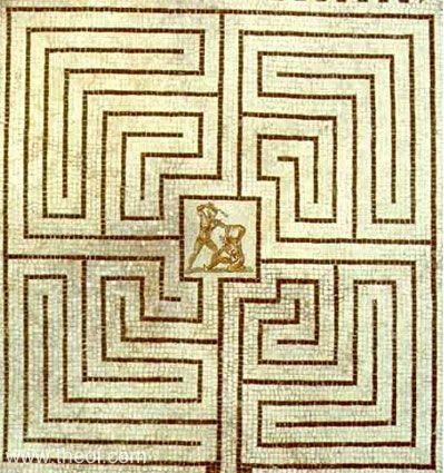
Those blobby sections (I take it you mean the small ones) where put in so the movement part of the legend could be taken out. As for the walls, as you say, I am limited for the size and if I had to redo the whole map over again, then I might of taken it in a different way, but that would mean know a complete rethink of all game play. So by doing what you ask, are you really telling me that I need to bin this one after so many months, and go all the way back to the drafting board?Also I don't get a good sense of the maze at all, it just has blobby sections of impassibles that are supposed to be rock. The labyrinth I've almost always seen has nice smooth walls, and impossibly huge. The labyrinth I've almost always seen has nice smooth walls, and impossibly huge. While I understand the limitations here, I just am not feeling any of that here, just a bad video game look.
Not a problem. But this is what frustrates me the most. Natty did it a lot I it really pissed me off no end. What you have posted is all opinion and there is nothing specific. You say the walls are not how you would like them, but you do not say how you would like them? I understand about the height thing but that comes from the games aspect of the map. How can the Greeks watch if the walls are a 100 feet tall.I just am not feeling any of that here, just a bad video game look. Sorry koontz.
The point... of my statement is that a nice map is not a map that meets with the standards of the Foundry. It is my opinion, yes, but no one else is saying anything, refute me, please, I welcome the discussion...koontz1973 wrote:RB0, I know you are quiet and without any comments from you, it is hard for me to steer a map in a direction that you would like.
RedBaron0 wrote:It's a nice looking map, but but overall it just isn't all that good.
The Greek characters in the title don't mean anything like that.koontz1973 wrote:Labs title font can change MB. Can I ask what is wrong with it?

That was one of the reasons it got changed from Greek Games of Death (too long) to Greek Games (Olympic year) to Labs.Labs is fine, better than Greek Games for sure. (Greek Games would give me more of feeling of the Olympics...)


ditto,IcePack wrote:i dont like the blocks...
This is a defeatist attitude. You know if you really decided to work on them you could get them to the point where you liked them. But you don't like them, so you don't want to work on them.koontz1973 wrote:the grey blocks are shit and no matter how much I improve them or change them, they will always be grey slabs of shit.IcePack wrote:i dont like the blocks...
I'm going to be nitpicky about the this, but the stones around the outside just don't really look good. Rock/stones don't have those features, even after they've been dug out...like water spilling from outside the map or like the stone is gradually creeping into the game board like vines or something. Instead of individual blocks, you could have one solid wall along the outside, etc. When rock is chiseled in the way you mean, it doesn't have jagged un-uniform edges. Additionally, the edges are usually as smooth as possible so that a person can't climb up the walls of the maze and escape.koontz1973 wrote:Stone areas around the edges will stay. Sort of like a dug out quarry is being used. Medusa gaze has not changed colour for a long time. Why has it suddenly become a problem now?
It is not a defeatist attitude. And no matter what you do to them, they will always be out of scale at this size. Also, if I was unwilling to work on them, why have I done all this over the last few days. You are sell me short their nole.You could make them the best looking blobs of grey ever and even then they would be out of scale. They are bloody huge and up to recently have not been a problem for anyone. We went through this map piece by piece including the impassables and adding the small rocks. There just has to be a time when radical overhauls have to be said no to. RB0 himself looked at the mock up last time and said it looked bad, this is just the same but with a few features on and made square.nolefan5311 wrote:This is a defeatist attitude. You know if you really decided to work on them you could get them to the point where you liked them. But you don't like them, so you don't want to work on them.koontz1973 wrote:the grey blocks are shit and no matter how much I improve them or change them, they will always be grey slabs of sh*t.IcePack wrote:i dont like the blocks...
Thats the problem though, like this it does not look like a maze at all. RB0 posted a decent maze and that is what a maze should be like. This is not a maze.They look much more intentional, as if the creators of the maze chiseled them and then intentionally put them there to make the slaves life more difficult. It looks like a maze, or a labyrinth.
I know what you mean and will give that a go, but I still think it will look like sh*t.One option is not for each cell grid to be an individual block, but a grouping of them (i.e., you remove the borders of them on the inside of the maps blocks, if you know what I mean).
Does not matter, stone/rock comes in all types of formations. It could easily be passed of as a lava flow that has cooled or an out cropping that has been weathered after centuries. Either way, it makes not difference.I'm going to be nitpicky about the this, but the stones around the outside just don't really look good. Rock/stones don't have those features, even after they've been dug out
Will look into it.The brown ground layer that the minotaur is standing on is a bit confusing. it almost looks like an impassable.

You can say no to them, that's fine. I'm not sure how likely the map is to get a stamp if you say no, but it's your map. And just to be clear, this map has not been subject to intense graphics scrutiny prior to this phase, and that's what it's under right now.koontz1973 wrote:It is not a defeatist attitude. And no matter what you do to them, they will always be out of scale at this size. You could make them the best looking blobs of grey ever and even then they would be out of scale. They are bloody huge and up to recently have not been a problem for anyone. We went through this map piece by piece including the impassables and adding the small rocks. There just has to be a time when radical overhauls have to be said no to. RB0 himself looked at the mock up last time and said it looked bad, this is just the same but with a few features on and made square.nolefan5311 wrote:This is a defeatist attitude. You know if you really decided to work on them you could get them to the point where you liked them. But you don't like them, so you don't want to work on them.koontz1973 wrote:the grey blocks are shit and no matter how much I improve them or change them, they will always be grey slabs of sh*t.IcePack wrote:i dont like the blocks...
A labyrinth is a maze. You can't have a perfect maze because it wouldn't pass GP, but as is,koontz1973 wrote:Thats the problem though, like this it does not look like a maze at all. RB0 posted a decent maze and that is what a maze should be like. This is not a maze.They look much more intentional, as if the creators of the maze chiseled them and then intentionally put them there to make the slaves life more difficult. It looks like a maze, or a labyrinth.
If you feel this is best, then so be it. Just as is I don't think it looks good.koontz1973 wrote:Does not matter, stone/rock comes in all types of formations. It could easily be passed of as a lava flow that has cooled or an out cropping that has been weathered after centuries. Either way, it makes not difference.I'm going to be nitpicky about the this, but the stones around the outside just don't really look good. Rock/stones don't have those features, even after they've been dug out
So if a map maker says he does not like the way his map is being pushed towards, then it does not get a stamp? I am all for experimenting with new things but to say that one person has that much power over everyone else in the foundry is a bit OTT. Here is a couple of the early versions with the same type of blocks as now. No one liked them and got me to change them to this, now I am being made to go back to this.You can say no to them, that's fine. I'm not sure how likely the map is to get a stamp if you say no, but it's your map. And just to be clear, this map has not been subject to intense graphics scrutiny prior to this phase, and that's what it's under right now.


I don't remember seeing that honestly, but I don't think it should have ever changed from that (the second one specifically). Much more crisp. I'm not sure who told you to change it to what you have now, but I like it a lot more. Again, I'm a gameplay guy, not a graphics guy...if isaiah or RB don't like it or think you're better off going a different route, then you'd be better off listening to them, but it just looks more "finished" to me.koontz1973 wrote:So if a map maker says he does not like the way his map is being pushed towards, then it does not get a stamp? I am all for experimenting with new things but to say that one person has that much power over everyone else in the foundry is a bit OTT. Here is a couple of the early versions with the same type of blocks as now. No one liked them and got me to change them to this, now I am being made to go back to this.You can say no to them, that's fine. I'm not sure how likely the map is to get a stamp if you say no, but it's your map. And just to be clear, this map has not been subject to intense graphics scrutiny prior to this phase, and that's what it's under right now.
I'm not making you out to be a troublemaker or the bad guy. I just don't want to see what happened to Jakarta happen to this map...get all the way to FF and the community has a sort of backlash against the graphics of the map and then you have to completely redo it. Might as well get it all taken care of now.koontz1973 wrote: And yes, this map has been under scrutiny graphically. Since the first time I posted it, it has had scrutiny. I remember making lots of the icons different, legend has gone through lots of changes. Not one part of this map has stayed the same from the start.
Do not make me out to be the bad guy here or even as a trouble maker, when have I ever said no to anyone when they have asked. You say this is better, I disagree. RB0 wanted this to see and I gave it to him, you wanted the tops done differently, I did it. How am I now the bad guy in all this?
No, the second one is total rubbish. It just looks fake.And just a question...what about the second version isn't better than what you have?
