
Argentine

RAF
Moderator: Cartographers


Thats not a nit pick. That is a bloody good idea.RedBaron0 wrote:I quicky nitpick I'll throw at you, the flags.... can be better. Personally I wouldn't mind seeing the respective air force roundels, which would be cleaner and by far easier to draw.
Argentine
RAF

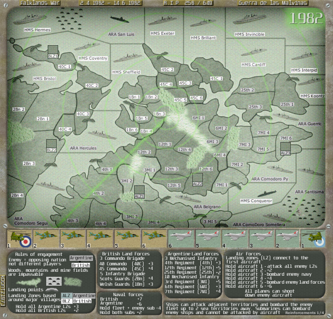
pamoa, will have a look at them when I fit in the new flags. I will say that the arrows are very minor part of the map, for a reason and they do work.pamoa wrote:about the landing points arrows
as you are in b/w now I think they should have a larger head
at the moment some are barely legible
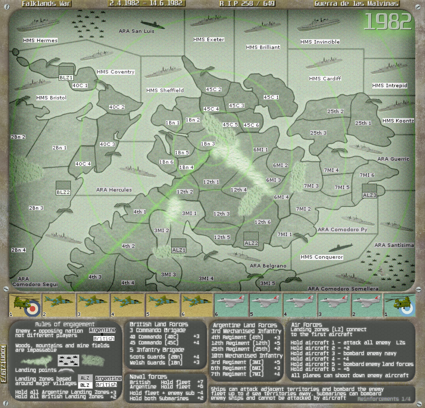
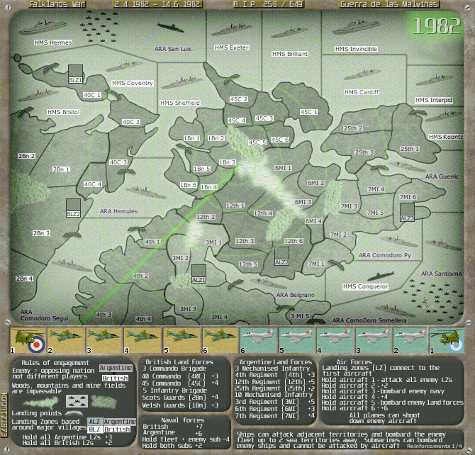

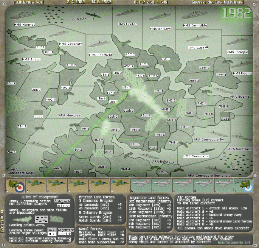


You did and I have.natty dread wrote:One thing, not sure if I already mentioned this, but can you make the argentina flag under the helicopter more visible? It kinda gets lost as the background colour is so similar to it... Whereas the british flag has a clear contrast to it's background and is very visible.
Red is more of a British colour. As for making it the same as the British, the planes and numbers should remove any confusion and it would make sense to have the control panel one colour.Here are three options. Choose one then I will do the small.natty dread wrote:Well that's not probably such a good idea. How about making it a reddish colour?


+1natty dread wrote:#2 definitely.


