It looks ok...but it doesn't seem to fit the theme to well...
Maybe make the bicycle a little more wooden...
Seriously, The new font for the legend is easy to read now, you shouldn't have any problems with it anymore. Good looking.
As for anything else...hmm...I can't see anything. I'll leave it to more experienced cartographers.
i'm glad you like the font.
any other suggestions?
“In the beginning God said, the four-dimensional divergence of an antisymmetric, second rank tensor equals zero, and there was light, and it was good. And on the seventh day he rested.”- Michio Kaku
should i make the bycicle pink? or is that too gayish?
“In the beginning God said, the four-dimensional divergence of an antisymmetric, second rank tensor equals zero, and there was light, and it was good. And on the seventh day he rested.”- Michio Kaku
“In the beginning God said, the four-dimensional divergence of an antisymmetric, second rank tensor equals zero, and there was light, and it was good. And on the seventh day he rested.”- Michio Kaku
it CAN'T get any gayer. this is the ultimate gay. the appex of gayness. the mecca of all that is gay, the epicenter of the gay world.
but enough about gay stuff. i need some gay feedback.
oops i mean some STRAIGHT feedback.
“In the beginning God said, the four-dimensional divergence of an antisymmetric, second rank tensor equals zero, and there was light, and it was good. And on the seventh day he rested.”- Michio Kaku
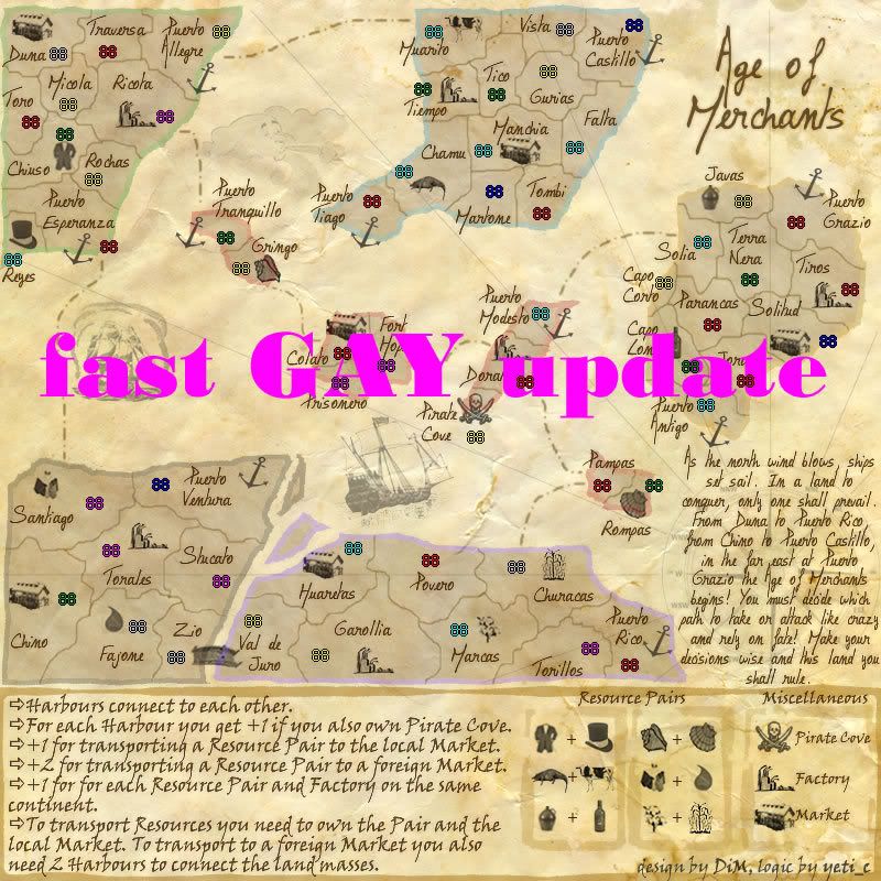
CaptainPlanet wrote:Make one more update quick fast, it doesn't matter what it is
here:
“In the beginning God said, the four-dimensional divergence of an antisymmetric, second rank tensor equals zero, and there was light, and it was good. And on the seventh day he rested.”- Michio Kaku
CaptainPlanet wrote:Now you need to change it to V69, and don't make any more changes
now seriously. i need some real suggestions. it's fun and all that but people get suspicious plus i'm married (to a woman)
here is the serous final version
“In the beginning God said, the four-dimensional divergence of an antisymmetric, second rank tensor equals zero, and there was light, and it was good. And on the seventh day he rested.”- Michio Kaku
mibi wrote:i think it was better without the derogatory usage for someones sexual preference.
come on it's just good clean fun
i got really bored cause i have no real suggestions.
“In the beginning God said, the four-dimensional divergence of an antisymmetric, second rank tensor equals zero, and there was light, and it was good. And on the seventh day he rested.”- Michio Kaku
it CAN'T get any gayer. this is the ultimate gay. the appex of gayness. the mecca of all that is gay, the epicenter of the gay world.
but enough about gay stuff. i need some gay feedback.
oops i mean some STRAIGHT feedback.
I just thought that you could put a rainbow, but too late now.
rainbows aren't gay. leprechauns have rainbows and leprechauns aren't gay
“In the beginning God said, the four-dimensional divergence of an antisymmetric, second rank tensor equals zero, and there was light, and it was good. And on the seventh day he rested.”- Michio Kaku
Enigma wrote:-i think i finally realized y the coloured edges look off- they look flat compared with the 3d effect on the rest of the map. maybe.... try putting a dark brown outline around the edges of the colour? that might help.
you're talking about the continent edges? you want me to put a brown edge on the coloured edges? like making a double edge? or just add some brown colour to the coloured edges? i'm not quite sure what you mean.
Enigma wrote:-ur territory dividers are really pixely
the borders are pixely?? i've seen a lot worse but no problemo. made them less pixely. how about now?
sry- to clarify, yes i meant a double border. just a line that matches the territory dividers around the outer edge of the coloured border.
and maybe i didnt want the word pixely- i think the dividers are too jagged. try rounding them a bit.
DiM wrote:rainbows aren't gay. leprechauns have rainbows and leprechauns aren't gay
agreed!! rainbow colours are for everyone (coming from a designer )
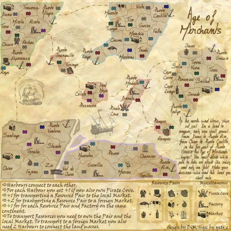
Do you need an excuse to have a war? I mean, who for? Can't you just say "You got lots of cash and land, but I've got a big sword, so divy up right now, chop chop."
Terry Pratchet
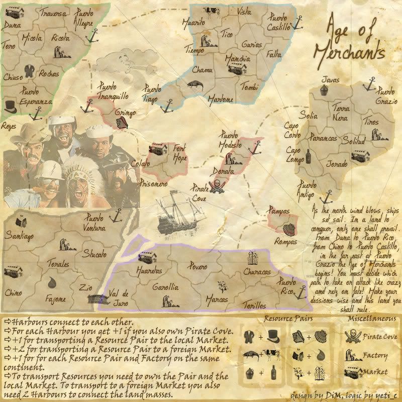
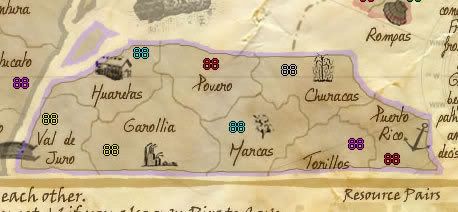
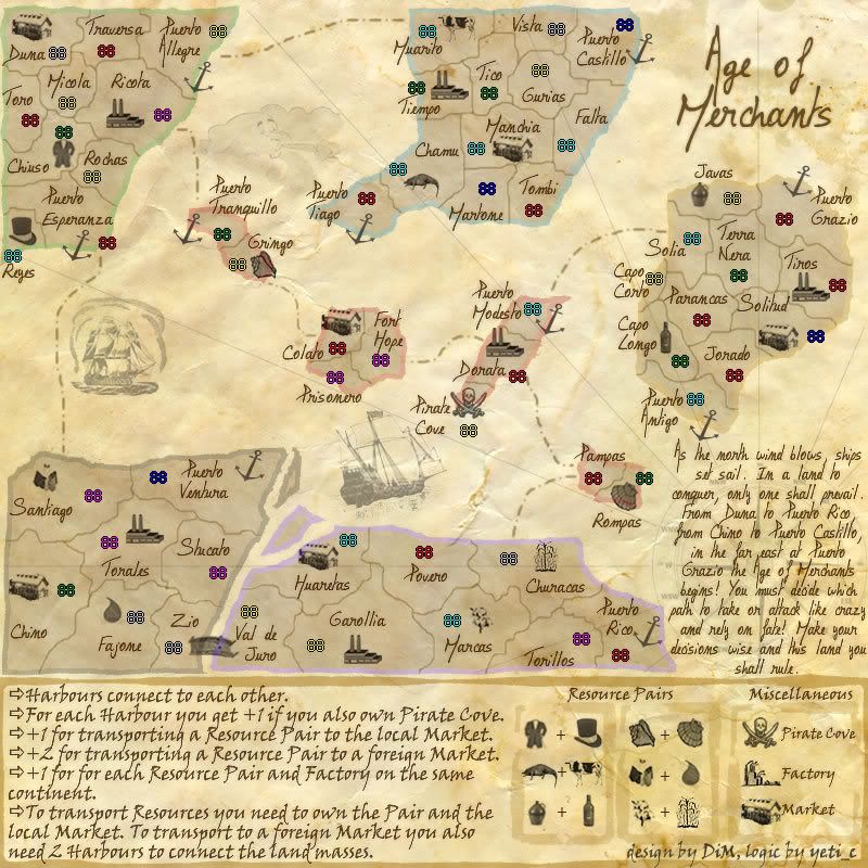
maybe the resource pairs could actually be pairs that make sense.
I see:
Suit + top hat = well dressed looking fellow
alligater + cow = leather? or quite a meal for the gator
jug + bottle = glass? i dunno
shells + shells = lots of shells!
house? + water drop = uh.. leaky house?
cotton + um.. corn? = uh.. im lost
oh and the pirates cove is already labeled on the map, no need for it in the Miscellaneous.
I also think the factory doesnt look like one.
Enigma wrote:-i think i finally realized y the coloured edges look off- they look flat compared with the 3d effect on the rest of the map. maybe.... try putting a dark brown outline around the edges of the colour? that might help.
you're talking about the continent edges? you want me to put a brown edge on the coloured edges? like making a double edge? or just add some brown colour to the coloured edges? i'm not quite sure what you mean.
Enigma wrote:-ur territory dividers are really pixely
the borders are pixely?? i've seen a lot worse but no problemo. made them less pixely. how about now?
sry- to clarify, yes i meant a double border. just a line that matches the territory dividers around the outer edge of the coloured border.
and maybe i didnt want the word pixely- i think the dividers are too jagged. try rounding them a bit.
DiM wrote:rainbows aren't gay. leprechauns have rainbows and leprechauns aren't gay
agreed!! rainbow colours are for everyone (coming from a designer )
here you go. something like this? i'm not too fond of it, it cramps the map even more. especially in the small islands in the center.
as for the internal dividers i don't think they're jagged. some are curvy some have pretty straight angles but look at any map and you'll see both types. the only type of border i haven't used is straight lines (like the americans have)
“In the beginning God said, the four-dimensional divergence of an antisymmetric, second rank tensor equals zero, and there was light, and it was good. And on the seventh day he rested.”- Michio Kaku
mibi wrote:maybe the resource pairs could actually be pairs that make sense.
I see:
Suit + top hat = well dressed looking fellow alligater + cow = leather? or quite a meal for the gator jug + bottle = glass? i dunno shells + shells = lots of shells! house? + water drop = uh.. leaky house? cotton + um.. corn? = uh.. im lost
oh and the pirates cove is already labeled on the map, no need for it in the Miscellaneous. I also think the factory doesnt look like one.
suit + hat = clothes
alligator + cow = skins
jug + bottle = booze
shells 1 + shells 2 = traditional jewl crafting
bucket + water drop = mineral water
plant 1 + plant 2 = cereals
i'll keep the pirate cove to avoid confusion and to mantain the legend simetry on 3 rows.
i'm open for factory image suggestions. if you have anything that looks like a factory please feel free to give me a link.
“In the beginning God said, the four-dimensional divergence of an antisymmetric, second rank tensor equals zero, and there was light, and it was good. And on the seventh day he rested.”- Michio Kaku
Molacole wrote:I don't like how the instructions font run into each other.
i don't quite follow you here. what runs into what?
do you mean the y or the p is too long and it runs into the line below?
if this is what you mean i don't think it's such a problem. i write exactly the same, plus they touch only 1 pixel in a few areas. it is very clear to read. this is how the font is made i dod not change any parameters.
“In the beginning God said, the four-dimensional divergence of an antisymmetric, second rank tensor equals zero, and there was light, and it was good. And on the seventh day he rested.”- Michio Kaku
DiM wrote:i'll keep the pirate cove to avoid confusion and to mantain the legend simetry on 3 rows.
I also made the point that the X marks the spot isn't referenced anywhere - you could change Pirate Cove to that in the key instead of removing it...
C.
X marks the spot is gone because now the pirate cove gives bonus for owning harbours. so i have nothing to reference.
“In the beginning God said, the four-dimensional divergence of an antisymmetric, second rank tensor equals zero, and there was light, and it was good. And on the seventh day he rested.”- Michio Kaku
is this factory better? the old one is in the legend. i like the old one better because it has an old look.
“In the beginning God said, the four-dimensional divergence of an antisymmetric, second rank tensor equals zero, and there was light, and it was good. And on the seventh day he rested.”- Michio Kaku