Nordic Countries [Quenched]
Moderator: Cartographers
Forum rules
Please read the Community Guidelines before posting.
Please read the Community Guidelines before posting.
Re: Nordic Countries (revamp)
Actually, for the 10 extra pixels for clarity reasons, just go ahead and do it.

Re: Nordic Countries (revamp)
May I suggest a darker yellow color on the Swedish shield
-
natty dread

- Posts: 12877
- Joined: Fri Feb 08, 2008 8:58 pm
- Location: just plain fucked
Re: Nordic Countries (revamp)
You may, and I've already done it, it will be visible in the next update.Gillipig wrote:May I suggest a darker yellow color on the Swedish shield
Actually it's 40 extra pixels, but ok, thanks.isaiah40 wrote:Actually, for the 10 extra pixels for clarity reasons, just go ahead and do it.

-
thenobodies80

- Posts: 5400
- Joined: Wed Sep 05, 2007 4:30 am
- Gender: Male
- Location: Milan
Re: Nordic Countries (revamp)
natty_dread has confirmed to me that he will work only on graphics, with the exception of some minor XML adjustments (i.e. coordinates).
For the above reason, I'm going to move this topic directly into the Main Foundry Workshop.
[Moved]
Nobodies
For the above reason, I'm going to move this topic directly into the Main Foundry Workshop.
[Moved]
Nobodies
-
thenobodies80
- Posts: 5400
- Joined: Wed Sep 05, 2007 4:30 am
- Gender: Male
- Location: Milan
Re: Nordic Countries [Quenched]
The mapmaker has started to work on a graphics revamp of this map, please visit that topic to leave your suggestions.
MAP REVAMP TOPIC --> http://www.conquerclub.com/forum/viewto ... 1&t=150683
[Locked]
Nobodies
MAP REVAMP TOPIC --> http://www.conquerclub.com/forum/viewto ... 1&t=150683
[Locked]
Nobodies
-
natty dread
- Posts: 12877
- Joined: Fri Feb 08, 2008 8:58 pm
- Location: just plain fucked
Re: Nordic Countries [Graphics Revamp]
Thanks nobodies.
Now, then... the original map had a compass. I wonder if I should make one for this one too?
There was also a legend about the impassables, but I've come to regard those as sort of redundant... everyone already knows mountains, rivers, etc. are impassables.
Also, is there anything else anyone would like to comment here - anything that sticks out, anything that should be changed?
-
natty dread
- Posts: 12877
- Joined: Fri Feb 08, 2008 8:58 pm
- Location: just plain fucked

Re: Nordic Countries [Graphics Revamp]
I remember the compass discussion was quite substantial when you first made this map. There where a lot of edits to try to get the best possible compass but in the end it wasn't as colorful as I would've liked! So my advice is to make it a lot more colorful this time around! Try to get many colors in there. A compass has the potential to be a maps diamond so don't make it bland. A wow effect compass would be awesome on this map!natty_dread wrote:Compass?
- Click image to enlarge.
-
koontz1973

- Posts: 6960
- Joined: Thu Jan 01, 2009 10:57 am
Re: Nordic Countries [Graphics Revamp]
Got to agree with Gillipig. The map has to be the one thing to stand out, as it has been said before in the thread, the map has a lot of competition with the style of game play so one thing to draw it out could be the difference between success and failure.
EDIT: One thing though with the current compass, it does not really go with the title.
EDIT: One thing though with the current compass, it does not really go with the title.

-
natty dread
- Posts: 12877
- Joined: Fri Feb 08, 2008 8:58 pm
- Location: just plain fucked
Re: Nordic Countries [Graphics Revamp]
Cramming "lots of colours" into something does not necessarily make it awesome. In fact, I would argue it will often do exactly the opposite...
Re: Nordic Countries [Graphics Revamp]
I trust your taste in colors is better than whoever made that paint job nattynatty_dread wrote:Cramming "lots of colours" into something does not necessarily make it awesome. In fact, I would argue it will often do exactly the opposite...
Edit: The whole point is for it to stand out and it's hard to do that with few colors!
-
natty dread
- Posts: 12877
- Joined: Fri Feb 08, 2008 8:58 pm
- Location: just plain fucked
Re: Nordic Countries [Graphics Revamp]
Totally untrue. Using lots of colours is no guarantee for visual intensity. Conversely, using few colours doesn't mean that something is necessarily bland.Gillipig wrote:Edit: The whole point is for it to stand out and it's hard to do that with few colors!
Anyway, there's another alternative... I could just integrate the compass with the title:
- Click image to enlarge.

-
koontz1973
- Posts: 6960
- Joined: Thu Jan 01, 2009 10:57 am
-
natty dread
- Posts: 12877
- Joined: Fri Feb 08, 2008 8:58 pm
- Location: just plain fucked
Re: Nordic Countries [Graphics Revamp]
Does it matter?koontz1973 wrote:Looks better there.
Is the compass pointing north though?

Re: Nordic Countries [Graphics Revamp]
work on the mountain ranges - so they are less blurry
would be cool to include lots of scandinavian fjords - more true to real life
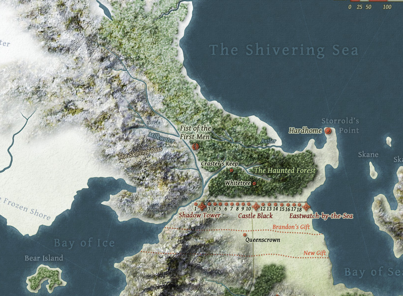
I say lose the texture in the lands - if you want to shoot for something cool - the Westeros map over at the guild would be inspiration for a cold feeling.
would be cool to include lots of scandinavian fjords - more true to real life
I say lose the texture in the lands - if you want to shoot for something cool - the Westeros map over at the guild would be inspiration for a cold feeling.
- Click image to enlarge.

-
natty dread
- Posts: 12877
- Joined: Fri Feb 08, 2008 8:58 pm
- Location: just plain fucked
Re: Nordic Countries [Graphics Revamp]
I'll work on the mountains. I've never seen a fjord, and I don't think I have the skills to pull of something like the westeros map in your guild.
-
natty dread
- Posts: 12877
- Joined: Fri Feb 08, 2008 8:58 pm
- Location: just plain fucked

-
natty dread
- Posts: 12877
- Joined: Fri Feb 08, 2008 8:58 pm
- Location: just plain fucked

-
sannemanrobinson
- Posts: 255
- Joined: Mon Dec 20, 2010 6:35 am
- Gender: Male
Re: Nordic Countries [Graphics Revamp]
This last mountain version is definitely more icey than the first post. Some shade could help make them keep the depth and contrast? Talking about shade, Does the light ever come from the northwest?
The dotted line behind the compass could be bent to the left.
The dotted line behind the compass could be bent to the left.
-
natty dread
- Posts: 12877
- Joined: Fri Feb 08, 2008 8:58 pm
- Location: just plain fucked
Re: Nordic Countries [Graphics Revamp]
I accidentally deleted those mountains... I'll have to start over... 
-
natty dread
- Posts: 12877
- Joined: Fri Feb 08, 2008 8:58 pm
- Location: just plain fucked
Re: Nordic Countries [Graphics Revamp]
...and then, gimp crashed on me... sigh...
I'll try this mountain business again tomorrow... hopefully with better luck...
I'll try this mountain business again tomorrow... hopefully with better luck...
-
natty dread
- Posts: 12877
- Joined: Fri Feb 08, 2008 8:58 pm
- Location: just plain fucked
Re: Nordic Countries [Graphics Revamp]
These, I think, are the best mountains so far.
- Click image to enlarge.

-
koontz1973
- Posts: 6960
- Joined: Thu Jan 01, 2009 10:57 am
Re: Nordic Countries [Graphics Revamp]
By a long way yes, but the tops look a little flat in the top line.natty_dread wrote:These, I think, are the best mountains so far.
-
natty dread
- Posts: 12877
- Joined: Fri Feb 08, 2008 8:58 pm
- Location: just plain fucked
-
natty dread
- Posts: 12877
- Joined: Fri Feb 08, 2008 8:58 pm
- Location: just plain fucked