Iberia [Quenched]
Moderator: Cartographers
Forum rules
Please read the Community Guidelines before posting.
Please read the Community Guidelines before posting.
-
Bad Speler

- Posts: 1027
- Joined: Fri Jun 02, 2006 8:16 pm
- Gender: Male
- Location: Ottawa
- Contact:

-
spinwizard
- Posts: 5016
- Joined: Sun Dec 10, 2006 9:52 am

-
basketballbestp
- Posts: 1
- Joined: Mon Dec 11, 2006 5:11 pm
- Location: Northern Kentucky University
too many continent bonuses
i think there are way too many continent bonuses.....maybe merge two small ones next to each other into one
-
spinwizard
- Posts: 5016
- Joined: Sun Dec 10, 2006 9:52 am
-
Bad Speler
- Posts: 1027
- Joined: Fri Jun 02, 2006 8:16 pm
- Gender: Male
- Location: Ottawa
- Contact:
-
Bad Speler
- Posts: 1027
- Joined: Fri Jun 02, 2006 8:16 pm
- Gender: Male
- Location: Ottawa
- Contact:


-
spinwizard
- Posts: 5016
- Joined: Sun Dec 10, 2006 9:52 am
-
Blueoctober

- Posts: 262
- Joined: Sat Feb 10, 2007 6:52 pm
- Location: Mars
-
Bad Speler
- Posts: 1027
- Joined: Fri Jun 02, 2006 8:16 pm
- Gender: Male
- Location: Ottawa
- Contact:
-
Kaleidoscopio

- Posts: 5
- Joined: Tue Dec 19, 2006 7:07 am
- Location: Lisbon - Portugal
-
Bad Speler
- Posts: 1027
- Joined: Fri Jun 02, 2006 8:16 pm
- Gender: Male
- Location: Ottawa
- Contact:
-
Bad Speler
- Posts: 1027
- Joined: Fri Jun 02, 2006 8:16 pm
- Gender: Male
- Location: Ottawa
- Contact:


-
DIRESTRAITS

- Posts: 1029
- Joined: Mon Jun 12, 2006 6:27 pm
- Location: Smacking everyone who says Oreeegone
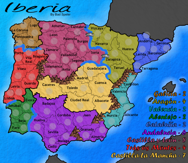
This map is looking sound as far as playability. I agree with DIRESTRAITS about the rivers, although I think it has more to do with the width of them and the fact they dont seem to meet the ocean as they should. I'm not really a fan of the mountains either. Could you perhaps create a few different templates and at least mix it up a bit?
Onto textures. I like the ocean, very nice. I think you should tone down the continent textures though and increase the non-playable areas texture. I'd look into a different approach to colouring the mountains as well, I don't think that texture is doing you any favours there.
At a quick glance the numbers seem centred. I'm wondering if your territory lines are fixed however. If you could give some a bit more room or move some text and shadows around it might look a bit cleaner. For example, Lisboa... if you move the label down and over the edge of the territory you could probably get that shadow in and create more space between it and Leiria. Barcelona is another example and the majority of territories in Galicia could be rearranged with text and shadow placement to make it look neater.

Happy to see how this map improved a lot.
Sorry if I point something already commented. I didnt read all.
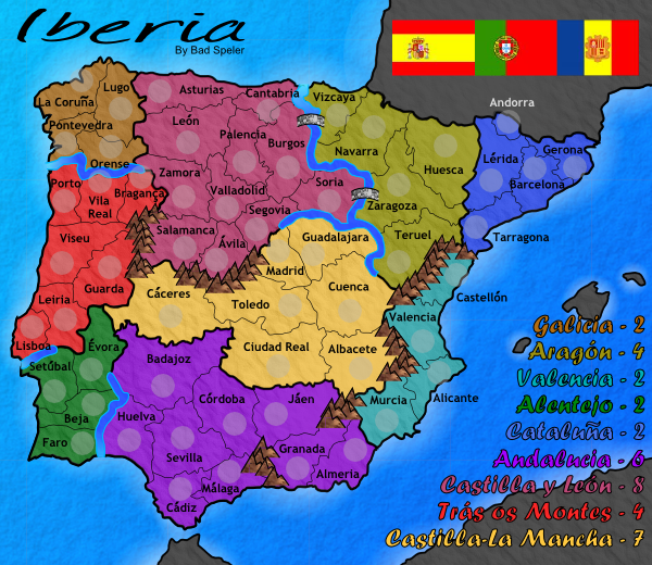
1) La Mancha bonus is too high. It could be 5, maybe 6, but not 7. In fact, wouldnt be La Mancha a better name to the region?
2) I think Castilla y Leon should have one less border, maybe block Asturias... Or, maybe a better option:
- Block Madrid to Segovia.
- Open Segovia to Guadalajara.
- Open Segovia to Teruel and Zaragoza.
- Remove Zaragoza to Soria.
3) Other minor things:
- Move Andorra name, maybe? Castellón too. Maybe La Coruña and Pontevedra.
- Adjust Galícia and Aragón colours in the legend. Same to La Mancha.
- If Im not wrong, Trás os Montes should have hyfen, like Trás-os-Montes... Im not sure about this, we need a portuguese to tell us.
Are there decorative images on your plans? I think the map looks sad without even a flag.
Sorry if I point something already commented. I didnt read all.
1) La Mancha bonus is too high. It could be 5, maybe 6, but not 7. In fact, wouldnt be La Mancha a better name to the region?
2) I think Castilla y Leon should have one less border, maybe block Asturias... Or, maybe a better option:
- Block Madrid to Segovia.
- Open Segovia to Guadalajara.
- Open Segovia to Teruel and Zaragoza.
- Remove Zaragoza to Soria.
3) Other minor things:
- Move Andorra name, maybe? Castellón too. Maybe La Coruña and Pontevedra.
- Adjust Galícia and Aragón colours in the legend. Same to La Mancha.
- If Im not wrong, Trás os Montes should have hyfen, like Trás-os-Montes... Im not sure about this, we need a portuguese to tell us.
Are there decorative images on your plans? I think the map looks sad without even a flag.

-
Fireside Poet

- Posts: 2671
- Joined: Mon Apr 24, 2006 1:49 pm

-
spinwizard
- Posts: 5016
- Joined: Sun Dec 10, 2006 9:52 am

looking better...
Id work on the mountains and rivers. also, looking at it kinda hurts my eyes, and im not exactly sure why. I think the ocean and the blur around the continent is so bright in comparison to the muted/dark colors of the continents that it is like looking into a bright light or something....
anyone else feel this way? Id mute the brightness of the sea, or brighten the continents.
-
Bad Speler
- Posts: 1027
- Joined: Fri Jun 02, 2006 8:16 pm
- Gender: Male
- Location: Ottawa
- Contact: