Good Morning Woodboro (V7.X) -- Home for the Holidays
Forum rules
Please read the Community Guidelines before posting.
Please read the Community Guidelines before posting.
- Evil DIMwit
- Posts: 1616
- Joined: Thu Mar 22, 2007 1:47 pm
- Gender: Male
- Location: Philadelphia, NJ
- natty dread
- Posts: 12877
- Joined: Fri Feb 08, 2008 8:58 pm
- Location: just plain fucked
Re: Good Morning Woodboro (V7.4) -- Font lines
Hmm, I kinda like the look of that.
- Evil DIMwit
- Posts: 1616
- Joined: Thu Mar 22, 2007 1:47 pm
- Gender: Male
- Location: Philadelphia, NJ
Re: Good Morning Woodboro (V7.4) -- Font lines
It looks kind of strange to me since the letters have a shadow and nothing else does. Do people like this, though?
-
carlpgoodrich
- Posts: 408
- Joined: Tue Aug 04, 2009 2:12 pm
Re: Good Morning Woodboro (V7.4) -- Font lines
I agree... and I'm sorry Natty, I know this is something you feel strongly about, and you know a lot more than me about it, but I really like Evil's version from page 14 (before all this text tweaking started) the best. I know the text is plain, and that that style wouldn't work for the majority of maps, but this map is supposed to be simple and cartoonish, that's one of the things that made me really like it in the first place. The fonts you made look very pretty in and of themselves, but I just don't think they fit with the rest of the map. I also do not understand what was wrong with the original text in the first place... "If it ain't broke, don't fix it." If it was illegible then I agree that's a problem, but I don't think it was.It looks kind of strange to me since the letters have a shadow and nothing else does.
Re: Good Morning Woodboro (V7.4) -- Font lines
I suppose the shadows do seem a little out of place. I also agree that the version at the top of page 14 was legible. I only made suggestions in the hope that it would help those who were having trouble reading that one. But once again, as I have learned so many times in the real world, "better" is the enemy of "good enough".carlpgoodrich wrote:I agree... and I'm sorry Natty, I know this is something you feel strongly about, and you know a lot more than me about it, but I really like Evil's version from page 14 (before all this text tweaking started) the best. I know the text is plain, and that that style wouldn't work for the majority of maps, but this map is supposed to be simple and cartoonish, that's one of the things that made me really like it in the first place. The fonts you made look very pretty in and of themselves, but I just don't think they fit with the rest of the map. I also do not understand what was wrong with the original text in the first place... "If it ain't broke, don't fix it." If it was illegible then I agree that's a problem, but I don't think it was.It looks kind of strange to me since the letters have a shadow and nothing else does.
- natty dread
- Posts: 12877
- Joined: Fri Feb 08, 2008 8:58 pm
- Location: just plain fucked
-
carlpgoodrich
- Posts: 408
- Joined: Tue Aug 04, 2009 2:12 pm
Re: Good Morning Woodboro (V7.4) -- Font lines
Ooooh, I actually do like that one  It kinda looks like someone mowed the names into the lawn.
- Evil DIMwit
- Posts: 1616
- Joined: Thu Mar 22, 2007 1:47 pm
- Gender: Male
- Location: Philadelphia, NJ
Re: Good Morning Woodboro (V7.4) -- Font lines
...Which is pretty much what I was looking for. Can I get the names on a transparent PNG by themselves?carlpgoodrich wrote:Ooooh, I actually do like that oneIt kinda looks like someone mowed the names into the lawn.
I'll post the large version of the names once I've scaled up the map.
- natty dread
- Posts: 12877
- Joined: Fri Feb 08, 2008 8:58 pm
- Location: just plain fucked
Re: Good Morning Woodboro (V7.4) -- Font lines
The text is on two layers, with blend modes that do not work on a transparent background...
How about I just give you the .pdn file? That way you can also see how they are made, and can adjust / tweak the details if you like.
How about I just give you the .pdn file? That way you can also see how they are made, and can adjust / tweak the details if you like.

- Evil DIMwit
- Posts: 1616
- Joined: Thu Mar 22, 2007 1:47 pm
- Gender: Male
- Location: Philadelphia, NJ
- natty dread
- Posts: 12877
- Joined: Fri Feb 08, 2008 8:58 pm
- Location: just plain fucked
Re: Good Morning Woodboro (V7.4) -- Font lines
http://www.fileden.com/files/2010/2/7/2 ... /wood2.pdn
ripway suddenly closed my account for no apparent reason... odd.
ripway suddenly closed my account for no apparent reason... odd.

Re: Good Morning Woodboro (V7.4) -- Font lines
Yeah - that text is much easier to read - nice work guys...
Once you get that in - I reckon you'll be set for a schtamp.
C.
Once you get that in - I reckon you'll be set for a schtamp.
C.

Highest score : 2297
Re: Good Morning Woodboro (V7.4) -- Font lines
This looks absolutely marvellous!
- Evil DIMwit
- Posts: 1616
- Joined: Thu Mar 22, 2007 1:47 pm
- Gender: Male
- Location: Philadelphia, NJ
Re: Good Morning Woodboro (V7.4) -- Font lines
Actually, Natty, could you describe the steps you took with the text so that I can just reproduce it on a larger scale?
- natty dread
- Posts: 12877
- Joined: Fri Feb 08, 2008 8:58 pm
- Location: just plain fucked
Re: Good Morning Woodboro (V7.4) -- Font lines
Sure.
1. I used Object outline on the text. Be sure to use the right one, there's 2 "object outline" plugins out there - I used pyrochild's one, it has this chinese symbol as the icon, the plugin can be found here > http://forums.getpaint.net/index.php?/t ... 2010-4-01/
I set it on colour black, thickness 2 and softness of 254, non-angled.
2. I duplicated the text layer, set the top layer on additive and bottom layer on multiply, and adjusted opacities of both layers to 127 (I think, you can check the numbers on the file).

Re: Good Morning Woodboro (V7.4) -- Font lines
Looks like you could do something similar with some sort of outer glow using a slightly darker green than the green of the grass (select the colour of the green using the eyedropper, and change it to another closish one that's just darker).

PB: 2661 | He's blue... If he were green he would die | No mod would be stupid enough to do that
- natty dread
- Posts: 12877
- Joined: Fri Feb 08, 2008 8:58 pm
- Location: just plain fucked
Re: Good Morning Woodboro (V7.4) -- Font lines
My way is better, because it adapts itself to whatever background colour. Like if we decide to change the tone of the grass later, we won't have to adjust the text again.MrBenn wrote:Looks like you could do something similar with some sort of outer glow using a slightly darker green than the green of the grass (select the colour of the green using the eyedropper, and change it to another closish one that's just darker).

- Evil DIMwit
- Posts: 1616
- Joined: Thu Mar 22, 2007 1:47 pm
- Gender: Male
- Location: Philadelphia, NJ
Re: Good Morning Woodboro (V7.4) -- Font lines
Thank you, Natty. I'll probably not get done with this step for a while, though, because work is mounting on all sides.
- Evil DIMwit
- Posts: 1616
- Joined: Thu Mar 22, 2007 1:47 pm
- Gender: Male
- Location: Philadelphia, NJ
Re: Good Morning Woodboro (V7.4) -- Font lines
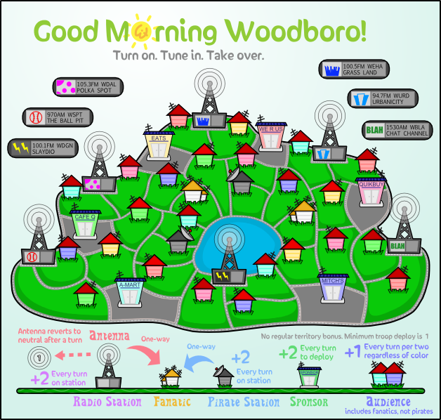
All right, here at long last are the small and large sizes with the new font. Versions with 88s are forthcoming.
- natty dread
- Posts: 12877
- Joined: Fri Feb 08, 2008 8:58 pm
- Location: just plain fucked
Re: Good Morning Woodboro (V7.4) -- Font lines
I have to admit that I'm not a great fan of the territory name font...
I'm not too sure what I'd suggest as an alternative; the typeface affects the aesthetic of the whole image. I don;t know if anything like these would fit?
http://www.fontspace.com/rick-mueller/stereo-mf
http://www.1001fonts.com/font_details.html?font_id=2681
http://www.1001fonts.com/font_details.html?font_id=2485

PB: 2661 | He's blue... If he were green he would die | No mod would be stupid enough to do that
- natty dread
- Posts: 12877
- Joined: Fri Feb 08, 2008 8:58 pm
- Location: just plain fucked
Re: Good Morning Woodboro (V7.4) -- Font lines
No offense MrB, but I couldn't see any of those fonts really fitting the style of the map...
A solid, thick hand-written-ish font would be best I think... perhaps just a little less squiggly than the current one?
http://www.dafont.com/yikes.font?psize= ... e+Lazy+Dog.
http://www.dafont.com/fast-action.font? ... e+Lazy+Dog.
either of these could work IMO...
A solid, thick hand-written-ish font would be best I think... perhaps just a little less squiggly than the current one?
http://www.dafont.com/yikes.font?psize= ... e+Lazy+Dog.
http://www.dafont.com/fast-action.font? ... e+Lazy+Dog.
either of these could work IMO...

Re: Good Morning Woodboro (V7.4) -- Font lines
Disagree - I really like the current font - it fits the theme and the aesthetics very well.
C.
C.

Highest score : 2297
Re: Good Morning Woodboro (V7.4) -- Font lines
This one looks pretty good - much better than the random ones I posted. I think my only concern about the current one is that I think it's a bit wibbly. It's fine as it is, of course (so I won't push for a change), I was just trying to articulate my thoughts and suggest an alternative.natty_dread wrote:No offense MrB, but I couldn't see any of those fonts really fitting the style of the map...
A solid, thick hand-written-ish font would be best I think... perhaps just a little less squiggly than the current one?
http://www.dafont.com/yikes.font?psize= ... e+Lazy+Dog.

PB: 2661 | He's blue... If he were green he would die | No mod would be stupid enough to do that


