Here's the XML test results. Compass updated to small map as well.
XML test large: XML test small:
everyone uses 88:s. I wanted to be different so I put 83:s
Extra! Extra! Read all about it! Russia building a huge compass near the Finnish border.
Moderator: Cartographers

Don't forget the headline, Mysterical force moved 2 islands in northern europe over 200 miles overnight! A real life equivalent of the Lost island! All inhabitants missing! Scientists in disbelief!natty_dread wrote: Extra! Extra! Read all about it! Russia building a huge compass near the Finnish border.
But they told me no one would notice!Gillipig wrote:Mysterical force moved 2 islands in northern europe over 200 miles overnight!


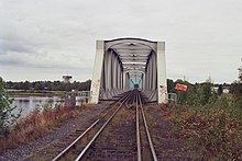
The bridge looks good! Keep it.natty_dread wrote:This is the Torniojoki bridge:
I put it on the map.
How does it look?


The other one was better! It gave the map some added style. This one is too flat!natty_dread wrote:New bridges.
v49 large v49 small
Argh... perhaps I should put the bridges on a poll?The other one was better! It gave the map some added style. This one is too flat!

I think all map threads could have something similar in their first post. This will help the casual commenter get in with the discussion without reading all 20+ pages of a map thread...First post wrote:Current feedback/comment requests:
- bridge between Finland/Sweden, which is best
- bonus areas: are they clear enough now?
- fonts, army circles: do they look good
- territory borders / connections: are all of them clear enough?
Of course you are welcome to comment on other topics as well.

No no, tell me what you were going to say! I can take it!isaiah40 wrote:To be honest natty there is a ... nah never mind. It is looking way better, and unfortunately I have no comments right now. Keep up the good work!!!


You said it yourself, it looks weird! If anyone wants to butcher a good map, that's how to do it!! Looks like giant rift valley sized impassables!! Not anywhere near good looking. Awful horrendus and actually a bit disgusting!!!natty_dread wrote:Alternate colour scheme, and weird things done to the bonus borders...
Yes, somewhat.Does this make sense?
Gotcha. I'm going to try that.As for a color scheme... well, I don't really have a suggestion and I guess it doesn't matter. Its the tone that I find awkward rather than the color and I think I've finally placed my finger on what bugged me. Purple for sweden is great, but it would work a lot better as Plum rather than an easter egg shade.
No worries, I'm going back to the previous version, with variations on central sweden's colour. Then we'll see where we go from there.I hope you didn't seriously consider using that border thickness!
