Golfe du St. Laurent[FD,G,GP,FF]
Forum rules
Please read the Community Guidelines before posting.
Please read the Community Guidelines before posting.

Re: Golfe du St. Laurent[FD,G,GP,FF]
Before this continues, and to save arguments at a later stage, it seems like me that the primary cartographers (ie people who drew the map) are Lone.Prophet and dolomite13. One of you will need to take overall ownership of the project (for copyright reasons) - and then I'll happily move you back into the foundry proper 

PB: 2661 | He's blue... If he were green he would die | No mod would be stupid enough to do that
-
Orange-Idaho-Dog

- Posts: 555
- Joined: Sun Jan 14, 2007 12:41 pm
- Gender: Male
- Location: South Carolina
Re: Golfe du St. Laurent[FD,G,GP,FF]
Why does it matter who takes "overall ownership"? Both would agree to the copyright terms, so it shouldn't matter...

Looking for a clan? Click here to send me a PM and find out how to join The Underworld! *Selective Recruitment*
Re: Golfe du St. Laurent[FD,G,GP,FF]
Orange-Idaho-Dog wrote:Why does it matter who takes "overall ownership"? Both would agree to the copyright terms, so it shouldn't matter...
Because a single person needs to agree to the terms of the copyright agreement. That's the way it has always been.
PB: 2661 | He's blue... If he were green he would die | No mod would be stupid enough to do that
-
Lone.prophet
- Posts: 1467
- Joined: Thu Oct 12, 2006 4:37 pm
- Location: Your basement Muahaha

-
Unit_2

- Posts: 1834
- Joined: Sun Jan 14, 2007 12:59 pm
- Gender: Male
- Location: Pennsylvania, U.S.A, North America, Earth, Milky Way, Universe.
Re: Golfe du St. Laurent[FD,G,GP,FF]
Lone.prophet wrote:is it alright if i say i agree to it?
Go for it. I give all my consent to L.P or Dolomite, whomever wants to deal with the copyright.

-
Orange-Idaho-Dog
- Posts: 555
- Joined: Sun Jan 14, 2007 12:41 pm
- Gender: Male
- Location: South Carolina
Re: Golfe du St. Laurent[FD,G,GP,FF]
I guess I'm kind of squished out of the 'ownership' circle now with only doing the xml, but I still don't see how LP has any rights to this. The colors have changed, the borders have changed, the names have changed, the title has changed, the textures have changed...
And personally, I'm against LP taking any rights at all considering he ditched the map forever ago, 'lost' the files needed to edit it, and now re-appears months later claiming full ownership? Throwing the BS flag here.
For the work Dolomite has put into the map, weather time consuming or not, I really want to see him take ownership.
Although at this point, we're too far in development to let this halt things, again. And I don't have as much say in the matter as I would like.
Looking for a clan? Click here to send me a PM and find out how to join The Underworld! *Selective Recruitment*
-
Orange-Idaho-Dog
- Posts: 555
- Joined: Sun Jan 14, 2007 12:41 pm
- Gender: Male
- Location: South Carolina
Re: Golfe du St. Laurent[FD,G,GP,FF]
Stepping aside from copyright issues...
I see some of the edges still appear 'sharp', and brown spots LP mentioned in Est du Quebec, though they look to be associated more with the border lines rather than the color of the actual territory(s).
On another note, back on page 52 I think Mr Benn mentioned that Iancanton would take a closer look at the last XML update upon his return. Are we qualified for the XML stamp yet, or does the graphical work need to be completed first?
Looking for a clan? Click here to send me a PM and find out how to join The Underworld! *Selective Recruitment*
-
dolomite13

- Posts: 1379
- Joined: Mon Aug 18, 2008 5:54 pm
Re: Golfe du St. Laurent[FD,G,GP,FF]
OK I tried to clean up edges and make suggested changes etc...
I will go ahead and claim copyright as a "legal derivative" of the original so that we may move this back into production.
=D=
Large v11
http://farm3.static.flickr.com/2712/428 ... 453f_o.png
Small v11

http://farm3.static.flickr.com/2781/428 ... 32fd_o.png
The Copyright Agreement
The author retains copyright on their work, and gives Conquer Club permission to use the imagery free of charge, for as long as Conquer Club sees fit on the Conquer Club website. Conquer Club cannot sell, lease, or lend the right to use the images to anyone else. The author swears that their map is their own work, or a legal derivative work and by submitting it, do hereby claim all responsibility for that being true.
I will go ahead and claim copyright as a "legal derivative" of the original so that we may move this back into production.
=D=
Large v11
http://farm3.static.flickr.com/2712/428 ... 453f_o.png
Small v11
http://farm3.static.flickr.com/2781/428 ... 32fd_o.png
The Copyright Agreement
The author retains copyright on their work, and gives Conquer Club permission to use the imagery free of charge, for as long as Conquer Club sees fit on the Conquer Club website. Conquer Club cannot sell, lease, or lend the right to use the images to anyone else. The author swears that their map is their own work, or a legal derivative work and by submitting it, do hereby claim all responsibility for that being true.
Where Have I Been? ... Testing a prototype board game that I co-designed called Alien Overrun!
Re: Golfe du St. Laurent[FD,G,GP,FF]
Since the map has been redrawn, it should really be put into the Graphics Workshop - although I don't see any need for it to stay in there very long - it just needs the scrutiny to check large/small images, coord placement, borders etc..
[moved]
[moved]
PB: 2661 | He's blue... If he were green he would die | No mod would be stupid enough to do that
-
RedBaron0

- Posts: 2657
- Joined: Sun Aug 19, 2007 12:59 pm
- Gender: Male
- Location: Pennsylvania
- Contact:
Re: Golfe du St. Laurent[FD,G,GP,FF]
Agreed, shouldn't be long.
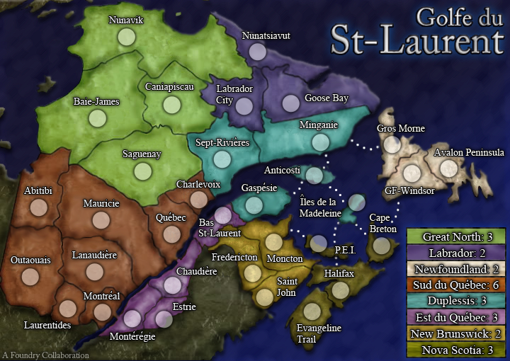
The connecting bridge from Quebec to Chaudiere seems to have a dividing line on it where the from Montreal to Monteregie doesn't. Either way you want, should be constant. I prefer the Montreal to Monteregie connector myself. The connecting dots between Halifax/PEI/Iles are in direct line with the "P" in PEI makes an almost perfect line. Just for a little clarity I'd like to see them offset a little bit just prevent any confusion. Is Halifax connected to Cape Breton? The connection is a little murky. Same for St. John and Halifax.
The connecting bridge from Quebec to Chaudiere seems to have a dividing line on it where the from Montreal to Monteregie doesn't. Either way you want, should be constant. I prefer the Montreal to Monteregie connector myself. The connecting dots between Halifax/PEI/Iles are in direct line with the "P" in PEI makes an almost perfect line. Just for a little clarity I'd like to see them offset a little bit just prevent any confusion. Is Halifax connected to Cape Breton? The connection is a little murky. Same for St. John and Halifax.


-
dolomite13
- Posts: 1379
- Joined: Mon Aug 18, 2008 5:54 pm
Re: Golfe du St. Laurent[FD,G,GP,FF]
RedBaron0 wrote:Agreed, shouldn't be long.
The connecting bridge from Quebec to Chaudiere seems to have a dividing line on it where the from Montreal to Monteregie doesn't. Either way you want, should be constant. I prefer the Montreal to Monteregie connector myself. The connecting dots between Halifax/PEI/Iles are in direct line with the "P" in PEI makes an almost perfect line. Just for a little clarity I'd like to see them offset a little bit just prevent any confusion. Is Halifax connected to Cape Breton? The connection is a little murky. Same for St. John and Halifax.
I will make those changes soon, girlfriend is out of town all weekend =)
=D=
Last edited by dolomite13 on Fri Jan 22, 2010 12:33 pm, edited 1 time in total.
Where Have I Been? ... Testing a prototype board game that I co-designed called Alien Overrun!
-
Orange-Idaho-Dog
- Posts: 555
- Joined: Sun Jan 14, 2007 12:41 pm
- Gender: Male
- Location: South Carolina
Re: Golfe du St. Laurent[FD,G,GP,FF]
When the final graphics are all sorted out, I'll make sure the XML coordinates are correct.
Looking for a clan? Click here to send me a PM and find out how to join The Underworld! *Selective Recruitment*
-
dolomite13
- Posts: 1379
- Joined: Mon Aug 18, 2008 5:54 pm
Re: Golfe du St. Laurent[FD,G,GP,FF]
OK here are the changes you asked for red...
- moved dots
- added seperation lines
- made the connections clearer (I hope)
=D=

http://farm3.static.flickr.com/2730/430 ... 222c_o.png

http://farm3.static.flickr.com/2726/430 ... 0179_o.png
- moved dots
- added seperation lines
- made the connections clearer (I hope)
=D=
http://farm3.static.flickr.com/2730/430 ... 222c_o.png
http://farm3.static.flickr.com/2726/430 ... 0179_o.png
Where Have I Been? ... Testing a prototype board game that I co-designed called Alien Overrun!
-
Unit_2
- Posts: 1834
- Joined: Sun Jan 14, 2007 12:59 pm
- Gender: Male
- Location: Pennsylvania, U.S.A, North America, Earth, Milky Way, Universe.
Re: Golfe du St. Laurent[FD,G,GP,FF]
Looks great! All we need now is to test the Cords and we are good to go, yes?
Unit_2.
Unit_2.
-
Orange-Idaho-Dog
- Posts: 555
- Joined: Sun Jan 14, 2007 12:41 pm
- Gender: Male
- Location: South Carolina
Re: Golfe du St. Laurent[FD,G,GP,FF]
Do we have an official OK from the Graphic's team yet? If so I'll re-test the XML asap and we can get this show on the road.
Looking for a clan? Click here to send me a PM and find out how to join The Underworld! *Selective Recruitment*
-
dolomite13
- Posts: 1379
- Joined: Mon Aug 18, 2008 5:54 pm
Re: Golfe du St. Laurent[FD,G,GP,FF]
I don't think I moved any unit circles or if I did it was possibly only a pixel or two so it should be quite fast to get the xml updated. =)Orange-Idaho-Dog wrote:Do we have an official OK from the Graphic's team yet? If so I'll re-test the XML asap and we can get this show on the road.
=D=
Where Have I Been? ... Testing a prototype board game that I co-designed called Alien Overrun!
-
thenobodies80

- Posts: 5400
- Joined: Wed Sep 05, 2007 4:30 am
- Gender: Male
- Location: Milan
Re: Golfe du St. Laurent[FD,G,GP,FF]
Nice work. 
Few small things:
New Brunswick and Nova scotia have similar colors, can you try to switch colors? maybe newfoundland with nova scotia.
Dolomite, have you tested your images with vischeck? I'm not sure but Est du québec and duplessis might give problems to colorblind people.
I did a test with coordinates and i don't see big issues, but i have some advices for you:
On the small version you could move 1 or 2 pixels to the right the Saint John text.
And 888 on montreal covers the connection with monteregie, can you move the coord a bit to left or/and down?
A final thought, have you ever considered to improve the title?
I know, it is perfectly readable, but (sorry no offense) it looks a bit flat, like if there's something still missing.
I think that you should try to use the title to create a perfect mix between your graphics and the place represented. RedBaron and myself thought about a fleur de lis, for example. Obviously you're free to try with something else, but we'd really like to see more canadian feeling on this map.

Re: Golfe du St. Laurent[FD,G,GP,FF]
The fleur-de-lis is very much a Quebec symbol, so I would say it's not broad-based enough. The home range of the Acadian people makes a closer approach to covering the area, and has a nice tricolour flag with a gold star in the canton, but this basically omits Newfoundland and Labrador. Perhaps crossing the Acadian banner with the N.L flag would add some pizzazz.
In a different direction, when I think of tourism in the Gulf of St. Lawrence, I think of whale watching. Could someone find a nice picture of a whale breaching?
In a different direction, when I think of tourism in the Gulf of St. Lawrence, I think of whale watching. Could someone find a nice picture of a whale breaching?
-
RedBaron0
- Posts: 2657
- Joined: Sun Aug 19, 2007 12:59 pm
- Gender: Male
- Location: Pennsylvania
- Contact:
Re: Golfe du St. Laurent[FD,G,GP,FF]
A Beluga whale for sure.
[bigimg]http://www.canadacool.com/COOLFACTS/QUEBEC/QUEBECPHOTOS/SaguenayWhales.jpg[/bigimg]
[bigimg]http://www.canadacool.com/COOLFACTS/QUEBEC/QUEBECPHOTOS/SaguenayWhales.jpg[/bigimg]
Re: Golfe du St. Laurent[FD,G,GP,FF]
No, they are way too cute for CC. What are you, a Raffi fan?
-
RedBaron0
- Posts: 2657
- Joined: Sun Aug 19, 2007 12:59 pm
- Gender: Male
- Location: Pennsylvania
- Contact:
Re: Golfe du St. Laurent[FD,G,GP,FF]
Okay, those 2 might be really cute for a map, but the Beluga are native to the St. Lawrence river.
Re: Golfe du St. Laurent[FD,G,GP,FF]
RedBaron0 wrote:Okay, those 2 might be really cute for a map, but the Beluga are native to the St. Lawrence river.
True, so they would be found in the Gulf, but a humpback breaching would be a more dramatic picture, and they are found there as well.
Re: Golfe du St. Laurent[FD,G,GP,FF]
thenobodies80 wrote:Nice work.
Few small things:
New Brunswick and Nova scotia have similar colors, can you try to switch colors? maybe newfoundland with nova scotia.
Dolomite, have you tested your images with vischeck? I'm not sure but Est du québec and duplessis might give problems to colorblind people.
I did a colourblind check a while back, and suggested some changes as a result of it. I think it's fine since then, unless anything else has changed much?
PB: 2661 | He's blue... If he were green he would die | No mod would be stupid enough to do that
-
Orange-Idaho-Dog
- Posts: 555
- Joined: Sun Jan 14, 2007 12:41 pm
- Gender: Male
- Location: South Carolina
Re: Golfe du St. Laurent[FD,G,GP,FF]
I'm not sure what Dolomite has been up to, but hopefully we can get another version up with the changes soon. I know he's been busy lately IRL.
Looking for a clan? Click here to send me a PM and find out how to join The Underworld! *Selective Recruitment*

Re: Golfe du St. Laurent[FD,G,GP,FF]
I agree on the above color comment. Switch East Quebec and New Brunswick