Japan - 日本 - Quenched
Moderator: Cartographers
Forum rules
Please read the Community Guidelines before posting.
Please read the Community Guidelines before posting.
-
natty dread

- Posts: 12877
- Joined: Fri Feb 08, 2008 8:58 pm
- Location: just plain fucked

Re: Japan - 日本 (D, Gp) V9.4 (Upd 11-3)pg28 Graphics Stamp??
I feel your pain.
On the other hand, I am intrigued by the "CC via Wii" comment. I have wondered about doing that, but I didn't have high-speed internet until the free browser offer for the Wii had expired, so I have never bothered to get it. Is it painful to access CC via the Wii? Will I lose BOB?
On the other hand, I am intrigued by the "CC via Wii" comment. I have wondered about doing that, but I didn't have high-speed internet until the free browser offer for the Wii had expired, so I have never bothered to get it. Is it painful to access CC via the Wii? Will I lose BOB?
-
natty dread
- Posts: 12877
- Joined: Fri Feb 08, 2008 8:58 pm
- Location: just plain fucked
Re: Japan - 日本 (D, Gp) V9.4 (Upd 11-3)pg28 Graphics Stamp??
Will I lose BOB?
Do you have Firefox on your WII, with Greasemonkey installed? Can you install scripts on your WII?

Re: Japan - 日本 (D, Gp) V9.4 (Upd 11-3)pg28 Graphics Stamp??
natty_dread wrote:Will I lose BOB?
Do you have Firefox on your WII, with Greasemonkey installed? Can you install scripts on your WII?
No, and I doubt that Firefox is available for Wii, unless someone wants to allay my suspicions.
-
RedBaron0

- Posts: 2657
- Joined: Sun Aug 19, 2007 12:59 pm
- Gender: Male
- Location: Pennsylvania
- Contact:
Re: Japan - 日本 (D, Gp) V9.4 (Upd 11-3)pg28 Graphics Stamp??
Wii has is own broswer, Opera, I believe its called. You can't download firefox, so no BOB.


-
RedBaron0
- Posts: 2657
- Joined: Sun Aug 19, 2007 12:59 pm
- Gender: Male
- Location: Pennsylvania
- Contact:
Re: Japan - 日本 (D, Gp) V9.4 (Upd 11-3)pg28 Graphics Stamp??
Back up and running, new computer. Give me a little bit to reset stuff and work out any kinks in my new system. Weekend at the latest.

Re: Japan - 日本 (D, Gp) V9.4 (Upd 11-3)pg28 Graphics Stamp??
RedBaron0 wrote:Bad news... My computer has totally crapped out. ... (or tossed out in favor of a spiffy new one) There won't be any updates. ...
Hope you get a spiffy new one as earyl Christmas pressent...good luck.

* Pearl Harbour * Waterloo * Forbidden City * Jamaica * Pot Mosbi
-
RedBaron0
- Posts: 2657
- Joined: Sun Aug 19, 2007 12:59 pm
- Gender: Male
- Location: Pennsylvania
- Contact:
Re: Japan - 日本 (D, Gp) V9.6 (Upd 11-14)pg29 Graphics Stamp??
Version 9.6
Small - 601x600
[bigimg]http://i213.photobucket.com/albums/cc121/RedBaron0/japan-version96-inprogress.jpg[/bigimg]
Large - 800x799
[bigimg]http://i213.photobucket.com/albums/cc121/RedBaron0/bigjapan-version96-inprogress.jpg[/bigimg]
After a bit of spinning my wheels and some unforeseen events... We've got an update.
Oki-shoto territory shape changed to be 2 islands with the army circle moved between the islands. XML updated to accommodate the change of position.
The shadow around the land has been changed to a simple drop shadow which is also under the sea connections.
The Compas rose has been toned down a bit, but is darker now with a white drop shadow behind.
Orientation of the mountains has be reversed to put the lit side of the mountain facing the light source of the map, the left top corner.
-
Industrial Helix

- Posts: 3462
- Joined: Mon Jul 14, 2008 6:49 pm
- Gender: Female
- Location: Ohio
Re: Japan - 日本 (D, Gp) V9.6 (Upd 11-14)pg29 Graphics Stamp??
I think I've finally put my finger on what's been bothering me about this map and I think it is the font. I think it gets conflicted in with the raised areas on the texture of the map. Try on a couple spaces writing it in black with a light color glow, like the Bushido saying, or try a dark glow on the white text. Use your judgment, if either looks like an improvement run with it. If not, don't worry about it.
Sketchblog [Update 07/25/11]: http://indyhelixsketch.blogspot.com/
Living in Japan [Update 07/17/11]: http://mirrorcountryih.blogspot.com/
Russian Revolution map for ConquerClub [07/20/11]: http://www.conquerclub.com/forum/viewto ... 1&t=116575
Living in Japan [Update 07/17/11]: http://mirrorcountryih.blogspot.com/
Russian Revolution map for ConquerClub [07/20/11]: http://www.conquerclub.com/forum/viewto ... 1&t=116575
-
porkenbeans

- Posts: 2546
- Joined: Mon Sep 10, 2007 4:06 pm
Re: Japan - 日本 (D, Gp) V9.6 (Upd 11-14)pg29 Graphics Stamp??
"dark glow" ?Industrial Helix wrote:I think I've finally put my finger on what's been bothering me about this map and I think it is the font. I think it gets conflicted in with the raised areas on the texture of the map. Try on a couple spaces writing it in black with a light color glow, like the Bushido saying, or try a dark glow on the white text. Use your judgment, if either looks like an improvement run with it. If not, don't worry about it.

-
Industrial Helix
- Posts: 3462
- Joined: Mon Jul 14, 2008 6:49 pm
- Gender: Female
- Location: Ohio
Re: Japan - 日本 (D, Gp) V9.6 (Upd 11-14)pg29 Graphics Stamp??
porkenbeans wrote:"dark glow" ?Industrial Helix wrote:I think I've finally put my finger on what's been bothering me about this map and I think it is the font. I think it gets conflicted in with the raised areas on the texture of the map. Try on a couple spaces writing it in black with a light color glow, like the Bushido saying, or try a dark glow on the white text. Use your judgment, if either looks like an improvement run with it. If not, don't worry about it.
lol... as in outer glow effect in black
Sketchblog [Update 07/25/11]: http://indyhelixsketch.blogspot.com/
Living in Japan [Update 07/17/11]: http://mirrorcountryih.blogspot.com/
Russian Revolution map for ConquerClub [07/20/11]: http://www.conquerclub.com/forum/viewto ... 1&t=116575
Living in Japan [Update 07/17/11]: http://mirrorcountryih.blogspot.com/
Russian Revolution map for ConquerClub [07/20/11]: http://www.conquerclub.com/forum/viewto ... 1&t=116575
-
natty dread
- Posts: 12877
- Joined: Fri Feb 08, 2008 8:58 pm
- Location: just plain fucked
Re: Japan - 日本 (D, Gp) V9.6 (Upd 11-14)pg29 Graphics Stamp??
"dark glow" ?
In other words, shading.
...actually, "dark glow" is the long lost brother of "blacklight"...
-
porkenbeans
- Posts: 2546
- Joined: Mon Sep 10, 2007 4:06 pm
Re: Japan - 日本 (D, Gp) V9.6 (Upd 11-14)pg29 Graphics Stamp??
Ah, ...drop shadow.Industrial Helix wrote:porkenbeans wrote:"dark glow" ?Industrial Helix wrote:I think I've finally put my finger on what's been bothering me about this map and I think it is the font. I think it gets conflicted in with the raised areas on the texture of the map. Try on a couple spaces writing it in black with a light color glow, like the Bushido saying, or try a dark glow on the white text. Use your judgment, if either looks like an improvement run with it. If not, don't worry about it.
lol... as in outer glow effect in black
-
the.killing.44

- Posts: 4724
- Joined: Thu Oct 23, 2008 7:43 pm
- Gender: Male
- Location: now tell me what got two gums and knows how to spit rhymes
- Contact:
Re: Japan - 日本 (D, Gp) V9.6 (Upd 11-14)pg29 Graphics Stamp??
porkenbeans wrote:Ah, ...drop shadow.Industrial Helix wrote:porkenbeans wrote:"dark glow" ?Industrial Helix wrote:I think I've finally put my finger on what's been bothering me about this map and I think it is the font. I think it gets conflicted in with the raised areas on the texture of the map. Try on a couple spaces writing it in black with a light color glow, like the Bushido saying, or try a dark glow on the white text. Use your judgment, if either looks like an improvement run with it. If not, don't worry about it.
lol... as in outer glow effect in black
No, black outer glow…
-
porkenbeans
- Posts: 2546
- Joined: Mon Sep 10, 2007 4:06 pm
Re: Japan - 日本 (D, Gp) V9.6 (Upd 11-14)pg29 Graphics Stamp??
Like usual, you talk as though you know, ...but you have no clue.the.killing.44 wrote:porkenbeans wrote:Ah, ...drop shadow.Industrial Helix wrote:porkenbeans wrote:"dark glow" ?Industrial Helix wrote:I think I've finally put my finger on what's been bothering me about this map and I think it is the font. I think it gets conflicted in with the raised areas on the texture of the map. Try on a couple spaces writing it in black with a light color glow, like the Bushido saying, or try a dark glow on the white text. Use your judgment, if either looks like an improvement run with it. If not, don't worry about it.
lol... as in outer glow effect in black
No, black outer glow…
-
Blitzaholic

- Posts: 23050
- Joined: Wed Aug 09, 2006 11:57 pm
- Location: Apocalyptic Area

-
RedBaron0
- Posts: 2657
- Joined: Sun Aug 19, 2007 12:59 pm
- Gender: Male
- Location: Pennsylvania
- Contact:
Re: Japan - 日本 (D, Gp) V9.6 (Upd 11-14)pg29 Graphics Stamp??
[bigimg]http://i213.photobucket.com/albums/cc121/RedBaron0/bigjapan-version95-inprogress.jpg[/bigimg]
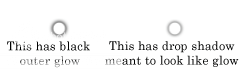
Okay tried it a little bit with outer glow. Check out Nagano (Black text white glow) and Fuji (White text black glow) I can fiddle withe some the numbers too, the glow for both these is at 60%; 3 pixels bigger than the text.
I actually like both so I can go either way.
Okay tried it a little bit with outer glow. Check out Nagano (Black text white glow) and Fuji (White text black glow) I can fiddle withe some the numbers too, the glow for both these is at 60%; 3 pixels bigger than the text.
I actually like both so I can go either way.
-
porkenbeans
- Posts: 2546
- Joined: Mon Sep 10, 2007 4:06 pm
Re: Japan - 日本 (D, Gp) V9.6 (Upd 11-14)pg29 Graphics Stamp??
FUJI.  You can also try keeping the drop shadow. just crank it up a bit. Then add an outside blk. stroke. The drop shadow raises it up and makes it stand out.
-
RedBaron0
- Posts: 2657
- Joined: Sun Aug 19, 2007 12:59 pm
- Gender: Male
- Location: Pennsylvania
- Contact:
Re: Japan - 日本 (D, Gp) V9.6 (Upd 11-14)pg29 Graphics Stamp??
The drop shadow I have on the the rest of the map is pretty much as high as it'll go opacity wise. I can make it disperse more though, which will likely make the text harder to read.
Lets see what a couple more people think and I'll make a version with all the territory text in that way.
Lets see what a couple more people think and I'll make a version with all the territory text in that way.
-
porkenbeans
- Posts: 2546
- Joined: Mon Sep 10, 2007 4:06 pm
Re: Japan - 日本 (D, Gp) V9.6 (Upd 11-14)pg29 Graphics Stamp??
If that is as high as it goes, maybe try pumping up the choke on it.RedBaron0 wrote:The drop shadow I have on the the rest of the map is pretty much as high as it'll go opacity wise. I can make it disperse more though, which will likely make the text harder to read.
Lets see what a couple more people think and I'll make a version with all the territory text in that way.
Re: Japan - 日本 (D, Gp) V9.6 (Upd 11-14)pg29 Graphics Stamp??
RedBaron0 wrote:[bigimg]http://i213.photobucket.com/albums/cc121/RedBaron0/bigjapan-version95-inprogress.jpg[/bigimg]
Okay tried it a little bit with outer glow. Check out Nagano (Black text white glow) and Fuji (White text black glow) I can fiddle withe some the numbers too, the glow for both these is at 60%; 3 pixels bigger than the text.
I actually like both so I can go either way.
I didn't really have a problem with the text before, but the new text on Fuji may be a good idea for Hokkaido and Shikoku, where the white text does not contrast with the yellow backgrounds. I don't think it will hurt anywhere else, so it would likely be worth a look at a version with all the text done that way.
-
Industrial Helix
- Posts: 3462
- Joined: Mon Jul 14, 2008 6:49 pm
- Gender: Female
- Location: Ohio
Re: Japan - 日本 (D, Gp) V9.6 (Upd 11-14)pg29 Graphics Stamp??
Yeah, Fuji is the way to go. Maybe disperse the outer glow just a tad though.
Sketchblog [Update 07/25/11]: http://indyhelixsketch.blogspot.com/
Living in Japan [Update 07/17/11]: http://mirrorcountryih.blogspot.com/
Russian Revolution map for ConquerClub [07/20/11]: http://www.conquerclub.com/forum/viewto ... 1&t=116575
Living in Japan [Update 07/17/11]: http://mirrorcountryih.blogspot.com/
Russian Revolution map for ConquerClub [07/20/11]: http://www.conquerclub.com/forum/viewto ... 1&t=116575
-
RedBaron0
- Posts: 2657
- Joined: Sun Aug 19, 2007 12:59 pm
- Gender: Male
- Location: Pennsylvania
- Contact:
Re: Japan - 日本 (D, Gp) V9.6 (Upd 11-14)pg29 Graphics Stamp??
[bigimg]http://i213.photobucket.com/albums/cc121/RedBaron0/bigjapan-version97-inprogress.jpg[/bigimg]
Here's the whole big map with the outer glow on all the territories, in black, white text, 60 % opacity, 2 pixels larger than the original. The mini-map text is still in drop shadow if you want to compare the difference.
Here's the whole big map with the outer glow on all the territories, in black, white text, 60 % opacity, 2 pixels larger than the original. The mini-map text is still in drop shadow if you want to compare the difference.
-
Industrial Helix
- Posts: 3462
- Joined: Mon Jul 14, 2008 6:49 pm
- Gender: Female
- Location: Ohio
Re: Japan - 日本 (D, Gp) V9.6 (Upd 11-14)pg29 Graphics Stamp??
I think its an improvement though I think you ought to up the size by about 1 or 2... maybe 3. Just to diffuse the outer lines a bit.
The minimap looks good to me though, I say just leave it.
The minimap looks good to me though, I say just leave it.
Sketchblog [Update 07/25/11]: http://indyhelixsketch.blogspot.com/
Living in Japan [Update 07/17/11]: http://mirrorcountryih.blogspot.com/
Russian Revolution map for ConquerClub [07/20/11]: http://www.conquerclub.com/forum/viewto ... 1&t=116575
Living in Japan [Update 07/17/11]: http://mirrorcountryih.blogspot.com/
Russian Revolution map for ConquerClub [07/20/11]: http://www.conquerclub.com/forum/viewto ... 1&t=116575
-
RedBaron0
- Posts: 2657
- Joined: Sun Aug 19, 2007 12:59 pm
- Gender: Male
- Location: Pennsylvania
- Contact:
Re: Japan - 日本 (D, Gp) V9.6 (Upd 11-14)pg29 Graphics Stamp??
[bigimg]http://i213.photobucket.com/albums/cc121/RedBaron0/bigjapan-version971-inprogress.jpg[/bigimg]
I dunno if I like that. I've tried it with Asahikawa, compare it to the nearby territories. It's 4 pixels bigger instead of 2.
I dunno if I like that. I've tried it with Asahikawa, compare it to the nearby territories. It's 4 pixels bigger instead of 2.