The Third Crusade [Quenched] Revamping
Moderator: Cartographers
Forum rules
Please read the Community Guidelines before posting.
Please read the Community Guidelines before posting.
-
Kabanellas
- Posts: 1482
- Joined: Fri Feb 27, 2009 12:21 pm
- Gender: Male
- Location: Porto, Portugal
Re: The Third Crusade version 18 [D,Gp] Analysing graphics
Thank you all for you support! Hope the Foundry feels the same way about it 
Re: The Third Crusade version 18 [D,Gp] Analysing graphics
Ever the one to sit on the fence, I would suggest that you could use both the arrow and the symbol. But if you are only going to use one, I think the symbol has a little more class. At first I thought it might make people think that the white area was another territory, which would not be a problem for the arrow, but then I realized that once the troop numbers are on the map, the white area will clearly be out of play.
-
Kabanellas
- Posts: 1482
- Joined: Fri Feb 27, 2009 12:21 pm
- Gender: Male
- Location: Porto, Portugal
Re: The Third Crusade version 18 [D,Gp] Analysing graphics
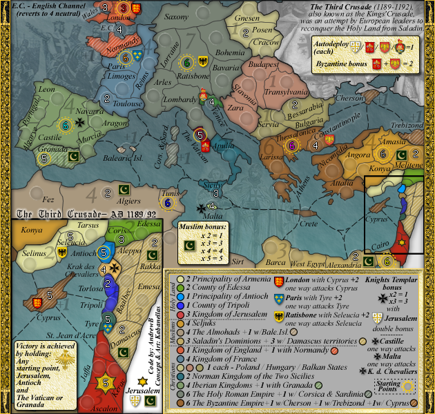
Small version ready:
I've done a mix of the previous font and the 'book antiqua' in the legend, just in case you find the previous one (in Italic) hard to read.... Which one do you prefer?
I've done a mix of the previous font and the 'book antiqua' in the legend, just in case you find the previous one (in Italic) hard to read.... Which one do you prefer?
- Industrial Helix
- Posts: 3462
- Joined: Mon Jul 14, 2008 6:49 pm
- Gender: Female
- Location: Ohio
Re: The Third Crusade version 18 [D,Gp] Analysing graphics
I say stick with the italics, I don't have a problem reading it at all plus it fits in with the rest of the map.
Sketchblog [Update 07/25/11]: http://indyhelixsketch.blogspot.com/
Living in Japan [Update 07/17/11]: http://mirrorcountryih.blogspot.com/
Russian Revolution map for ConquerClub [07/20/11]: http://www.conquerclub.com/forum/viewto ... 1&t=116575
Living in Japan [Update 07/17/11]: http://mirrorcountryih.blogspot.com/
Russian Revolution map for ConquerClub [07/20/11]: http://www.conquerclub.com/forum/viewto ... 1&t=116575
- InsomniaRed
- Posts: 2246
- Joined: Sun Dec 30, 2007 2:58 am
- Gender: Female
- Location: In Nick's heart
Re: The Third Crusade version 18 [D,Gp] Analysing graphics
I agree with Helix here, the italics fit better with the map, and they are really not at all hard to read. This map looks great, keep up the amazing work, this really is looking quite handsomeIndustrial Helix wrote:I say stick with the italics, I don't have a problem reading it at all plus it fits in with the rest of the map.
- I will always love you Nick, Forever.

- I will always love you Nick, Forever.
Re: The Third Crusade version 18 [D,Gp] Analysing graphics
Great looking map! Love the use of shields.
Perhaps incorperate the Muslim icons into a shield also.
Perhaps incorperate the Muslim icons into a shield also.
-
Kabanellas
- Posts: 1482
- Joined: Fri Feb 27, 2009 12:21 pm
- Gender: Male
- Location: Porto, Portugal
Re: The Third Crusade version 18 [D,Gp] Analysing graphics
thanks guys  I'll just wait for Andrew's opinion on the small legend ... but I'd keep the italics.
as for the shield in the Muslim Bonus, replacing it for a shield has crossed my mind before, but its just feels right having a different shape from the Christians' shields.
as for the shield in the Muslim Bonus, replacing it for a shield has crossed my mind before, but its just feels right having a different shape from the Christians' shields.
-
whitestazn88
- Posts: 3128
- Joined: Mon Feb 05, 2007 2:59 pm
- Gender: Male
- Location: behind you
- Contact:
Re: The Third Crusade version 18 [D,Gp] Analysing graphics
granada should not be next to a start point... or it should be a neutral 20 or something like that
ps. sorry i haven't been here in a while, and if that has already been discussed
ps. sorry i haven't been here in a while, and if that has already been discussed
-
Kabanellas
- Posts: 1482
- Joined: Fri Feb 27, 2009 12:21 pm
- Gender: Male
- Location: Porto, Portugal
Re: The Third Crusade version 18 [D,Gp] Analysing graphics
stazn, there's no problem with that - no one will win the game holding (only) Granadawhitestazn88 wrote:granada should not be next to a start point... or it should be a neutral 20 or something like that
ps. sorry i haven't been here in a while, and if that has already been discussed
-
Kabanellas
- Posts: 1482
- Joined: Fri Feb 27, 2009 12:21 pm
- Gender: Male
- Location: Porto, Portugal
Re: The Third Crusade version 18 [D,Gp] Analysing graphics
Done!!
I think work is pretty much completed. Should we advance for the xml now?
V18 small
I think work is pretty much completed. Should we advance for the xml now?
V18 small
Re: The Third Crusade version 18 [D,Gp] Analysing graphics
u still haven't removed the E on the end of ratisbon.
almost every bonus zone is named after the state, not the people. seljuks therefore looks out of place. change it to sultanate of rum?
http://www.historyfiles.co.uk/KingLists ... liaRum.htm
in the legend, u have room to write balearics islands in full.
ian.
almost every bonus zone is named after the state, not the people. seljuks therefore looks out of place. change it to sultanate of rum?
http://www.historyfiles.co.uk/KingLists ... liaRum.htm
in the legend, u have room to write balearics islands in full.
ian.
-
Kabanellas
- Posts: 1482
- Joined: Fri Feb 27, 2009 12:21 pm
- Gender: Male
- Location: Porto, Portugal
Re: The Third Crusade version 18 [D,Gp] Analysing graphics
Completely forget about Ratisbon 
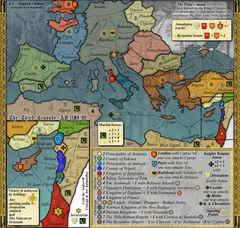
All done now:
Large version Small version
All done now:
Large version Small version
Re: The Third Crusade version 18.2 [D,Gp] Analysing graphics
The first versions of XML are created:
http://bolonniy.com/CC/Third_Crusade_v2.xml
Done:
1. Large map army circles
2. All neighbors are defined
Things to do:
1. Fix small map army circles (they didn't scale down too well at all)
2. Add bonuses
3. Add starting positions and starting neutrals
3. Add objectives
http://bolonniy.com/CC/Third_Crusade_v2.xml
Done:
1. Large map army circles
2. All neighbors are defined
Things to do:
1. Fix small map army circles (they didn't scale down too well at all)
2. Add bonuses
3. Add starting positions and starting neutrals
3. Add objectives

Re: The Third Crusade version 18.2 [D,Gp] XML on the making
it gets rather wordy in the legend...are you gonna stick with this font?
Gain the upper hand
Re: The Third Crusade version 18.2 [D,Gp] XML on the making
Version 3 of the XML is created:
http://bolonniy.com/CC/Third_Crusade_v3.xml
Still to do:
1. Fix small map army circles (they didn't scale down too well at all)
http://bolonniy.com/CC/Third_Crusade_v3.xml
Still to do:
1. Fix small map army circles (they didn't scale down too well at all)

Re: The Third Crusade version 18.2 [D,Gp] XML on the making
While I personally dislike the faded bonus numbers, I can see that they have functional value, particularly as it's always going to be difficult to match up those coloured circles from the legend.
RjBeals mentioned that the frame around the legend looks out of place - and I'd be inclined to agree, particularly as you don't have a similar frame around the map inset.
Having said that, these are just my personal preferences, and it gives me great pleasure to give you this:

RjBeals mentioned that the frame around the legend looks out of place - and I'd be inclined to agree, particularly as you don't have a similar frame around the map inset.
Having said that, these are just my personal preferences, and it gives me great pleasure to give you this:


PB: 2661 | He's blue... If he were green he would die | No mod would be stupid enough to do that
-
Kabanellas
- Posts: 1482
- Joined: Fri Feb 27, 2009 12:21 pm
- Gender: Male
- Location: Porto, Portugal
Re: The Third Crusade version 18.2 [D,Gp] XML on the making
Thanks a lot MrBenn. Makes me really happy to see this map passing to another stage!
Though I like all the graphical aspects of this map the way they are, and I'm not saying with this that I find it all perfect (what's perfect anyway), I'll keep my mind set on it and see if something better occurs to me.
Though I like all the graphical aspects of this map the way they are, and I'm not saying with this that I find it all perfect (what's perfect anyway), I'll keep my mind set on it and see if something better occurs to me.
- Raskholnikov
- Posts: 638
- Joined: Fri Sep 11, 2009 3:40 pm
Re: The Third Crusade [D,GP,GR] finishing XML
Congratulations to the entire TTC team! Great job! Now let's hope "The Dawn of Ages" progresses too. It's a stunning map and I really look forward to seeing it in beta soon!
Raskholnikov
Raskholnikov
-
Kabanellas
- Posts: 1482
- Joined: Fri Feb 27, 2009 12:21 pm
- Gender: Male
- Location: Porto, Portugal
Re: The Third Crusade [D,GP,GR] XML completed!!
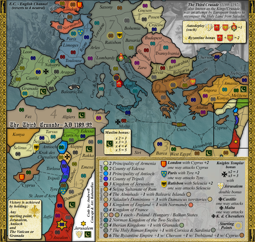
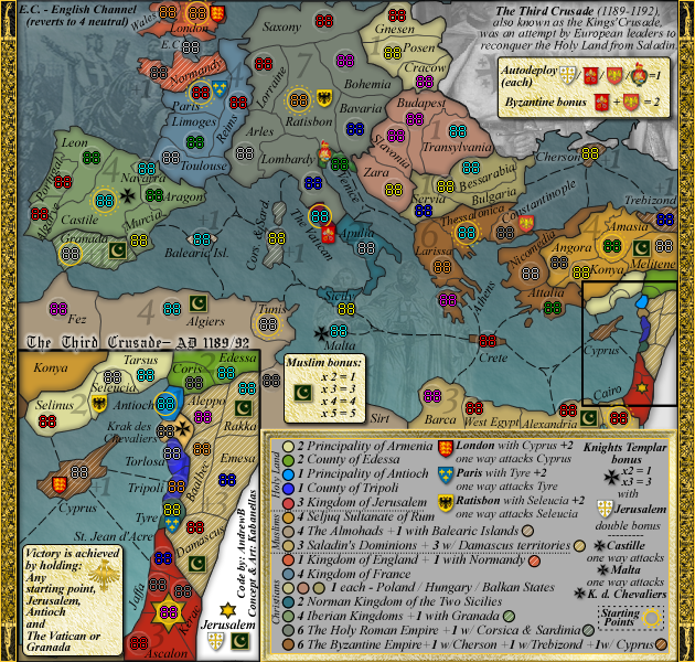
posting maps with numbers:
Large version Small version
Large version Small version
- Evil DIMwit
- Posts: 1616
- Joined: Thu Mar 22, 2007 1:47 pm
- Gender: Male
- Location: Philadelphia, NJ
Re: The Third Crusade [D,GP,GR] XML completed!!
This map is crazy awesome. I don't see why it shouldn't move on to Final Forge last week.
-
Kabanellas
- Posts: 1482
- Joined: Fri Feb 27, 2009 12:21 pm
- Gender: Male
- Location: Porto, Portugal
Re: The Third Crusade [D,GP,GR] XML completed!!
Thanks for the support Evil 
Andrew is just finalizing some minor tweaks that Forza and Nobodies discovered in XML and it will all be done soon
Andrew is just finalizing some minor tweaks that Forza and Nobodies discovered in XML and it will all be done soon
Re: The Third Crusade [D,GP,GR] XML completed!!
- Final Forge
Post questions and concerns if any.

PB: 2661 | He's blue... If he were green he would die | No mod would be stupid enough to do that
- porkenbeans
- Posts: 2546
- Joined: Mon Sep 10, 2007 4:06 pm
Re: The Third Crusade [D,GP,GR] XML completed!!
Hey Kab,
Did not know about this map. You certainly are shaping up to be one of the top map makers in my opinion. This map is awesome. Please allow me to make a graphics suggestion. Like on your Ages map, I think that a little contrast between the land and water will spark it up a bit. You can go lighter or darker with the water. Here are a couple of examples to show what I am getting at. Also threw an outside bevel to give the land a touch of relief.
I am leaning toward the darker option, but both work to give it the needed contrast.


