Nice idea - I think you might still need to make it clearer what the attack routes between rings are.
Will the auto-deploy territories start neutral?
Keep going - I see you have good support for this .
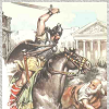
[Abandoned] - Colisevm
Moderator: Cartographers
Forum rules
Please read the Community Guidelines before posting.
Please read the Community Guidelines before posting.
-
Teflon Kris

- Posts: 4236
- Joined: Sun Jul 13, 2008 4:39 pm
- Gender: Male
- Location: Lancashire, United Kingdom
-
generalahole
- Posts: 39
- Joined: Thu May 01, 2008 7:10 pm
Re: Arena for Gladiators (pag 3)
map looks interesting...
Re: Arena for Gladiators (pag 3)
Sorry for my little hollidays... tomorrow I will answer, first to say that I am very grateful for all your comments. Thank you.
Yes all the bonus places will begin neutral 3.
JJ41375 wrote:Looks like a great idea. My only comment would be there are 10 auto-deploys of +1, so unless there 2 or 5 players, or some are neutral to start, there may be an advantage to a player(s).
Other than that I would love to see this map and be able to play it.
Good luck.
JJ
DJ Teflon wrote:Nice idea - I think you might still need to make it clearer what the attack routes between rings are.
Will the auto-deploy territories start neutral?
Keep going - I see you have good support for this .
Yes all the bonus places will begin neutral 3.
-
sinctheassasin

- Posts: 490
- Joined: Fri Feb 06, 2009 5:57 pm
- Gender: Male
- Location: probably in chat room, advertising conquer crater
Re: Arena for Gladiators (version 4)
It would be pretty funny and fresh to have the outer territs be the names of our mods, then closet to the center, our admin, and then lack in the center.
Just a thought
Just a thought
Woop Woop, i love conquer club, why'd i leave for a year?
Who LIkes finishing what they started?

Who LIkes finishing what they started?
Re: Arena for Gladiators (version 4)
sinctheassasin wrote:It would be pretty funny and fresh to have the outer territs be the names of our mods, then closet to the center, our admin, and then lack in the center.
Just a thought
Really I can change the name of the regions. No problem if smbdy tell me what I need to improve.
PepeAtila

Re: Arena for Gladiators (version 4)
I love the idea, but graphics wise, I think you've overdone the arrows now
The circles are a bit lost in all the arrows. Also, adding an obstacle here and there where normally a route would go, could make it more strategic to posses certain areas over others.
The circles are a bit lost in all the arrows. Also, adding an obstacle here and there where normally a route would go, could make it more strategic to posses certain areas over others.
-
sinctheassasin
- Posts: 490
- Joined: Fri Feb 06, 2009 5:57 pm
- Gender: Male
- Location: probably in chat room, advertising conquer crater
Re: Arena for Gladiators (version 4)
iceco wrote:I love the idea, but graphics wise, I think you've overdone the arrows now
The circles are a bit lost in all the arrows. Also, adding an obstacle here and there where normally a route would go, could make it more strategic to posses certain areas over others.
I don't really think that would work with the idea of the map. An obstacle would be a real mess actually, clogging up gameplay like a turd clogs a toilet...
Woop Woop, i love conquer club, why'd i leave for a year?
Who LIkes finishing what they started?
Who LIkes finishing what they started?
Re: Arena for Gladiators (version 4)
iceco wrote:I love the idea, but graphics wise, I think you've overdone the arrows now
The circles are a bit lost in all the arrows. Also, adding an obstacle here and there where normally a route would go, could make it more strategic to posses certain areas over others.
Thanks. The first idea was without arrows but perhaps is more difficult for people to play. The idea of circles was mainly to avoid the paths and arrows, so, like a compromise. But you are right I will try to indicate the way without arrows ... in the other hand to be more realistic there are not corners in an Arena.
Anyway it is not so strange to see itsinctheassasin wrote:I don't really think that would work with the idea of the map. An obstacle would be a real mess actually, clogging up gameplay like a turd clogs a toilet...I like my comparisons!
PepeAtila
Re: Arena for Gladiators (version 5)
Please tell me if now all the movements are so clear as I think and what could be improved ... I am thinking about to add obstacles ... or bonus system about rings, but also I don't think is necesary.

Re: Arena for Gladiators (version 5.2)
I was kind reading before but it was real quick so if someone already said this please for give me. You could remove some arrows from the board... people will get the hint on wich direction to attack, now like the circus you can have attacks occur only in the direction of circle flow but at points where arrows point in towards eachother attacks can be made diagonally. You can also make the 1/3 or 2/3 boundries outside to in and visaversa that incourages kind of a maze effect of movement and instead of lines throw in a lion or tiger graphic to add som flare. You gotta remember the colosseum had many working parts that could turn itself into a maze. You can then determine territories and bonouses by figuring out attack points and defensive points. Territories could include a water zone, dungeon zone, sand zone, etc. Get creative and it could be really fun and exciting. Get back to me with questions if there is something you rnot quite understanding.
Re: Arena for Gladiators (version 5.2)
First thank you very much for your comments. I see you understand what I was trying. I began similarly, but little by little I was leaving the right way. So I will re-define again.
for the new version I will change the philosophy then. I will make that gladiators start only in one bonus place, and from there they can spread with a very strong defensive position, in that way they cannot be killed easily....
I will try in this week
for the new version I will change the philosophy then. I will make that gladiators start only in one bonus place, and from there they can spread with a very strong defensive position, in that way they cannot be killed easily....
I will try in this week
PepeAtila
Re: Arena for Gladiators (version 6.0) **NEW**
Now I change definitions
-
Teflon Kris
- Posts: 4236
- Joined: Sun Jul 13, 2008 4:39 pm
- Gender: Male
- Location: Lancashire, United Kingdom
Re: Arena for Gladiators (version 6.0) **NEW**
[bigimg]http://img190.imageshack.us/img190/6443/arenav6example.jpg[/bigimg]
Hi
I like the progress on this map, nice graphics - there are a few things I dont understand though.
Clockwise or anticlockwise rings: There are often arrows showing one-way attacks - this makes sense for the sideways attacks but isnt it already one-way for the clockwise /anti-clockwise attacks.
The puddle shapes - do they indicate where sideways attacks can or cant take place.
The Medius-Fuscina bonus. Where is Fuscina?
I like the fact that there are rings in opposite directions - it will make players have to carefully plan moves around the board.
The Scutum neutral values may be a bit high though - I can imagine many games where players aim for the gladiators and the centre but ignore the scutums perhaps. Maybe a lower neutral value and correspondingly lower bonus value?
Re: Arena for Gladiators (version 6.0) **NEW**
DJ Teflon wrote:Hi
I like the progress on this map, nice graphics - there are a few things I dont understand though.
Clockwise or anticlockwise rings: There are often arrows showing one-way attacks - this makes sense for the sideways attacks but isnt it already one-way for the clockwise /anti-clockwise attacks.
The outer and the 3rd ring movements are clockwise attack.
2nd and 4th rings are counter clockwise.
All the attacks arround the ring are only one way, I am going to write it.
I removed all the arrows because I think you can hint ... perhaps some more arrow can clarify.
yes, they are the points were you can attack both directions (that is way the puddleDJ Teflon wrote:The puddle shapes - do they indicate where sideways attacks can or cant take place.
DJ Teflon wrote:The Medius-Fuscina bonus. Where is Fuscina?
I will remove the word. "Fuscina" is the name for the weapon ("Tridentis")
DJ Teflon wrote:I like the fact that there are rings in opposite directions - it will make players have to carefully plan moves around the board.
The Scutum neutral values may be a bit high though - I can imagine many games where players aim for the gladiators and the centre but ignore the scutums perhaps. Maybe a lower neutral value and correspondingly lower bonus value?
Yes, this I want. But dont forget that Scutum is protecting each player to be eliminated, you cannot access the "Helmet-start point" if you dont go throug the Scutum
Really thanks for your help.
Re: Arena for Gladiators (try 6.0)
Well I hope smbdy make some comment. I did change what I told to DJ Teflon, but I think it is very little change yet....
PepeAtila
Re: Arena for Gladiators (try 6.1- Draft needed)
To be considered a Working Draft a project must be more than just an idea; a Draft should have a clear thematic focus, a plan for how the gameplay will work, and a basic image which should include:
1. Territory Labels - temporary names or numbers will suffice, and are always open to change.
2. Borders/Paths/Impassables - it should be made clear where territories do/do not connect.
3. Bonus Areas - where combinations/groups of territories will award a bonus, this should be indicated on the map.
4. Legend - speculative bonus values and explanations of any attack rules or gameplay features.
Draft images should not be larger than 630x600px (small image) or 840x800px (large image).
Now everything from my point of view is correct. (i show the 630x600px as example but also I have it in 840x800 ... so I guess the best size once you gave me the Draft stamp can be also 672x640... since the map can change between both limits easily.
Re: Arena for Gladiators (try 6.1- Draft needed)
It still doesn't work 100%, but it's getting better.
What I see:
I hope that's helpful and not too discouraging.
What I see:
- You still have to replace some "U"s with "V"s.
- The Gladiusses shouldn't all be horizontal on the map, make them point in the direction they will be attacking.
- I don't know how much work it would be, but maybe the lines between territories on the same ring should be slightly curved to hint at what direction you move in, I think that would make it feel a bit more "natural".
- The graphics for the helmets and shields are quite nice, but they don't really blend in with the rest of the map. While I wouldn't know anything really helpful, I do have experienced myself that making them only slightly transparent (between 70 and 90%) really helps sometimes.
- The blood stains to symbolise two-way attacks don't really look like much. Maybe just remove the border at these places, while making it more visible everywhere else (otherwise these openings will be hard to detect.)
- The arrows indicating two one-ways from the same territory should be replaced by smaller, less intrusive, arrows, like the small ones that now show single one-ways on some places. (Which themselves could be left out, as those one-ways follow the normal rules.)
- Maybe territory rounds should be added as well. Try it.
I hope that's helpful and not too discouraging.

Re: Arena for Gladiators (try 6.1- Draft needed)
iceco wrote:It still doesn't work 100%, but it's getting better.
What I see:
- You still have to replace some "U"s with "V"s. done
- The Gladiusses shouldn't all be horizontal on the map, make them point in the direction they will be attacking.done
- I don't know how much work it would be, but maybe the lines between territories on the same ring should be slightly curved to hint at what direction you move in, I think that would make it feel a bit more "natural".I agree but I dont like and also it is a lot of work, mainly because the efact is similar to make the lines wider (I mean you need more space) I even tried with angles and doesnt work ... But I keep in mind the good idea
- The graphics for the helmets and shields are quite nice, but they don't really blend in with the rest of the map. While I wouldn't know anything really helpful, I do have experienced myself that making them only slightly transparent (between 70 and 90%) really helps sometimes.I made with shields, ...
- The blood stains to symbolise two-way attacks don't really look like much. Maybe just remove the border at these places, while making it more visible everywhere else (otherwise these openings will be hard to detect.)
I prefer the stains
- The arrows indicating two one-ways from the same territory should be replaced by smaller, less intrusive, arrows, like the small ones that now show single one-ways on some places. (Which themselves could be left out, as those one-ways follow the normal rules.) I made them a bit smallers
- Maybe territory rounds should be added as well. Try it. I dont see it
I hope that's helpful and not too discouraging.
Really very helpful ... I will try
thank you very very much.
Last edited by PepeAtila on Sun Sep 06, 2009 10:15 am, edited 1 time in total.
-
jsholty4690

- Posts: 145
- Joined: Sun May 03, 2009 2:42 pm
- Gender: Male
- Location: Peoria, IL
Re: Arena for Gladiators (try 6.1- Draft needed)
I agree with iceco the graphics seem to jump out and say "Hey, I was just an afterthought!" I would do what he said by making them more transparent. That might fix my second critique, which is that the map seems too cludered. Anyways, it has gone a long way since I last looked at it, good job.

-
thenobodies80

- Posts: 5400
- Joined: Wed Sep 05, 2007 4:30 am
- Gender: Male
- Location: Milan
Re: Arena for Gladiators (try 6.1- Draft needed)
Hi PepeAtila!
Some good improvements on this map
Some quick suggestions:
I like very much the effect that all these changes of direction have on the gameplay.
Another step in the right way! Yes, the main foundry is not so far
Have a nice day
Nobodies
Some good improvements on this map
Some quick suggestions:
- You have a legend in which you explain that in the 3rd and the outer rings attacks (and moves) are clockwise and in the 2nd and in the 4th are counter clockwise. I think you can remove some arrows from the map
For example players already know that commudus can attack septimus but not viceversa. Leave only commudus to maxcst (not explained on the legend).Also you don't need arrows like vesper-nox (already explained in the legend) - The bloodstains, some of the borders are unclear.For example, generalahole, caesar, maximino and bryan.davis . The bloodstain touch all these regions, so, generalahole should be able to attack (and to be attacked by) caesar.

- Agree with DJ Teflon about scutum bonus and neutrals. Although I understand and agree about the importance of the scutum regions, i think that 10 is a high value.At the start (with everything neutral and 8 start regions) the first player will deploy 3 troops and 1 is autodeployed. Total 7 troops.If you code your scutum with 5/6 neutral troops (for example) you have to fight against 8/9 troops with only 7. Not so easy.
- The arrows less thick?
- The background is a bit empty, maybe adding a sort of small coliseum and maybe an audience (like cirus maximus) to cover the empty corners?
- I don't think that you need to write where players will start, leave only helmet +1 autodeploy bonus.
- The right bottom legend (where you explain the movements) is a sort of minimap, but you should cut the lower zone (not necessary) to free up some space
I like very much the effect that all these changes of direction have on the gameplay.
Another step in the right way! Yes, the main foundry is not so far
Have a nice day
Nobodies

Re: Arena for Gladiators (try 6.1- Draft needed)
Well I'm not a big fan of this map but that is just cause I'm not a fan of circus maximus
So i haven't really glanced at it since you started
But know its starting to look very interesting
As been mentioned your graphic "blood stains" etc don't really blend but you can work on that
I also would suggest not to thin your 90 degree arrow just align them better and they will work a lot better and not clog the works
may major concern is the borders it could be my colour blindness but a can't see all of them or they fade to much
I'm not sure if you mean to overlap so many places with your blood stains
but as theNobodies80 stated this causes confusion
i think the game play needs only a few tweaks
so you have your majority of work on graphic so your draft shouldn't be far off
this being said
tweak your arrows work on clairty on the stains and there blending with the image its self
and i also have a huge nit pick for you
as you go into the inner rings should why do some borders line up perfect and some are stepped forward doesn't really feel "feng shui"
keep up the good work pepe
Re: Arena for Gladiators (try 6.1- Draft needed)
Definetly getting better. I like it. Do some tweaking... make sure people arnt going to have questions, and maybe drop a few of the bonous icons. Keep up the good work. 
Re: Arena for Gladiators (try 6.1- Draft needed)
A quick suggestion I forgot to add last time:
Save it in .png instead of .jpg, if you can. Normally it will look better (no pixellation in places like between the arrows on the minimap), just try it and tell me if it looks better.
Save it in .png instead of .jpg, if you can. Normally it will look better (no pixellation in places like between the arrows on the minimap), just try it and tell me if it looks better.
Re: Arena for Gladiators (try 6.1- Draft needed)
iceco wrote:A quick suggestion I forgot to add last time:
Save it in .png instead of .jpg, if you can. Normally it will look better (no pixellation in places like between the arrows on the minimap), just try it and tell me if it looks better.
yes, really I think is more 'natural'. Thank you again
Re: Arena for Gladiators (try 6.1- Draft needed)
Conan29 wrote:Definetly getting better. I like it. Do some tweaking... make sure people arnt going to have questions, and maybe drop a few of the bonous icons. Keep up the good work.
Thank you. I made the 'scutum' a little more transparents.
I hope map is now fully understable.