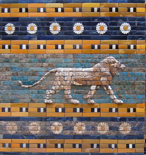
porkenbeans wrote:I just noticed the tiled lion painting. If you notice the areas that are showing cracks in the paint, You could chip away some of those "blocks" of paint to see what I am suggesting.
that might actually look very, very sweet.
.44
Moderator: Cartographers

porkenbeans wrote:I just noticed the tiled lion painting. If you notice the areas that are showing cracks in the paint, You could chip away some of those "blocks" of paint to see what I am suggesting.


oaktown wrote:This isn't pushed nearly to the degree that porkenbeans wants, but it's definitely more colorful than my previous attempts. I find that what looks like a significant change as I'm working on it doesn't always translate into a significant change the overall effect. Overall I like how it looks - even the faded version - and I don't think over-saturating the colors is an improvement. I just want to remove the "haze" that seems to have been over the recent versions, and I hope this does it.
In previous updates, Oak has listened to comments like yours, and produced a muddy map. He is not there yet, but he IS headed in the right direction. Do you NOT like the lion picture ?AndyDufresne wrote:In the latest image, I actually dislike how much the bricks stand out now---the lines, especially in the light colored areas, are more overwhelming, and less a part of the background, as in previous updates.
--Andy
Three things,Incandenza wrote:oaktown wrote:This isn't pushed nearly to the degree that porkenbeans wants, but it's definitely more colorful than my previous attempts. I find that what looks like a significant change as I'm working on it doesn't always translate into a significant change the overall effect. Overall I like how it looks - even the faded version - and I don't think over-saturating the colors is an improvement. I just want to remove the "haze" that seems to have been over the recent versions, and I hope this does it.
I think you might have pushed it a bit too far, personally. I can appreciate pork's position on this, but his quick 'n dirty demo is so bright that it renders moot the map's whole theme. I think the version you had at the top of the page is a nice compromise between bright and weathered.
porkenbeans wrote:Three things,Incandenza wrote:oaktown wrote:This isn't pushed nearly to the degree that porkenbeans wants, but it's definitely more colorful than my previous attempts. I find that what looks like a significant change as I'm working on it doesn't always translate into a significant change the overall effect. Overall I like how it looks - even the faded version - and I don't think over-saturating the colors is an improvement. I just want to remove the "haze" that seems to have been over the recent versions, and I hope this does it.
I think you might have pushed it a bit too far, personally. I can appreciate pork's position on this, but his quick 'n dirty demo is so bright that it renders moot the map's whole theme. I think the version you had at the top of the page is a nice compromise between bright and weathered.
First, I purposefully went "TOO" far in my example, to show, just how muddy the map was going.
Second, I only had a copy of the picture, not the layers to work with.
Three, I only spent 20 min. on it.
I had not seen the lion picture, but that is the direction that I was trying to achieve.
With the working file, I could make it look just like that lion picture. I am sure that Oak can do the same, I just wished that he would try it , and stop listening to the peanut gallery.
AndyDufresne wrote:Woah there bugger.I'm just posting my opinion of the development of latest update.
--Andy
Is that lion deep saturated and un-appropriate ?Incandenza wrote:porkenbeans wrote:Three things,Incandenza wrote:oaktown wrote:This isn't pushed nearly to the degree that porkenbeans wants, but it's definitely more colorful than my previous attempts. I find that what looks like a significant change as I'm working on it doesn't always translate into a significant change the overall effect. Overall I like how it looks - even the faded version - and I don't think over-saturating the colors is an improvement. I just want to remove the "haze" that seems to have been over the recent versions, and I hope this does it.
I think you might have pushed it a bit too far, personally. I can appreciate pork's position on this, but his quick 'n dirty demo is so bright that it renders moot the map's whole theme. I think the version you had at the top of the page is a nice compromise between bright and weathered.
First, I purposefully went "TOO" far in my example, to show, just how muddy the map was going.
Second, I only had a copy of the picture, not the layers to work with.
Three, I only spent 20 min. on it.
I had not seen the lion picture, but that is the direction that I was trying to achieve.
With the working file, I could make it look just like that lion picture. I am sure that Oak can do the same, I just wished that he would try it , and stop listening to the peanut gallery.
I know you didn't just dismissively refer to me as the peanut gallery.
And you say the map is muddy. I'm not quite sure what you mean. Certainly the colors are muted, but I don't think anything is unclear or blurred. Deep saturated color won't be appropriate for every map, and IMHO I don't think it's appropriate here.
porkenbeans wrote:
hehehe
It's just that sometimes people give there opinions just to be saying something.
Incandenza wrote:And you say the map is muddy. I'm not quite sure what you mean. Certainly the colors are muted, but I don't think anything is unclear or blurred. Deep saturated color won't be appropriate for every map, and IMHO I don't think it's appropriate here.
OK,AndyDufresne wrote:porkenbeans wrote:
hehehe
It's just that sometimes people give there opinions just to be saying something.
Agreed, if I wanted to get my post count up, I'd spam much more than you see me doing.Incandenza wrote:And you say the map is muddy. I'm not quite sure what you mean. Certainly the colors are muted, but I don't think anything is unclear or blurred. Deep saturated color won't be appropriate for every map, and IMHO I don't think it's appropriate here.
I think Incandenza's point here is a good one and I tend to agree with it.
--Andy
porkenbeans wrote:One more thing, I never understood what is it about post count that some are so enamored with. Is it some sort of competition thing ?
If so, I personally do NOT wish to compete in that ridiculous contest.
Whats so funny, do you NOT understand English ?saaimen wrote:porkenbeans wrote:One more thing, I never understood what is it about post count that some are so enamored with. Is it some sort of competition thing ?
If so, I personally do NOT wish to compete in that ridiculous contest.
Funny then how you're the only one double- (or triple-) posting in this thread
(Nothing personal, it just struck me)
Edit:
I better say something about the graphics aswell.
I don't know why but I completely liked the way this map looked when it was entered for the Centerscape competition. It was a lot hazier and lighter. Agreed, it wasn't 'colourful' enough, but IMHO oak, you've gone quite far enough now. I understand the craze about the lion-wall-style, yet I don't think this is what we should be aiming at for this map. I'd keep the saturation low and make it more sand-ish or desert-rock-ish, than ceramic tile-ish. I'd even consider lightening up the main background colour (the brown-ish sand-like one) to give it even more of a scorched effect.
But to suit your needs, oak: I don't think there's any specific point that needs to be changed. Everything is very clear... Good job.
