Hmm... FIrst time commenting on this
1) Don't really care for the texture of some things, these things being the following:
A) The car
B) The territory circles
C) The room outlines
D) The title
Those things the texture could probably do with changing, as they do not currently look all that good... (Letters that I have bolded are ones that look worse IMO)
2) I do not like the font used for the title, it just doesn't seem to fit the map. Have you thought of using a font that is slightly more faded/eroded at parts, or maybe one that is more of a rough sketch? Some that I think might look good are:


(^Would have to remove wing things)


There are many more, but those are some that I think might look good.
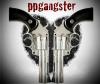
3) The carts and guns could probably used with a slight drop in opacity
4) Same with the army circles
5) The room outline/building plans do not really seem like building plans. Here are some pictures of building plans that might be good inspiration:
- Click image to enlarge.

- Click image to enlarge.

- Click image to enlarge.


Building plans usually tend to be a bit more sketchy in places, with doors being a line with dashes to it if it is open.
6) The wood background seems strange to me in every spot except in the lower right corner. Maybe consider changing it? There is a good tut here:
http://www.webdesign.org/cat/photoshop/ ... p.489.html
7) Some of the names, especially the up and down ones, are harder to read.

It is almost impossible to read the red name under Tlane and right of A.Sub
9) The car seems weird IMO. Maybe do something like in the third building outline picture?? (Look in spoiler, it is 3rd picture down)
Also, Would it be possible that you could say when the updates are? Title says page 20, yet the newest updates are on page 21.