WWII - Eastern Front-statistic page 1 [Quenched]5000 finish
Moderator: Cartographers
Forum rules
Please read the Community Guidelines before posting.
Please read the Community Guidelines before posting.

qwert wrote:I see wath you mean Guiscard, but i look and program say that Narva have same font and same size whit other names, and i think that these 1 letter should not be a huge problem why must change all names.
It is not 1 letter man, it is all over the place, for example compare Stavropol and Rostov and Novorossiysk. Compare Belgorod and Kursk. There are more like these.
qwert wrote:You right for these word,but your name its name of city in Ukraine, and my name its river Donets.
see in wikipedia.
Why would you put a name of the river there, if everywhere else you have city names? Donetsk (City) is a perfect choice for the area.
-
Qwert

- SoC Training Adviser
- Posts: 9262
- Joined: Tue Nov 07, 2006 5:07 pm
- Location: VOJVODINA
- Contact:
Andrew B wrote.
Why would you put a name of the river there, if everywhere else you have city names? Donetsk (City) is a perfect choice for the area.
Maybe for you, but river Donets its a wery importan detail in Eastern fron, these river been front line.
Donets been part of these battles-KHARKOV-KURSK, and when russian croos these river he in wery fast free ukrainy.
i try to find something of City Donetsk but nothing, maybe you will have better luck.
qwert wrote:What you mean far from ideal? all names its same font and color , do you some ideal text for these map?
I look all your AUSTRALIA TOPIC,and you know what i see,from begining you juse same text font and color,and dont put diferent font and colors,and definitly yours text not ideal for map ,but can read.
Do you put diferent text font and colors if somebody ask that of you?
Please tell me.
I mean far from ideal, because while it is legible it doesn't look very nice and could be improved.
Would you focus on making improvements to your own map and stop worrying about what everyone else is doing. The Australia map font has been changed from its original style at the request of others. The images may no longer be there to prove it, but I listened to what people wanted and made the changes accordingly.
-
Qwert
- SoC Training Adviser
- Posts: 9262
- Joined: Tue Nov 07, 2006 5:07 pm
- Location: VOJVODINA
- Contact:
keyogy wrote
I mean far from ideal, because while it is legible it doesn't look very nice and could be improved.
Would you focus on making improvements to your own map and stop worrying about what everyone else is doing. The Australia map font has been changed from its original style at the request of others. The images may no longer be there to prove it, but I listened to what people wanted and made the changes accordingly.
That i put in vote, becouse sombody like and sombody dont, and in these way i vill know, if these who dont like in minority or in mayor population.
Please everybody to stay focusing on vote qwestion its good qwestion and vote for what to do or what to, or to not change.
Last edited by Qwert on Wed Jan 10, 2007 5:35 pm, edited 1 time in total.

-
Guiscard

- Posts: 4103
- Joined: Fri Dec 08, 2006 7:27 pm
- Location: In the bar... With my head on the bar
The Australia map has gone through lots of changes, and a lot of advice has been taken and changes made. its the best it can be according to the forum, and thats why its in final forge. Qwert, focus on making your map the best it can be too. Why not try another lot of fonts? maybe different to the roman style you've tried recently?
One further point - in the legend you could try taking the shadow off the actual text, as it makes it muddy, and put it on the boxes, lifting them off the map a little. See if that looks better.
One further point - in the legend you could try taking the shadow off the actual text, as it makes it muddy, and put it on the boxes, lifting them off the map a little. See if that looks better.
qwert wrote:I just say that i dont see in hes map diferent text font and colors, nothing else.
Its these mean that map in final forge can not change nothing?
I think you can get away with a simple font as in most cases it's easier to read. The font you have is okay, but try adding a white glow.
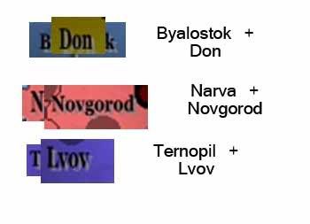
My main concern with the font is the size variation. You want another example, look at Lvov and Ternopil. Lvov's little letters are as big as Ternopil's capital T.
-
Qwert
- SoC Training Adviser
- Posts: 9262
- Joined: Tue Nov 07, 2006 5:07 pm
- Location: VOJVODINA
- Contact:
Guiscard wrote
Qwert its not a vote, you need to sort out the text sizes. Its only a small thing.
People who dont mine these wil wote for yes, and i again say dont talk yust vote, and will see after vote.
If you vant i can put next qwestion in wote"Do you Hate this Text size"
"Yes its terible"
"No its minor thing and not have influence in game"
I belive that many people vote that these minor thing not have influence in game, but who knows.
You can't put everything to vote qwert.
Your current poll shows 15-8 in favour of the font you have at present. To me, that's still 8 people that have a problem with the font and I think that's enough to warrant some more changes.
You're never going to please everybody and you shouldn't need to. Your font needs improving though and if it's not me or Guiscard or anyone else saying it I'm sure Andy will come in and say the same anyway.
-
Qwert
- SoC Training Adviser
- Posts: 9262
- Joined: Tue Nov 07, 2006 5:07 pm
- Location: VOJVODINA
- Contact:
KEYOGI wrote
You can't put everything to vote qwert.
Your current poll shows 15-8 in favour of the font you have at present. To me, that's still 8 people that have a problem with the font and I think that's enough to warrant some more changes.
You're never going to please everybody and you shouldn't need to. Your font needs improving though and if it's not me or Guiscard or anyone else saying it I'm sure Andy will come in and say the same anyway.
Its wery interest, but if 15 people say "dont change these " and 8 say "you must change" who is right?
And why i must please you and dont please other 15 players, maybe hes right too, i belive that Andy will respect what other people vote.
Guiscard wrote
Just to clarify.... you do understand what we mean don't you Qwert? You don't need to put everything to a vote. Its not a choice between two fonts or whether or not to have an impassable border. Just a simple alteration which will make the map look much smarter.
Yes i understand,you want from me to manual resize letter N or T or L for 0,001 cm.
If i do that i dont be smarter, i will be a stupid.
Why 70 or 80% of people who vote dont search for these minority like you do.
.And Guiscard please whait will vote been finish,i dont change something when its in vote pool. I hope you understand these.
-
Guiscard
- Posts: 4103
- Joined: Fri Dec 08, 2006 7:27 pm
- Location: In the bar... With my head on the bar
Ok Qwert. its getting a bit silly now. I'm not saying anything about actual font, just the size of some of the words. its not a miniscule thing (which is what i assume you mean by 0.0001cm), its pretty noticable and it would take literally three or four minutes to fix.
If you really want to do a vote make it this:
And see what people say.
If you really want to do a vote make it this:
Should I leave some of the territory names streched and vertically bigger than others or should I make them all equal?
And see what people say.
-
Qwert
- SoC Training Adviser
- Posts: 9262
- Joined: Tue Nov 07, 2006 5:07 pm
- Location: VOJVODINA
- Contact:
Please tel me how big its diference in these letters, maybe 0,1 or 0,2.
Yes its getting silly, but i dont do these.
If i see in your map that 1 letter in biger of others letter for 0,1 or 0,2 i will not say nothing, becouse its not have influence in game and visual not get map horible.
And you quote
Quote:
Should I leave some of the territory names streched and vertically bigger than others or should I make them all equal?
are you seriously think?
I realy dont know have these will improve my map.
qwert wrote:Its wery interest, but if 15 people say "dont change these " and 8 say "you must change" who is right?
And why i must please you and dont please other 15 players, maybe hes right too, i belive that Andy will respect what other people vote.
There's not 15 people saying not to change the font, there's 15 people saying they can read it. I can read the font, but I think it still needs to be improved.
If you continue with your current attitude then I urge you to give up map making completely. The foundry exists to discuss and improve maps, if you're not willing to accept suggestions then your maps will never get anywhere.

KEYOGI wrote:qwert wrote:Its wery interest, but if 15 people say "dont change these " and 8 say "you must change" who is right?
And why i must please you and dont please other 15 players, maybe hes right too, i belive that Andy will respect what other people vote.
There's not 15 people saying not to change the font, there's 15 people saying they can read it. I can read the font, but I think it still needs to be improved.
If you continue with your current attitude then I urge you to give up map making completely. The foundry exists to discuss and improve maps, if you're not willing to accept suggestions then your maps will never get anywhere.
or they vote they think its a good font but they are thinking it can be better


-
Qwert
- SoC Training Adviser
- Posts: 9262
- Joined: Tue Nov 07, 2006 5:07 pm
- Location: VOJVODINA
- Contact:
Ok i give my map second chance, but you with stupid reason want to i give up of my map.
I vill go in next quote in direct qwestion.
"DO YOU THINK THAT THESE MAP FINISH, OR DO I MUST ERASE THIS MAP"
POOL 1 " YES THIS MAP ITS FINIS"
POOL 2" NO THIS MAP NOT FINIS,ERASE"I hope you will be satisfy with these direct qwestion, i think that my map fulfil requirements.
If people vote for 2, well you be hapy and i dont, but such is life- somtimes you won and sometimes dont.
-
Guiscard
- Posts: 4103
- Joined: Fri Dec 08, 2006 7:27 pm
- Location: In the bar... With my head on the bar
Qwert you're being absolutely ridiculous and very childish. No-ones criticising your map. Its a good map, visually its nearly there. An interesting subject and good playability.
A few minor points about the font need clearing up, and you seem unable to accept the advice of others. All we want is for you to finish a great map. I'm not going to lie, I think you may be beginning to annoy a few people, people who have given you very helpful advice and support (and remember they don't have to keep checking back and giving their opinions and advice).
Please don't erase this map, just erase your attitude problem. If your that bothered about adjusting text then send me the file and I'll do it for you!
I agree with Guiscard, your map is nearing completion, but you refuse to make minor adjustments. My Australia map has been in Final Forge for weeks and I continue to make small changes. Map making is a process of change and improvement.
It seems like your taking comments and suggestions as personal attacks. Our comments are made to improve your map not insult it or you.
It seems like your taking comments and suggestions as personal attacks. Our comments are made to improve your map not insult it or you.