Oasis [Quenched]
Moderator: Cartographers
Forum rules
Please read the Community Guidelines before posting.
Please read the Community Guidelines before posting.


Re: Oasis ---- Another Update! June 23rd (on page 1 and 37) [I]
Um, this time you missed Desert 81.
-
wcaclimbing

- Posts: 5598
- Joined: Fri May 12, 2006 10:09 pm
- Location: In your quantum box....Maybe.
- Contact:
Re: Oasis ---- Another Update! June 23rd (on page 1 and 37) [I]
TaCktiX wrote:Um, this time you missed Desert 81.
*headdesk*
fail
lol
i'll fix it.
EDIT: fixed, uploading to photobucket now.
EDIT2: posted. go check the new image.
Last edited by wcaclimbing on Mon Jun 23, 2008 7:15 pm, edited 2 times in total.


Re: Oasis ---- Another Update! June 23rd (on page 1 and 37) [I]
The only things I would change are in the banner. The word "Bonuses" floating above the desert looks a bit odd. I think that section is perfectly understandable without it, so I'm in favor of getting rid of that word altogether. I agree that the color of the desert in the legend looks a bit off, still, too. Also, maybe capitalize the "a" in "a map by wcaclimbing"? And perhaps move the "XML by Zimmah" a bit closer to the corner.
These are all very minor things, though. I basically agree with Ink: quench!
These are all very minor things, though. I basically agree with Ink: quench!
-
wcaclimbing
- Posts: 5598
- Joined: Fri May 12, 2006 10:09 pm
- Location: In your quantum box....Maybe.
- Contact:
Re: Oasis ---- Another Update! June 23rd (on page 1 and 37) [I]
desert 81 has been fixed. see the new image (replaced the old one)
-
wcaclimbing
- Posts: 5598
- Joined: Fri May 12, 2006 10:09 pm
- Location: In your quantum box....Maybe.
- Contact:
Re: Oasis ---- Another Update! June 23rd (on page 1 and 37) [I]
ZeakCytho wrote:The only things I would change are in the banner. The word "Bonuses" floating above the desert looks a bit odd. I think that section is perfectly understandable without it, so I'm in favor of getting rid of that word altogether. I agree. I'll get rid of it.I agree that the color of the desert in the legend looks a bit off, still, too. So its not just me that didn't like the colors. I'll fix that also.Also, maybe capitalize the "a" in "a map by wcaclimbing"? maybe. I'll see how it looks.And perhaps move the "XML by Zimmah" a bit closer to the corner. I'll move it a bit more to the right.
These are all very minor things, though. I basically agree with Ink: quench! Yes please (but I still need the small version and the XML for that)

Re: Oasis ---- Another Update! June 23rd (on page 1 and 37) [I]
I dont understand why this doesnt have any stamps.

Re: Oasis ---- Another Update! June 23rd (on page 1 and 37) [I]
Kaplowitz wrote:I dont understand why this doesnt have any stamps.
Well, game play at least is still a little up in the air. Not sure about the graphics though.
-
wcaclimbing
- Posts: 5598
- Joined: Fri May 12, 2006 10:09 pm
- Location: In your quantum box....Maybe.
- Contact:
Re: Oasis ---- Another Update! June 23rd (on page 1 and 37) [I]
Kaplowitz wrote:I dont understand why this doesnt have any stamps.
gameplay wasn't fair for Assassin style.
graphics didn't have enough room for numbers (well, it did, but they still wanted more space)
both are fixed. at least, I think they are fixed. Gimil and Oaktown might not agree
-
wcaclimbing
- Posts: 5598
- Joined: Fri May 12, 2006 10:09 pm
- Location: In your quantum box....Maybe.
- Contact:
Re: Oasis ---- Another Update! June 23rd (on page 1 and 37) [I]
wcaclimbing wrote:ZeakCytho wrote:The only things I would change are in the banner. The word "Bonuses" floating above the desert looks a bit odd. I think that section is perfectly understandable without it, so I'm in favor of getting rid of that word altogether. I agree. I'll get rid of it.[done] word deleted. I agree that the color of the desert in the legend looks a bit off, still, too. So its not just me that didn't like the colors. I'll fix that also.[done] sides are lighter now Also, maybe capitalize the "a" in "a map by wcaclimbing"? maybe. I'll see how it looks.[done] tried it, it didn't look too great. And perhaps move the "XML by Zimmah" a bit closer to the corner. I'll move it a bit more to the right.[done] moved
These are all very minor things, though. I basically agree with Ink: quench! Yes please (but I still need the small version and the XML for that)
I'll wait for any other suggestions, and then I'll post all these changes at once.
-
Ditocoaf
- Posts: 1054
- Joined: Wed Feb 27, 2008 9:17 pm
- Location: Being eaten by the worms and weird fishes
Re: Oasis ---- Another Update! June 23rd (on page 1 and 37) [I]
Yeah, leave the "a" uncapitalized.
This is looking awesome. I can't wait to play it.
This is looking awesome. I can't wait to play it.

>----------✪ Try to take down the champion in the continuous IPW/GIL tournament! ✪----------<
Note to self: THINK LESS LIVE MORE
-
wcaclimbing
- Posts: 5598
- Joined: Fri May 12, 2006 10:09 pm
- Location: In your quantum box....Maybe.
- Contact:
Re: Oasis ---- stamps please? June 23rd (on page 1 and 37) [I]
So, looks like 6 is going to be the winner of the poll, unless anything big changes.
I've added a "stamps please" to the title of this thread. maybe the mods will notice it (I don't want to harass them with more PMs about it.)
EDIT: ah, just remembered that I still need to make a small version first....
I've added a "stamps please" to the title of this thread. maybe the mods will notice it (I don't want to harass them with more PMs about it.)
EDIT: ah, just remembered that I still need to make a small version first....
-
wcaclimbing
- Posts: 5598
- Joined: Fri May 12, 2006 10:09 pm
- Location: In your quantum box....Maybe.
- Contact:
Re: Oasis ---- stamps please? June 23rd (on page 1 and 37) [I]
updated Big:
[bigimg]http://i147.photobucket.com/albums/r315/wcaclimbing/V8BIG.png[/bigimg]
Small!:
[bigimg]http://i147.photobucket.com/albums/r315/wcaclimbing/V8small.png[/bigimg]
[bigimg]http://i147.photobucket.com/albums/r315/wcaclimbing/V8BIG.png[/bigimg]
Small!:
[bigimg]http://i147.photobucket.com/albums/r315/wcaclimbing/V8small.png[/bigimg]

Re: Oasis ----small version! June 24th (see first post) [I]
I think I'm good to go on this one in terms of gameplay... you settle on the starting values and let's start stamping this sucker. 
I've been looking and I haven't found any, but make sure that none of your fictitious territory names can be confused for another.
I've been looking and I haven't found any, but make sure that none of your fictitious territory names can be confused for another.
-
wcaclimbing
- Posts: 5598
- Joined: Fri May 12, 2006 10:09 pm
- Location: In your quantum box....Maybe.
- Contact:
Re: Oasis ----small version! June 24th (see first post) [I]
oaktown wrote:I think I'm good to go on this one in terms of gameplay... you settle on the starting values and let's start stamping this sucker.
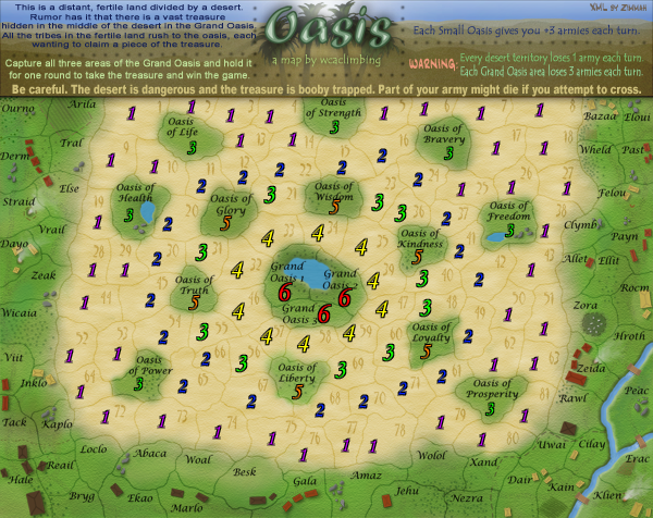
I'll get that done later today. [click here] The neutrals will be set like they are in that update [V6.0] but adjusted because the bottom is now fertile. The numbers go in rings around the fertile land. first 4s, then 3s, then 2s, then 1s. oases close to the grand oasis get 5, far oases get 3.
I've been looking and I haven't found any, but make sure that none of your fictitious territory names can be confused for another. I dont think that will be much of a problem. Allet and Ellit are a bit similar and right next to eachotehr, but they are different enough that I don't think it'll be a problem. Inklo, Kaplo, Loclo, and Marlo won't be a problem. and Kain + Klien are different enough. I think those are the only ones that are similar.
-
rocky mountain

- Posts: 415
- Joined: Thu Jul 12, 2007 7:08 pm
Re: Oasis ----small version! June 24th (see first post) [I]
the small map seems quite a lot smaller than other maps' smalls... it will still work though.
does graphics have to come before gameplay, vice versa, or does it matter?
does graphics have to come before gameplay, vice versa, or does it matter?
InkL0sed wrote:Quench.

best: place 2349; points 1617; GP 216; GW 102(47%); Lieutenant
-
AndyDufresne

- Posts: 24935
- Joined: Fri Mar 03, 2006 8:22 pm
- Location: A Banana Palm in Zihuatanejo
- Contact:
Re: Oasis ----small version! June 24th (see first post) [I]
Hm, one minor suggestion. In the legend perhaps alter the color of the text after "WARNING:" The desert territory text is green, and perhaps for consistency it should be more in tone with the actual desert. You could always use that color of green somewhere else in the legend.
--Andy
--Andy
-
wcaclimbing
- Posts: 5598
- Joined: Fri May 12, 2006 10:09 pm
- Location: In your quantum box....Maybe.
- Contact:
Re: Oasis ----small version! June 24th (see first post) [I]
AndyDufresne wrote:Hm, one minor suggestion. In the legend perhaps alter the color of the text after "WARNING:" The desert territory text is green, and perhaps for consistency it should be more in tone with the actual desert. You could always use that color of green somewhere else in the legend.
--Andy
Sure, I'll give that a try.
Re: Oasis ----small version! June 24th (see first post) [I]
The small map does seem unusually small...oh well, I always play the large anyway. I agree with Andy about the font colors...other than that, not much to say. Could you post the small and large with 88s and/or 888s?
-
wcaclimbing
- Posts: 5598
- Joined: Fri May 12, 2006 10:09 pm
- Location: In your quantum box....Maybe.
- Contact:
Re: Oasis ----small version! June 24th (see first post) [I]
ZeakCytho wrote:Could you post the small and large with 88s and/or 888s?
I think zimmah will be providing those images after he finishes up with the XML, which will probably be a few days from now.
Re: Oasis ----small version! June 24th (see first post) [I]
ZeakCytho wrote:The small map does seem unusually small...oh well, I always play the large anyway. I agree with Andy about the font colors...other than that, not much to say. Could you post the small and large with 88s and/or 888s?
I think the small map could be a little bigger, no?
Also, I do believe you don't need the bigimg tags for the small.

![[click here]](http://i147.photobucket.com/albums/r315/wcaclimbing/V60witharmies.png)
Re: Oasis ----small version! June 24th (see first post) [I]
oaktown wrote:I think I'm good to go on this one in terms of gameplay... you settle on the starting values and let's start stamping this sucker.
I've been looking and I haven't found any, but make sure that none of your fictitious territory names can be confused for another.
You might consider moving 55 56 65 & 66 away from each other a bit?
C.

Highest score : 2297
-
wcaclimbing
- Posts: 5598
- Joined: Fri May 12, 2006 10:09 pm
- Location: In your quantum box....Maybe.
- Contact:
Re: Oasis ----small+neutral #s June 24th (see first post) [I]
this image shows the neutral armies.
Thats done.
where would I move them to?
I haven't tried that yet, but I will.
oaktown wrote:I think I'm good to go on this one in terms of gameplay... you settle on the starting values and let's start stamping this sucker.
Thats done.
yeti_c wrote:You might consider moving 55 56 65 & 66 away from each other a bit?
where would I move them to?
AndyDufresne wrote:Hm, one minor suggestion. In the legend perhaps alter the color of the text after "WARNING:" The desert territory text is green, and perhaps for consistency it should be more in tone with the actual desert. You could always use that color of green somewhere else in the legend.
I haven't tried that yet, but I will.
Re: Oasis ----small+neutral #s June 24th (see first post) [I]
I'm satisfied... let's play this shizzle.

the numbering is indeed strange in the area mentioned above... if you change 66 to be 56 then kept up the numbering it would move 65 to the far left.
the numbering is indeed strange in the area mentioned above... if you change 66 to be 56 then kept up the numbering it would move 65 to the far left.
Re: Oasis ----small+neutral #s June 24th (see first post) [I]
Woot! Grats on the Gameplay, hope Graphics comes fast.