Yes, please show us normal size version.
Oz
Classic map touchup, take three! Live map updated!
Forum rules
Please read the Community Guidelines before posting.
Please read the Community Guidelines before posting.

Re: Classic map touchup, take three!
Or: everything is the same color... and we're all winners! That would make me feel good.

Re: Classic map touchup, take three!
Change it back to the original please.
Forgot that option....
It doesn't need anything done to it.
Forgot that option....
It doesn't need anything done to it.
Last edited by Dekloren on Thu Apr 10, 2008 6:22 pm, edited 1 time in total.
-
Scott-Land

- Posts: 2423
- Joined: Tue Jan 23, 2007 9:37 pm
Re: Classic map touchup, take three!
The problem is green/gray and orange/yellow- is there a reason those colors aren't included in the sample?
-
Sir Hamilton

- Posts: 1
- Joined: Tue Apr 01, 2008 4:49 pm
Re: Classic map touchup, take three!
i like it with either 30% white or 30% black.

Re: Classic map touchup, take three!
Hey, I just voted and it keeps coming up "submit vote." Are you sure these results aren't being skewed 
Re: Classic map touchup, take three!
That's a good point: why is there not the option to keep the map the way it was?

Re: Classic map touchup, take three!
The difference is minor so to me it's not that important. What ever ...

Re: Classic map touchup, take three!
Etoh wrote:That's a good point: why is there not the option to keep the map the way it was?
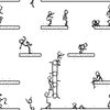
lackattack wrote:The army shadows were changed from black to white to make it easier to see armies when they are printed on a territory of the same colour (e.g. blue armies over Europe), and to help people with poor eyesight distinguish green from blue.
-
lord voldemort

- Posts: 9596
- Joined: Sat Oct 20, 2007 4:39 am
- Gender: Male
- Location: Launceston, Australia
- Contact:


Re: Classic map touchup, take three!
thanks very much guys!
30% black looks good to me; it does not distract the eye and makes the armies a little more clear .
30% black looks good to me; it does not distract the eye and makes the armies a little more clear .


Re: Classic map touchup, take three!
I think Black at 40% is the way to go here. I dont like the white dots it ruins the map somewhat.
-
hammockboy1

- Posts: 235
- Joined: Tue Feb 13, 2007 7:08 pm
Re: Classic map touchup, take three!
I like no shadows, it seems a bit better for the color scheme.
Veni I came
Vidi I saw
Vici I conquered
Caesar
La garde recule. Sauve qui peut! The guard retreats. Save yourself if you can!
Napolean's troops at Waterloo
Which will happen to you?
Vidi I saw
Vici I conquered
Caesar
La garde recule. Sauve qui peut! The guard retreats. Save yourself if you can!
Napolean's troops at Waterloo
Which will happen to you?
-
DOMINATING YOU

- Posts: 1
- Joined: Sun Jan 27, 2008 11:49 pm
- Gender: Male
- Location: COLORADO
Re: Classic map touchup, take three!
The new shadows are terrible. Love this game but hate that change.
-
SkyCaptain

- Posts: 92
- Joined: Sat Jun 10, 2006 12:06 pm
- Location: The World of Tomorrow
Re: Classic map touchup, take three!
I voted for white 30% because it looks the best, in my opinion. However, in the interest of fairness, there should be a runoff of the top two choices when this poll closes. Otherwise, we could have white 30% (which is winning as of this post) win, when in fact a black one would win if its votes weren't split among all the blacks. Yes, i know, the whites are split as well, but who knows?
-
vrex
- Posts: 95
- Joined: Thu Jun 14, 2007 2:21 pm
- Location: in containment with the infected neutrals...
Re: Classic map touchup, take three!
although white 60 didn't bother me like it did others ... i could go with white 30...its still readable and more clear than any of the black options to my eyes 
Highest rank:

AWESOME!! I achieved point count above!!
AWESOME!! I achieved point count above!!
Re: Classic map touchup, take three!
The results thus far are disappointing for me. I can live with 30% white, but won't like it. I would love 60% black, but apparently I'm in the minority.

Re: Classic map touchup, take three!
I voted white 30, but all of them are allright.
Cant we just roll the dices to decide??
Cant we just roll the dices to decide??
Re: Classic map touchup, take three!
Let's change it back to normal.
Colour codes are for people who can't see well, besides, why are people who can't see colour, playing a game of colour?? And complaining about it??
There's probably about 10 people who actually want the map changed. Why is there no Change it back vote? Because it would win?
*Sigh*
This place is starting to suck.
Re: Classic map touchup, take three!
Is there a way to show a white army on a white circle? Also, a slate army on a black circle? Those might be the best indicators since people have been complaining about not seeing an army on a territory due to the circles.
Re: Classic map touchup, take three!
The problem is the Deep Tonings of the Sea Colour.Tone it down a bit and it will make the rest of the map more easy on the eyes
-
DrUniverse
- Posts: 7
- Joined: Mon Dec 31, 2007 4:26 am
Re: Classic map touchup, take three!
why not not use any shadows, and just replace blue with another color?
-
jako

- Posts: 1022
- Joined: Sun Jun 03, 2007 4:50 am
- Gender: Male
- Location: A lost soul with no-one to stalk.
Re: Classic map touchup, take three!
looks like white 30% is winning although i find it is pretty bright for army cirlces. white 40% is about right for me.

Time to retire this much loved sig of mine with a new clan.

Re: Classic map touchup, take three!
Thanks Lack!!!
White 30 is awesome!!!!!
White 30 is awesome!!!!!
-
lackattack

- Posts: 6097
- Joined: Sun Jan 01, 2006 10:34 pm
- Location: Montreal, QC
Re: Classic map touchup, take three!
Dekloren wrote:There's probably about 10 people who actually want the map changed. Why is there no Change it back vote? Because it would win?
Apparently it's a lot more than 10, because the old Classic was black 60%