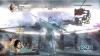
hecter wrote:Well, I find that when the lava just kinda stops at the water, it looks weird... Maybe if you found a way to merge the two, maybe add some steam, y'know...
Also, with the lava, maybe if you were even able to incorperate it somehow so that the lava is the border markers.
Then again, maybe neither will work. But hey, you asked...
well usually lava does stop at the water and forms little humps were it solidifies. i guess steam can be added.
as for the borders it would be nice but it would cause too much confusion i'm afraid.
“In the beginning God said, the four-dimensional divergence of an antisymmetric, second rank tensor equals zero, and there was light, and it was good. And on the seventh day he rested.”- Michio Kaku
FreeMan10 wrote:One last question - D'im and Gimi'l, but there's no Yetic? What's up with that? Doesn't he deserve space in the Mua continent?
If DiM & gimil want themselves to be conquered so easily - then so be it... I'm quite happy to leave my ass intact.
C.
i can already be conquered on madness map so the harm is already done
“In the beginning God said, the four-dimensional divergence of an antisymmetric, second rank tensor equals zero, and there was light, and it was good. And on the seventh day he rested.”- Michio Kaku
I think the colors are too bright and cheery for an 'age of mayhem'. I think you should unify the your pallet with some darker hues. here are some suggestions.
thanks for the input. i'd like a version between the 2 you suggested and if other people are happy with a darker map then i can do it. will update on monday.
mibi wrote:I also don't like the tears in the legend background, as the text does not conform to them so it stands out as inauthentic.
yeah i know and i tried making them more realistic but then the readability is very poor.
there are 2 options.
1. tears were made after the text was written in which case parts of text should be missing.
2. text was written over the tears in which case some letters should be skewed to follow the bumps left by the tears. i tried this but it was still very poor to read.
so i decided to sacrifice realism for readability.
“In the beginning God said, the four-dimensional divergence of an antisymmetric, second rank tensor equals zero, and there was light, and it was good. And on the seventh day he rested.”- Michio Kaku
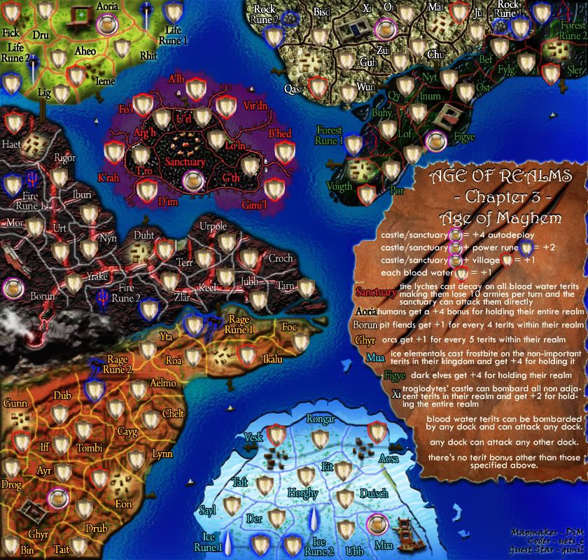
v9
here's the dark version.
note it is not as dark as mibi suggested because borders and army numbers become very hard to read.
at first i really liked the darker shade idea but after tweaking it for a while i realised:
1. army numbers will be hard to read
2. some borders fade away
3. text becomes very hard to read in some areas
4. my eyes hurt after staring at the image.
so now i'm not too fond of darkening the image
original:
new:
“In the beginning God said, the four-dimensional divergence of an antisymmetric, second rank tensor equals zero, and there was light, and it was good. And on the seventh day he rested.”- Michio Kaku
DiM wrote:v9 here's the dark version. note it is not as dark as mibi suggested because borders and army numbers become very hard to read. at first i really liked the darker shade idea but after tweaking it for a while i realised: 1. army numbers will be hard to read 2. some borders fade away 3. text becomes very hard to read in some areas 4. my eyes hurt after staring at the image.
so now i'm not too fond of darkening the image
yeah thats a bit contrasty for me, which is why your eyes hurt.
just drop everything behind these layers. as you can see, when something was too dark, i would just erase the darker layer to lighten it up, i did t for the army numbers and towns and such but you can mess with it further. there are three layers and a combination might work best, also adjust the opacity and such to suit.[/quote]
DiM wrote:v9 here's the dark version. note it is not as dark as mibi suggested because borders and army numbers become very hard to read. at first i really liked the darker shade idea but after tweaking it for a while i realised: 1. army numbers will be hard to read 2. some borders fade away 3. text becomes very hard to read in some areas 4. my eyes hurt after staring at the image.
so now i'm not too fond of darkening the image
yeah thats a bit contrasty for me, which is why your eyes hurt.
just drop everything behind these layers. as you can see, when something was too dark, i would just erase the darker layer to lighten it up, i did t for the army numbers and towns and such but you can mess with it further. there are three layers and a combination might work best, also adjust the opacity and such to suit.
thanks mibi. it works great.
but how did you create those 3 layers??
i'd like to know the logic behind the process because all i did was toy with the hue and saturation and adjust the colour curves.
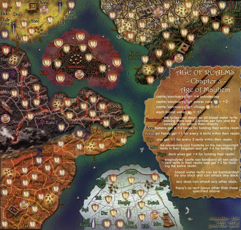
here's V9
darker yet visible.
“In the beginning God said, the four-dimensional divergence of an antisymmetric, second rank tensor equals zero, and there was light, and it was good. And on the seventh day he rested.”- Michio Kaku
but how did you create those 3 layers?? i'd like to know the logic behind the process because all i did was toy with the hue and saturation and adjust the colour curves.
What I did was find some old parchment and used that as the darkening layer. I find that it helps to overlay a layer of a single color or hue when you want to 'unify' the pallete of your work. Often when working on serperate elements of different colors, they can all end up being very far from each other on the color wheel and end up looking too bright and cartoony. By adding a top layer of a single color, it makes all the colors related, in a sense. I used parchment because I liked its hues and its more random then a solid color, but you could also use dark clouds, cliff face, whatever.
Then I adjusted layer style running though the drop down and playing with the opacity until I found something that looked cool. There are a few styles that can darken and lighten areas at the same time. Then I duplicated the layer and reduced the brightness of the parchment to get some different effects in there. Obviously some parts were much too dark so I erased out parts I wanted 'highlighted' with a soft brush. Just messing with it really.
cool thanks.
“In the beginning God said, the four-dimensional divergence of an antisymmetric, second rank tensor equals zero, and there was light, and it was good. And on the seventh day he rested.”- Michio Kaku
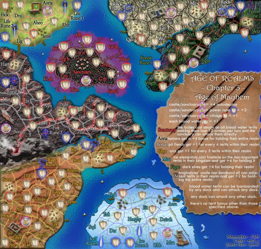
alright, the dock is back in A'lb, but with the overall color changes it kinda gets lost. So does Ieme... seems like these are pretty important play features that should be more prominent.
As for the legend, it really does need to be better explained that there are no automatic armies for holding territories. Wait, why not just say that?
"No bonuses other than those specified above; no automatic armies for number of territories held."
oaktown wrote:alright, the dock is back in A'lb, but with the overall color changes it kinda gets lost. So does Ieme... seems like these are pretty important play features that should be more prominent.
As for the legend, it really does need to be better explained that there are no automatic armies for holding territories. Wait, why not just say that?
"No bonuses other than those specified above; no automatic armies for number of territories held."
ok i'll work on making the docks more visible and i'll add the no automatic armies thing on the legend
“In the beginning God said, the four-dimensional divergence of an antisymmetric, second rank tensor equals zero, and there was light, and it was good. And on the seventh day he rested.”- Michio Kaku
This map looks amazing, especially after the darkening. Two suggestions though:
1) Upping this map to 7 players instead of 6 might destroy the unity a bit.
2) The lyches could stand a little bit of blurring; right now they look a bit cartooney; same with the lava on the volcano above Borun, but not as much. These things just don't seem to fit in with the rest of the art, due to their highly defined lines.
Why is it that the humans get +4 for their whole Realm and only have two borders to defend, yet the Dark Elves also get +4 buy have 6 to defend? It just don't make sense!
In heaven... Everything is fine, in heaven... Everything is fine, in heaven... Everything is fine... You got your things, and I've got mine.
Actually, the Elves have the same two borders as the Humans do. Unlike previous maps, there's now a lava flow between the Elves' border and the Troglodytes' border. Note to DiM, make that more obvious.
TaCktiX wrote:Actually, the Elves have the same two borders as the Humans do. Unlike previous maps, there's now a lava flow between the Elves' border and the Troglodytes' border. Note to DiM, make that more obvious.
far as i can see there is 3 borders for the lava area, 2 for the humans, and idk for the rest
edit: dark elves do have 6, 2 ports, 2 bridges to the xi area, and 2 territories that connect to the xi area
edit2: unless there is lava there like you said, in that case there is 4
i like to put the same bonuses all over the place because it adds to confussion in fog games. but the best solution is quite simple. leave the elves at 4 and drop the humans to 2. oh and btw these bonuses are not very important because by the time you get to hold an entire continent you'll already have hundreds of troops from other bonuses.
“In the beginning God said, the four-dimensional divergence of an antisymmetric, second rank tensor equals zero, and there was light, and it was good. And on the seventh day he rested.”- Michio Kaku
DiM wrote:ok i'll work on making the docks more visible and i'll add the no automatic armies thing on the legend
I so no reason why i won't stamp the next update.
i will provide the next update as soon as possible. probably today when i wake up if nothing comes up.
“In the beginning God said, the four-dimensional divergence of an antisymmetric, second rank tensor equals zero, and there was light, and it was good. And on the seventh day he rested.”- Michio Kaku
The rivier dividing Xi and Figye is a bit unclear with the darker colors. Its a bit hard to tell where it ends (does Ju attack Bef, or is it blocked by the river?)
Lol. I see DiM and Gimil in the blood waters
Theres a small green area behind the lo'ln name. Looks to be part of the Age of Might textures. is that supposed to be there?
wcaclimbing wrote:The rivier dividing Xi and Figye is a bit unclear with the darker colors. Its a bit hard to tell where it ends (does Ju attack Bef, or is it blocked by the river?)
i will make the river more clear but in the meantime if you look at the map you'll see ju attacks bef. between them there's a red border and the spring of the river. so they have a normal border between them that allows attack.
but as i said i will make the river more visible.
“In the beginning God said, the four-dimensional divergence of an antisymmetric, second rank tensor equals zero, and there was light, and it was good. And on the seventh day he rested.”- Michio Kaku