
The Puget Sound [Quenched]
Moderator: Cartographers
Forum rules
Please read the Community Guidelines before posting.
Please read the Community Guidelines before posting.
The Puget Sound [Quenched]
Last edited by Tisha on Fri Dec 07, 2007 4:18 pm, edited 39 times in total.
-
WidowMakers
- Posts: 2774
- Joined: Mon Nov 20, 2006 9:25 am
- Gender: Male
- Location: Detroit, MI


-
I GOT SERVED

- Posts: 1532
- Joined: Fri Jan 26, 2007 9:42 pm
- Gender: Male
- Location: Good 'ol New England


-
sam_levi_11

- Posts: 2872
- Joined: Mon Dec 11, 2006 2:48 pm
- Gender: Male
Re: The Puget Sound
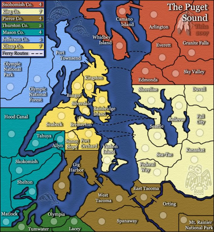
Tisha wrote:Any thoughts on the color changing on the text of Silverdale and Bainbridge Island?
id say if i could find them
-
sam_levi_11
- Posts: 2872
- Joined: Mon Dec 11, 2006 2:48 pm
- Gender: Male

 GO T!!!
 FANTASTIC!
THE BEST MAP EVER!!!!!!!!!!!!!!!!!!!!! lol good job tisha, i see you made some improvements 
-
I GOT SERVED
- Posts: 1532
- Joined: Fri Jan 26, 2007 9:42 pm
- Gender: Male
- Location: Good 'ol New England
Thanks for doing this map, I was hoping someone would get to it. My suggestions, and the reasons for each one.
Number of territories - I think it would be better to end up with 42 territories, the size of the standard map. 36 is a very bad number for 1v1 games; both players start with 12 territories, so the first player gets 4 armies, but the second player probably doesn't.
Tumwater - maybe split it in half east-west; a continent with only two territories is too easy to randomly start the game with.
Matlock - split it in half north-south; it's too long and skinny.
Olympic National Park - definitely needs splitting. Same reason as Tumwater, plus both existing territories are border territories; a 1 army bonus for the continent isn't enough to be worth taking it, and a 2 army bonus is too swingy if someone randomly starts with the whole continent.
Tahuya, Allyn, Sunny Slope, Bangor - you have a four-way corner here. Move the borders to eliminate it, or add a geographic feature to justify it.
Edmonds, Shoreline, Sky Valley, 203 - ditto.
Seattle to Bremerton ferry - I know that's accurate, but boy is it ugly. Suggestion: How about having certain territories (maybe Seattle, Bremerton, Port Townsend, Edmonds, and Whidbey and Vashon Islands) be marked as ferry terminals, and all ferries border all other ferries? That would give this map an interesting gameplay feature rather than just different geography.
The rivers - it's just a graphical thing, but the fact that these don't go all the way to the sound is really weird. How about using bridges instead?

you have quite a good start but it still needs a lot of work.
most of what I'm saying has probably been mentioned but it doesn't hurt to hear it twice.
I think having the title in the middle is a mistake. It should stand out more than it does right now. Also, maybe put a small signature on the map somewhere. These are minor issues but still need to be addressed at some point.
The water routes don't work. It doesn't flow with everything else you have going. It clashes with the feel you have going so far. The ones on the north part look like weird red headphones.
Personally I don't like two territory continents. Almost every game someone will start with it. And, you have two of them. I've learned that I'm not fond of three territory continents either but, that would probably help here.
I'd prefer one font throughout. But it might work how you have it currently. One exception is the multi-coloured territory names. The ones that are both black and white. Probably use black font with a glow around it so you can read it anywhere on the map.
I like the thinner borders and water btw but not all of your borders connect so double check that. And, I still think you could do better with the water. Right now it just seems like another part of the landmass instead of water.
The 4 way border. Right side in the middle. Either put an impassable in the middle of it or just move one of the lines over so it's not a 4 way.
I noticed you have quite a few straight lines. Are these separations copied from reality? I'm not familiar with the area so it just seems weird.
What is that thing in the bottom right? It doesn't seem to fit in the map (stylewise) at all.
-
happy2seeyou

- Posts: 4021
- Joined: Mon Jan 22, 2007 2:59 pm
- Gender: Female
- Location: A state that is in the shape of a mitten!
- Contact:

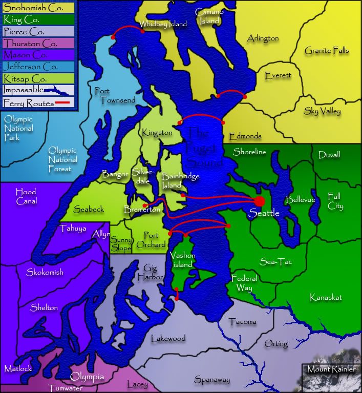
now 42 territories
also got rid of the four way borders
i would like the ferry routes and the borders of the counties to remain...i would like to keep the map true to the area.
i also adjusted the opacity on MT. RAINIER on the lover right hand corner.
the font...i have used the same font throughout the whole map. i have been working with the font for a while, and it doesn't seem to bother my eyes..like some say..
i still need help with bridges..
-
eyeofdeath
- Posts: 107
- Joined: Wed Feb 07, 2007 8:51 pm
-
Risky_Stud

- Posts: 297
- Joined: Sun Dec 24, 2006 12:04 am
- Gender: Male
- Location: Recliner Surfing in my living room
puget sound map
OMG, THIS MAP LOOKS TOTALLY AWESOME. I'M REALLY LOOKING FORWARD TO PLAYING. THEY HAVE GET THIS MAP APROVED FOR PLAY ASAFP.
Ferry routes - Still ugly. I know you want to keep the map true to reality, but come on, when you need to move an army surely you can hijack the ferries and make them go to a terminal off the normal route. 
Silverdale, Bremerton, Allyn - I'm a bit concerned there won't be room for army circles on these, especially on the small map.
Silverdale, Bremerton, Allyn - I'm a bit concerned there won't be room for army circles on these, especially on the small map.
Xyl wrote:Ferry routes - Still ugly. I know you want to keep the map true to reality, but come on, when you need to move an army surely you can hijack the ferries and make them go to a terminal off the normal route.
Silverdale, Bremerton, Allyn - I'm a bit concerned there won't be room for army circles on these, especially on the small map.
so even if there were different lines for ferry routes, you still wouldn't be pleased? on the first page i have posted an undated map, and the army circles do fin fine on the larger map, as for the smaller map...there are alot of maps with smaller territories then mine on them...and they manage to squeeze army circles on
Edit: so i have this little ferry(for the terminals)...and adding it to Bremerton really crowds it out
I think that allowing any ferry terminal to attack any other ferry terminal will be less cluttered visually, be easier to understand, make for better gameplay, and distinguish the map from all the other maps based on real locations. But that is just my opinion. If you want to keep the ferries on fixed lines, I recommend removing the Seattle-Bremerton line. I know it really exists, but it has to do a weird curve to fit on the map, and I think it will confuse people more than it adds to the gameplay.
You're right, you can probably squeeze the army circles on the small map, but I think you'll have to use a smaller font for the labels.
You're right, you can probably squeeze the army circles on the small map, but I think you'll have to use a smaller font for the labels.