Page 4 of 14
Posted: Fri Feb 08, 2008 4:06 pm
by wicked
no way dude. I like the northern part the way it is. In fact, I like all the gameplay... don't change a thing where gameplay is concerned, even the proposed changes you already have. ick.
Posted: Fri Feb 08, 2008 4:07 pm
by yeti_c
wicked wrote:no way dude. I like the northern part the way it is. In fact, I like all the gameplay... don't change a thing where gameplay is concerned, even the proposed changes you already have. ick.
Meh - of the 20 games I've played on this map - I've never started on the top :snigger:
C.
Posted: Fri Feb 08, 2008 4:08 pm
by wicked
so? doesn't mean we should change the entire map just to suit you.
Posted: Fri Feb 08, 2008 4:10 pm
by yeti_c
wicked wrote:so? doesn't mean we should change the entire map just to suit you.
No but we should try and make the gameplay more balanced... I'll bet that 70% of victories on this map are from players starting in either of the top two castles.
C.
Posted: Fri Feb 08, 2008 4:38 pm
by bryguy
gimil wrote:bryguy wrote:question, are the trees those little bumps that look like mole hills??
Better add this one to the list . . . .
sorry 'bout that, but unless u look closeley they do look like mole hills/hills, either way i like it

Posted: Fri Feb 08, 2008 7:01 pm
by sfhbballnut
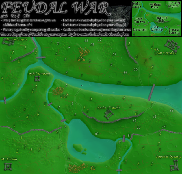
maybe its just my screen, but the revamp map looks really dark, probably just me though
Posted: Fri Feb 08, 2008 7:06 pm
by edbeard
sorry I didn't read anything but I noticed something about this version that is bad.
In the old version, I could tell where the borders between regions were quite easily. In this version, they don't stand out that much from regular borders. Additionally, the south east region border to the north looks more like a continuation of the impassable cliff (or whatever it is) than just a regular border.
Posted: Fri Feb 08, 2008 7:08 pm
by hecter
gimil wrote:hecter wrote:No offence, but I think your trees make your map look diseased...
Well hector comments like that dont help people when it comes to fixing concerns. . .
Make them look less like sharp, small hills. Make them look more like trees (a darker colour of green would be a good start).
Posted: Fri Feb 08, 2008 10:06 pm
by bryguy
sfhbballnut wrote:maybe its just my screen, but the revamp map looks really dark, probably just me though
its SUPPOSED to be dark
Posted: Fri Feb 08, 2008 10:08 pm
by bryguy
edbeard wrote:In the old version, I could tell where the borders between regions were quite easily. In this version, they don't stand out that much from regular borders.
your right, in the original they stood out cause of the slight yellow glow behind them, now they
blend
Posted: Sat Feb 09, 2008 6:02 am
by zimmah
yeti_c wrote:yeti_c wrote:Like the new rivers & Bridges - hate the new green...
You need to make the top half of the map harder to hold.
C.
For this - how about a boat yard in Yer village that lands on the north shore?
C.
would be nice to see a boat yard or something
as well as 2 extra castles (and maybe 1 extra town) to enable 8 player play.
and for some gameplay options, if possible make some scriptings that would enable you to 'see' part of the territories that are 'down below' when you look down from the mountain range each castle has around it, for in fact you do see quite a lot further from above right? so in FoW games, why not show the first 2 or 3 territories from the edge of the mountain if you hold it? (attacking would be impossable off course, unless with arrows, but that would be more like bombarding, and would screw up the gameplay, so just line-of-sight would be fine) on the other hand it might make it harder to invade a given castle, but what if a castle only has 1 side it can see, and 1 side it can't see, then you must find a 'longer and potentially more dangerous route' to sneak up to a given castle, or take the 'short route' and risk being discovered early. also, if you are to implement this, don't forget to add 'forest regions' since forest provides cover

just my 49 cents
Posted: Sat Feb 09, 2008 7:24 am
by Sven Hassel
yeti_c wrote:wicked wrote:so? doesn't mean we should change the entire map just to suit you.
No but we should try and make the gameplay more balanced... I'll bet that 70% of victories on this map are from players starting in either of the top two castles.
C.
nope here you are wrong i played with some guy about 15 games on feudal, i started almost all of them from the bottom part and managed only lost 2 or 3 the top can be a disadvantage (if you know how

) because most players go for the rhu village and waste armies there, if you are quick and mount a good counter you can take their castle while there are trying to take rhu village

Posted: Sat Feb 09, 2008 8:13 am
by yeti_c
zimmah wrote:yeti_c wrote:yeti_c wrote:Like the new rivers & Bridges - hate the new green...
You need to make the top half of the map harder to hold.
C.
For this - how about a boat yard in Yer village that lands on the north shore?
C.
would be nice to see a boat yard or something
as well as 2 extra castles (and maybe 1 extra town) to enable 8 player play.
and for some gameplay options, if possible make some scriptings that would enable you to 'see' part of the territories that are 'down below' when you look down from the mountain range each castle has around it, for in fact you do see quite a lot further from above right? so in FoW games, why not show the first 2 or 3 territories from the edge of the mountain if you hold it? (attacking would be impossable off course, unless with arrows, but that would be more like bombarding, and would screw up the gameplay, so just line-of-sight would be fine) on the other hand it might make it harder to invade a given castle, but what if a castle only has 1 side it can see, and 1 side it can't see, then you must find a 'longer and potentially more dangerous route' to sneak up to a given castle, or take the 'short route' and risk being discovered early. also, if you are to implement this, don't forget to add 'forest regions' since forest provides cover

just my 49 cents
THis isn't available in the current form of the XML - you would have to list as Bombarding...
However - I believe it was listed as a Maybe on an XML extension so probably next round of XML upgrades could do this.
C.
Posted: Sat Feb 09, 2008 9:25 am
by Lone.prophet
gimil wrote:Kaplowitz wrote:yeti which one am i?
and i didnt think you should stop, i liked it a lot. I just thought you should have worked on the China map first.
What I do with my spare time isnt up to you though is it?
what is this a hostile answer all he says is i think
and you than basicly say stfu i dont listen to you
Posted: Sat Feb 09, 2008 11:12 am
by wicked
LoneProphet, we don't need you trying to moderate here, as all you're doing is stoking the fire.
Please do comment on the actual map though. And remember, BE NICE.

Posted: Sat Feb 09, 2008 12:48 pm
by Lone.prophet
most previous comments werent on the map and i am free to give my opinion, and for gimil he is a CA and so shouldnt he be an example?
Posted: Sat Feb 09, 2008 12:56 pm
by wicked
If anyone has a problem with any "staff" member here, PM Twill, don't bring it up in the thread. Thanks.
Now, back on topic.... I think the numbers look better now, although they seem to be different colors in different parts of the map?
Posted: Sat Feb 09, 2008 12:59 pm
by Lone.prophet
i have no words for what you just said
Posted: Sat Feb 09, 2008 1:01 pm
by wicked
Then there's no need to post then, eh?
Now I just noticed this was on vacation. Why start it up then leave it? Is it really on vacation?
Posted: Sat Feb 09, 2008 1:04 pm
by Lone.prophet
yeah he got all annoying thing about how he should spent his time and shouldnt revamp a just created map that he stopped with it
Posted: Sun Feb 10, 2008 12:49 am
by gimil
Im back after my huff

And lone, where not gonna speak about your instigating, k?

Posted: Sun Feb 10, 2008 1:44 am
by FreeMan10
Likey Lotey!!!
Looks really good Gimil. I like the fact that the 'neutral' territories have white numbers and the kingdom territs have yellow ones. That would have made things much more obvious to me the first time I played (well, this time).
Somehow, the numbers in Barbarians seem to be a little dimmer than the rest, though. Maybe it's just my eyes playing tricks on me.
I now see the forests - they're much more foresty. I like the hills and dales, too. Vertical relief does seem to add a nice touch.
Posted: Sun Feb 10, 2008 2:07 am
by Unit_2
lol, the lake looks like a kidney

Posted: Sun Feb 10, 2008 11:25 am
by fireedud
I don't like the roads travelling through the kingdoms, they look awkward. I'm not sure how you can change it, maybe you can just get rid of it altogether?
Posted: Sun Feb 10, 2008 11:30 am
by wcaclimbing
could you try darkening the territory borders a bit? they get hard to see in some spots.
Like around North Plains 9,10,12,13. and Lake Minstello 7,8. When the borders cross over the textured land they get kinda difficult to see.
