[Abandoned] - New York State
Moderator: Cartographers
Forum rules
Please read the Community Guidelines before posting.
Please read the Community Guidelines before posting.


well I still have lots of problems with this map. though it has come a long way.
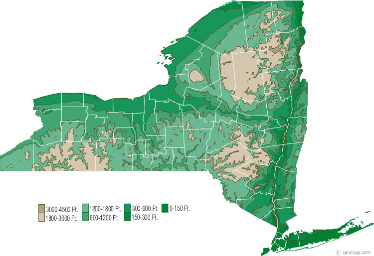
I don't get why you only have one mountain area on the map. According to this it looks like you should have two more. Also, I still don't like the mountains you have. They look quite gaudy. They're just too big.
I don't like how the rivers are just like the other borders except blue. Also I'd like bridges instead of the river just stopping in those places where you've put the gaps.
I'd get rid of those trees and put mountains in the spots shown on the map. Use those and rivers for impassables.
-
WidowMakers
- Posts: 2774
- Joined: Mon Nov 20, 2006 9:25 am
- Gender: Male
- Location: Detroit, MI
I completely agree with everything edbeard said. Your map still seems thrown together.edbeard wrote:well I still have lots of problems with this map. though it has come a long way.
I don't get why you only have one mountain area on the map. According to this it looks like you should have two more. Also, I still don't like the mountains you have. They look quite gaudy. They're just too big.
I don't like how the rivers are just like the other borders except blue. Also I'd like bridges instead of the river just stopping in those places where you've put the gaps.
I'd get rid of those trees and put mountains in the spots shown on the map. Use those and rivers for impassables.
If you are going to use rivers and mountains, make them accurate. There is no way the rivers twist and turn like that.
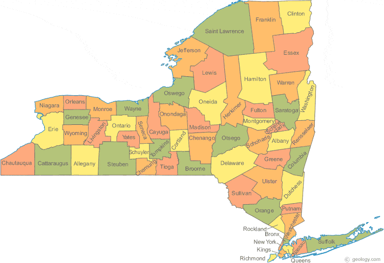
The border layout of the territories seems made up as well. I understand they are the counties but some of them are missing and why have you grouped them the way you have?
Plus your outer glow on the text makes some of them blurry and harder to read.
Here are some more maps that might help.
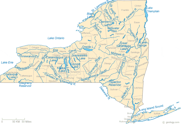
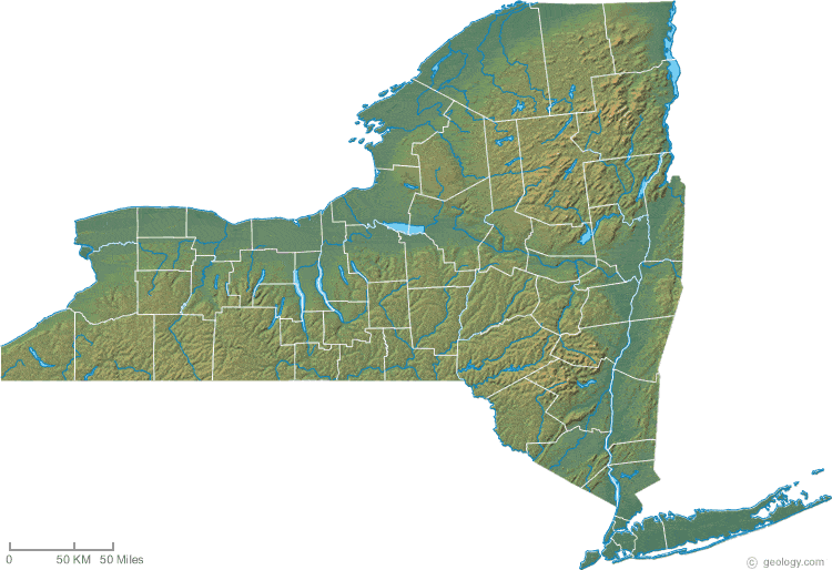
Basically if you want to use mountains and rivers as impassibles, and you want this map to be a real representation of New York State, use the actual size and locations of the mountains and rivers.
Here is what I would do (and have done on all of my maps)
- 1) Look over maps and map and maps!!! (see above)
2) Figure out how many territories you want on the map
3) Group together smaller counties
4) Figure out how many bonus groups you want
5) Develop you borders and attack layout
6) Post rough draft on gameplay to make sure you are headed in the right direction before spending 20 hours tweaking graphics. Once gameplay is worked out.......
7) Tinker with the style of the map. (this will lead the way to the methods of drawing and layout of various elements (trees, rivers, etc)
8) Repost, edit, repost edit......
Good luck
WM

Illl do some of these things.
The reason why the places are grouped are because there were many small, useless territories. The were unimportant gameplay-wise and left no room for names and army #'s. I also wanted a smaller, even number of territories.
and do you really think i should change the mts again? i really like them now...well, ill wait for more comments..


Sorry But This doesn't seem to work .... It is too Dark... The font for the legend is bad... The territ names are hard too read.... It just does not feel like a NEW YORK MAP the mountains are wrong and the borders are too thick.... Sorry too sound harsh but I think this could be MUCH better... In fact I will give it a shot myself
-
Lone.prophet
- Posts: 1467
- Joined: Thu Oct 12, 2006 4:37 pm
- Location: Your basement Muahaha

-
Lone.prophet
- Posts: 1467
- Joined: Thu Oct 12, 2006 4:37 pm
- Location: Your basement Muahaha


yeti_c wrote:Is there any need for the mountain range to take up 20% of your real estate?
C.
i was thinking the mountains could be made a little smaller, and they probably shouldn't really go all the way down to saratoga..considering i live there and there aren't many mountains right here.. just a minor suggestion. other then that great map, would love to play it

-
benny profane

- Posts: 248
- Joined: Sat Jun 16, 2007 4:00 pm
- Gender: Male
- Location: Brooklyn, NY
i totally support this map, but i think that what is really holding it back is the fact that most of the work that you've done (colors, borders, rivers, mountains) is in stark contrast with the strong realism of the image that you've used for the background. i prefer the realism.
sorry i can't be more helpful, but i don't know how you would reconcile this.
also, most of new york state is pretty dreary.
maybe you could reflect that. (kidding!)
sorry i can't be more helpful, but i don't know how you would reconcile this.
also, most of new york state is pretty dreary.
maybe you could reflect that. (kidding!)

laxguy wrote:that is much better Kapolwitz, i wouldn't change anything else, i think its a great idea!
tenio wrote:you should at least add a NYC territory
why is seaway only 1 bonus?
Maybe ill add NYC....it wouldnt really do much game play-wise.
Seaway is only a bonus of 1 b/c it only has 3 territories.
-
Sir. Ricco

- Posts: 4555
- Joined: Tue Oct 02, 2007 2:33 pm
- Gender: Male
- Location: Making kingdoms burn and bloodshed start.
- Contact: