Page 4 of 5
Posted: Mon May 21, 2007 3:58 am
by Steel Panzer
plysprtz wrote:with 34 countries
3 player-11 each one neutral
4 player-8 with 2 neutral
5 player-6 with 4 neutral
6 player-5 with 4 neutral
and with the added 2'
3 player- 12 each no neutral
4 player- 9 each no neutral
5 player- 7 each 1 neutral
6 player- 6 each no neutral
so overall i think you need the extra two armies
just some suggestions
its voted one make oregon another continent with 2 countrys, so that the playability of the map would improve.
Posted: Tue Jun 12, 2007 6:59 pm
by Gemineye
Yes, make it 2 territories, worth bonus of 1.
46% [ 23 ]
Yes, make it 2 territories, worth bonus of 2.
16% [ 8 ]
Yes, but i dont know how many territories or how much bonus.
10% [ 5 ]
No, there is plenty on the map.
26% [ 13 ]
------------------------------------------------------------------------------------
Sorry guys, i have been going through the first stages of divorce, and have been busy w/ a few other things, and didnt feel like messing with this. Now, i think i can finish it, if it is still a map that everyone thinks might be interesting. Thoughts and suggestions please.
Thanks
Posted: Thu Jun 14, 2007 10:01 pm
by Gemineye
Newest update:
3 player- 12 each no neutral
4 player- 9 each no neutral
5 player- 7 each 1 neutral
6 player- 6 each no neutral
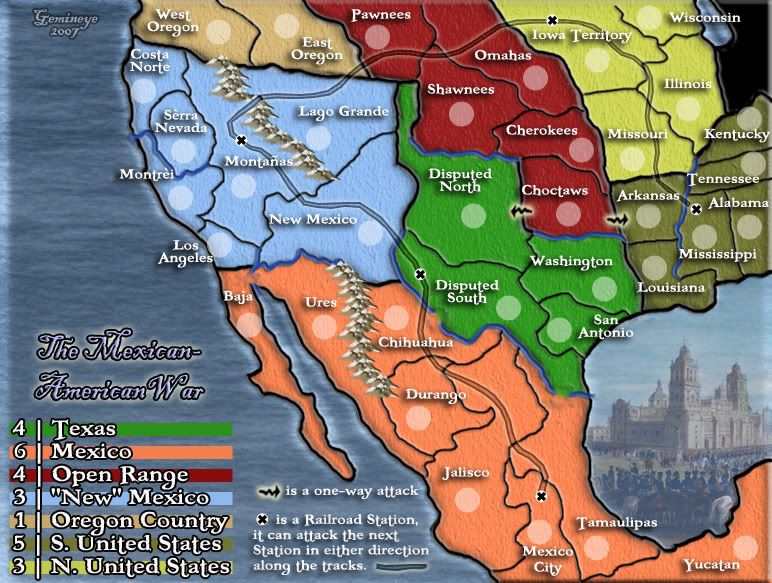
36 territories-7 regions
please post some feedback on what else i need to do, or if this map is even something you guys are interested in anymore.
Update 8:
changed legend
changed bridges
moved title to legend.
added Oregon Country
toned down water pattern
Posted: Thu Jun 14, 2007 10:14 pm
by d.gishman
I love this map, i think it looks awesome. Looking at the map.. i can't really see any problems (i just posted to give support for this map)
Posted: Thu Jun 14, 2007 11:19 pm
by Bad Speler
Map looks great! Only thing i can see right now, is the left side of the map looks empty, maybe put another image there, a ship maybe.
Posted: Fri Jun 15, 2007 8:00 am
by hulmey
were is the map...coz i cant see it!!!!!!!!!
Posted: Thu Jun 21, 2007 4:00 pm
by Gemineye
well, i can only assume, by the mere fact that no one is supplying me with information on how to improve, or move forward with this map, that it isn't worth continuing.
i will put a poll up to determine this. thanks
Posted: Thu Jun 21, 2007 4:04 pm
by edbeard
I don't like Oregon county. I'm not a big fan of 2 territory continents. Maybe add Pawnees and call the area northwest
Posted: Thu Jun 21, 2007 7:50 pm
by AndyDufresne
Hm, I think visually it is a very good looking map. And gameplay looks alright also. I'm not sure why the map hasn't got much feedback, but I'll throw out a few things that might spark some feedback...hm all this will be in random thought order:
The water on the west side of the map...just doesn't look like it fits. I'm not sure why, but it doesn't seem to have the right feel, at least just yet. I'd play around with different textures or perhaps even colors and shades. As for the image in the east area, I understand the idea behind using it, but I don't think it really adds much to the map, and could simply be replaced with water.
What is the idea behind the one way attacks for the Choctaws? I'm curious.
I like the railroad idea you have, it actually improves flow on the map wonderfully. I'd maybe consider using a different graphic other than the current X you have.
What is the dark black area? Could you simply add that to either of the land areas near it? Or make it something that goes with the map rather than a black hole? Maybe gray would be better.
Regarding the continent of new mexico, are there 5 borders? If so, 3 seems a little low. And I'd consider making Texas and N. US the same value. Open Range seems like a tough continent, with all borders.
Hm, I'd like to comment more on playability, but I'm going to think over a few things first.
How many countries do you have on the map?
--Andy
Posted: Fri Jun 22, 2007 12:12 am
by Gemineye
AndyDufresne wrote:The water on the west side of the map...just doesn't look like it fits. I'm not sure why, but it doesn't seem to have the right feel, at least just yet. I'd play around with different textures or perhaps even colors and shades. As for the image in the east area, I understand the idea behind using it, but I don't think it really adds much to the map, and could simply be replaced with water.
On it.
AndyDufresne wrote:What is the idea behind the one way attacks for the Choctaws? I'm curious.
My thought on this is that if it wasnt a only one way attack out, it would be all borders. i assume i could just put in some impassible border there to help. I like the idea of one way attacks, but i will do what the majority of the Foundry deems appropriate.
AndyDufresne wrote:I like the railroad idea you have, it actually improves flow on the map wonderfully. I'd maybe consider using a different graphic other than the current X you have.
I will be glad to, what are your thoughts, or anyone else's for that matter, on what i should use...that wouldnt distract from the map too much?
AndyDufresne wrote:What is the dark black area? Could you simply add that to either of the land areas near it? Or make it something that goes with the map rather than a black hole? Maybe gray would be better.
I think i will just adjoin it to "Illinois" to keep confusion down. Thanks.
AndyDufresne wrote:Regarding the continent of new mexico, are there 5 borders? If so, 3 seems a little low. And I'd consider making Texas and N. US the same value. Open Range seems like a tough continent, with all borders.
New Mexico: Good call, i forgot to take that into account when i added "Oregon Country" to the map.
Texas/N.US": well, these are my thoughts...
N.US has 4 territories, 3 borders. those 3 borders are attackable from 4 adjacent territories and 1 railroad.
Texas has 5 territories, 3 borders. those 3 borders are attackable from 7 adjacent territories, and 1 railroad.
when you look at it like this, i think that Texas should have AT LEAST 1 more man bonus, but if the common consensus is to lower Texas' bonus, i will.
AndyDufresne wrote:Hm, I'd like to comment more on playability, but I'm going to think over a few things first.
thank you, and i look forward to it.
AndyDufresne wrote:How many countries do you have on the map?
Gemineye wrote:Newest update:
3 player- 12 each no neutral
4 player- 9 each no neutral
5 player- 7 each 1 neutral
6 player- 6 each no neutral
36 territories-7 regions
Posted: Fri Jun 22, 2007 3:45 am
by RobinJ
I agree with almost everything Andy has said. However, I would like to add that your bonuses are a bit suspect. Texas should be worth a maximum of 3 - no 4-territory continent should ever be worth more. New Mexico is only worth 3? That should be at least about 5 - it has more territories than almost everywhere else. S. Perhaps N. US should only be worth 2. Mexico could also be perhaps worth 7.
Finally, I would not make Choctaws one way - it would be better to be geographically accurate and bump up the bonus to 5.
Other than that, and what Andy said, this is a good map
Posted: Tue Jun 26, 2007 2:26 pm
by Diablo Returns
i suggest instead of an x at the railroad you should put a tiny picture of a train, like that one in the monopoly game.
Posted: Tue Jun 26, 2007 5:08 pm
by WidowMakers
Here is a graphic for the railroad. It would look better as tracks. I made it in Illustrator. If you want me to, I can trace your current line and send you a png file with the track.

Posted: Tue Jun 26, 2007 7:54 pm
by unriggable
I don't think the state lines were as clearcut as they are now, Id recommend extending those northeast states a bit to clear up that black spot.
Posted: Tue Jun 26, 2007 8:31 pm
by thegeneralpublic
Maybe it's just me, but the border between Baja and Ures is really bugging me; I see how you're continuing the same bridge concept that is used everywhere else on the map, but because of the size of the actual border, it looks as if there isn't one there at all. Plus it's a touch awkward to have the river run into the ocean like that. Maybe you could just eliminate the river in their border, or make the bridge smaller?
Posted: Tue Jun 26, 2007 9:09 pm
by DiM
thegeneralpublic wrote:Maybe it's just me, but the border between Baja and Ures is really bugging me; I see how you're continuing the same bridge concept that is used everywhere else on the map, but because of the size of the actual border, it looks as if there isn't one there at all. Plus it's a touch awkward to have the river run into the ocean like that. Maybe you could just eliminate the river in their border, or make the bridge smaller?
that's not the only issue o this map. there are lots of little pesky things that hurt the eye. different thickness for borders, rivers that go into the ocean, borders that don't go all the way, etc. i don't have the time to explain all of them right now but if it is needed i'll do it later.
for now i'll just post a pic of the problems i spotted in about 3 minutes:
Posted: Tue Jul 03, 2007 1:49 am
by Gemineye
Feedback please. I think we are almost there.
update 9
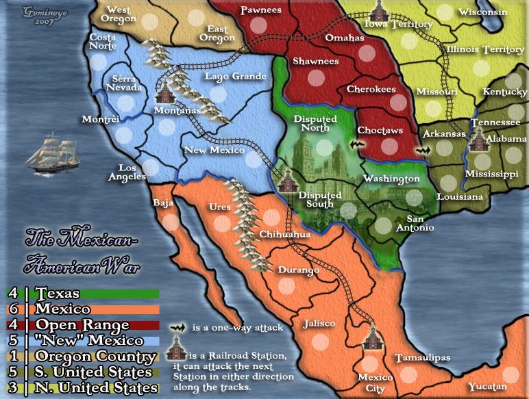
update 9
changed Railway
cosmetic adjustments
added ship
moved image from Gulf of Mexico
added Stations to the railway
took out the black abyss in the NE corner
adjusted New Mexico's bonus
Posted: Tue Jul 03, 2007 2:32 am
by Balsiefen
Nice map like it,
Change the river crossings so they are more noticable, mabye make them look more like bridges.
That's Cool
Posted: Tue Jul 03, 2007 10:11 am
by TexasAngel21
I'm jealous i wish i could make things like that i'm soooo freaking jealous
Posted: Tue Jul 03, 2007 11:28 am
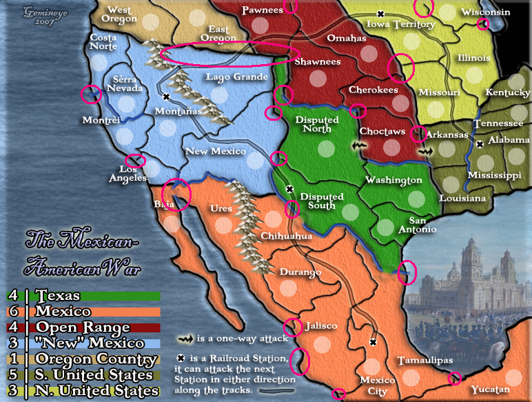
by cairnswk
Geminieye...hi...i haven't posted in here for a while and the map is looking good.
Can you pay attention to the circles areas i have in the image below....there are a few smudge marks that detract from the map, and also a couple of army shadow circles that could be moved so they are not so close to other elements and there is space for them to be moved to.
The railroad lines are perfect btw...very good work there!

Also i have to question the raised bevel i think it is you have around the edge of the map....it seems inconsistent in between land and sea or is that something else you have applied there.
Good work....keep going and the finish line will be there for you.


Posted: Tue Jul 03, 2007 2:40 pm
by RjBeals
I really like this map - although I liked it better before the image was blended into the texas background. IMO - that looks way out of place & should go. I guess that was suggested in a previous post? I love the land & water textures, and the use of colors is great - but I'm not a fan of the inner bevel on the entire picture border. Great Work.
Posted: Wed Jul 04, 2007 4:37 pm
by d.gishman
Hey, great looking map. I must petition for "Open Range" be changed back to "Unorganized Territory" because it is historically more accurate.
Posted: Thu Jul 05, 2007 5:02 pm
by Gemineye
I'm working on some of the minor details....
Please answer the new poll.
Posted: Fri Jul 06, 2007 4:45 am
by alster
It's a cool map.
One thing I noticed though - right now the territories are stretching right to the edge of the map. And the cricles at some are pretty close (like NE U.S.). Maybe putting in a buffert, showing how the outskirts of the lands fade away?
Posted: Sun Dec 09, 2007 2:34 pm
by Unit_2
did you abandon this? i think its looking good, please stay with it 