Page 3 of 6
Posted: Wed Mar 07, 2007 7:56 pm
by Samus
DiM wrote:Enigma wrote:i really like the design but im not sure i would want to play it many times. there isnt really much to capture interest. the graphics are so nice- is there anything that could be added to make it take the jump from pretty to playable?
i constantly get this thing with people not playing it cause it has no theme. why is that??
this has a theme. it's a torn parchment. why do people play the other maps? the basic principle of the gameplay is the same. why would a USA map be played more then a fictional map??
if the fictional map offered better gameplay i would definitely chose it.
as far as the graphics go i want the map to look nice but i don't reall need a theme or a certain real location to rely to. but that's probably just me

DiM, all I can tell you about this is the people on this forum are much more concerned with theme and graphics over gameplay than the vast majority of the people on this site. Crossword has a very unique concept, but it ties with Indochina for least played map. It has 1 page of active games. World 2.0 has no theme and no interesting graphics. It has 17 pages of active games. Your theme is way better than World 2.0, so don't worry about mass appeal.
Posted: Wed Mar 07, 2007 8:55 pm
by DiM
Samus wrote:DiM, all I can tell you about this is the people on this forum are much more concerned with theme and graphics over gameplay than the vast majority of the people on this site. Crossword has a very unique concept, but it ties with Indochina for least played map. It has 1 page of active games. World 2.0 has no theme and no interesting graphics. It has 17 pages of active games. Your theme is way better than World 2.0, so don't worry about mass appeal.
i've seen this and i truly don't understand it. why not consider the gameplay the #1 priority?? i understand graphics and a theme are important but they only add flavour to the gameplay itself. gorgeous graphics interesting themes can't and shouldn't replace interesting gameplay.
anyway. sitting around the computer not being able to install fireworks

i was thinking of a new map. not actually thinking about the graphics but about the gameplay. i'll post a new thread.
Posted: Thu Mar 08, 2007 9:09 am
by DiM
finaly back at home doing some modifications.
here are 2 designs for the blotting pad. please tell me which one fits better. personally i like the first one. although i think it needs a more leathery texture but i could not find one yet
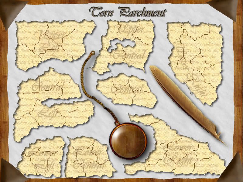

ignore the fact that the monocle still reflects the table and not the blotting pad. i'll work on that now. and i even have a really nice improvement to add to it.
Posted: Thu Mar 08, 2007 9:27 am
by DiM
the monocle is done. which do you like?
if you don't leike either of the 2 i'll just make it transparent. but i think if adds flavour if the actual wise man is reflected in the lens.
the first one is an artistic wise man and the the second one is michelangelo.

Posted: Thu Mar 08, 2007 10:43 am
by DiM
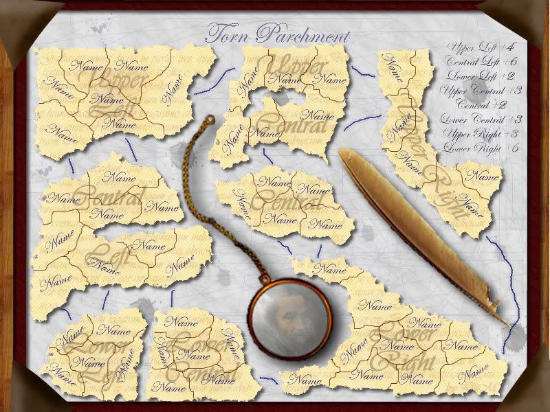
here is the latest update. i modified some stuff and added legend and connectors.
also added teritory names.
edit// removed some spots and modified the background text a bit. also modified some lighting issues.
here's the edited image.
Posted: Thu Mar 08, 2007 11:23 am
by Wisse
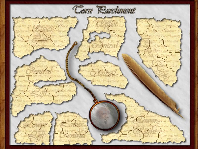
that inner shade is strange, it looks like the background is half above the pieces
Posted: Thu Mar 08, 2007 11:37 am
by DiM
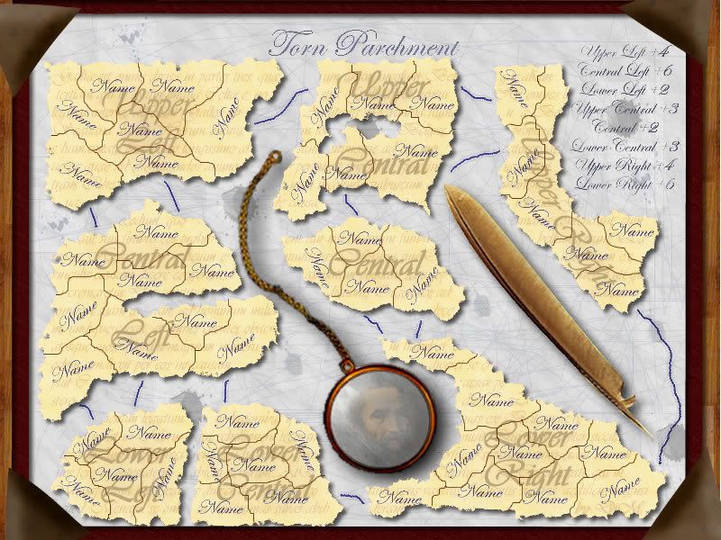
here is without the inner shade.
also added scribbles and ink stains on the blotting pad.
any more improvements???
Posted: Thu Mar 08, 2007 11:46 am
by Molacole
just an idea to try I would suggest try using calligraphy sytle writing for your attack routes. I think that's how those feather pens wrote back in the day.
it might work if you use wide to start then then fade into a thin line towards the middle and open it back up at the end. You could even swerve it around a little to see what you get.
Worth a shot, but not sure how well it would work. You might want to also use Lucidal handwritting or something. It might end up looking sloppy so the lucidal type you have now woudl probably be best.
during the time of parchments I dont think they had parchment frames. didnt they use a piece of thread and tie a knot around it or something. Not sure how you could show that, but I would lose the parchment frame.
Posted: Thu Mar 08, 2007 1:01 pm
by DiM
i'll keep experimenting for the attack routes.
the frame is not actually a frame for the parchment. it's the frame of the blotting pad. the parchment is on top of that.
Posted: Thu Mar 08, 2007 1:10 pm
by Samus
Samus wrote:Predictably, I've got a few more tweaks.
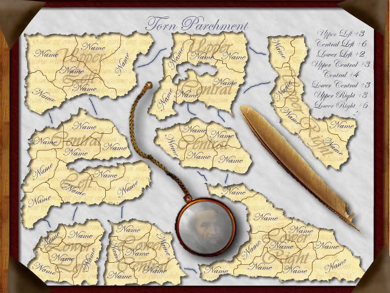
After conferring with my "strategy lab," we think you should find some way to connect the tips of lower right and upper right. Obviously this will be tough to do with the quill where it is.
Upper Left needs another territory to bring it in line with Upper Right. Just split the top left territory into two.
Central should have 1 country removed, bringing it down to 4 countries, and the right connection to Upper Central removed. Given that you can take the Lower Right territory to merge 2 points into one, we can basically treat this like a region with 5 territories and 2 borders. Now it's the same as lower left and also worth +2. This also makes Upper Central slightly easier to hold for the +3 bonus.
I should also tell you that you'll probably want to move Lower Left a little bit to the left, just because you'll have problems when you start to put territory names in there.
This stuff still.
I don't think connecting Upper Right and Lower right will be as hard now, just one long line that runs through the ink blot at the end of the quill.
Posted: Thu Mar 08, 2007 1:14 pm
by DiM
Samus wrote:Samus wrote:Predictably, I've got a few more tweaks.
After conferring with my "strategy lab," we think you should find some way to connect the tips of lower right and upper right. Obviously this will be tough to do with the quill where it is.
Upper Left needs another territory to bring it in line with Upper Right. Just split the top left territory into two.
Central should have 1 country removed, bringing it down to 4 countries, and the right connection to Upper Central removed. Given that you can take the Lower Right territory to merge 2 points into one, we can basically treat this like a region with 5 territories and 2 borders. Now it's the same as lower left and also worth +2. This also makes Upper Central slightly easier to hold for the +3 bonus.
I should also tell you that you'll probably want to move Lower Left a little bit to the left, just because you'll have problems when you start to put territory names in there.
This stuff still.
I don't think connecting Upper Right and Lower right will be as hard now, just one long line that runs through the ink blot at the end of the quill.
sorry i totally forgot about your gameplay modifications. i got so entangled in the graphics aspect. i'll do it now.
Posted: Thu Mar 08, 2007 1:50 pm
by DiM
here are the modifications. not exactly as you said because that mede the map with too many +3 bonuses but basicaly i followed your line of thought.
PS: i think i really exagerated with this map. i have almost 500 layers and many many effects. for example in each connector line i have 8 effects (and i'm still not satisfied with how they look)
Posted: Thu Mar 08, 2007 2:12 pm
by Samus
DiM wrote:here are the modifications. not exactly as you said because that mede the map with too many +3 bonuses but basicaly i followed your line of thought.
Yeah, we kind of thought this too. But I think if you added a territory to Upper Central it would definitely be worth +4. The problem we have with Upper Left is that it only borders 2 regions, so it's just too easy to defend for +4. So, I think it should still be +3, Upper Central with another territory is +4.
I still think Central needs a territory removed since it's only worth +2 now (and like you said we don't want yet another +3). I suggest merging "Name" and "Name" (I'm funny!

).
Right now the map has 53 territories, which for 6 players is 8 each with 5 neutrals. If we add another territory it's 54, which is 9 each with no neutrals. I think that goes into Upper Right to help balance it compared to Upper Left, which has the same borders but has 7 territories.
Posted: Thu Mar 08, 2007 2:19 pm
by Marvaddin
Sorry if you think Im being rude, its not my goal... and I admit I didnt read all the thread... but whats the theme of this map? A desk and pieces of an old newsletter page?
Maybe Im not getting the idea... is it a normal map, with no new features, just old paper on a desk? Continents called upper right, lower central, etc... I dont feel any appeal. I think the poll is favourable, but because we can see your graphical skills... and of course doing something so freely, its very simple do a good map in playability.
But anyway... I would like it... with a cauldron, a candle and some skulls, or something decorative that could add a "magic" atmosphere. Maybe pieces if old scrolls written in an ancient elfic language, or with pieces od a pentagram, if you understand what I say... not an old guy trying to join the pieces of a letter he has ripped by accident.
Posted: Thu Mar 08, 2007 2:49 pm
by DiM
Samus wrote:DiM wrote:here are the modifications. not exactly as you said because that mede the map with too many +3 bonuses but basicaly i followed your line of thought.
Yeah, we kind of thought this too. But I think if you added a territory to Upper Central it would definitely be worth +4. The problem we have with Upper Left is that it only borders 2 regions, so it's just too easy to defend for +4. So, I think it should still be +3, Upper Central with another territory is +4.
I still think Central needs a territory removed since it's only worth +2 now (and like you said we don't want yet another +3). I suggest merging "Name" and "Name" (I'm funny!
).
Right now the map has 53 territories, which for 6 players is 8 each with 5 neutrals. If we add another territory it's 54, which is 9 each with no neutrals. I think that goes into Upper Right to help balance it compared to Upper Left, which has the same borders but has 7 territories.
i did the modifications. also improved the quill after browsing through some tutorials. i think it looks less blurry now.
Posted: Thu Mar 08, 2007 2:53 pm
by DiM
Marvaddin wrote:Sorry if you think Im being rude, its not my goal... and I admit I didnt read all the thread... but whats the theme of this map? A desk and pieces of an old newsletter page?
Maybe Im not getting the idea... is it a normal map, with no new features, just old paper on a desk? Continents called upper right, lower central, etc... I dont feel any appeal. I think the poll is favourable, but because we can see your graphical skills... and of course doing something so freely, its very simple do a good map in playability.
But anyway... I would like it... with a cauldron, a candle and some skulls, or something decorative that could add a "magic" atmosphere. Maybe pieces if old scrolls written in an ancient elfic language, or with pieces od a pentagram, if you understand what I say... not an old guy trying to join the pieces of a letter he has ripped by accident.
i suggest reading the thread. the map already has a theme the text on the parchment is real (Caesar's De Bello Gallico), and it's about a wise man that copies the text from the old parchment. (btw the guy reflecting in the monocle is Michelangelo)
alos the continent names and country names are just to get an idea of the overall look. those aren't the final names.
Posted: Thu Mar 08, 2007 3:27 pm
by Marvaddin
Posted: Thu Mar 08, 2007 3:33 pm
by Guiscard
Marv, you're being a bit harsh but I do agree with you...
It really does need a solid theme in my opinion. If it were a famous document, or perhaps a treasure map or something along those lines it would have something to attract people. At the moment, however good the graphics and gameplay are at least a few people will think that its very boring and never play the map.
Posted: Thu Mar 08, 2007 3:44 pm
by DiM
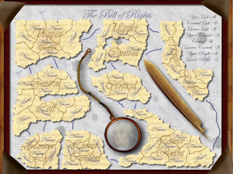
ok guys pretend the parchment is the Bill of rights and the text on the background forms the 10 Amendments.
i can easily modify the text to input the 10 amendments.
and in the monocle i can put the reflection of James Madison the first author of the Bill of Rights. or since the bill of rights is torn to bits let's presume Alexander Hamilton did it since he was the first to argue against it and i'll put his image in the monocle, maybe with an evil expression on his face.
is it ok now?? would it be an appealing map?
here is the original bill of rights.
http://upload.wikimedia.org/wikipedia/commons/7/79/Bill_of_Rights_Pg1of1_AC.jpg
Posted: Thu Mar 08, 2007 3:48 pm
by Guiscard
Thats what I mean. Thats a theme, whereas at the moment you just have graphics. Would definitely make the map more attractive. It would be a shame to waste the wonderful graphics on a map few people will be interested in.
Posted: Thu Mar 08, 2007 4:23 pm
by DiM
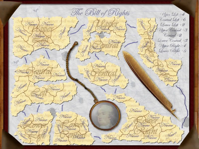
here is the Bill of Rights.
first image with James Madison the second one with Alexander Hamilton

Posted: Thu Mar 08, 2007 4:38 pm
by fluffybunnykins
possibly the shadows could be a little sharper & closer to the objects, as they are resting on the blotter, rather than floating above it! the chain, especially, looks like it is floating.
Posted: Thu Mar 08, 2007 4:53 pm
by DiM
here are the modified shadows.
the continents should be the amendments (only 8 - the other 2 are on the missing pieces) but what should i put for the territory names??
Posted: Thu Mar 08, 2007 5:33 pm
by fluffybunnykins
cool!
another thought: how abot a slightly different colour for the blotting paper? perhaps pale green or blue; something that will contrast with the parchment better???
I've done you an alternative leather corner for the blotter, as well... but I need to go to bed now, so I'll send it tomorrow, if you're interested.
(it's got a gold leaf stripe and everything!)
Posted: Thu Mar 08, 2007 5:42 pm
by DiM
fluffybunnykins wrote:cool!
another thought: how abot a slightly different colour for the blotting paper? perhaps pale green or blue; something that will contrast with the parchment better???
I've done you an alternative leather corner for the blotter, as well... but I need to go to bed now, so I'll send it tomorrow, if you're interested.
(it's got a gold leaf stripe and everything!)
i'll try changing the colour tomorrow cause i'm going to sleep too.
i'll wait for your blotter corner. thanks.
edit// i was thinking at 4 metal eagles. one in each corner but i can't find a proper image.