Page 3 of 28
Posted: Thu Jan 11, 2007 6:10 pm
by Guiscard
Ok... some improvements.
The images are less obvious. Is this alright or do they need to be faded even more. I do like them so I think this amount is probably OK.
Made the neutral areas a bit darker and took away the underlying image. Replaced it with a few other images to give it some character. Are these too much? I can add more but I think it might look a bit much.
I've altered the impassable borders representing the wall of china as I didn;t really like those anyway. Are these any better?
Also, have thickened the borders in Yuan. is this what you were thinking of Andy? Didn't want to go over the whole map if it was too thick or too thin. Should I go over the whole map thicker or just the play area?
As for army shadows I'm planning on adding maybe very light ones to seem the same as the drop shadows on the words, although i'll try it without as well. What size do the shadows have to be? Also does it differ between small and large maps?
Posted: Thu Jan 11, 2007 6:21 pm
by Ruben Cassar
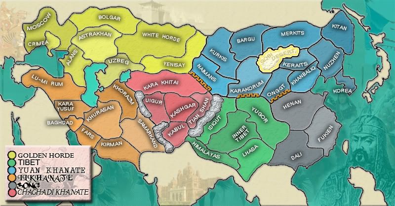
I am going to focus on the legend in this post. The circles need to be properly aligned and their outer rim seems a bit too jagged. Maybe you can improve on that. I am also having some difficulty reading some of the names in the legend, mainly the fourth and fifth one. I think you are trying to give it an oriental style using some specific fonts but maybe you could keep the style and make it more legible?
Posted: Thu Jan 11, 2007 6:24 pm
by Guiscard
Ok no problem. Really havn't focussed on the legend since my first version, and I will do in the next update (will be a big update as i have a week off next week).
Might even change the backing for the legend, unless people really like it as it is now.
the fonts are font options. Which ones do people like best?
I prefer Chaghadi or Ilkhanate, but I'll put up a poll i think.
edit: Also, what do people think of the mountains? I don't mind them but I might try a thinner version, similar to the wall rather than the desert. opinions?
Posted: Thu Jan 11, 2007 11:53 pm
by KEYOGI
This map looks like it is off to a great start. Playability looks pretty good at first glance and it's a nice looking map. Are the squiggly line borders necessary? It's not like they're reducing borders.
I think those pictures in the background need to be toned down some more.
My knowlege of this areas geography is minimal, but is it possible to extend Yugor across to the West, removing the Idiqut/Maimans/Karakorum border? I think your bonus of 3 would be more fitting then. The other bonuses seem pretty good at the moment.
Crimea should probably be moved over to cover more of its territory. It's pretty clear where it belongs but may cause some confusion.
I look forward to some more updates so I can comment more. The Mongol Empire is a map I considered, I just don't have the knowledge to do it justice.
Posted: Sun Jan 14, 2007 3:06 pm
by Lone.prophet
BUMP work on it guiscard
Posted: Sun Jan 14, 2007 3:25 pm
by Guiscard
I am doing one prophet

Had a little university exam period to worry about.
Doing a big update later tonight though all being well, and also going to look at my charlemagne map to see whether its worth continuing with that.
cool
Posted: Sun Jan 14, 2007 3:42 pm
by spinwizard
this map is cool...mabey take out some of the impassable borders
Posted: Sun Jan 14, 2007 3:52 pm
by Lone.prophet
i dont really like ur impassables maybe u could do some other grahpic change?
Posted: Sun Jan 14, 2007 5:38 pm
by Guiscard
Ok. As promised, a major update.
- Thickened the borders and added a bit of blur to smooth them up - Is it too much blur?
- Smartened up the legend, lined everything up and created some proper graphics. I've used the font which was highest in the vote but this can still be changed of course.
- Added a title.
-Toned down the images in the sea (although I've tried to keep old Ghenghis reasonably prominant as he is the star of the show) and I've also added geographically suitable images to the non-playable areas. I'm not 100% sure I want to keep these images, however, so do you like them?
-Yugor now streches over idiqut.
- Changed the mountain graphics and the location of the impassable borders. I've extended the great wall to break up the map a bit and lessened the mountains. The major question here is whether the bonuses should change. The red continent is worth 4 whereas green is worth 3 even though they have the same borders and territories. My reasoning is that green can be exteneded to encompass the grey continent without adding any more borders, whereas red is more central and it is much harder to take over a neighbouring continent without increasing your border significantly.
Phew. What needs doing next then?

edit: To do list:
-
Delete flagpole in black sea.
-
Army shadows: what size?
-
Background colour
-
new wall graphics
-
impassable border location.
Posted: Sun Jan 14, 2007 5:44 pm
by Lone.prophet
looks very good, only can u delete that "flagpole" in the black sea?
Posted: Sun Jan 14, 2007 5:51 pm
by Ruben Cassar
I do not think the borders are too blurred. They are just right.
I also like the image of Genghis Khan. Do keep him!
Legend is perfect now.
Posted: Sun Jan 14, 2007 5:55 pm
by Guiscard
One point (either directed at andy or anyone whos completed a map before) - what size do the army shadows have to be? Do I just guess?
Posted: Sun Jan 14, 2007 11:01 pm
by Guiscard
Anyone else want to comment?????
Posted: Sun Jan 14, 2007 11:20 pm
by KEYOGI
Looks very nice.
The new border thickness is good and it's not too blurry.
I think there may be too much contrast with the unplayable part of the map and the sea. Maybe darken them both up, or just the land, I'm not sure, see what you can come up with.
I still really dislike that wall graphic.
Make your army shadows of at least 22 or 23 pixels.
Posted: Mon Jan 15, 2007 12:30 am
by Marvaddin
The graphics are very good, I love it!
Playability:
- A minor problem: red and blue areas have high bonuses.
- A great problem: the southern area is incredibly strong with those 3 small continents. I strongly suggest you rethink your continents scheme. Maybe join Tibet and Song and split Khanate.
That wall is the Chinese Great Wall, I suppose. Is it in its real place? Can we change its position? I can think better about suggestions knowing the answer to this question...
Posted: Mon Jan 15, 2007 2:28 am
by Fitz69
to comments:
1. Make all water darker.
2. A drop-shadow on the wall will make it stand out more.
Posted: Mon Jan 15, 2007 8:41 am
by Guiscard
I think there may be too much contrast with the unplayable part of the map and the sea. Maybe darken them both up, or just the land, I'm not sure, see what you can come up with.
1. Make all water darker.
I'm a bit loathe to darken the water too much as I feel that the colour is quite appealing and that it makes this map stand out from other maps. If you look back a few pages Andy also commented that it was a good feature... Do other people think I should darken the seas?
That wall is the Chinese Great Wall, I suppose. Is it in its real place? Can we change its position? I can think better about suggestions knowing the answer to this question...
It certainly is the great wall but its not 100% accurate in its placement. At this point the wall wasn't the continuous barrier we see today either so as long as it is in a generaly north-westerly area then its probably ok.
- A great problem: the southern area is incredibly strong with those 3 small continents. I strongly suggest you rethink your continents scheme. Maybe join Tibet and Song and split Khanate.
The continents are based on the historical areas so it would be a bit hard to break up their current structure. I'd rather explore the possibilities available through impassable borders before splitting/merging any continents. It would be easier to add territories to the existing continents as well than to change them altogether.
- A minor problem: red and blue areas have high bonuses.
Blues bonus seemed correct before the impaassable border streched so far accross and there were more border territories. I'll take it down to six and I think I should open up another border as well. As for red, I explained earlier in the thread that I thought it should be higher as it is much harder to expand from that position compared to green (which can expand into the grey continent without adding any extra borders) and it is also in the centre of the map and people are going to be powering through it to break continents.
Posted: Mon Jan 15, 2007 10:10 am
by Fireside Poet

This one is a beauty...
Posted: Mon Jan 15, 2007 10:13 am
by Guiscard
Fireside Poet wrote:=D>
This one is a beauty...
...is that a vote FOR keeping the sea the same

...
Posted: Mon Jan 15, 2007 11:35 am
by boberz
possibly make the gobi desert more readable.
Posted: Mon Jan 15, 2007 12:29 pm
by Guiscard
boberz wrote:possibly make the gobi desert more readable.
Ok added to the list. it is an impassable, however. is this clear enough to everyone???
Posted: Mon Jan 15, 2007 1:15 pm
by sully800
I vote for keeping the sea color as it is, and I really like all of the images you have under the sea and dead territories. They seem to be about perfect in terms of visual strength.
The new mountains look MUCH better, but I think you could make them slightly larger and bolder. I didn't even notice they were there at first. Also I don't like the image you have chosen for the Great Wall but everything else visually looks very nice to me.
Posted: Mon Jan 15, 2007 1:38 pm
by glee
Great progress since last time i posted!
i like the colour scheme and i think you should keep gengis khan and the sea colour as it is.
the problem with an unbalanced map north-south-wize you could perhaps solve by making tibet and changdi unpassable. i mean there should be more mountains in that area anyway, you could even add mountains in tibet that don't cut down borders, just for appearance.
i think that you should change the looks of the wall (maybe enough people have said this already) but i'm not bothered by it not being in exactly the right place
Posted: Mon Jan 15, 2007 9:37 pm
by AndyDufresne
I like the way this map is moving, but I don't have the time at the current moment to give a real feel over. I'll do it as soon as I can!
--Andy
Posted: Tue Jan 16, 2007 12:32 pm
by Guiscard
AndyDufresne wrote:I like the way this map is moving, but I don't have the time at the current moment to give a real feel over. I'll do it as soon as I can!
--Andy
No worries Andy, I'm starting back at uni again next week so I'll probably be a bit too busy to give the map too much attention for a little while.
I'll have a go at some new wall graphics as the current ones don't seem to have gone down to well.
I'll try breaking up the wall and adding more mountainous borders in the chaghadi / tibet region.
Thanks for all the comments guys!