Chinese Checkers [Quenched] May '07 re-opener?
Moderator: Cartographers
Forum rules
Please read the Community Guidelines before posting.
Please read the Community Guidelines before posting.

-
HoustonNutt

- Posts: 419
- Joined: Tue Dec 12, 2006 5:03 pm

KEYOGI wrote:I don't see what else you can do to it. It's Chinese Checkers and I think it looks like a great map. I'm ready to play it. Perhaps put a poll up to gauge interest!?
Final Forge?
I argee with that.
Vote: Mandy
Eddie35: hi everyone
Serbia: YOU IDIOT! What is THAT supposed to be? Are you even TRYING to play this game?! Kill the idiot NOW please!
Eddie35: hi everyone
Serbia: YOU IDIOT! What is THAT supposed to be? Are you even TRYING to play this game?! Kill the idiot NOW please!
Skoffin wrote: So um.. er... I'll be honest, I don't know what the f*ck to do from here. Goddamnit chu.
-
sfhbballnut
- Posts: 1687
- Joined: Fri May 05, 2006 3:01 pm

Yeah, the idea is interesting (even to me  ), and there are no many things to change...
Hmmm, maybe...
- Use black letters to all triangles.
- Use numbers in the white area? I dont know if it would be good.
- Put the end of the red triangle over the dragon, so I wont have the impression that its screaming in pain, hehe
- Use a smaller title and add another interesting picture, like a phoenix, or a lotus flower, I dont know.
- This is personal, but if I were you, I wouldnt put "this map came from" in the sig, it seems you were wanting consume some space...
Beyond that, no many things to change. Well, I think

-
sully800

- Posts: 4978
- Joined: Wed Jun 14, 2006 5:45 pm
- Gender: Male
- Location: Bethlehem, Pennsylvania
Some of the letters and words could be cleaned up, specifically where they go off the edge of the board into the shading that makes it look 3D (which worked very well by the way!)
Specifically- the 'Bl' in Blue, ABC in yellow, the A in orange on the small version, the A in purple, WXYH in white, Q, etc.
All of those places have letters slightly overlapping other lines and it makes it harder to read. I think they would all be easily fixable though.
Specifically- the 'Bl' in Blue, ABC in yellow, the A in orange on the small version, the A in purple, WXYH in white, Q, etc.
All of those places have letters slightly overlapping other lines and it makes it harder to read. I think they would all be easily fixable though.
-
AndyDufresne

- Posts: 24935
- Joined: Fri Mar 03, 2006 8:22 pm
- Location: A Banana Palm in Zihuatanejo
- Contact:
-
btownmeggy

- Posts: 2042
- Joined: Thu Jan 04, 2007 1:43 am

-
reverend_kyle

- Posts: 9250
- Joined: Tue Mar 21, 2006 4:08 pm
- Location: 1000 post club
- Contact:

alright all, thanks for the feedback... I wasn't sure if the lack of responses was from lack of interest, or because you all were ok with it.
I'm not sure it's final forge material yet, as I have some graphics issues to work out - font, images, label placement - but all that will fall into place once we've settled on the playability of the map. It would seem that nobody has a serious issue with how the map would play, so I can move on.
A concern that's been raised about playability regards the space names... I was labeling each region in a circular pattern - white sprials out clockwise from the center, A-Y, and the triangles clockwise from the top. Would it make more sense to label them down in rows? I think it might for the triangles, but maybe not for the white hex... thoughts?
Color names with each "A" space: I figure with seven As, Bs, etc, this will be confusing enough as it is - I don't want people cursing this map because they put their armies on the wrong "E" space.
I'll open photoshop back up tomorrow and see what i come up with.


looks like maybe it oculd use a super power bonus. Something that would force people to challenge whoever goes after it because little 3 point bonuses is going to make this a very slow paced map in my opinion.
I like the map and idea so good work on that! Just seems like if everyone goes for their own 3 points there will be less strategy involved and focused more on the dice rolls and original starting placement over anything else.
I like the map and idea so good work on that! Just seems like if everyone goes for their own 3 points there will be less strategy involved and focused more on the dice rolls and original starting placement over anything else.
Molacole wrote:looks like maybe it oculd use a super power bonus. Something that would force people to challenge whoever goes after it because little 3 point bonuses is going to make this a very slow paced map in my opinion.
yeah, i really agree with you on this one. I proposed upping the bonuses in each triangle, but it didn't go over well. Personally I don't think a region's bonus should be based on a formula of size and attack points, but on how it works with game play. Plus there are a lot of territories: in a four player game, everybody starts with 12 territories, so relative to per turn automatic income three isn't much of a bonus. Maybe i'll poll how much they should be worth.
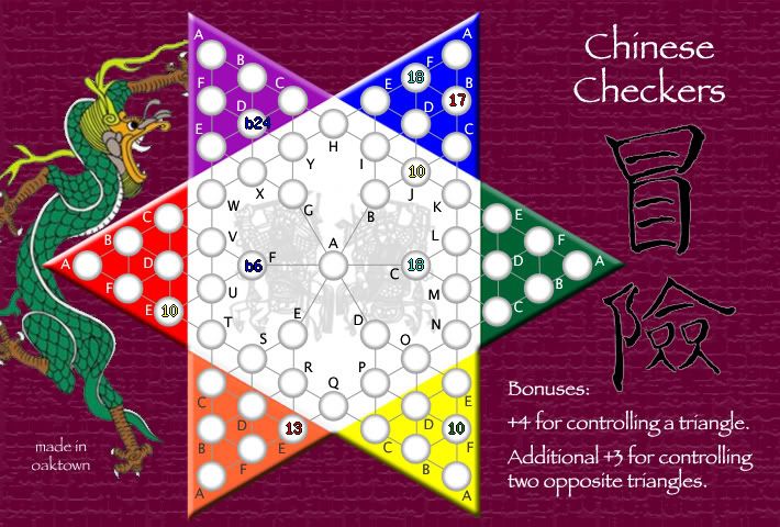
Some minor changes to map - I think the territory labels are more clear. And as one of those color blind players who can't tell red from green players, I think the orange and red are pretty clear so I lost the color labels. And the kanji is chinese for "risk."
Actually, I think initial placement is at least as important in games with 'australias' that are easy to grab and hold. I can't tell you how many games I've lost in the first two turns because somebody else started with all of Japan or Housing.
Molacole wrote:seems like if everyone goes for their own 3 points there will be less strategy involved and focused more on the dice rolls and original starting placement over anything else.
Actually, I think initial placement is at least as important in games with 'australias' that are easy to grab and hold. I can't tell you how many games I've lost in the first two turns because somebody else started with all of Japan or Housing.
-
sully800
- Posts: 4978
- Joined: Wed Jun 14, 2006 5:45 pm
- Gender: Male
- Location: Bethlehem, Pennsylvania
For everyone saying this is Final Forge ready- have you recently read Andy's description of what it means to reach the final forge stage?
"Once the Foundry agrees that the respective map is finished, the Foundry Foreman will make a quick check to make sure that all major suggestions have been either implemented or refuted with logical reasoning. This is the 'Final Forge'."
I know that the gameplay issues were largely settled by the basic design, and the graphics don't need too much work. But since issues and suggestions were still ongoing you can't just declare it to be ready for the forge!
As for the updates- I don't think the chinese characters you added look very good. They appear pasted on and don't fit with the rest of the map very well.
-Putting the tip of the red triangle over the dragon was definitely an improvement, as was losing the continent labels.
-I would prefer to see the countries labeled across the rows for the triangles, and a different method implemented for the white region as well. I think the spiral pattern is a bit confusing, but I don't know how you would solve that. I guess it doesn't really matter because the labels are much clearer now, and it wouldn't take long to search for any particular country name.

minor change, but id label each triangle like this...
(this is the red triangle)
....D
..B
A..E
..C
....F
im not sure i like the added chinese characters either. maybe its the pinkish border on them. maybe match the border on the characters with the lighter red that is in the background?
otherwise, looks good!
(this is the red triangle)
....D
..B
A..E
..C
....F
im not sure i like the added chinese characters either. maybe its the pinkish border on them. maybe match the border on the characters with the lighter red that is in the background?
otherwise, looks good!

-
Lone.prophet
- Posts: 1467
- Joined: Thu Oct 12, 2006 4:37 pm
- Location: Your basement Muahaha

labelling order could be better if changed: I agree. I'll move labels as suggested, and try A-Y top to bottom in white.
kanji looks lame: sure. it was mentioned that I needed something in that space, so I was trying to come up with something fast and on topic. I'll try blending it in better, and if it still sucks I'll drop it entirely.
additional bonuses for holding parts of triangles: I don't like giving a bonus for holding a single territory, because then somebody gets a bonus just because the computer assigned you that territory. Giving a bonus for the back three is a thought... +1 or +2 for the back 3; +4 for the entire triangle?


