Nothing has really changed since I've last heard from a mod. We have the final version towards the bottom of the last page. We could use something to fix or a quench.
Erm... the -1 that Mind causes needs to be moved down a few pixels, as the red glow is clearing the top of that bar. Other than that... I still want enemy seats back, but if I can't have them, I'd say it's ready for a quench. Did you post the XML per Andy's request?
Nikolai wrote:Erm... the -1 that Mind causes needs to be moved down a few pixels, as the red glow is clearing the top of that bar. Other than that... I still want enemy seats back, but if I can't have them, I'd say it's ready for a quench. Did you post the XML per Andy's request?
all the alterations to words that were so easy to understand and all the quality options this map originally started with was great! It's still a kick ass map, but I think we need a CC map area with people who have a brain so more sophisticated maps can exists here on CC.
I wonder if Andy is executing some sort of revenge against me because I sent him a pm saying I'd done what he asked and he viewed it as me hassling him.
I think I'll just continue to believe he'll get to this eventually. He's busy.
Don't worry, Coleman. Nothing held against you (or so I will say in public! Only kidding). Hopefully soon I'll be able to give this map a final look over.
Nikolai wrote:Do try to get that -1 thing fixed before he does so...
Just so you know I've pmed WidowMakers about that, but I think that is some serious OCD nit picking. But that's just my opinion, if WidowMakers is willing to fix it great, because if it is really something that needs to be fixed and he doesn't wana, I'll have to do it. And I don't think anyone is going to like what that looks like.
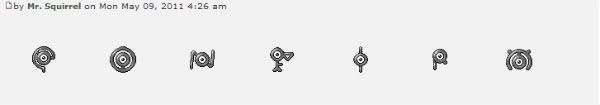
It's not a big issue, but since you're looking for stuff to fix, I think that the sword doesn't really seem to fit with the other symbols. Maybe it's just because it's thinner, but it just doesn't seem to be the same style.
SkyCaptain wrote:It's not a big issue, but since you're looking for stuff to fix, I think that the sword doesn't really seem to fit with the other symbols. Maybe it's just because it's thinner, but it just doesn't seem to be the same style.
I think the sword is just fine. It IS the war section.
In heaven... Everything is fine, in heaven... Everything is fine, in heaven... Everything is fine... You got your things, and I've got mine.