Page 17 of 28
Re: [Official] Classic Revamp (V8, page 24, 11/21/09)
Posted: Sat Nov 28, 2009 12:50 am
by ender516
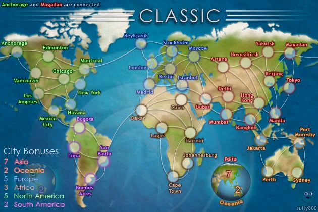
sully800 wrote:There was a recent wave of posts in favor of 2 globes instead of the current 3. If we don't have any more pressing issues I think we can make a poll to decide 3 or 2 globes, or maybe even the simple list. And if we use the list or 2 globes should we reinstate the compass. Plenty of options out there! I like the globes, and I think the current arrangement is very clear and has a nice balance, but it also takes up more space than the 2 globe arrangement.
If I recall correctly, the switch from 2 globes to 3 was done
- to fill space, once the compass was discarded,
- to separate the information on the 2 globes, which some people felt was too cluttered or cramped.
Now, I'm not saying I agree with that, but I would hate to see development start cycling back and forth among versions we have already had. On the other hand, it might be best to lay out all the options in a poll for a final sorting and selection.
Re: [Official] Classic Revamp (V9, page 27, 11/27/09)
Posted: Sat Nov 28, 2009 1:32 am
by Bruceswar
Somwhere in the middle of those 2 saturation wise would be ideal. The 2nd one with the numbers looks too saturated to me.
Re: [Official] Classic Revamp (V8, page 24, 11/21/09)
Posted: Sat Nov 28, 2009 8:32 am
by jiminski
sully800 wrote:
i popped in to see how this was progressing, I scrolled up and hit this image first .. and I thought 'yeah! now we're getting somewhere!'
Something as simple as that adjustment making such a difference is astonishing to me. In a stroke it pastelises (my new word), softens and matures the image.
(in passing, I think the typeface or likely just the colouring of 'Anchorage and Magdan..' (top left corner) detracts from the image. I realise that it is somewhat lurid in order to attract the eye ... but can it be more organic to the general colour scheme of the mother image? the 'Anchorage' is ok in fact, it is the neon red of 'Magdan' i don't feel comfortable with.)
Re: [Official] Classic Revamp (V8, page 24, 11/21/09)
Posted: Sun Nov 29, 2009 12:36 am
by ender516
jiminski wrote:sully800 wrote:
i popped in to see how this was progressing, I scrolled up and hit this image first .. and I thought 'yeah! now we're getting somewhere!'
Something as simple as that adjustment making such a difference is astonishing to me. In a stroke it pastelises (my new word), softens and matures the image.
(in passing, I think the typeface or likely just the colouring of 'Anchorage and Magdan..' (top left corner) detracts from the image. I realise that it is somewhat lurid in order to attract the eye ... but can it be more organic to the general colour scheme of the mother image? the 'Anchorage' is ok in fact, it is the neon red of 'Magdan' i don't feel comfortable with.)
The colours of those cities in the legend are identical to the ones used in the map itself -- that's the point. It's intended to make it easier to find the actual locations which have the wraparound connection.
Re: [Official] Classic Revamp (V9, page 27, 11/27/09)
Posted: Sun Nov 29, 2009 1:12 am
by The Neon Peon
There appears to be a layer with a very low opacity that has not been completely erased.

It's a rough outline, but I think you can see it. There is an almost triangular area where the sea is a slightly darker shade.
Sorry about the weird colors, the online gif creator I used is very low quality. You can still see it on the actual map, though.
Edit: there also appears to be a similar thing going on in the Pacific beneath North America in the shape of a large rectangle. Although that one may just be the texture.
Re: [Official] Classic Revamp (V9, page 27, 11/27/09)
Posted: Sun Nov 29, 2009 1:35 am
by porkenbeans
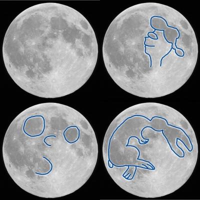
Your mind is just connecting lines. Its like looking at the clouds and seeing shapes. or looking at the moon and seeing faces. ...It is just the texture.
Re: [Official] Classic Revamp (V9, page 27, 11/27/09)
Posted: Sun Nov 29, 2009 1:44 am
by Robinette
porkenbeans wrote:Your mind is just connecting lines. Its like looking at the clouds and seeing shapes. or looking at the moon and seeing faces. ...It is just the texture.
I agree with you about the clouds...
but the Moon??? no way!
all my life i've seen things on the moon...
There REALLY ARE shapes on the moon,,,,,,
aren't there?


Re: [Official] Classic Revamp (V9, page 27, 11/27/09)
Posted: Sun Nov 29, 2009 2:31 am
by ender516
Robinette wrote:porkenbeans wrote:Your mind is just connecting lines. Its like looking at the clouds and seeing shapes. or looking at the moon and seeing faces. ...It is just the texture.
I agree with you about the clouds...
but the Moon??? no way!
all my life i've seen things on the moon...
There REALLY ARE shapes on the moon,,,,,,
aren't there?


Say, if you leave off the ponytail, that profile looks a lot like JFK, doesn't it? (Look at the same area on the image without the blue lines.) Could this be the link between the JFK conspiracy theories (who "killed" him and the story of how he actually survived as a shadowy advisor to all the presidents since his "death") and the phony moon landing theories?

On second thought, it looks more like a cross between George Jetson and Mickey Mouse. Clearly, at some point in the future, Disney Corp has bought Hannah-Barbera and developed time travel to put up the solar system's largest billboard.


Re: [Official] Classic Revamp (V9, page 27, 11/27/09)
Posted: Sun Nov 29, 2009 2:32 am
by cairnswk
sully800 wrote:There was a recent wave of posts in favor of 2 globes instead of the current 3. If we don't have any more pressing issues I think we can make a poll to decide 3 or 2 globes, or maybe even the simple list. And if we use the list or 2 globes should we reinstate the compass. Plenty of options out there! I like the globes, and I think the current arrangement is very clear and has a nice balance, but it also takes up more space than the 2 globe arrangement.
My preference is three globes. It sits nicely on the map and makes the bonuses uncluttered.
As for size, you're the mapmaker, you're call.

Re: [Official] Classic Revamp (V8, page 24, 11/21/09)
Posted: Sun Nov 29, 2009 1:38 pm
by jiminski
ender516 wrote:jiminski wrote:sully800 wrote:
i popped in to see how this was progressing, I scrolled up and hit this image first .. and I thought 'yeah! now we're getting somewhere!'
Something as simple as that adjustment making such a difference is astonishing to me. In a stroke it pastelises (my new word), softens and matures the image.
(in passing, I think the typeface or likely just the colouring of 'Anchorage and Magdan..' (top left corner) detracts from the image. I realise that it is somewhat lurid in order to attract the eye ... but can it be more organic to the general colour scheme of the mother image? the 'Anchorage' is ok in fact, it is the neon red of 'Magdan' i don't feel comfortable with.)
The colours of those cities in the legend are identical to the ones used in the map itself -- that's the point. It's intended to make it easier to find the actual locations which have the wraparound connection.
not quite, they are more vivid -- that's the point. It's intended to draw attention to the actual note i assume or it may well just be an accidental trick due to the darker blue in the north. Whichever, they are slightly too much; the text shadow should be toned down a to allow for the contrast.
Re: [Official] Classic Revamp (V9, page 27, 11/27/09)
Posted: Sun Nov 29, 2009 4:37 pm
by porkenbeans
Two things,
1.) I love the globes, however they are scaled way too large. They are taking over the main focus from the map. Same thing with the title. These elements should be much smaller, then the game would jump to the foreground and be the main focus.
2.) The colored glow around the text is not working. It is acting in a counterproductive way, as It is not making the text easier to read. I think that if you try just using a black drop shadow on all of the text, you will see what I mean.
Re: [Official] Classic Revamp (V9, page 27, 11/27/09)
Posted: Sun Nov 29, 2009 4:41 pm
by The Neon Peon
porkenbeans wrote:Two things,
1.) I love the globes, however they are scaled way too large. They are taking over the main focus from the map. Same thing with the title. These elements should be much smaller, then the game would jump to the foreground and be the main focus.
2.) The colored glow around the text is not working. It is acting in a counterproductive way, as It is not making the text easier to read. I think that if you try just using a black drop shadow on all of the text, you will see what I mean.
I agree with you on the first point, although I don't think it's a necessary change.
On the second, I disagree completely.
Re: [Official] Classic Revamp (V9, page 27, 11/27/09)
Posted: Sun Nov 29, 2009 6:47 pm
by sully800
The Neon Peon wrote:There appears to be a layer with a very low opacity that has not been completely erased.

It's a rough outline, but I think you can see it. There is an almost triangular area where the sea is a slightly darker shade.
Sorry about the weird colors, the online gif creator I used is very low quality. You can still see it on the actual map, though.
Edit: there also appears to be a similar thing going on in the Pacific beneath North America in the shape of a large rectangle. Although that one may just be the texture.
I don't see the artifact that you do, and there are no partial layers in that region. I think you are just seeing pictures in the clouds like everyone else said

jiminski wrote:ender516 wrote:jiminski wrote:(in passing, I think the typeface or likely just the colouring of 'Anchorage and Magdan..' (top left corner) detracts from the image. I realise that it is somewhat lurid in order to attract the eye ... but can it be more organic to the general colour scheme of the mother image? the 'Anchorage' is ok in fact, it is the neon red of 'Magdan' i don't feel comfortable with.)
The colours of those cities in the legend are identical to the ones used in the map itself -- that's the point. It's intended to make it easier to find the actual locations which have the wraparound connection.
not quite, they are more vivid -- that's the point. It's intended to draw attention to the actual note i assume or it may well just be an accidental trick due to the darker blue in the north. Whichever, they are slightly too much; the text shadow should be toned down a to allow for the contrast.
jim, I think this is indeed just a trick of the eye. The note in the top left uses the exact same size, text, color and glow (and any other effects) as the regular territory names. You are correct that it contrasts a bit more on the dark ocean background, so I can tone it down a LITTLE bit - but I intend the legend to match the labels on the map, so it will be a very small adjustment to keep the overall contrast similar.
porkenbeans wrote:Two things,
1.) I love the globes, however they are scaled way too large. They are taking over the main focus from the map. Same thing with the title. These elements should be much smaller, then the game would jump to the foreground and be the main focus.
2.) The colored glow around the text is not working. It is acting in a counterproductive way, as It is not making the text easier to read. I think that if you try just using a black drop shadow on all of the text, you will see what I mean.
1 - You're right, the globes could be a bit smaller. If I remember right I started to have scaling issues beyond their current size (the edges get flat or pixelated) and if I can't fix that issue then it will look better to have them at the current scale.
2 - I also disagree here. The colored outerglow compliments the inner color and sets each region's label apart. If all the outerglows were black it would be very difficult to distinguish the pale text of the labels from one region to another.
The reason the red looks red is more to do with the outerglow than the font color, and that holds true for each label.
Re: [Official] Classic Revamp (V9, page 27, 11/27/09)
Posted: Sun Nov 29, 2009 10:22 pm
by ender516
sully800 wrote:jiminski wrote:ender516 wrote:jiminski wrote:(in passing, I think the typeface or likely just the colouring of 'Anchorage and Magdan..' (top left corner) detracts from the image. I realise that it is somewhat lurid in order to attract the eye ... but can it be more organic to the general colour scheme of the mother image? the 'Anchorage' is ok in fact, it is the neon red of 'Magdan' i don't feel comfortable with.)
The colours of those cities in the legend are identical to the ones used in the map itself -- that's the point. It's intended to make it easier to find the actual locations which have the wraparound connection.
not quite, they are more vivid -- that's the point. It's intended to draw attention to the actual note i assume or it may well just be an accidental trick due to the darker blue in the north. Whichever, they are slightly too much; the text shadow should be toned down a to allow for the contrast.
jim, I think this is indeed just a trick of the eye. The note in the top left uses the exact same size, text, color and glow (and any other effects) as the regular territory names. You are correct that it contrasts a bit more on the dark ocean background, so I can tone it down a LITTLE bit - but I intend the legend to match the labels on the map, so it will be a very small adjustment to keep the overall contrast similar.
I suppose I should take your word that the texts use all the same attributes, but I guess I have to make a slight retraction: the colours of those cities in the legend do not appear to be identical to the ones used in the map itself. When I zoom in on that corner of the map, it looks like the glow on "Anchorage" in the note is a dark colour (black?) while the glow on "Anchorage" on the map is a green which matches the text. This might be what jiminski is seeing. Personally, even if the note is more vivid, I don't think it is enough to be a distraction.
Re: [Official] Classic Revamp (V9, page 27, 11/27/09)
Posted: Sun Nov 29, 2009 10:56 pm
by porkenbeans
sully800 wrote:The Neon Peon wrote:There appears to be a layer with a very low opacity that has not been completely erased.

It's a rough outline, but I think you can see it. There is an almost triangular area where the sea is a slightly darker shade.
Sorry about the weird colors, the online gif creator I used is very low quality. You can still see it on the actual map, though.
Edit: there also appears to be a similar thing going on in the Pacific beneath North America in the shape of a large rectangle. Although that one may just be the texture.
I don't see the artifact that you do, and there are no partial layers in that region. I think you are just seeing pictures in the clouds like everyone else said

jiminski wrote:ender516 wrote:jiminski wrote:(in passing, I think the typeface or likely just the colouring of 'Anchorage and Magdan..' (top left corner) detracts from the image. I realise that it is somewhat lurid in order to attract the eye ... but can it be more organic to the general colour scheme of the mother image? the 'Anchorage' is ok in fact, it is the neon red of 'Magdan' i don't feel comfortable with.)
The colours of those cities in the legend are identical to the ones used in the map itself -- that's the point. It's intended to make it easier to find the actual locations which have the wraparound connection.
not quite, they are more vivid -- that's the point. It's intended to draw attention to the actual note i assume or it may well just be an accidental trick due to the darker blue in the north. Whichever, they are slightly too much; the text shadow should be toned down a to allow for the contrast.
jim, I think this is indeed just a trick of the eye. The note in the top left uses the exact same size, text, color and glow (and any other effects) as the regular territory names. You are correct that it contrasts a bit more on the dark ocean background, so I can tone it down a LITTLE bit - but I intend the legend to match the labels on the map, so it will be a very small adjustment to keep the overall contrast similar.
porkenbeans wrote:Two things,
1.) I love the globes, however they are scaled way too large. They are taking over the main focus from the map. Same thing with the title. These elements should be much smaller, then the game would jump to the foreground and be the main focus.
2.) The colored glow around the text is not working. It is acting in a counterproductive way, as It is not making the text easier to read. I think that if you try just using a black drop shadow on all of the text, you will see what I mean.
1 - You're right, the globes could be a bit smaller. If I remember right I started to have scaling issues beyond their current size (the edges get flat or pixelated) and if I can't fix that issue then it will look better to have them at the current scale.
2 - I also disagree here. The colored outerglow compliments the inner color and sets each region's label apart. If all the outerglows were black it would be very difficult to distinguish the pale text of the labels from one region to another.
The reason the red looks red is more to do with the outerglow than the font color, and that holds true for each label.
If this is the case, I think that you would get a better result with a stroke instead of an outer glow. You see the glow tries to blend the text in, and eliminates the sharp contrasting line of the text, where it meets the background.
Also a tip about scaling down those globes. Don't use the manual method. use the boxes at the top to type in the numbers. Use even numbers. It will say w/100% and h/100%. change them to say 80% or 70% or any EVEN number. If you put an odd number, or do it by hand on the map you will run the risk of loosing detail. The computer needs an even number to scale evenly up or down with. Otherwise half of of object will be 1 pixel larger on one side than the other, resulting in the loss of detail. I hope this makes sense.
Re: [Official] Classic Revamp (V9, page 27, 11/27/09)
Posted: Mon Nov 30, 2009 8:38 am
by natty dread
Use even numbers. It will say w/100% and h/100%. change them to say 80% or 70% or any EVEN number.
Yes, but even number by pixels, not by percentages...
Re: [Official] Classic Revamp (V9, page 27, 11/27/09)
Posted: Mon Nov 30, 2009 1:08 pm
by ender516
natty_dread wrote:Use even numbers. It will say w/100% and h/100%. change them to say 80% or 70% or any EVEN number.
Yes, but even number by pixels, not by percentages...
So, the trick is to pick a percentage that becomes a fraction that works with the size of the thing you are scaling?
For example, if your map is 832x800, scaling to 25% will work cleanly, because it will become 208x200 with no leftover pixels, but 30% would mess up a bit because 832 times 30% is 249.6. Is that it?
In that case, you will want to think of numbers that divide both dimensions evenly, use them as denominators of fractions and hope you can get an exact percentage value for the scaling factor.
Re: [Official] Classic Revamp (V9, page 27, 11/27/09)
Posted: Mon Nov 30, 2009 2:01 pm
by porkenbeans
ender516 wrote:natty_dread wrote:Use even numbers. It will say w/100% and h/100%. change them to say 80% or 70% or any EVEN number.
Yes, but even number by pixels, not by percentages...
So, the trick is to pick a percentage that becomes a fraction that works with the size of the thing you are scaling?
For example, if your map is 832x800, scaling to 25% will work cleanly, because it will become 208x200 with no leftover pixels, but 30% would mess up a bit because 832 times 30% is 249.6. Is that it?
In that case, you will want to think of numbers that divide both dimensions evenly, use them as denominators of fractions and hope you can get an exact percentage value for the scaling factor.
This is very interesting. I understand what you are saying, and I learned something new today.

Re: [Official] Classic Revamp (V9, page 27, 11/27/09)
Posted: Mon Nov 30, 2009 2:52 pm
by natty dread
Or, you can just use bicubic resampling...
Re: [Official] Classic Revamp (V9, page 27, 11/27/09)
Posted: Mon Nov 30, 2009 2:54 pm
by sully800
Thanks for the tip, I'll try scaling to even pixels only (I do use the % boxes, but I never thought about the consequences of odd versus even number of pixels).
Actually, it seems like if the initial file is even you should scale to an even pixel count. If the initial file is odd you should scale to an odd pixel count.
Re: [Official] Classic Revamp (V9, page 27, 11/27/09)
Posted: Mon Nov 30, 2009 5:56 pm
by MrBenn
PArt of me has concerns about the three different globes... I can't help but think it would be more coherent to revert to a simple list; this would a) keep the bonus information in one place, and b) prevent the eye from drifting towards the globes at the bottom of the map.
At the end of the day though, it's your call- if you do revert to a simple list, I wonder if you could leave a globe behind it as an extra detail - although it might actually make it feel more cluttered.
The debate about the text in the top corner is certainly to do with the dark outer glow - one of the first things I commented on when entering the foundry 2 years ago, was the
apparent difference between the colour of the "dust bowl" legend and the "dust bowl" on the map; the two areas were technically identical, but the difference in background and neighbouring detail tricks the eye into thinking that the colours are different - it reminds me of the following optical illusion - which square is darker - A or B:

Re: [Official] Classic Revamp (V9, page 27, 11/27/09)
Posted: Mon Nov 30, 2009 6:19 pm
by MrBenn
Hmmm... I've very quickly knocked up this sample:

A larger globe ghosted behind a list could work...
To fill the gap in the middle, how about some concentric circles that are reminiscent of the original classic? The CC Star in the middle is at 5% opacity; the concentric circles are variations of that (taken from an image knocked up by WidowMakers for
this thread)

Re: [Official] Classic Revamp (V9, page 27, 11/27/09)
Posted: Mon Nov 30, 2009 6:20 pm
by sully800
Ah. I think I may understand the problem here. The red text has exactly the same outerglow as the other labels but there is another "Magadan" in the icy colored font beneath that red one. Despite being the same size, perhaps we are seeing some of the dark blue outerglow from the background label?
I will mask those words once I have photoshop, but no access to that at the moment so I can't test this out.
EDIT:
That legend does look pretty good Benn. It is simpler and less cluttered as everyone has pointed out. A little less "cool" perhaps, but maybe that is the way to go after all.
I'm not sure about the watermark CC star - You did a great job on it for a quick mock up, but I'll have to think about it (and hear what everyone else says)
Re: [Official] Classic Revamp (V9, page 27, 11/27/09)
Posted: Mon Nov 30, 2009 6:20 pm
by the.killing.44
No thanks to the star…
Re: [Official] Classic Revamp (V9, page 27, 11/27/09)
Posted: Mon Nov 30, 2009 7:32 pm
by ustus
I can't read the numbers on the ghosted globe at all. In fact, they make the actual legend harder to read. It seems redundant and counterproductive to me. It looks off balance. there's an area of overlapping stuff, and then on the other side of South America there's an area that's just ocean (albeit ocean with a really sweet looking CC star watermark).
Sorry, Mr. Benn, on re-read that sounds harsher than I meant to be... but I can't find a way to re-word it...
If it was just a globe in the background, that might work. but if you're doing that, take the globe off the other side, or at least take the numbers off the globe on the other side.
EDIT: I meant that last paragraph to say that the numbers are what's really making the legend hard to read. Left that out, oops...


