Page 16 of 18
Posted: Sat Jul 07, 2007 5:52 am
by DiM
cairnswk wrote:DiM wrote:instead of robbers you could use names of famous pyramid explorers

DiM...i was actually thinking of robber like characters in The Mummy i.e. Thief Beni played by Kevin J O'Connor.
i don't know. i never watched the mummy and if i see thief beni as a terit name i'll just think it's a random name. hoever famous explorers might sound more familiar.
V50 Update
Posted: Tue Jul 10, 2007 4:14 am
by cairnswk
DiM wrote:cairnswk wrote:DiM wrote:instead of robbers you could use names of famous pyramid explorers

DiM...i was actually thinking of robber like characters in The Mummy i.e. Thief Beni played by Kevin J O'Connor.
i don't know. i never watched the mummy and if i see thief beni as a terit name i'll just think it's a random name. hoever famous explorers might sound more familiar.
DiM...made some updates to the Robbers names and replaced them with
the names of Explorers of these tombs.
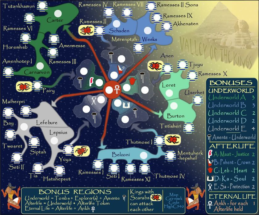
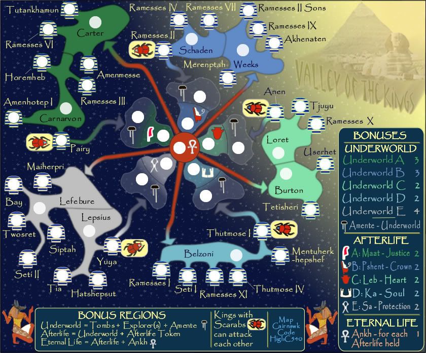
Small Map V50

Large V50

XML....this new file has the new robber tert replacement names of explorers in it.
http://www.sendspace.com/file/cw407w
Re: V50 Update
Posted: Tue Jul 10, 2007 4:23 am
by DiM
cairnswk wrote:DiM wrote:cairnswk wrote:DiM wrote:instead of robbers you could use names of famous pyramid explorers

DiM...i was actually thinking of robber like characters in The Mummy i.e. Thief Beni played by Kevin J O'Connor.
i don't know. i never watched the mummy and if i see thief beni as a terit name i'll just think it's a random name. hoever famous explorers might sound more familiar.
DiM...made some updates to the Robbers names and replaced them with
the names of Explorers of these tombs.
sweet.


Posted: Tue Jul 10, 2007 4:42 am
by yeti_c
I like these new names much better - great work Cairns.
C.
Posted: Fri Jul 13, 2007 3:57 am
by cairnswk
Thanks DiM and yeti_c.
I must say after a week the new names have grown on me.
Posted: Fri Jul 13, 2007 9:21 pm
by AndyDufresne
The names are a great idea! Glad to see it replaced the old Robber lettering system. Definitely coming along nicely.

--Andy
Posted: Sat Jul 14, 2007 8:56 pm
by cairnswk
Any further comments?
Posted: Tue Jul 17, 2007 9:11 pm
by KEYOGI
I think the territory label placement in a few areas could use some work, the Ramesses VI and Horemheb area in particular. There's the potential for some unnecessary confusion with how it is at the moment. Maiherpri could also be moved over to the right a bit, so it sits over the territory.
The map looks very nice visually though. Perhaps we can see small and large versions with army numbers for the next update.
Posted: Wed Jul 18, 2007 4:09 am
by jasnostj
why not using an actual map of the Valley of the Kings?
See
http://www.thebanmappingproject.com/
Posted: Wed Jul 18, 2007 6:20 am
by cairnswk
Hi jasnosttj...if you check back to P1, you'll see that this map stated out as the actual map, or a version thereof. However, the eveolvelment of the gameplay allowed me to decide to break the valley apart and into separate regions and this is the final design.
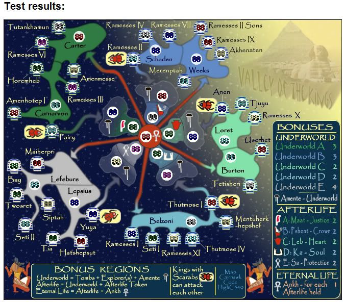
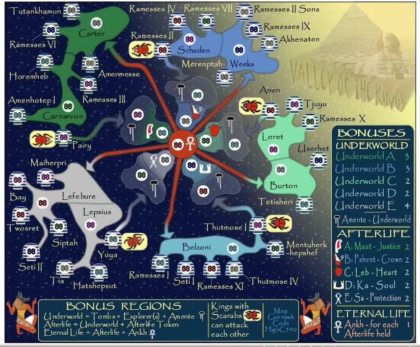
V50 Update Army Numbers
Posted: Wed Jul 18, 2007 8:21 am
by cairnswk
V50 Army Numbers
Small
 Large
Large

Posted: Wed Jul 18, 2007 8:22 am
by cairnswk
KEYOGI wrote:I think the territory label placement in a few areas could use some work, the Ramesses VI and Horemheb area in particular. There's the potential for some unnecessary confusion with how it is at the moment. Maiherpri could also be moved over to the right a bit, so it sits over the territory.
The map looks very nice visually though. Perhaps we can see small and large versions with army numbers for the next update.
Version Army Numbers Small and Large as requested Keyogi, with fixes to those name placements.
Posted: Fri Jul 20, 2007 3:08 am
by KEYOGI
V26 Onwards Heralds A Complete Re-Design For Simplicity - R U Interested Now?
Yes
62% [ 33 ]
No
37% [ 20 ]
Total Votes : 53
Posted: Fri Jul 20, 2007 9:57 pm
by KEYOGI
There seems to be a bit of excessive blur to the map, in particular some of the territory labels. It looks like a compression problem perhaps, so would you mind posting some higher quality images Cairns?
Posted: Sat Jul 21, 2007 6:25 am
by cairnswk
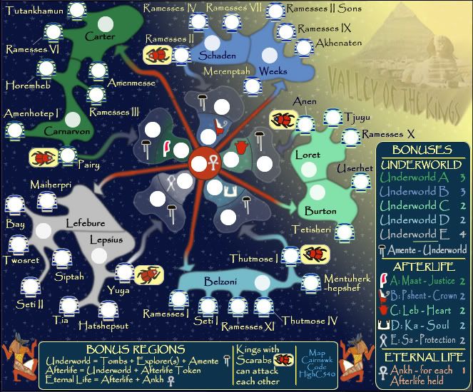
KEYOGI wrote:There seems to be a bit of excessive blur to the map, in particular some of the territory labels. It looks like a compression problem perhaps, so would you mind posting some higher quality images Cairns?
As requested in the maps above Keyogi.
Posted: Fri Jul 27, 2007 1:28 pm
by AndyDufresne
It's looking nice, mind supplying us with the links to the map images, along with the XML (hopefully updated with 'territory').
--Andy
Posted: Fri Jul 27, 2007 2:23 pm
by cairnswk
AndyDufresne wrote:It's looking nice, mind supplying us with the links to the map images, along with the XML (hopefully updated with 'territory').
--Andy
Yup, thanks Andy! As requested below!
 Small V50 @ 100%
http://i155.photobucket.com/albums/s282 ... 0S-100.jpg
 Large V50 @ 100%
http://i155.photobucket.com/albums/s282 ... 0L-100.jpg
 XML with "territory"
Download alleyofthekingswithterritory.xml
Posted: Fri Jul 27, 2007 2:38 pm
by Coleman
EDIT: Cairns updated so....
Look I can dance! ->

Posted: Fri Jul 27, 2007 2:48 pm
by cairnswk
Whoops!

Thanks Coleman.
Posted: Sat Jul 28, 2007 5:14 pm
by KEYOGI
Hmm... the font in the legend is looking a little untidy. There seem to be some stray pixels around the edges of the font, most noticeably on the headings. Is this an effect of the text or something gone wrong somewhere along the line?
P.S. Foundry is spelt incorrectly in your sig Cairns.

Posted: Sat Jul 28, 2007 8:13 pm
by cairnswk
KEYOGI wrote:Hmm... the font in the legend is looking a little untidy. There seem to be some stray pixels around the edges of the font, most noticeably on the headings. Is this an effect of the text or something gone wrong somewhere along the line?
P.S. Foundry is spelt incorrectly in your sig Cairns.

Ooops! Thanks for the pickup on the Found'ry. Fixed.

Yes, unfortunately there is some pixelation on the Papyrus font, but I don't think it is anything to fuss over.

Comes with the font and kind of gives it that tattered ancient look as though other parts had fallen off the plaster, dont' you think! Which is exactly what this map needs for character.
Posted: Sat Jul 28, 2007 8:39 pm
by AndyDufresne
I thought 'Foundary' was maybe an Australian thing. Like color and colour, etc.

Anyways, regarding the pixelation, it really doesn't appear to be it. The edginess (as in on the letters) works for the style of the map I think.
--Andy
Posted: Sat Jul 28, 2007 8:49 pm
by cairnswk
AndyDufresne wrote:I thought 'Foundary' was maybe an Australian thing. Like color and colour, etc.

Anyways, regarding the pixelation, it really doesn't appear to be it. The edginess (as in on the letters) works for the style of the map I think.
--Andy
He he...

No andy, I simply stuffed that one up!

I agree about the pixelation.

Posted: Sat Jul 28, 2007 9:26 pm
by Enigma
wow cairns- this is beautiful. the colours are gorgeous, the pathways are
so much clearer, and the touch of continent colour in the underworld is absolutely brilliant. (im not sure whos idea that was, but im not really interested in going back and reading 2 months worth of posts

).
as for comments, i have to agree with keygoi about the font being a bit pixely- especially in the legend, but also throughout the map and in your (and highc540's) sig.
2nd, there is a dark line dividing each amente from its paired afterlife. these lines look like they could
almost make a circle if connected, but it seems that they would not quite match up. i think the map would look better if these lines were based around a perfect circle as this is the focal point of the map. [also note that on maat this line does not connect all the way to the upper edge of the "cloud"].
other than that i cant see any tweaks

. this map is really shaping up wonderfully and it looks like it will be a lot of fun to play

.
Posted: Sat Jul 28, 2007 11:13 pm
by cairnswk
cairnswk wrote:AndyDufresne wrote:I thought 'Foundary' was maybe an Australian thing. Like color and colour, etc.

Anyways, regarding the pixelation, it really doesn't appear to be it. The edginess (as in on the letters) works for the style of the map I think.
--Andy
He he...

No andy, I simply stuffed that one up!

I agree about the pixelation.

Oh...and Andy....I'm sorry to say this, but "colour" is English, which the Australians adopted as their native language [not referring of course to the indigenous peoples]
I think it was the Americans who dropped the "u", and have continued to do so in just about everything: we call it Americanisms. LOL


