mibi wrote:i'd like to see that funny man turn into a camel, which is much more middle east then some guy in a dress with a strange stick in his hand. what is that thing anyways?
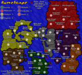
that stick is a bow and that funny map is an archer. it looks like a philistine archer to me but keyogi says is parthian so i'll trust him
a camel looks like a cliche so i like the archer better.
“In the beginning God said, the four-dimensional divergence of an antisymmetric, second rank tensor equals zero, and there was light, and it was good. And on the seventh day he rested.”- Michio Kaku
mibi wrote:i'd like to see that funny man turn into a camel, which is much more middle east then some guy in a dress with a strange stick in his hand. what is that thing anyways?
that stick is a bow and that funny map is an archer. it looks like a philistine archer to me but keyogi says is parthian so i'll trust him
a camel looks like a cliche so i like the archer better.
i wonder how far he can throw those arrows since his bow has no string on it.
hulmey wrote:your a bloddy genuis sully!!!! How on earth are you a multi hunter!!!
How are you meant to know without screwing your eyes up where the continents ends and start in Iran???
Well I'm with KEYOGI- I have no problem distinguishing any of the continent divisions. But I guess your eyesight problem cleared up if you're seeing it better now too
I really like the texture and coloring of the first gradient map you posted KEYOGI. A very nice blend of colors distinct enough to tell them apart, yet similar enough to all look like parchment.
Well to tell you the truth i watched SAW 3 on the computer yesterday and it was so dark that i changed the monitor settings and completely forgot LOL...
Just a suggestion, I don't know if this has been discussed before, but could you make the borders between a continent and another bolder that the rest of the territory borders?
I still think the original is the best, but I don't mind the gradient look either. I dont think the thicker borders suit the rest of the map. Once we're past this colour/border issue once and for all I can focus on getting the map edge done.
Ruben Cassar wrote:I cannot see any difference between #1 and #2. What are these gradients exactly?
In each continent, the colour starts darker at one end and gradually gets lighter across the continent. I have a feeling you have some colour blindness, is this correct Ruben? Do you have a preference between the three?
Wisse wrote:#3 but if you can make the border a bit less thick it will be perfect
Hmm... the original borders are drawn with a 1 pixel pen and the thicker ones are drawn with a 2 pixel pen. Pretty sure there aren't any 1.5 pixel pen options.
Hmm yes I am mild colour blind but to be honest I cannot see this gradient thing in #2 so I guess it's worse than I thought. Hehe.