Page 15 of 20
Re: Archipelago v12 (Pg. 1&21) [I, Gp] - New Poll - 7/06
Posted: Tue Jul 08, 2008 8:31 pm
by ZeakCytho
pepperonibread wrote:I don't think the oval circles are going to help, just because of how the xml engine places the army numbers.Take these XML tests for the USSR map:
[Images removed]
Notice how in the second image, the first two digits are centered, but the third one slides off the edge. The site will only center the first two digits, any others are pushed to the right. If you try and make the XML so the triple digits are centered, the double digits won't be. Just making sure you know, as this sometimes gets confusing when you start making the XML

Yeah, I pointed that out to Mjinga after she made the images
. A while ago she joked that I shouldn't be allowed to make graphics; now I think I'm entitled to say she shouldn't do army centering

Anyway, no circles is winning by a landslide, so I don't think it matters all that much. Thanks anyway, though!
Re: Archipelago v12 (Pg. 1&21) [I, Gp] - New Poll - 7/06
Posted: Tue Jul 08, 2008 8:38 pm
by pepperonibread
ZeakCytho wrote:pepperonibread wrote:I don't think the oval circles are going to help, just because of how the xml engine places the army numbers.Take these XML tests for the USSR map:
[Images removed]
Notice how in the second image, the first two digits are centered, but the third one slides off the edge. The site will only center the first two digits, any others are pushed to the right. If you try and make the XML so the triple digits are centered, the double digits won't be. Just making sure you know, as this sometimes gets confusing when you start making the XML
Yeah, I pointed that out to Mjinga after she made the images
. A while ago she joked that I shouldn't be allowed to make graphics; now I think I'm entitled to say she shouldn't do army centering
Anyway, no circles is winning by a landslide, so I don't think it matters all that much. Thanks anyway, though!
Yeah, I voted no circles as well, the bright colors on this map should make it easy to do without them. It's looking pretty sweet!

Re: Archipelago v12 (Pg. 1&21) [I, Gp] - New Poll - 7/06
Posted: Tue Jul 08, 2008 9:11 pm
by ZeakCytho
pepperonibread wrote:Yeah, I voted no circles as well, the bright colors on this map should make it easy to do without them. It's looking pretty sweet!
Thanks! I'll take all the credit, since Mjinga is AWOL again.
Re: Archipelago v12 (Pg. 1&21) [I, Gp] - New Poll - 7/06
Posted: Tue Jul 08, 2008 9:52 pm
by Mjinga
Pffffft! I am not AWOL!
Thank you, peps.
Yep, there won't be any circles on the final version, I'm thinking.
Re: Archipelago v14 (Pg. 1&24) [I, Gp] Updated! - 7/11
Posted: Fri Jul 11, 2008 8:30 pm
by Mjinga
Okay, so the poll finished. The lightened mountains and no troop dots were the clear winners in those categories. In the Bishan category, the Lake won by one actual vote over the other options, but for the volcano there were more combined votes in the smoke/no smoke options. Hence, I decided to go with the volcano on Bishan.
Zeak finds the scale difference between the volcano on Bishan and the mountains on Vienlorre irritating. Does this bother anyone else? If so, how do you feel about changing the mountains to more foot-hill looking things, in order to fix it?
Update:Version 14 (Large)[bigimg]http://smg.photobucket.com/albums/v238/Rhiannonaecastilla/CC/Maps/Archipelago/ArchMap14.png[/bigimg]
Version 14 With 888s (Large)[bigimg]http://smg.photobucket.com/albums/v238/Rhiannonaecastilla/CC/Maps/Archipelago/888ArchMap14.png[/bigimg]
Version 14 (Small) Version 14 With 888s (Small)
 Changes In This Version:
1) Volcano Added
2) Mountains Changed
3) Troop Dots Removed
4) Small Version Created
Points of Discussion:1) Mountains?
To Do:1) Resolve any details
Re: Archipelago v14 (Pg. 1&24) [I, Gp] Updated! - 7/11
Posted: Fri Jul 11, 2008 9:19 pm
by Kaplowitz
Wow
While I was away, the volcano became awesome!
Maybe you could try army dots that arent just circles. Give some effects or something!
Re: Archipelago v14 (Pg. 1&24) [I, Gp] Updated! - 7/11
Posted: Fri Jul 11, 2008 10:51 pm
by AndyDufresne
I like the idea of the Volcano, but it oddly doesn't feel like the rest of the map...I'm not sure why.
--Andy
Re: Archipelago v14 (Pg. 1&24) [I, Gp] Updated! - 7/11
Posted: Sat Jul 12, 2008 2:00 am
by cairnswk
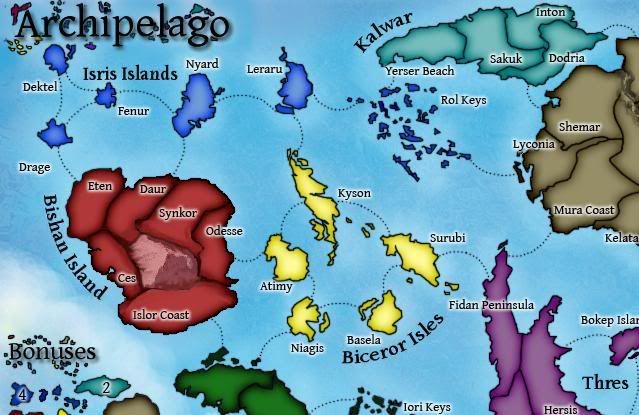
Mjinga and Zeak...before i stamp this could you trim 10 px from the right side of the map and perhaps move the sigs and year over to the left. The map is showing at 640 px and requirements are 630px wide for smal maps.
I'm not sure i like the mountains, the volcano appears good, but the mountains on Vienlorre look like a vein of something i can't describe - no offense just can't think how to describe it. Somehow they still don't match.
I think if you are going to have mountains perhaps some texture of some sort wouldn't go astray to show undulation in the islands counrtryside. Without such, the mountains and volcano seem plonked on the land.
The other aspect i have to comment on is that the inner shadow on all islands except Biceror Isles looks reasonable consistenet, but there appears to be no inner shadow there. Perhaps this should be dark version of yellow to fix that.
Is there any way you can bring some of the army numbers and names of the islands together more. For instance Leraru army number could be moved to the top right of that islands so that the army numbers sit on the right of the island name.
on Inton, can you swap the army numbers and the name, because if ever someone has the map colour turned on and the they have over 100 armies on both Inton and Sakuk, there is going to be a clash of numbers there - Sakuk will overlap Inton. Dodria might also be a challenge.
Perhaps also adjust Eten and Daur in that respect of above-mentioned; also Kelata and Luron Coast, and Seis and Rilok.
I don't think this overlap will apply on the large map, but perhaps adjust that also to be sure they don't overlap.
This adjustment now will ensure you don't have to adjust it later after the map has gone live.
IN the mini-map, you have a large yellow island plus two small islands, but on the map you have five islands. Can you fix this to show five islands in the legend and put the bonus number in the middle of those islands on the mini-map.
Does Rol Keys belong to Isris Islands of is it part of Kalwar. It looks like it is part of Isris....is this clear enough so that people don't have to ask questions when playing the map?
Good work though. Starting to really look good. I like the ocean you've decided on.
Re: Archipelago v14 (Pg. 1&24) [I, Gp] Updated! - 7/11
Posted: Sun Jul 13, 2008 12:44 am
by ZeakCytho
Okay, we'll get to work on that big list of things
I think the only one I disagree with is the change in the minimap to make Biceror have 5 islands there - the minimap is a rough copy of the main map, not an exact one. I think having five islands would necessitate shrinking them, thus making the yellow less visible and the whole thing less intuitive. However, we can add a few islands. I'd just like to keep the large one.
On the same note, how do you guys feel about shrinking the Vienlorre minimap island? I've told Mjinga it looks like a blob for the past few months
Also, how do you guys feel about the vast difference in scale between the volcano and the Vienlorre mountains? It's bugging me a lot

. I think the only way to solve it is to make one of them a body of water, or make the volcano tiny (which would look bad) or make the mountains huge (which would probably look bad). The best solution may be to make Vienlorre's mountains rivers.
All this will be done once I get back from vacation next Wednesday, though.
Re: Archipelago v14 (Pg. 1&24) [I, Gp] Updated! - 7/11
Posted: Sun Jul 13, 2008 9:26 am
by bryguy
the mountains/volcano look that they are "detatched" from the ground
Re: Archipelago v14 (Pg. 1&24) [I, Gp] Updated! - 7/11
Posted: Sun Jul 13, 2008 11:12 am
by InkL0sed
Yes, the scale difference is quite simply horrifying. Go with rivers in Vienlorre, I like that idea.
Re: Archipelago v14 (Pg. 1&24) [I, Gp] Updated! - 7/11
Posted: Mon Jul 14, 2008 2:29 am
by ZeakCytho
bryguy wrote:the mountains/volcano look that they are "detatched" from the ground
I see how the mountains look detached, but the volcano too? I think the blending on it is fine.
InkL0sed wrote:Yes, the scale difference is quite simply horrifying. Go with rivers in Vienlorre, I like that idea.
That looks like the easiest way to fix things to me
Re: Archipelago v14 (Pg. 1&24) [I, Gp] Updated! - 7/11
Posted: Mon Jul 14, 2008 2:48 am
by cairnswk
ZeakCytho wrote:bryguy wrote:the mountains/volcano look that they are "detatched" from the ground
I see how the mountains look detached, but the volcano too? I think the blending on it is fine.
....
Zeak...the reason they both looked detached is because there is no texture on the island terts themselves and also because the graduation to the volcano is missing.
If you look at the mountain under the castle on Das Schloss, you'll see that a graduation of some sort is required to make it look realistic; a graduation even if it is in red of the island but gives that appearance of undulation rising to volcano. Same applies to the mountains.
Re: Archipelago v14 (Pg. 1&24) [I, Gp] Updated! - 7/11
Posted: Mon Jul 14, 2008 2:17 pm
by ZeakCytho
cairnswk wrote:ZeakCytho wrote:bryguy wrote:the mountains/volcano look that they are "detatched" from the ground
I see how the mountains look detached, but the volcano too? I think the blending on it is fine.
....
Zeak...the reason they both looked detached is because there is no texture on the island terts themselves and also because the graduation to the volcano is missing.
If you look at the mountain under the castle on Das Schloss, you'll see that a graduation of some sort is required to make it look realistic; a graduation even if it is in red of the island but gives that appearance of undulation rising to volcano. Same applies to the mountains.
Oh, okay. I think I know what you mean. I hope Mjinga does, since she actually has to fix it
.
Expect an update sometime later this week, when I get back from vacation and Mjinga is done with other work.
Re: Archipelago v14 (Pg. 1&24) [I, Gp] Updated! - 7/11
Posted: Sat Jul 19, 2008 11:55 am
by bryguy
ZeakCytho wrote:cairnswk wrote:ZeakCytho wrote:bryguy wrote:the mountains/volcano look that they are "detatched" from the ground
I see how the mountains look detached, but the volcano too? I think the blending on it is fine.
....
Zeak...the reason they both looked detached is because there is no texture on the island terts themselves and also because the graduation to the volcano is missing.
If you look at the mountain under the castle on Das Schloss, you'll see that a graduation of some sort is required to make it look realistic; a graduation even if it is in red of the island but gives that appearance of undulation rising to volcano. Same applies to the mountains.
Oh, okay. I think I know what you mean. I hope Mjinga does, since she actually has to fix it
.
Expect an update sometime later this week, when I get back from vacation and Mjinga is done with other work.
reason to me that they look detached, is because the map is flat, except for thos 2 things. Unless you make the rest of it elevated, they are gonna look detached.
edit: something like the mountain and volcano in version 9 would fit the map better.
Re: Archipelago v14 (Pg. 1&24) [I, Gp] Updated! - 7/11
Posted: Sat Jul 19, 2008 12:03 pm
by ZeakCytho
bryguy wrote:reason to me that they look detached, is because the map is flat, except for thos 2 things. Unless you make the rest of it elevated, they are gonna look detached.
edit: something like the mountain and volcano in version 9 would fit the map better.
Well, I can't stand the mountains in version 9, and they were voted against, so they won't be coming back. But we're working on making the mountains look less detached, and resolving the scale issue. Not sure when the next version will be out...probably early next week.
Re: Archipelago v14 (Pg. 1&24) [I, Gp] Updated! - 7/11
Posted: Mon Jul 21, 2008 5:07 am
by jiminski
well as you you know i prefer the lake option in Bisham but if Mohamed is going to the mountain... perhaps if you make it more angular and pyramidal it would work better? .. perhaps the elevation may be truer to the map... ..

edit - i checked it, the angle does not really work .. but the shape may.
don't knock a tryer!

Disclaimer: the above awful mountain has nothing to do with the Map artists.
Re: Archipelago v14 (Pg. 1&24) [I, Gp] Updated! - 7/11
Posted: Mon Jul 21, 2008 11:58 am
by ccm87
I really like the idea of this map!

Re: Archipelago v14 (Pg. 1&24) [I, Gp] Updated! - 7/11
Posted: Mon Jul 21, 2008 11:59 am
by whitestazn88
this is an interesting map, but i never asked... is it based on something real? or is it completely made up?
Re: Archipelago v14 (Pg. 1&24) [I, Gp] Updated! - 7/11
Posted: Mon Jul 21, 2008 1:56 pm
by ZeakCytho
Jiminski, I'll let Mjinga respond to your picture, since she's the one making the mountains. Thanks yet again for your help!
ccm87 wrote:I really like the idea of this map!
whitestazn88 wrote:this is an interesting map, but i never asked... is it based on something real? or is it completely made up?
It's completely fictional. I did a basic sketch of some islands for Mjinga, she came up with a much prettier and fleshed out version, and then I made up names with some help from an online name generator.
Re: Archipelago v14 (Pg. 1&24) [I, Gp] Updated! - 7/11
Posted: Thu Jul 24, 2008 9:08 am
by jiminski
Now what is happening with my favourite map-in-the-making?
Re: Archipelago v14 (Pg. 1&24) [I, Gp] Updated! - 7/11
Posted: Thu Jul 24, 2008 9:26 am
by ZeakCytho
It's delayed for a bit because Mjinga is in San Diego for a few days doing stuff, and I don't think anyone would be happy if I did the update
Re: Archipelago v15 (Pg. 1&25) [I, Gp] - Updated 7/26
Posted: Fri Jul 25, 2008 11:13 pm
by ZeakCytho
New UpdateNote: army numbers are not centered. This is not an XML test, the numbers were put in by hand. When the XML centering is done, they will be moved around. So don't complain about army numbers that should be moved around, because chances are they will be.
Version 15 (Large)[bigimg]http://smg.photobucket.com/albums/v238/Rhiannonaecastilla/CC/Maps/Archipelago/ArchMap15.png[/bigimg]
Version 15 With 888s (Large)[bigimg]http://smg.photobucket.com/albums/v238/Rhiannonaecastilla/CC/Maps/Archipelago/888ArchMap15.png[/bigimg]
Version 15 (Small) Version 15 With 888s (Small)
 Changes In This Version:
1) Volcano Added modified to look not-floating
2) River in Vienlorre reinserted
3) Minimap Biceror island made more like the real map
4) Moved some army circle placements around to avoid the overlap problem Cairns pointed out
5) Added a bit more to the Rol keys to show the blue color more clearly
6) Tweaked a few small islands around the title
7) Darkened the glow on Biceror to make it more visible and similar to other continents\
8] Made the small the correct size.
Points of Discussion:1) Volcano look good and not-floaty?
To Do:1) Get the graphics stamp, maybe?
2) XML centering for small version
Re: Archipelago v15 (Pg. 1&25) [I, Gp] - Updated 7/26
Posted: Sat Jul 26, 2008 12:18 am
by Mjinga
Sorry I was late with the update, peeps. Had some stuff happen and had to go some places and suchlike.
Re: Archipelago v15 (Pg. 1&25) [I, Gp] - Updated 7/26
Posted: Sat Jul 26, 2008 1:29 am
by whitestazn88
that volcano looks so out of place...