Page 15 of 25
Re: Philadelphia - [11 Oct 2011] pg 24
Posted: Tue Oct 11, 2011 1:47 pm
by MarshalNey
RedBaron0 wrote:I'll fiddle with the paths a little bit make them mesh better, long kinda spray paint lines with maybe some drips? And I think I'll go with a uniform color instead multicolored.
Uniform color would be good, otherwise a player might wonder if there is some special significance to the coloring.
As for the lines themselves, I was looking at the previous versions to figure out why they didn't bother me and they do now... the thing is that right now the solid lines are very close to the style of the rivers and inset borders... they need to have a distinct look that says "standard attack line". Double-arrowed lines would be the clearest, but that might be too neat to fit the theme.
You used stars and other dashed-looking styles before... would that work here? A dashed or dotted line might work. I'm just worried that the thinner lines will look like region borders. Maybe thin dashed lines?
-- Marshal Ney
Re: Philadelphia - [12 Oct 2011] pg 24
Posted: Wed Oct 12, 2011 10:13 pm
by RedBaron0
[bigimg]http://i213.photobucket.com/albums/cc121/RedBaron0/newphilly43.jpg[/bigimg]
I'm really liking the look here with the lines. It does bother me that the lines aren't really registering with the indenting, but when I see real graffiti, such as this example:
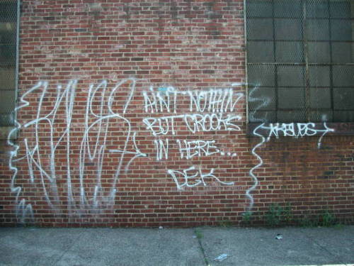
The mortar doesn't really alter the lines path at all.
The bridges have been redrawn into a very simplistic style that fits in the theme. since these lines are a little thicker there is a bit of indenting going on, but it isn't pronounced. I think it works though.

The only thing bugging me at the moment is the border for the inset, so that might change. And whatever else seems overtly wrong from yous guys!
Re: Philadelphia - [12 Oct 2011] pg 24
Posted: Wed Oct 12, 2011 11:13 pm
by MarshalNey
The lines look excellent to me now, very clear and still very grafitti
Re: Philadelphia - [17 Oct 2011] pg 24
Posted: Mon Oct 17, 2011 12:31 pm
by RedBaron0
[bigimg]http://i213.photobucket.com/albums/cc121/RedBaron0/newphilly45.jpg[/bigimg]
Image size: 830x800
[bigimg]http://i213.photobucket.com/albums/cc121/RedBaron0/newsmallphilly45.jpg[/bigimg]
Image size: 623x600
Large and small now, couple slight alterations:
Rocky is stronger and fiddled with the fonts a bit
Feeling like I might have to change the font, except for the title perhaps. And maybe the outline of the city skyline is detracting from the functionality of the inset.
idk, what do you guys think?
Re: Philadelphia - [17 Oct 2011] pg 24
Posted: Mon Oct 17, 2011 12:39 pm
by isaiah40
On South Philly and Germantown, I think you need to go with black on the text as it is too hard to read. You might want to play with the kerning a little to make the names easier to read. Yes I think the skyline in the inset is a little too distracting, I say nix it.
Re: Philadelphia - [18 Oct 2011] pg 24
Posted: Tue Oct 18, 2011 10:12 pm
by RedBaron0
[bigimg]http://i213.photobucket.com/albums/cc121/RedBaron0/newphilly46.jpg[/bigimg]
Image size: 830x800
[bigimg]http://i213.photobucket.com/albums/cc121/RedBaron0/newsmallphilly46.jpg[/bigimg]
Image size: 623x600
Alright kids, how we looking?
The only thing that's bothering me is the "IN" in the bottom statement in both large and small is floating in the river... it just wouldn't fit on that line or any other line if I rearrange the words. Something always stuck out into the river. :/ This is best I could get it without making the font smaller.
Re: Philadelphia - [18 Oct 2011] pg 24
Posted: Wed Oct 19, 2011 5:13 pm
by gimil
Hi red,
Unfortunately I still feel dissatisfied this how you have applied the graffiti effect on this map. Your text sits in perfectly straight lines with tidy black strokes, everything is in saturated/bright colours. Your bell graphics looks like transparent clip art.
The only thing (to me) that feels remotely graffiti is the black bridges, in fact those look fantastic and feel like someone actually has taken a spray can to your map. Also the yellow arrows are almost as good, they are just missing some kind of glow or blur to give them that spray feel. What you have done with the bridges and arrows is what I would like to see more of. I would like to see the likes of the title looking more like natural graffiti, and probably at more of an angle rather than straight left to right. The territories themselves really need to be heavy pigment colours with the black borders similar in style to the the black lines that the bridges were drawn with.
That is all just my opinion. But I deffo feel that this map is a long way off where it should be.
Sorry to be an ass...again,
gimil
p.s. I am only saying this because I think you can do better.
Re: Philadelphia - [18 Oct 2011] pg 24
Posted: Thu Oct 20, 2011 1:30 am
by RedBaron0
No worries Gimil, last I checked that was in the job discription.

Your critique isn't unfounded and easily can be better. I mean the territory names and legends should have as much straight lines as possible to keep the function of the map at a high level, however the title doesn't have that restriction. I can work on all that stuff and see what I can come up with.
Re: Philadelphia - [18 Oct 2011] pg 24
Posted: Thu Oct 20, 2011 9:17 am
by isaiah40
Finally figured out what has been bugging me about this. It is the large bricks and the graffiti on them. When I think graffiti on a wall, I think large paintings. this looks like the artist took a small portion of wall and painted a SMALL map on it. Can you shrink down both wall layers to make it look like a large map was painted on the wall? Basically small bricks. Also, I know you're at 18% for the top wall layer, but I think the opacity can be increased to about 10%. This way the brick and mortar in the painted areas aren't distracting, and it will make the "painted areas" more painted on.
Re: Philadelphia - [18 Oct 2011] pg 24
Posted: Thu Oct 20, 2011 9:32 am
by Gillipig
Best thing about this map is the less than 4 territs bonus. We need more of that type of stuff!!
Re: Philadelphia - [18 Oct 2011] pg 24
Posted: Thu Oct 20, 2011 9:53 am
by AndyDufresne
isaiah40 wrote:Finally figured out what has been bugging me about this. It is the large bricks and the graffiti on them. When I think graffiti on a wall, I think large paintings. this looks like the artist took a small portion of wall and painted a SMALL map on it. Can you shrink down both wall layers to make it look like a large map was painted on the wall? Basically small bricks. Also, I know you're at 18% for the top wall layer, but I think the opacity can be increased to about 10%. This way the brick and mortar in the painted areas aren't distracting, and it will make the "painted areas" more painted on.
Hm, I think Isaiah is onto a couple of things.
--Andy
Re: Philadelphia - [18 Oct 2011] pg 24
Posted: Sat Oct 22, 2011 11:19 am
by Tisha
gimil wrote:Hi red,
Unfortunately I still feel dissatisfied this how you have applied the graffiti effect on this map. Your text sits in perfectly straight lines with tidy black strokes, everything is in saturated/bright colours. Your bell graphics looks like transparent clip art.
The only thing (to me) that feels remotely graffiti is the black bridges, in fact those look fantastic and feel like someone actually has taken a spray can to your map. Also the yellow arrows are almost as good, they are just missing some kind of glow or blur to give them that spray feel. What you have done with the bridges and arrows is what I would like to see more of. I would like to see the likes of the title looking more like natural graffiti, and probably at more of an angle rather than straight left to right. The territories themselves really need to be heavy pigment colours with the black borders similar in style to the the black lines that the bridges were drawn with.
That is all just my opinion. But I deffo feel that this map is a long way off where it should be.
Sorry to be an ass...again,
gimil
p.s. I am only saying this because I think you can do better.
agree completely.
Re: Philadelphia - [18 Oct 2011] pg 24
Posted: Sat Oct 22, 2011 1:36 pm
by Gillipig
I'm not a big fan of the river. Could you try another tone of blue?
Re: Philadelphia - [1 Nov 2011] pg 25
Posted: Tue Nov 01, 2011 2:47 am
by RedBaron0
[bigimg]http://i213.photobucket.com/albums/cc121/RedBaron0/newphilly50.jpg[/bigimg]
Image size: 830x800
[bigimg]http://i213.photobucket.com/albums/cc121/RedBaron0/newsmallphilly50.jpg[/bigimg]
Image size: 623x600
While not completely finished I probably still need to add more graffito type things to tie this all together, I wanted to get an update up and running t show my progress.
Added a bit of glow around the bonus regions that mimics what you often see in graffiti, I'll like be adding this to the Liberty Bell Graphic as well, but more as a shine to give the perception of the bell's curvature.
Different river color.
New tighter background for the perception of it being a much larger wall, might need to be further away still.
Still might have to go a tad lower for the mortar, its at about 18%, 10% was just too low the detail was just gone.
Connections across the river impassibles have been made in the same style as the major bridge to the Liberty Bell connections.
Added glow to these paths to give it more of a spray paint feel. (NOTE: not present in the large, only the small)
At this point still using a font for the title block, but tilted at an angle for graffito randomness, Also added to the title for the Liberty Bell. At least for the title I perhaps might just ditch the font all together for a hand drawn title a-la the bridges and spray paint paths.
I'm not overly sure about applying the same spray paint look to the borders and outlines, I think when I tried it I used a line that was too thick, so I'll probably try that again too.
Re: Philadelphia - [1 Nov 2011] pg 25
Posted: Tue Nov 01, 2011 6:24 am
by natty dread
One thing that bothers me: the city inset still doesn't match the shape of the city on the map...
Re: Philadelphia - [1 Nov 2011] pg 25
Posted: Tue Nov 01, 2011 8:19 am
by koontz1973
natty_dread wrote:One thing that bothers me: the city inset still doesn't match the shape of the city on the map...
And I think with the size and shape that the inset has, it looks fine. The only thing that looks bad are the arrows. Great looking arrows but some of the running paint goes of the the left and not straight down. You could also use some of that effect (runny paint) around the board. Just not too much.
Re: Philadelphia - [1 Nov 2011] pg 25
Posted: Tue Nov 01, 2011 11:56 am
by RedBaron0
While this is still generally a work-in-progress... The inset size and shape is generally set. Look natty I know it's been bothering you, but you need to look at it from a couple angles. One it has been stretched to be larger and be a practical playing surface. Second if the shape matched exactly the inset would be tilted to match the orientation and then I'd have to take up more space to make sure all the connections were easily visible. And lastly when you take in inset out of city grid, its always laid in such a way for easy understanding of the main city grid, the source map I used was an inset itself and was laid out the same way.
[bigimg]http://www.rususa.com/city/images/phtrans.gif[/bigimg]
Re: Philadelphia - [1 Nov 2011] pg 25
Posted: Tue Nov 01, 2011 5:30 pm
by Victor Sullivan
I think white text in the dark green of South Philly would be easier on the eyes.
-Sully
Re: Philadelphia - [19 Nov 2011] pg 25
Posted: Sat Nov 19, 2011 5:02 am
by RedBaron0
Current Draft:
[bigimg]http://i213.photobucket.com/albums/cc121/RedBaron0/newphilly52.jpg[/bigimg]
Image size: 830x800
[bigimg]http://i213.photobucket.com/albums/cc121/RedBaron0/newsmallphilly52.jpg[/bigimg]
Image size: 623x600
Alright kids, I'm back up and running here.
Tried tilting as much text as I thought I could get away with.
redid the yellow connector lines
redid the territory borders to be more like spay paint
deleted the liberty bell army circles (regular army circles may be required)
Fiddled with the main Liberty Bell for more depth to the simplistic image
I did tinker with the colors of the bonus zones a little more, but not much.
So guys, what do you think?
Re: Philadelphia - [19 Nov 2011] pg 25
Posted: Sun Nov 20, 2011 3:31 pm
by gimil
Yes, we have taken a step in the right direction I think. Feeling alot more graffiti like now. The bell though, doesn't really work for me like this. I think it is just because you have not drawn it very well. You could probably get away with just having a plain yellow bell, with no outer glow or anything.
I shall comeback later for a fully review. Once I see what others think of this update.
Good work mate.
Re: Philadelphia - [19 Nov 2011] pg 25
Posted: Sun Nov 20, 2011 11:45 pm
by Victor Sullivan
gimil wrote:Yes, we have taken a step in the right direction I think. Feeling alot more graffiti like now. The bell though, doesn't really work for me like this. I think it is just because you have not drawn it very well. You could probably get away with just having a plain yellow bell, with no outer glow or anything.
I shall comeback later for a fully review. Once I see what others think of this update.
Good work mate.
I agree with gimil here. It's lookin' great!
-Sully
Re: Philadelphia - [19 Nov 2011] pg 25
Posted: Wed Dec 07, 2011 11:42 am
by thenobodies80
What I don't like is that right now the map doesn't look on the wall, but more in front of it....it isn't like
painted on the wall
Re: Philadelphia - [19 Nov 2011] pg 25
Posted: Sun Dec 18, 2011 12:34 am
by RedBaron0
Yeah I know... isaiah40 has been helping me out with that, and hopefully when I update sometime later today/tonight, It'll be better.
Re: Philadelphia - [18 Dec 2011] pg 25 -Painted on or not?
Posted: Sun Dec 18, 2011 2:19 am
by RedBaron0
[bigimg]http://i213.photobucket.com/albums/cc121/RedBaron0/newphilly53.jpg[/bigimg]
I'm mainly looking at the "painted on" look here. So I got the large setup only. isaiah40 has helped me out with the small and given me the blueprint to apply to the large. One I wanna make sure I didn't screw it up.... and make sure this is the affect we all seem to be pushing towards. Then I can work on the little odds and ends and get this sucker bumped upstairs!
EDIT: Ya know as I look at it.... its the outline that seems to make the make kinda be on top of the brick instead of painted on... I think. No outline guys?
Re: Philadelphia - [18 Dec 2011] pg 25 -Painted on or not?
Posted: Sun Dec 18, 2011 2:34 am
by natty dread
It's mostly the text that looks like it's not painted on. The small text looks like it just sits there on top of the wall, and the larger text looks like a sticker that's stuck on the wall.
The outlines... sorta, I think if you made them a bit lighter so they'd be a very dark grey, and applied some very slight blur on them, then lowered the opacity... they could work.
As for the text, I think you need to remove that very slight outline you have on the white text, and make the black text a bit lighter.
Another thing... make the depth of the brick wall show more under the paint.