Page 13 of 22
Re: Portland [24 July 2011] v.37 - What is left for graphics
Posted: Sat Aug 06, 2011 7:24 pm
by lostatlimbo
natty_dread wrote:Anyway... sorry if this has been discussed before, but: Swan island. It looks like the light is coming from the wrong direction... On Mt. Tabor, the light comes from upper left, while on swan island, it seems to come from lower right... unless it is supposed to go inwards?
Swan Island is concave, where as Mt Tabor is convex.
That said, I cleaned up Swan Island to hopefully better illustrate this
Re: Portland [6 AUG 2011] v.38 - Header fixed
Posted: Sat Aug 06, 2011 7:32 pm
by lostatlimbo
DiM wrote:some nitpicking.
some of the following things may be considered by other commenter as too minor to need fixing. if that happens i won't hold it against you for not fixing them.
1. the beer icon on the map might be copyrighted. it's impossible to tell precisely but i think you have a link or a copyright message on that image:
The icon is not copyrighted. I painted over a photo. That's just a few stray pixels.
I know a lot of people play with their screen blown up to 300% so I'll get in there and clean that up shortly.
Re: Portland [6 AUG 2011] v.38 - Header & Swan Island fix, m
Posted: Sat Aug 06, 2011 7:39 pm
by lostatlimbo
38th DraftFixed header text
Also re-did Swan Island for clarity
Darkened MAX windows
Cleaned up beer icons
Fixed black spots under train tracks and other minor blemishes
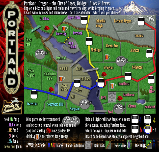
[bigimg]http://i134.photobucket.com/albums/q102/lostatlimbo/Portland_new19.png[/bigimg]
Re: Portland [24 July 2011] v.37 - What is left for graphics
Posted: Mon Aug 08, 2011 8:54 am
by Coleman
flexmaster33 wrote:This nit-picking is a bit much...that's a font style...I think it looks good.
On the large map it looks great, on the small map (the way I always play) it kinda hurts my head for some reason. I get that it is the font style and if that is what he likes he can stick with it, I was just saying it looks odd to me and it apparently looked odd to other people as well.
Re: Portland [24 July 2011] v.37 - What is left for graphics
Posted: Mon Aug 08, 2011 8:46 pm
by lostatlimbo
Coleman wrote:flexmaster33 wrote:This nit-picking is a bit much...that's a font style...I think it looks good.
On the large map it looks great, on the small map (the way I always play) it kinda hurts my head for some reason. I get that it is the font style and if that is what he likes he can stick with it, I was just saying it looks odd to me and it apparently looked odd to other people as well.
I did increase the font size and kerning. Did that help at all?
Re: Portland [24 July 2011] v.37 - What is left for graphics
Posted: Wed Aug 10, 2011 2:27 am
by Coleman
lostatlimbo wrote:Coleman wrote:flexmaster33 wrote:This nit-picking is a bit much...that's a font style...I think it looks good.
On the large map it looks great, on the small map (the way I always play) it kinda hurts my head for some reason. I get that it is the font style and if that is what he likes he can stick with it, I was just saying it looks odd to me and it apparently looked odd to other people as well.
I did increase the font size and kerning. Did that help at all?
Yeah it looks fine to me now. O.o Maybe it was temporary insanity before.
Re: Portland [6 AUG 2011] v.38 - Header & Swan Island fix, m
Posted: Wed Aug 10, 2011 3:13 am
by cairnswk
font looks fine for me also now.

Re: Portland [6 AUG 2011] v.38 - Header & Swan Island fix, m
Posted: Wed Aug 10, 2011 4:33 am
by natty dread
The beers and roses could use drop shadows, to make them stand out a bit better, and look less pasted on.
Re: Portland [6 AUG 2011] v.38 - Header & Swan Island fix, m
Posted: Wed Aug 10, 2011 4:24 pm
by flexmaster33
nice work limbo...this map looks better than most on the site...sounds like you're nearly approved. Thanks for sticking with it bud
Re: Portland [10 AUG 2011] v.39 - Drop Shadows & header font
Posted: Wed Aug 10, 2011 8:42 pm
by lostatlimbo
39th DraftAdded drop shadows to roses, brews, and trees
Changed the anti-alias of the header & legend text for increased clarity
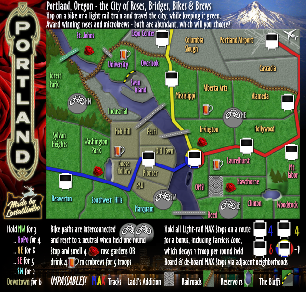
[bigimg]http://i134.photobucket.com/albums/q102/lostatlimbo/Portland_new21.png[/bigimg]
Re: Portland [6 AUG 2011] v.38 - Header & Swan Island fix, m
Posted: Wed Aug 10, 2011 8:55 pm
by lostatlimbo
flexmaster33 wrote:nice work limbo...this map looks better than most on the site...sounds like you're nearly approved. Thanks for sticking with it bud
Thanks flex. Unfortunately, I'm not sure that this will ever get approved. There will always be something else to fix. Even though I agree with most of the suggestions people make, its well past the point where anyone outside this topic is going to notice or appreciate the extra effort. Nearly three years into this thing (one since the major overhaul) and though the map looks great, it feels like it has been a waste of time. I'm not sure why some maps are held to different standards - maybe its based on community interest and there just isn't enough for this one.
I have some other map ideas I might develop. Hopefully they will see a better fate. Thanks for all the input and support.
Re: Portland [10 AUG 2011] v.39 - Drop Shadows & header font
Posted: Wed Aug 10, 2011 9:35 pm
by isaiah40
Well this looks good to me, so I'll have the other CA's take a peek at it and hopefully if everything goes well, I'll stamp this in a couple of days! So you can go ahead and start on the XML if you haven't already.

Re: Portland [10 AUG 2011] v.39 - Drop Shadows & header font
Posted: Wed Aug 10, 2011 9:43 pm
by natty dread
Come on limnbo, it will be stamped. It's not being kept here just to spite you... it's the same with all maps, all concerns need to be addressed. You should be happy that so many people are interested enough in your map that they give you feedback and tell you what needs to be fixed... If there were no interest for the map, you wouldn't be getting all this feedback.
So anyway, I think stamping is very near for this map. Just keep going, it will be worth it in the end.
Re: Portland [10 AUG 2011] v.39 - Drop Shadows & header font
Posted: Wed Aug 10, 2011 10:52 pm
by Victor Sullivan
I echo natty. I'm more of a gameplay sucker myself. Normally, I wouldn't be too fond of the idea of a Portland map, but what you've done with the gameplay is beautiful, and with the stunning graphics... I'm blown away! I hope this experience doesn't defer you from pursuing the construction of more maps. In my experience following map threads, the first time for a mapmaker is generally the longest.
-Sully
Re: Portland [10 AUG 2011] v.39 - Drop Shadows & header font
Posted: Thu Aug 11, 2011 2:52 am
by lostatlimbo
Thanks for the encouragement. Mostly the process has been fun and I've definitely learned a lot. I'm just eager to move on to the next step.
Re: Portland [10 AUG 2011] v.39 - Drop Shadows & header font
Posted: Thu Aug 11, 2011 3:06 am
by lostatlimbo
39th Draft Part III was playing around with the legend and I'm liking this layout a little better. Is it still clear?
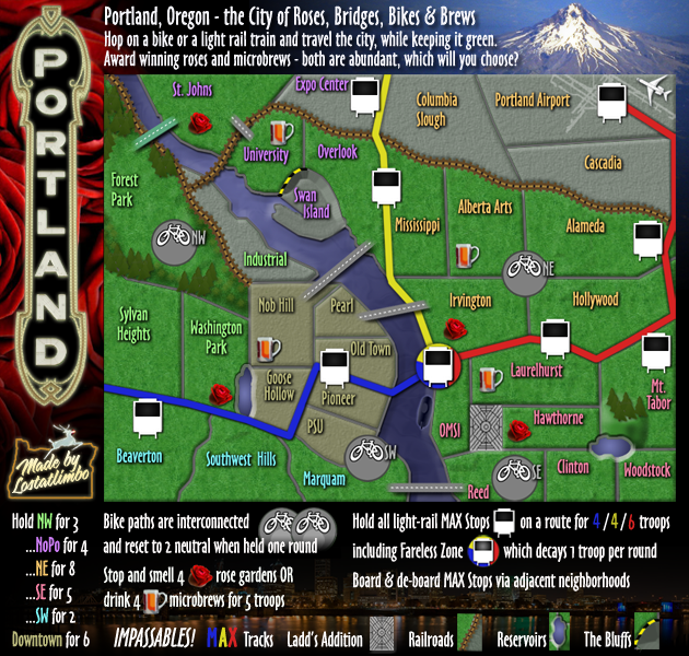
[bigimg]http://i134.photobucket.com/albums/q102/lostatlimbo/Portland_new22.png[/bigimg]
Re: Portland [10 AUG 2011] v.39 - Drop Shadows & header font
Posted: Thu Aug 11, 2011 3:43 am
by Victor Sullivan
In my experience, pictures are more effective than text, so I'd go with the previous version myself.
-Sully
Re: Portland [10 AUG 2011] v.39 - Drop Shadows & header font
Posted: Thu Aug 11, 2011 10:39 am
by AndyDufresne
Post a side by side of the two legends?
--Andy
Re: Portland [10 AUG 2011] v.39 - Drop Shadows & header font
Posted: Thu Aug 11, 2011 7:15 pm
by lostatlimbo
AndyDufresne wrote:Post a side by side of the two legends?
--Andy
Original post has both versions
viewtopic.php?f=241&t=70975
Re: Portland [10 AUG 2011] v.39 - Drop Shadows & header font
Posted: Thu Aug 11, 2011 8:04 pm
by isaiah40
I'm fine with either one, so let's use the previous one first and see what happens during Beta. if no one has any other concerns/comments then I'll get this stamped sometime tomorrow!
Re: Portland [10 AUG 2011] v.39 - Drop Shadows & header font
Posted: Fri Aug 12, 2011 9:27 pm
by lostatlimbo
isaiah40 wrote:I'm fine with either one, so let's use the previous one first and see what happens during Beta. if no one has any other concerns/comments then I'll get this stamped sometime tomorrow!
Sounds good!
Re: Portland [10 AUG 2011] v.39 - Drop Shadows & header font
Posted: Fri Aug 12, 2011 9:35 pm
by isaiah40
Since there are no other major concerns, I do hereby stamp this Made In Oregon!

Congratulations!!

Re: Portland [10 AUG 2011] v.39 - Drop Shadows & header font
Posted: Fri Aug 12, 2011 10:42 pm
by Seamus76
congrats lostatlimbo!!
Re: Portland [10 AUG 2011] v.39 - Drop Shadows & header font
Posted: Sat Aug 13, 2011 2:00 am
by flexmaster33
Re: Portland [10 AUG 2011] v.39 - Drop Shadows & header font
Posted: Sat Aug 13, 2011 4:00 am
by Victor Sullivan
Final Forge - finally! How does it feel, lostatlimbo?

-Sully