Page 13 of 16
Posted: Fri Sep 14, 2007 1:06 pm
by cairnswk
jako wrote:isnt it quench time yet?
he has small and large, adn the xml written up, the only probs lately has been those army shadow centering, adn that should be down already.
sorry jako and coleman, haven't quite finished the centering of army shadows yet, and hopefully this weekend will be able to put all that to rest.
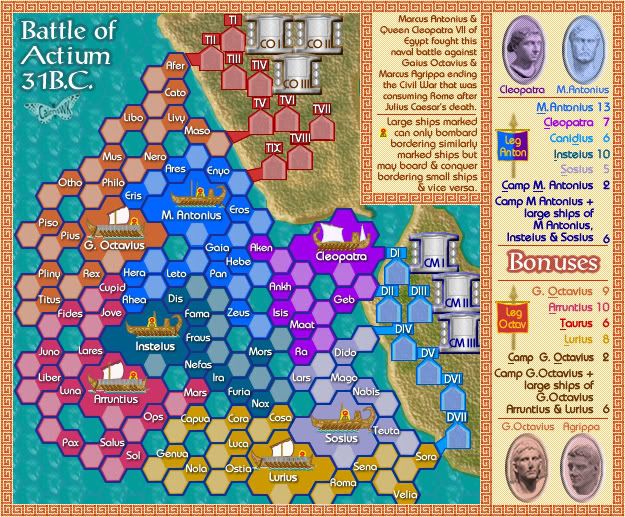
V26 Army Test Small
Posted: Fri Sep 14, 2007 9:29 pm
by cairnswk
Can Somebody check Army shadows please
v26 Small Test
Posted: Fri Sep 14, 2007 9:46 pm
by edbeard
Pliny, Rex, Ops, Casa are too low
Maat, Capua are too high
Lurius is too high as well but it's on the bottom of the map. might look weird if you moved any lower.
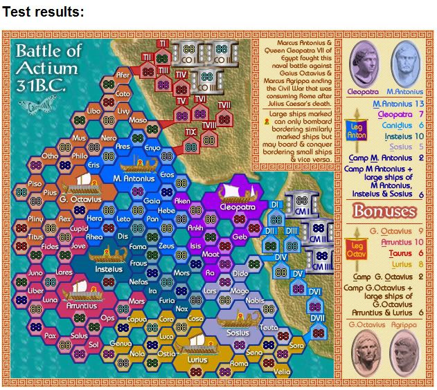
Posted: Sat Sep 15, 2007 3:52 am
by Wisse
the tens and the gray/metalic things are all good
orange bonus area:
libo is 1 px to high
maso is 1 px to far to the right
g. octavius, rex, pliny are 1px to low
blue bonus area:
ares is 1 px to far to the right
m. antonius is 1px to low
dark blue bonus area:
mors is 1 px to high
light blue bonus area:
no idea about that, can you post that area with another colour background or another colour army shade
yellow bonus area:
velia is 1 px to far to the left
cosa is 1px to low
cora, capua are 1 px to far to the right
purple bonus area:
aken is 1 px to far to the right
violet bonus area:
ops is 1px to low
i am 100% sure that are all the things (exept the light blue continent i can see that there is something wrong there but not wich ones are good and wich ones are wrong and why they are wrong so please change the background just for the test and then change it back
Posted: Sat Sep 15, 2007 3:55 am
by Wisse
edbeard wrote:Pliny, Rex, Ops, Casa are too low
Maat, Capua are too high
Lurius is too high as well but it's on the bottom of the map. might look weird if you moved any lower.
maat is on the right place
its not casa but cosa
and lurius is also good

i zoomed in so i know it for sure

Posted: Sat Sep 15, 2007 3:56 am
by edbeard
mars I meant. confused which one belonged where. might be mors I can't tell if it's an a or o and there's another with the simliar name so I don't know. but right next to the one I said before
Posted: Sat Sep 15, 2007 3:58 am
by cairnswk
edbeard wrote:Pliny, Rex, Ops, Casa are too low
Maat, Capua are too high
Lurius is too high as well but it's on the bottom of the map. might look weird if you moved any lower.
edbeard, thank you for looking that over.
I've fixed those in the same version 26 above...please refresh your browser to see the changes.
Posted: Sat Sep 15, 2007 3:58 am
by Wisse
edbeard wrote:mars I meant. confused which one belonged where
mars is also at the right place
Posted: Sat Sep 15, 2007 4:01 am
by edbeard
Wisse wrote:edbeard wrote:mars I meant. confused which one belonged where
mars is also at the right place
no you're looking at the wrong one. the one by maat is not in the right place.
and, cairns you need to move maat back to where it was before
Posted: Sat Sep 15, 2007 4:16 am
by Wisse
edbeard wrote:Wisse wrote:edbeard wrote:mars I meant. confused which one belonged where
mars is also at the right place
no you're looking at the wrong one. the one by maat is not in the right place.
and, cairns you need to move maat back to where it was before
then its mors not mars
Posted: Sat Sep 15, 2007 4:24 am
by cairnswk
Wisse wrote:the tens and the gray/metalic things are all good
orange bonus area:
libo is 1 px to high
maso is 1 px to far to the right
g. octavius, rex, pliny are 1px to low
blue bonus area:
ares is 1 px to far to the right
m. antonius is 1px to low
dark blue bonus area:
mors is 1 px to high
light blue bonus area:
no idea about that, can you post that area with another colour background or another colour army shade
yellow bonus area:
velia is 1 px to far to the left
cosa is 1px to low
cora, capua are 1 px to far to the right
purple bonus area:
aken is 1 px to far to the right
violet bonus area:
ops is 1px to low
i am 100% sure that are all the things (exept the light blue continent i can see that there is something wrong there but not wich ones are good and wich ones are wrong and why they are wrong so please change the background just for the test and then change it back
I have checked the blues, and they are all correct.
below is the latest update V26 on your take above....thanks Wisse.
Posted: Sat Sep 15, 2007 4:29 am
by edbeard
Maat needs to go back up 1 where it was originally before I mixed up the names earlier. Other than that I see nothing wrong
Posted: Sat Sep 15, 2007 4:36 am
by cairnswk
edbeard wrote:Maat needs to go back up 1 where it was originally before I mixed up the names earlier. Other than that I see nothing wrong
edbeard...refresh and that should be fixed above now. thanks.
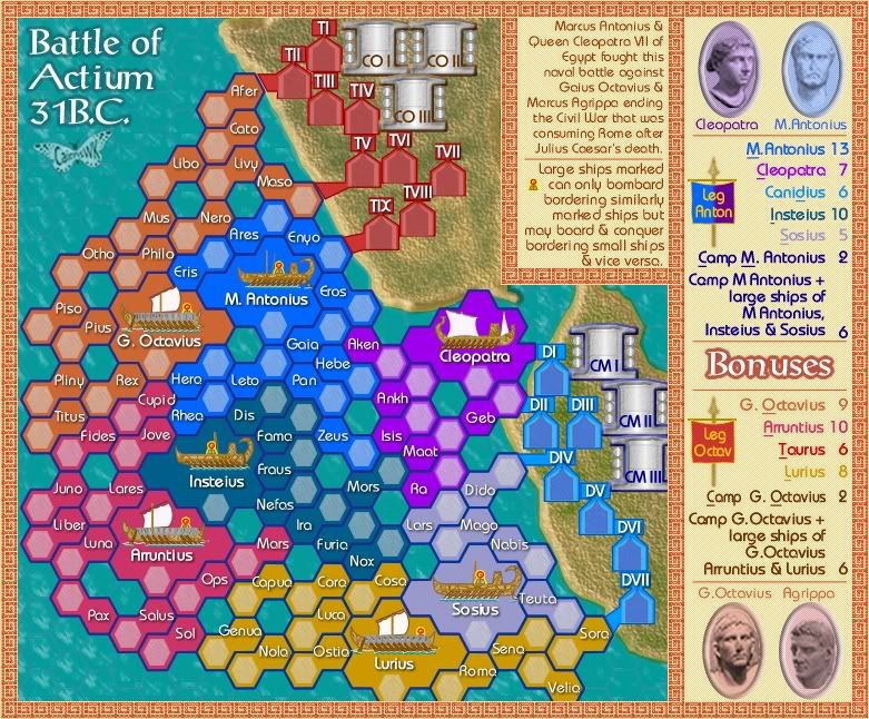
now onto the large version.
Posted: Sat Sep 15, 2007 4:40 am
by cairnswk
Proposed Change of Bonus
I want to propose a change to the extra bonus.
I was thinking that it might be better if rather than have the camp of each side, the extra bonus could include the opponent.
that is...for M Anotonius, rather than have the large ships of his team plus canidius, we had his large ships and G Ovtavius.
And the same for G Octavius...the bonus could include Cleopatra and the large do ships of G Octavius, Luris and Arruntius.
What do you think about that one?
Posted: Sat Sep 15, 2007 12:57 pm
by suggs
its about time somone brought him down a peg or two! Strip him of all is ill-gotten names, and lets just call him Gaius Octavius!
But what a brilliant idea for a map, wll done.
Suggius Twatius.
Posted: Sat Sep 15, 2007 10:01 pm
by cairnswk
suggs wrote:its about time somone brought him down a peg or two! Strip him of all is ill-gotten names, and lets just call him Gaius Octavius!
But what a brilliant idea for a map, wll done.
Suggius Twatius.
Thanks suggs...pleased you like it
Large and Small w/ armies
Posted: Sat Sep 15, 2007 10:03 pm
by cairnswk
Posted: Sat Sep 15, 2007 11:07 pm
by Unit_2
can you attack though the names of the territorys?
Posted: Sat Sep 15, 2007 11:11 pm
by cairnswk
Unit_2 wrote:can you attack though the names of the territorys?
how do you mean unit_2?
Posted: Sat Sep 15, 2007 11:32 pm
by Unit_2
the names of the territorys: like nax, can you attack though the name nax to get to cosa?
Posted: Sat Sep 15, 2007 11:56 pm
by edbeard
the territory consists of two parts: the name; the army shadow. So, anything that touches either of those is a bordering territory.
Posted: Sun Sep 16, 2007 12:33 am
by cairnswk
Unit_2 wrote:the names of the territorys: like nax, can you attack though the name nax to get to cosa?
yeah unit_2, much like edbeard says...each name and army shadow is contained within two joined hexes, that that has a thick blue border, so anything that borders that territory can attack it. the double hexes are meant to represent ships of course.
and i had a look at KevinC's tool for checking borders just a few hours ago, and I can teel you there are some quite large numbers of bordering terts on some of the inner ships.

Posted: Sun Sep 16, 2007 9:37 am
by Unit_2
ok, i just wasn't sure.
Posted: Sun Sep 16, 2007 1:15 pm
by unriggable
Only problem I see is COIII
Posted: Sun Sep 16, 2007 1:27 pm
by oaktown
cairnswk wrote:Unit_2 wrote:the names of the territorys: like nax, can you attack though the name nax to get to cosa?
yeah unit_2, much like edbeard says...each name and army shadow is contained within two joined hexes, that that has a thick blue border, so anything that borders that territory can attack it. the double hexes are meant to represent ships of course.
I see where Unit_2's confusion is coming from - the inner 'army hexagon' within each territory gives the impression that it is separate from the half with the title. It's especially confusing on the small map, where you can't always see the darker color around the army hex which makes it work with the name half.
This will take some getting used to during game play, and will probably lead to occasional misplacement.
The hexagons are certainly better than the circles back on page 15 (see, I'm learning to back-read

), but I'm wondering if this is a map that could get away with no army shadows at all? In general I'd say shadows are better for readability, but they could be a source of confusion here. Most of the colors are already more subtle than the army count colors, though some may need to be toned down a bit.