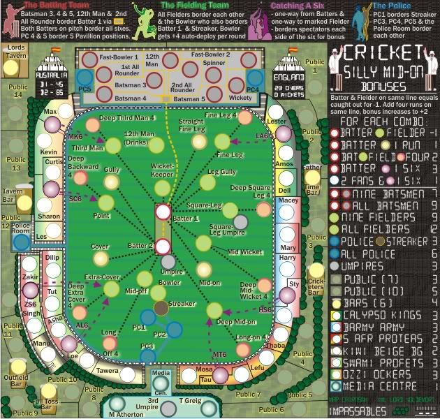
Just from the look of the map, I see a lot of blur, it's all over the map in colored lines, circles, and text. A lot of circles are really close together or close to territory names, there is going to be a major reordering that needs to go on in the batter's area and probably in the media center too, otherwise you'll never pass 888 xml test. Just some stuff to start you out on.
CRICKET: SILLY MID-ON
Moderator: Cartographers
Forum rules
Please read the Community Guidelines before posting.
Please read the Community Guidelines before posting.
-
RedBaron0

- Posts: 2657
- Joined: Sun Aug 19, 2007 12:59 pm
- Gender: Male
- Location: Pennsylvania
- Contact:
Re: CRICKET: SMO [D,GP]V17 (p17)
What part of the Foundry are we in again? 
 I dunno anything about cricket. I'll stick to baseball.
Just from the look of the map, I see a lot of blur, it's all over the map in colored lines, circles, and text. A lot of circles are really close together or close to territory names, there is going to be a major reordering that needs to go on in the batter's area and probably in the media center too, otherwise you'll never pass 888 xml test. Just some stuff to start you out on.
Just from the look of the map, I see a lot of blur, it's all over the map in colored lines, circles, and text. A lot of circles are really close together or close to territory names, there is going to be a major reordering that needs to go on in the batter's area and probably in the media center too, otherwise you'll never pass 888 xml test. Just some stuff to start you out on.


Re: CRICKET: SMO [D,GP]V17 (p17)
RedBaron0 wrote:What part of the Foundry are we in again?
Just from the look of the map, I see a lot of blur, it's all over the map in colored lines, circles, and text. A lot of circles are really close together or close to territory names, there is going to be a major reordering that needs to go on in the batter's area and probably in the media center too, otherwise you'll never pass 888 xml test. Just some stuff to start you out on.
OK RB0, thanks for that...working on it

* Pearl Harbour * Waterloo * Forbidden City * Jamaica * Pot Mosbi
-
RedBaron0
- Posts: 2657
- Joined: Sun Aug 19, 2007 12:59 pm
- Gender: Male
- Location: Pennsylvania
- Contact:
Re: CRICKET: SMO [D,GP]V17 (p17)
http://www.conquerclub.com/forum/viewtopic.php?f=127&t=109948
Based on the comments by cairns in this above thread, this map will go on vacation.... unless cairns changes his mind, of which I'll give a bit of time to hopefully happen.
Based on the comments by cairns in this above thread, this map will go on vacation.... unless cairns changes his mind, of which I'll give a bit of time to hopefully happen.
Re: CRICKET: SMO [D,GP]V18
RedBaron0 wrote:http://www.conquerclub.com/forum/viewtopic.php?f=127&t=109948
Based on the comments by cairns in this above thread, this map will go on vacation.... unless cairns changes his mind, of which I'll give a bit of time to hopefully happen.
cairns will stay until this map and Stalingrad are completed, while he waiting on Das SchloSS tweaks.
For now, so that Lord Voldemort can get the xml done. here is version 18 to see where changes have to be made for centering.
[bigimg]http://i155.photobucket.com/albums/s282/cairnswk/Silly_Mid-On/silly-mid-on-cricket_V18L.jpg[/bigimg]
* Pearl Harbour * Waterloo * Forbidden City * Jamaica * Pot Mosbi
-
Gypsys Kiss

- Posts: 1038
- Joined: Thu Apr 05, 2007 2:23 pm
- Gender: Male
- Location: In a darkened room, beyond the reach of Gods faith
-
RedBaron0
- Posts: 2657
- Joined: Sun Aug 19, 2007 12:59 pm
- Gender: Male
- Location: Pennsylvania
- Contact:
Re: CRICKET: SMO [D,GP]V17 (p17)
cairnswk wrote:cairns will stay until this map and Stalingrad are completed, while he waiting on Das SchloSS tweaks.
Sweetness!
Okay, couple things. The map is looking tons clearer!
Only a bit of blur remains around colored titles in the top legend, it might be on purpose, so it just might be me.
I'm not overly fond of the field texture, but then again I'm an American who is used the criss-cross patterns normally seen on a baseball field. I'd love to see some other opinions on this, but either way I think something that shows a little something more "grassy" might work a little better.
The purple army circles seem to be not filled in, the rings around the circles, you can kinda see the outlines but the color is missing. ZS6 looks to be filled in though.
The word "Father" in Father Time Bar is getting lost in the frothy head of the beer icon.
Are those flags normal Cricket flags on the top of the towers? They just look like the flag of Spain to me, Aussie and Brit flags would seem more appropriate, but again I'm not sure if that's the way it's supposed to be.
-
Gypsys Kiss
- Posts: 1038
- Joined: Thu Apr 05, 2007 2:23 pm
- Gender: Male
- Location: In a darkened room, beyond the reach of Gods faith
Re: CRICKET: SMO [D,GP]V17 (p17)
The flag is the MCC(Marylebone Cricket Club) flag. Also affectionately referred to as 'egg and bacon'.

Re: CRICKET: SMO [D,GP]V17 (p17)
RedBaron0 wrote:cairnswk wrote:cairns will stay until this map and Stalingrad are completed, while he waiting on Das SchloSS tweaks.
Sweetness!
Okay, couple things. The map is looking tons clearer!
Only a bit of blur remains around colored titles in the top legend, it might be on purpose, so it just might be me.
Yes...the colours are causing the blur. I don't think it's an issue.
I'm not overly fond of the field texture, but then again I'm an American who is used the criss-cross patterns normally seen on a baseball field. I'd love to see some other opinions on this, but either way I think something that shows a little something more "grassy" might work a little better.
This is the way the cricket field is mowed. In a straight up and down pattern. I've worked out how to widen the pattern, so it should look more realistic now.
The purple army circles seem to be not filled in, the rings around the circles, you can kinda see the outlines but the color is missing. ZS6 looks to be filled in though.
All the purple (6) army circles are the same. I've changed the underlying black around them so that it is now even.
The word "Father" in Father Time Bar is getting lost in the frothy head of the beer icon.
I've changed the lettering in those bars to be abbreviations, and in the xml i'll get Lord Voldemort to write them as
FTB1 - Father Time Bar
FTB2 - Full Toss Bar
OBar - Outfield Bar
CBar - Cricketer's Bar
TBar - Tavern Bar.
The position of the the bar army circles has also moved
Are those flags normal Cricket flags on the top of the towers? They just look like the flag of Spain to me, Aussie and Brit flags would seem more appropriate, but again I'm not sure if that's the way it's supposed to be.
At Lord Circket Ground, which is what this map is based on, you would see these (as already stated by Gypsys Kiss)
and in particular when an international match is in progress. I think they are quite representative of the field and very appropriate.
Version 19 below:

[bigimg]http://i155.photobucket.com/albums/s282/cairnswk/Silly_Mid-On/silly-mid-on-cricket_V19L-1.png[/bigimg]
Last edited by cairnswk on Sat Mar 13, 2010 7:12 pm, edited 1 time in total.
* Pearl Harbour * Waterloo * Forbidden City * Jamaica * Pot Mosbi
-
thenobodies80

- Posts: 5400
- Joined: Wed Sep 05, 2007 4:30 am
- Gender: Male
- Location: Milan
Re: CRICKET: SMO [D,GP]V19 (p19)
In the top legend, the batting team title. Can you increase the white of the text like the others.I think it will increase the readability.
I find very hard to see the police connections on the green, specially for PC1 and PC2, maybe try using the darker blue you've used for the circles ?
Credits are very hard to read.
I find very hard to see the police connections on the green, specially for PC1 and PC2, maybe try using the darker blue you've used for the circles ?
Credits are very hard to read.
Re: CRICKET: SMO [D,GP]V19 (p19)
thenobodies80 wrote:In the top legend, the batting team title. Can you increase the white of the text like the others.I think it will increase the readability.
I find very hard to see the police connections on the green, specially for PC1 and PC2, maybe try using the darker blue you've used for the circles ?
Credits are very hard to read.
Yes tnb80, i think this is occuring from the colour translations. I will replace the images above with the .png files.
Edit: That should be whole lot clearer now. Please F5 to see the changes.
* Pearl Harbour * Waterloo * Forbidden City * Jamaica * Pot Mosbi
-
thenobodies80
- Posts: 5400
- Joined: Wed Sep 05, 2007 4:30 am
- Gender: Male
- Location: Milan
Re: CRICKET: SMO [D,GP]V19 (p19)
Wow! much better! 
edit: A question, how attacks work for the media? Atherton can attack 3rd umpire and Greig?
edit: A question, how attacks work for the media?
Re: CRICKET: SMO [D,GP]V19 (p19)
thenobodies80 wrote:Wow! much better!
edit: A question, how attacks work for the media?
Yes. they're all within one area.
* Pearl Harbour * Waterloo * Forbidden City * Jamaica * Pot Mosbi
-
RedBaron0
- Posts: 2657
- Joined: Sun Aug 19, 2007 12:59 pm
- Gender: Male
- Location: Pennsylvania
- Contact:
Re: CRICKET: SMO [D,GP]V19 (p19)
Can we see a couple versions with numbers on the map and a vischeck, cairns?
Re: CRICKET: SMO [D,GP]V19 (p19)
RedBaron0 wrote:Can we see a couple versions with numbers on the map and a vischeck, cairns?
Here's the vischeck...Lord V has the xml in process and i am waiting on it.

* Pearl Harbour * Waterloo * Forbidden City * Jamaica * Pot Mosbi

Re: CRICKET: SMO [D,GP]V19 (p19)
Ha - I thought we'd moved your map to India for a minute!!
C.
C.

Highest score : 2297
Re: CRICKET: SMO [D,GP]V19 (p19)
yeti_c wrote:Ha - I thought we'd moved your map to India for a minute!!
C.
* Pearl Harbour * Waterloo * Forbidden City * Jamaica * Pot Mosbi
Re: CRICKET: SMO [D,GP]V20
OK, don't know if this is a good move or not.
I kinda liked the national colours on the fans, but they did nothing for the CB clarity.
So i've changed the colours to something more suitable, which gives a different and clearer CB map.
Still have to find a better colour for the batters, the yellow is not good for border determination.


I kinda liked the national colours on the fans, but they did nothing for the CB clarity.
So i've changed the colours to something more suitable, which gives a different and clearer CB map.
Still have to find a better colour for the batters, the yellow is not good for border determination.
* Pearl Harbour * Waterloo * Forbidden City * Jamaica * Pot Mosbi
-
natty dread

- Posts: 12877
- Joined: Fri Feb 08, 2008 8:58 pm
- Location: just plain fucked
Re: CRICKET: SMO [D,GP]V20 (p20)
I like the change. I never really liked the 2-colour gradients you had before, they made the map look kinda cheesy IMO.
Only, the yellow seems too bright for my taste. Doesn't really fit with the rest of the colours. I would desaturate that a bit.
Only, the yellow seems too bright for my taste. Doesn't really fit with the rest of the colours. I would desaturate that a bit.

Re: CRICKET: SMO [D,GP]V21
natty_dread wrote:I like the change. I never really liked the 2-colour gradients you had before, they made the map look kinda cheesy IMO.
Only, the yellow seems too bright for my taste. Doesn't really fit with the rest of the colours. I would desaturate that a bit.
How does this look?
Yellow desaturated....and batters given same colour as the top legend

* Pearl Harbour * Waterloo * Forbidden City * Jamaica * Pot Mosbi
-
natty dread
- Posts: 12877
- Joined: Fri Feb 08, 2008 8:58 pm
- Location: just plain fucked
Re: CRICKET: SMO [D,GP]V21 (p20)
The yellow is much better... The batters also look fine.
I'm not a huge fan of the fielders colour though, somehow that colour combination makes the circles look fuzzy...
I'm not a huge fan of the fielders colour though, somehow that colour combination makes the circles look fuzzy...

Re: CRICKET: SMO [D,GP]V21 (p20)
You may have desaturated the yellow a touch too far: it's not very different now from the Kiwi beige. Admittedly, they are quite separated in the stands, but a little more visual spread might be nice.
-
natty dread
- Posts: 12877
- Joined: Fri Feb 08, 2008 8:58 pm
- Location: just plain fucked
Re: CRICKET: SMO [D,GP]V21 (p20)
Hmm. Yes, ender has a point. They should be separated a bit more, colourwise.
Re: CRICKET: SMO [D,GP]V21 (p20)
ender516 wrote:You may have desaturated the yellow a touch too far: it's not very different now from the Kiwi beige. Admittedly, they are quite separated in the stands, but a little more visual spread might be nice.
natty_dread wrote:Hmm. Yes, ender has a point. They should be separated a bit more, colourwise.
OK, this should be better below.
natty_dread wrote:The yellow is much better... The batters also look fine.
I'm not a huge fan of the fielders colour though, somehow that colour combination makes the circles look fuzzy...
I don't think the colour combination makes the circles look fuzzy

* Pearl Harbour * Waterloo * Forbidden City * Jamaica * Pot Mosbi
Re: CRICKET: SMO [D,GP]V21 (p20)
If natty is a natural mapmaker then so is I ! 
* Pearl Harbour * Waterloo * Forbidden City * Jamaica * Pot Mosbi
-
natty dread
- Posts: 12877
- Joined: Fri Feb 08, 2008 8:58 pm
- Location: just plain fucked
Re: CRICKET: SMO [D,GP]V21 (p20)
Yes, this looks better w.r.t. the calypso kings. However... The batting team looks very similar to the s.afr. proteas. Perhaps change one of them slightly?
Also, the fielding team circles still look kinda fuzzy... not sure if it's the colour combination or just the JPG file format, but... well, I'm not really sure if it's an issue, you have lots of stuff on this map so obviously you'll be short on colours to use... Still, perhaps you could try a slightly different hue for the fielding team.
Of course you're a natural, cairns... but you don't have a long white beard to show for it