Page 12 of 22
Posted: Sat Feb 17, 2007 3:44 pm
by oaktown
back by popular demand: circles with depth!

Other changes:
- blue and purple lines are same color, both a light tan pulled from the board's center
- text rearranged; title larger, credit under title, key put together and droped down, killed the bit about the circles being spaces (obvious when you see army counts), and killed the outline around the title (key needs it to be readable in smaller print against background)
right now the circles are a color from the background, though a light shade to maintain some contrast. I could go all tan circles as EvilOtto suggested, but i thought I'd throw this out there first. Again, please ignore army counts being of-center.
If people like the general look of the circles, I can make the transition from the background color to the circles a bit smoother, but it's work that I won't do if these circles are not meant to be.
Posted: Sat Feb 17, 2007 3:46 pm
by Wisse
great! w00t

Posted: Sun Feb 18, 2007 3:31 pm
by oaktown
HELP! I've spent the last hour recording the coordinates of the center of every row and column of circles according to photoshop, and re-doing the XML so that there is no variation. Now the army counts are WAY off... everycount up above the circle and skewed toward the center horizontally. Does CC not figure coordinates from the edge of the map? If that's the case, the only way I can get them all right is by eye-balling them one at a time, which sucks. I seem to remember reading that somebody else was having the same problem, but I can't find it.
Anyway, here's the latest. No significant changes since the new 'depth' circles were dropped in, but the board has been sized slightly within the frame.

Posted: Sun Feb 18, 2007 3:34 pm
by narian
couldn't you just put lines connecting them to show they can atk each other?
Posted: Sun Feb 18, 2007 3:44 pm
by KEYOGI
Take 23 off the Y coordinate and add 3 to the X coordinate. I think that should do the trick.
Posted: Sun Feb 18, 2007 3:48 pm
by oaktown
KEYOGI wrote:Take 23 off the Y coordinate and add 3 to the X coordinate. I think that should do the trick.
thanks keyogi - that should work for the Y, but the X doesn't shift left or right, it shifts in, so that X-coordinates are increasingly off as you approach the edges. I'll have to do every column manually, then do it all again for the small map.

I imagine a fix on the site would require re-writing the XML for all of the existing maps. Bleh.
Posted: Sun Feb 18, 2007 3:51 pm
by KEYOGI
That is strange. Have fun!

Posted: Sun Feb 18, 2007 3:52 pm
by EvilOtto
oaktown wrote:If people like the general look of the circles, I can make the transition from the background color to the circles a bit smoother, but it's work that I won't do if these circles are not meant to be.
My preference is still no texture inside the circles, so they are smooth. A little color might be okay, but I think the texture just confuses the eye. You don't want the transition to be too smooth; there should be an edge there. Anyone agree/disagree?
Posted: Sun Feb 18, 2007 4:18 pm
by oaktown
EvilOtto wrote:My preference is still no texture inside the circles, so they are smooth. A little color might be okay, but I think the texture just confuses the eye. You don't want the transition to be too smooth; there should be an edge there. Anyone agree/disagree?
On the first version above the texture is lighter, which I do think worked better... without the texture I find it doesn't look like it's a part of the board, but an image floating above it (which is exactly what it is really). I guess it would jut be easier to show you...

Posted: Sun Feb 18, 2007 5:36 pm
by oaktown
KEYOGI wrote:Take 23 off the Y coordinate and add 3 to the X coordinate. I think that should do the trick.
Now that I'm working on it you have the right numbers keyogi... but you have to subtract 3 to X and add 23 to Y. Thanks!
Posted: Sun Feb 18, 2007 5:42 pm
by Gamera
I say textured circles all the way! It looks fake otherwise.
Posted: Sun Feb 18, 2007 5:56 pm
by Wisse
oaktown wrote:HELP! I've spent the last hour recording the coordinates of the center of every row and column of circles according to photoshop, and re-doing the XML so that there is no variation. Now the army counts are WAY off... everycount up above the circle and skewed toward the center horizontally. Does CC not figure coordinates from the edge of the map? If that's the case, the only way I can get them all right is by eye-balling them one at a time, which sucks. I seem to remember reading that somebody else was having the same problem, but I can't find it.
Anyway, here's the latest. No significant changes since the new 'depth' circles were dropped in, but the board has been sized slightly within the frame.

i love those shadows
Posted: Sun Feb 18, 2007 6:10 pm
by oaktown
OK, ironed out the coordinates issues. Would be much easier if the site didn't shift both X and Y axis, but whatever. I'd like to know if people prefer the image with the texture in the circles, or without. I don't want to bother polling this - I'll bow to the wishes of those of you who are good enough to check in regularly.
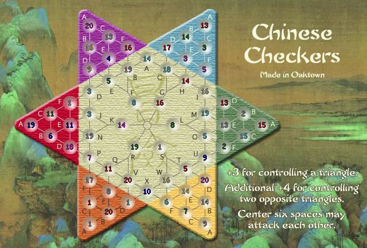
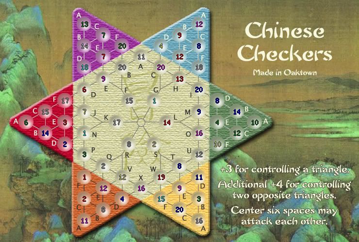
Option 1, light texture:

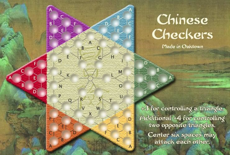
Option 2, without texture:

And what the hell, Option 3 with heavier texture:

Posted: Sun Feb 18, 2007 6:19 pm
by Gamera
Heavy or Light texture is fine by me. Perhaps Light is better so those who are hard of sight have a better chance of seeing clearly.
Posted: Sun Feb 18, 2007 6:25 pm
by narian
i think the heavy one looks the best
Posted: Sun Feb 18, 2007 6:39 pm
by KEYOGI
Light.
Posted: Sun Feb 18, 2007 7:01 pm
by Coleman
light

Posted: Sun Feb 18, 2007 8:58 pm
by oaktown
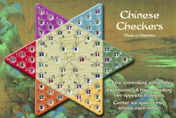
and if anybody's curious, here's the small map with the lighter textured circles. XML done, coordinates entered and I already see couple that are off. I've noticed all army counts are a bit to the right and maybe a pixel low (I blame the CC coordinate shift, maybe it's Y+22 and X-4), but I'm keeping it because that way the numbers hit the lighter part of the circles and are easier to read.

I've noticed some developers post their XML - I'll do so if anybody cares.
Posted: Sun Feb 18, 2007 11:31 pm
by sully800
Heavy looks alright, light looks better. No texture doesn't work in my opinion.
Posted: Mon Feb 19, 2007 12:35 am
by Captain Crash
Light texture IMO, but no texture just sux.

Posted: Mon Feb 19, 2007 1:39 am
by Sargentgeneral
heavy looks the best in my opinion, but i think you have to go with the light one for it has the best playability. You can see the numbers more clearly on that one.
Posted: Mon Feb 19, 2007 4:52 am
by Wisse
oaktown wrote:and if anybody's curious, here's the small map with the lighter textured circles. XML done, coordinates entered and I already see couple that are off. I've noticed all army counts are a bit to the right and maybe a pixel low (I blame the CC coordinate shift, maybe it's Y+22 and X-4), but I'm keeping it because that way the numbers hit the lighter part of the circles and are easier to read.

I've noticed some developers post their XML - I'll do so if anybody cares.
can you post also the tiny one with heavy texture? then i can make my opinion
Posted: Mon Feb 19, 2007 5:54 am
by yeti_c
Light Texture is best I think.
Posted: Mon Feb 19, 2007 9:56 am
by Enigma
ya, light looks the best.
im totally fine with this not being changed, but it looks like the circles are almost a little too large, especially evident in purple-A. there seems to be a little too much space to the upper left. maybe the edges could be blended into the background a little more? cuz the circles on light backgrounds, like the center ones, look wonderful.
if no1 else sees the need 4 this, however, dont bother

Posted: Mon Feb 19, 2007 12:52 pm
by oaktown
Enigma wrote:im totally fine with this not being changed, but it looks like the circles are almost a little too large, especially evident in purple-A. there seems to be a little too much space to the upper left. maybe the edges could be blended into the background a little more? cuz the circles on light backgrounds, like the center ones, look wonderful.
I tend to agree with you - not that the circles are too large, but that they need some blending. The trouble is, as EvilOtto indirectly pointed out, that the circles should remain distinct from the rest of the board, because there is no other way in which the territories/spaces are marked. It's not like a standard map with borders - if the army circles are too subtle, you can make out the territory itself.
Once I start blending the edges of the circles a bit to flow better with the board I can't alter other aspects of the circles without losing that blending work, so it'll be the last thing I do.
So, I'm definitely at that point in map creation where I feel pretty good about the product but I'm at the mercy of all of you. Other than the blending of the circles all of the problems I've had with the map have been addressed... tell me your problems with it and maybe we can get 'er done.
