Page 11 of 36
Posted: Mon Jun 18, 2007 4:07 am
by yeti_c
Cairns... this is how the new x of y stuff will work...
It was changed...
lackattack wrote:Collections / X of Y BonusInstead of introcuing a new <collections> tag how about adding a "required" (or "quantity"?) tag to <continent>, like this:
Code: Select all
<continent>
   <name>Any 4 Kings</name>
   <bonus>5</bonus>
   <components>
      <component>Red King</component>
      <component>Green King</component>
      <component>Blue King</component>
      <component>Purple King</component>
      <component>Yellow King</component>
   </components>
   <required>4</required>
</continent>
This will require a bit more XML but is more flexible and similar to what we already have.
Comments?Overruling continent bonusInstead of a <bestof> tag how about a set of <overrule>s, like this:
Code: Select all
<continent>
   <name>Any 4 Kings</name>
   <bonus>5</bonus>
   <components>
      <component>Red King</component>
      <component>Green King</component>
      <component>Blue King</component>
      <component>Purple King</component>
      <component>Yellow King</component>
   </components>
   <required>4</required>
   <overrules>
      <overrule>Any 2 Kings</overrule>
      <overrule>Any 3 Kings</overrule>
   </overrules>
</continent>
SO... what you need is the following...
Code: Select all
<continent>
   <name>Vals</name>
   <bonus>5</bonus>
   <components>
      <component>V1</component>
      <component>V2</component>
      <component>V3</component>
      <component>V4</component>
      <component>V5</component>
   </components>
   <overrules>
      <overrule>2 Vals</overrule>
      <overrule>4 Vals</overrule>
   </overrules>
</continent>

<continent>
   <name>4 Vals</name>
   <bonus>4</bonus>
   <components>
      <component>V1</component>
      <component>V2</component>
      <component>V3</component>
      <component>V4</component>
      <component>V5</component>
   </components>
   <required>4</required>
   <overrules>
      <overrule>2 Vals</overrule>
   </overrules>
</continent>

<continent>
   <name>2 Vals</name>
   <bonus>3</bonus>
   <components>
      <component>V1</component>
      <component>V2</component>
      <component>V3</component>
      <component>V4</component>
      <component>V5</component>
   </components>
   <required>2</required>
</continent>
OK?
C.
PS Indentation makes code a lot easier to read...
Posted: Mon Jun 18, 2007 4:21 am
by cairnswk
yeti_c wrote:Cairns... this is how the new x of y stuff will work...
It was changed...
lackattack wrote:Collections / X of Y BonusInstead of introcuing a new <collections> tag how about adding a "required" (or "quantity"?) tag to <continent>, like this:
Code: Select all
<continent>
   <name>Any 4 Kings</name>
   <bonus>5</bonus>
   <components>
      <component>Red King</component>
      <component>Green King</component>
      <component>Blue King</component>
      <component>Purple King</component>
      <component>Yellow King</component>
   </components>
   <required>4</required>
</continent>
This will require a bit more XML but is more flexible and similar to what we already have.
Comments?Overruling continent bonusInstead of a <bestof> tag how about a set of <overrule>s, like this:
Code: Select all
<continent>
   <name>Any 4 Kings</name>
   <bonus>5</bonus>
   <components>
      <component>Red King</component>
      <component>Green King</component>
      <component>Blue King</component>
      <component>Purple King</component>
      <component>Yellow King</component>
   </components>
   <required>4</required>
   <overrules>
      <overrule>Any 2 Kings</overrule>
      <overrule>Any 3 Kings</overrule>
   </overrules>
</continent>
SO... what you need is the following...
Code: Select all
<continent>
   <name>Vals</name>
   <bonus>5</bonus>
   <components>
      <component>V1</component>
      <component>V2</component>
      <component>V3</component>
      <component>V4</component>
      <component>V5</component>
   </components>
   <overrules>
      <overrule>2 Vals</overrule>
      <overrule>4 Vals</overrule>
   </overrules>
</continent>

<continent>
   <name>4 Vals</name>
   <bonus>4</bonus>
   <components>
      <component>V1</component>
      <component>V2</component>
      <component>V3</component>
      <component>V4</component>
      <component>V5</component>
   </components>
   <required>4</required>
   <overrules>
      <overrule>2 Vals</overrule>
   </overrules>
</continent>

<continent>
   <name>2 Vals</name>
   <bonus>3</bonus>
   <components>
      <component>V1</component>
      <component>V2</component>
      <component>V3</component>
      <component>V4</component>
      <component>V5</component>
   </components>
   <required>2</required>
</continent>
OK?
C.
PS Indentation makes code a lot easier to read...
Yeti_C...gracia...gracia...I understand. Yes i know about indentation but the copy/paste didn't keep it.

Posted: Mon Jun 18, 2007 4:27 am
by cairnswk
hulmey wrote:Make the bonus legend more steely and military like. At the moment it looks like your dreaded firework show which i personally dont find fitting to this map....
Also the bottom legend is very bright.....
Thanks hulmey....so far you're the only 'complainant' about the "fireworks show"
which Pearl Harbor was anyway, so i personally DO think it is most appropriate...and I am NOT in favour of steel/military thingys...i personally think they're boring, and I don't want my maps to look like all then other miltiary maps; I do like a bit of colour around....to make it more fun and less serious-serious.
The bottom legend i'll grant you is bright and that is up for change.

Posted: Mon Jun 18, 2007 4:29 am
by cairnswk
Wisse wrote:hulmey wrote:Make the bonus legend more steely and military like. At the moment it looks like your dreaded firework show which i personally dont find fitting to this map....
Also the bottom legend is very bright.....
hulm can you edit your sig? its much to big...
and cairns you forgot my post again
Wisse...no i hadn't forgotten your post....there is something coming to answer it soon.
Posted: Mon Jun 18, 2007 4:58 am
by yeti_c
cairnswk wrote:Yeti_C...gracia...gracia...I understand. Yes i know about indentation but the copy/paste didn't keep it.
No worries - and fair enough... CnP is rubbish sometimes!!
The most annoying thing is to get a tab into that - I had to CnP it from Lacks post - otherwise Tab takes you to the "Disable BBCode in this Post" checkbox!!!
C.
Poll for Attack Lines - ends 26 June 07
Posted: Mon Jun 18, 2007 3:08 pm
by cairnswk
POLL FOR ATTACK LINES
ENDS 26 JUNE 07
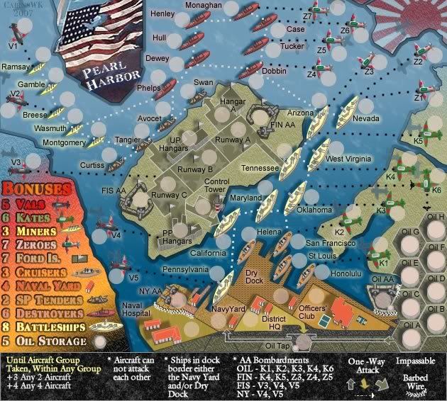
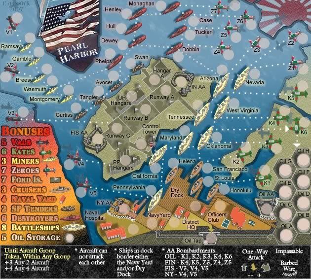
There seems to be some preferences out there for the colours of the attack lines on this map...so to make things democratic, there's a poll for majority rule.
My vote as cartograher will be for OPTION A
The options are as below:
OPTION A
Ships - light blue lines; planes - light blue double dashed lines

OPTION B
Ships - white squares; Planes - black thick dots
OPTION C
Ships - white squares; planes - white medium dots
OPTION D
Ships - solid light blue lines; planes - red dashed double lines

OPTION E
Ships - solid light blue lines; planes - thick yellow dots (carnival time)
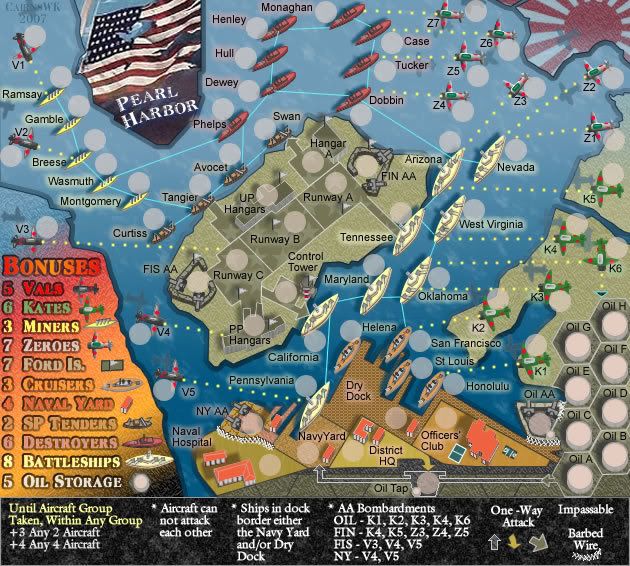
OPTION F
Ships - white squares; planes - single black dash lines

OPTION G
Ships - light blue squares; planes - single white dash lines

Posted: Mon Jun 18, 2007 3:14 pm
by onbekende
OPTION A's sea lines with OPTION G's air lines
just to make it you difficult
Posted: Mon Jun 18, 2007 3:31 pm
by Sparqs
I vote for: Option E
Ships - solid light blue lines; planes - thick yellow dots (carnival time)
Given the option, I would choose Ships - solid light blue lines; planes - thick light blue (or maybe red or black) dots.
Differentiating ships and planes by having lines for the ships and dots for the planes keeps things cleaner and clearer, to my eye. The double dashed lines look too jittery to me.
I suspect you are aware of this, but some one-way arrowheads are missing or odd in some of the option examples.
Posted: Mon Jun 18, 2007 3:36 pm
by cairnswk
Sparqs wrote:I suspect you are aware of this, but some one-way arrowheads are missing or odd in some of the option examples.
yes sparqs...al that will be fixed when the poll is done....for now all i want is an indication of the poll. Thanks
Posted: Tue Jun 19, 2007 3:04 am
by cairnswk
anyone voting on the above poll???
Posted: Tue Jun 19, 2007 3:10 am
by RobinJ
Either A or D. However, I prefer D because you have the contrast between the blue and the red. Definitely use solid lines for the boats and double-dashed for the planes though - makes it look like they are firing at the mainland (sort of).
Posted: Wed Jun 20, 2007 3:43 pm
by cairnswk
RobinJ wrote:Either A or D. However, I prefer D because you have the contrast between the blue and the red. Definitely use solid lines for the boats and double-dashed for the planes though - makes it look like they are firing at the mainland (sort of).
Thanks RobinJ for your input

Common people...some more votes for your preferences please!
Posted: Thu Jun 21, 2007 12:53 pm
by cairnswk
anymore votes fir prefrences here?
Posted: Thu Jun 21, 2007 12:56 pm
by nagerous
A, D and E are the best.
Posted: Thu Jun 21, 2007 4:49 pm
by hulmey
i like option a and d.....Good stuff Cairns
Posted: Thu Jun 21, 2007 8:04 pm
by ritz627
Option B seems to be a bit easier on the eyes.
Posted: Fri Jun 22, 2007 12:37 pm
by cairnswk
anymore votes?
Posted: Fri Jun 22, 2007 10:49 pm
by AndyDufresne
All of them hurt my eyes and make me sick, but I think I like E more than the others, but barely. All the attack lines always make me stray away from posting in this thread, it seems like! Eep.
--Andy
Posted: Sat Jun 23, 2007 5:54 am
by Ruben Cassar
Cairns this map looks great and it has a lot of potential, but personally I find it too busy and too complicated. Is this what you are aiming for or would you consider simplifying it and reducing some of the territories to make it clearer?
Please note that this is just a personal opinion.
Posted: Sat Jun 23, 2007 7:21 pm
by cairnswk
Ruben Cassar wrote:Cairns this map looks great and it has a lot of potential, but personally I find it too busy and too complicated. Is this what you are aiming for or would you consider simplifying it and reducing some of the territories to make it clearer?
Please note that this is just a personal opinion.
Thanks Ruben....Yes it is busy...comes with the territory unfortunately...but i am considering options, so i haven't finalised things yet. I think there is a long way to go with this one, but i don't want to reduce it to the ordinary risk style map....i would like to have it as something very different.
Posted: Sat Jun 23, 2007 7:47 pm
by AndyDufresne
As Ruben pointed out, the busyness of the current options I think will turn down some people. But I'm not sure how you can overcome it, while trying to stay true to the idea you have. Hm,
Perhaps if you went with some sort of grid scheme...where the planes in a grid could attack the boats in a grid (I.E. they'd be in range to attack only those boats). But even that...wouldn't quite be like what you have on the map, as certain planes have certain attack routes on the current map. The grid idea would make it a bit more random...but perhaps like war?
--Andy
Posted: Sat Jun 23, 2007 8:03 pm
by cairnswk
AndyDufresne wrote:As Ruben pointed out, the busyness of the current options I think will turn down some people. But I'm not sure how you can overcome it, while trying to stay true to the idea you have. Hm,
Perhaps if you went with some sort of grid scheme...where the planes in a grid could attack the boats in a grid (I.E. they'd be in range to attack only those boats). But even that...wouldn't quite be like what you have on the map, as certain planes have certain attack routes on the current map. The grid idea would make it a bit more random...but perhaps like war?
--Andy
Well, thanks Andy...appreciated...that's food for thought...but this is gonna be difficult. I think also, some of the busyness is created by shadows...while it looks realistic...it certainly adds another 18 element to the design. Hmmm..
I kinda like the grid idea, but then that too is putting a whole lot of extra lines on the map, and may end up being worse if you know what i mean. I guess i might have to try it....but not this week as that poll it still finishing....and i'll see what others have to say...there is bound to be a ot of feedback on this matter.
Posted: Sat Jun 23, 2007 8:06 pm
by edbeard
I still say that one type of attack line is better. Sorry cairns I probably said this like 5 times, but I think one uniform line will cut down on the "busy" problem
Posted: Sun Jun 24, 2007 12:32 am
by hulmey
No it was already busy befoer that. This map is a busy map. There is no way of getting around it...
The different attack lines help identify alot better which attacks which!!!
Posted: Sun Jun 24, 2007 1:39 am
by edbeard
I totally disagree. The version on page 3, version 3 I think, was the best. All solid lines, easy to tell what attacked what. yes, the current version has quite a few more attacks, but I'd like to see those lines on this verison