Page 11 of 28
Posted: Sun Feb 25, 2007 2:29 pm
by AndyDufresne
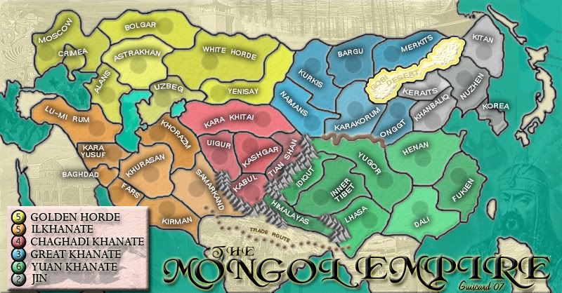
Is that a snake on the map?

--Andy
Posted: Sun Feb 25, 2007 3:32 pm
by Qwert
No Andy its a snake wall
Posted: Sun Feb 25, 2007 4:37 pm
by Guiscard
Ok. Bit thicker and a bit darker...
Posted: Sun Feb 25, 2007 5:07 pm
by fisherman5
looks good
Posted: Sun Feb 25, 2007 5:13 pm
by KEYOGI
I'm still of the opinion it needs to be of the same perspective as the mountains. What you have really doesn't fit with the rest of the map. It's such a great looking map, it's just this wall holding it back.
Posted: Sun Feb 25, 2007 5:21 pm
by Guiscard
I know... I just can't do it! I'd be happy to send someone the photoshop file if they wanted to have a crack... I just can't get it right at the moment. Its driving me insane because this is the last major hurdle (in my opinion).
Posted: Sun Feb 25, 2007 5:24 pm
by Contrickster
A thin, white/cream line would minimise the perspective problem and the graphic problem.
Posted: Sun Feb 25, 2007 5:39 pm
by happysadfun

If you use just the front, get rid of the rest, and lighten it a bit, it could work if you copy and paste it and edit it a bit.
Posted: Sun Feb 25, 2007 6:58 pm
by cairnswk
Guiscard, great Map...very professional, and I look forward to playing it.
For the wall, even though it is crude are u after something like this...


PLEASE LEAVE YOUR VOTE AND OPINION - GREAT BARRIER REEF
 http://www.conquerclub.com/forum/viewtopic.php?t=13702
Posted: Sun Feb 25, 2007 7:05 pm
by Guiscard
Yeh very much after something like that... Just can't get it right graphically drawing it myself, nor can I find a suitable image to use.
Posted: Sun Feb 25, 2007 7:12 pm
by KEYOGI
cairnswk wrote:
Something like that would be ideal.
Posted: Sun Feb 25, 2007 7:25 pm
by cairnswk
That was a five minute job in Fireworks...friend of mine just returned from walking the Great Wall, and sent me some photos, so I kinda know what it looks like.
What program are you developing the map in, Guiscard, Photoshop?
Posted: Mon Feb 26, 2007 8:58 am
by ViscountGort
KEYOGI wrote:cairnswk wrote:
Something like that would be ideal.
I absolutely agree - this is exactly what's needed. Nice one cairnswk.
Posted: Mon Feb 26, 2007 10:13 pm
by Guiscard
Yeh photoshop... I'll have a crack tonight.
Posted: Mon Feb 26, 2007 11:04 pm
by Guiscard
OK here's my effort at a new '3d' style wall...

Any good?
Posted: Mon Feb 26, 2007 11:23 pm
by Guiscard
Andy I know you're lurking around somewhere...

Posted: Mon Feb 26, 2007 11:32 pm
by AndyDufresne
**Sneaks in...but sneaks away.**
--Andy
Posted: Tue Feb 27, 2007 12:27 am
by KEYOGI
Can you take some of the "shine" off it? Seems a little bright.
Posted: Tue Feb 27, 2007 8:48 am
by Contrickster
I agree it's blurry. Walls are hard.
Posted: Tue Feb 27, 2007 9:12 am
by Ruben Cassar
I like this wall better. I agree with the others though, remove that glow.
I would also try to include another tower in Karakorum in the middle between the first and second tower and see how it looks if it's not a big hassle.
Posted: Tue Feb 27, 2007 9:16 am
by Wisse
the wall looks good to me, remove the glow or make it less
Posted: Tue Feb 27, 2007 9:36 am
by Guiscard
Less glow and tried to make it look 'harder', also added a middle tower.

Posted: Tue Feb 27, 2007 9:48 am
by Wisse
hmm mayby blur it?
Posted: Tue Feb 27, 2007 12:32 pm
by Arcanos
i personally liked the brown wall better
Posted: Tue Feb 27, 2007 12:57 pm
by Guiscard
The colour can be changed, its more the actual graphic - this one is a better perspective in my opinion... Also looks reasonably 'run down', as the great wall was at the time.