Page 2 of 39
Posted: Tue Dec 04, 2007 3:30 pm
by Optimus Prime
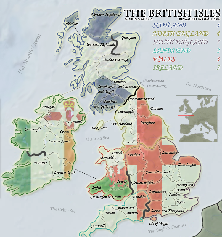
Don't like the flags....AT ALL! Just doesn't look good to me, the idea is original, but the flags just look silly to me.
Posted: Tue Dec 04, 2007 3:30 pm
by gimil
TODO LIST:
-XML modification
-Reduce dead space at the top of map
-Make unpassables pretty

-Begin small version
-Get moved to main foundry.
Posted: Tue Dec 04, 2007 3:35 pm
by gimil
Optimus Prime wrote:Don't like the flags....AT ALL! Just doesn't look good to me, the idea is original, but the flags just look silly to me.
whats wrong with them? to strong? dont fit your taste?
Posted: Tue Dec 04, 2007 3:36 pm
by Nephilim
i think it looks great, dude
helluva job
Posted: Tue Dec 04, 2007 3:41 pm
by khazalid
ja very nice. make the white on the saltire a little thinner maybe.
Posted: Tue Dec 04, 2007 3:42 pm
by spinwizard
gimil wrote:Optimus Prime wrote:Don't like the flags....AT ALL! Just doesn't look good to me, the idea is original, but the flags just look silly to me.
whats wrong with them? to strong? dont fit your taste?
Both for me, add to that too distracting and I was gunna use them on my map

Posted: Tue Dec 04, 2007 3:43 pm
by gimil
spinwizard wrote:gimil wrote:Optimus Prime wrote:Don't like the flags....AT ALL! Just doesn't look good to me, the idea is original, but the flags just look silly to me.
whats wrong with them? to strong? dont fit your taste?
Both for me, add to that too distracting and I was gunna use them on my map
well thats tuff for you aint it
Posted: Tue Dec 04, 2007 3:56 pm
by spinwizard
gimil wrote:spinwizard wrote:gimil wrote:Optimus Prime wrote:Don't like the flags....AT ALL! Just doesn't look good to me, the idea is original, but the flags just look silly to me.
whats wrong with them? to strong? dont fit your taste?
Both for me, add to that too distracting and I was gunna use them on my map
well thats tuff for you aint it
I guess so!

Posted: Tue Dec 04, 2007 3:57 pm
by yeti_c
spinwizard wrote:gimil wrote:spinwizard wrote:gimil wrote:Optimus Prime wrote:Don't like the flags....AT ALL! Just doesn't look good to me, the idea is original, but the flags just look silly to me.
whats wrong with them? to strong? dont fit your taste?
Both for me, add to that too distracting and I was gunna use them on my map
well thats tuff for you aint it
I guess so!
I think the flags are great...
C.
Posted: Tue Dec 04, 2007 4:03 pm
by The1exile
Some spelling issues:
-"Linconshire" --> "Lincolnshire"
-"Donegol" --> "Donegal"
-"Dorest" --> "Dorset"
-"Lothian and Boarders" --> "Lothian and Borders"
-"Glamongan" --> "Glamorgan"
-"Westmoreland" --> "Westmorland"
Also, if that's an ampersand in south wales, consider using it consistently as a replacement for and (scotland).
Posted: Tue Dec 04, 2007 4:22 pm
by Optimus Prime
gimil wrote:Optimus Prime wrote:Don't like the flags....AT ALL! Just doesn't look good to me, the idea is original, but the flags just look silly to me.
whats wrong with them? to strong? dont fit your taste?
I think they are a little too bold, perhaps fading them some would help, but I would have to see it. Overall, it just makes the map too busy. Part of the appeal for the other one was that there wasn't too much that distracted you when playing the game.
I personally would like to see it done similar to the current version just with a more updated feel, but not adding all sorts of extra images and things.
That's just me though.
Posted: Tue Dec 04, 2007 4:23 pm
by Optimus Prime
Also, the double-line borders between the continents just look awkward to me. They don't seem to match up very well.
Posted: Tue Dec 04, 2007 5:04 pm
by whitestazn88
i just feel like its too much...
Posted: Tue Dec 04, 2007 5:13 pm
by Jesse710
I like it

Posted: Tue Dec 04, 2007 5:30 pm
by MeDeFe
What happened to Cork and Kerry? Those are my favourite territories on the BI map.
Also, the impassable dividers look ugly, try some mountains.
Posted: Tue Dec 04, 2007 5:39 pm
by gimil
MeDeFe wrote:What happened to Cork and Kerry? Those are my favourite territories on the BI map.
Also, the impassable dividers look ugly, try some mountains.
The impassables are still under going work like i mentioned. . . .
and the terr names have been changed to make the map more geographically correct. But the gameplay is still the same.
Posted: Tue Dec 04, 2007 5:48 pm
by gimil
Next updates TODO LIST:
-XML modification
-Reduce dead space at the top of map
-Make unpassables pretty
-Begin small version
-Get moved to main foundry.
-"Linconshire" --> "Lincolnshire"
-"Donegol" --> "Donegal"
-"Dorest" --> "Dorset"
-"Lothian and Boarders" --> "Lothian and Borders"
-"Glamongan" --> "Glamorgan"
-"Westmoreland" --> "Westmorland"
-Replace ampersand with "and"
-Tidy up doubles boarders
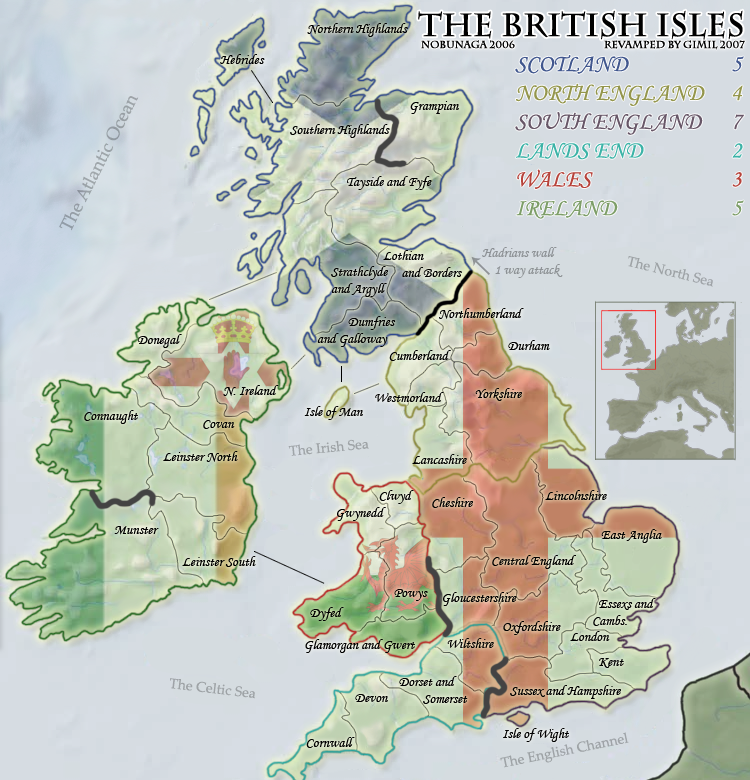
-reduce the flags opacity
Posted: Tue Dec 04, 2007 6:37 pm
by benjikat
More spelling errors (I think there were more wrong than right to start with
):
Lothian and Borders
Glamorgan and Gwent
I don't like "Central England" as a territory - maybe change that plus Lincolnshire into "West Midlands" and "East Midlands" with their correct borders, which wouldn't affect the gameplay.
Technically "The British Isles" includes the Channel Islands as well as the Orknies and Shetlands - but as this is a revamp I guess they are quite hard to include.
Posted: Tue Dec 04, 2007 11:45 pm
by gimil
TODO LIST:
-XML modification
-Make unpassables pretty Wink
-Begin small version
-Get moved to main foundry
Posted: Tue Dec 04, 2007 11:48 pm
by Coleman
Have you tried coloring in the continents and then making the flags be a watermark inside?
Also congrats on figuring out my checklist to get moved.
Posted: Tue Dec 04, 2007 11:54 pm
by gimil
Coleman wrote:Have you tried coloring in the continents and then making the flags be a watermark inside?
I like the subtle geographic background i have going on atm. Without it everything is flat and would require more artificial textures. Something i dont really want.
Coleman wrote:Also congrats on figuring out my checklist to get moved.
Done it all by myself
Posted: Tue Dec 04, 2007 11:55 pm
by gimil
p.s. is it safe to mark this as an [OFFICIAL] revamp thread?
Posted: Tue Dec 04, 2007 11:57 pm
by Coleman
There has been demand, the author showed up to ask, you persued it and recieved direct permission. If he wanted there to be a contest he made no mention of it. You are the official revamp artist, much like how the Brazil revamp went.
Posted: Tue Dec 04, 2007 11:58 pm
by gimil
Coleman wrote:There has been demand, the author showed up to ask, you persued it and recieved direct permission. If he wanted there to be a contest he made no mention of it. You are the official revamp artist, much like how the Brazil revamp went.
Sounds good to me, jsut needed the official word
EDIT: doesnt that look better
Posted: Wed Dec 05, 2007 1:00 am
by wicked
I really don't like the country flags as is. Not sure how to fix it, but I'd rather play the current map than that one (and I've played this map alot).
Also, can you change the text of the oceans? Looks like they were just thrown on there.