Page 2 of 11
Posted: Tue Mar 20, 2007 6:58 pm
by CaptainPlanet
Wisse wrote:CaptainPlanet wrote:Wisse wrote:PimpCaneYoAss wrote:I plan on getting a new version up in a few days to help with the names and maybe add more territories. Please keep the feed back coming.
frist ask jagex for copyrights or you are doig things for nothing
He already asked Jagex and is now waiting for a reply
ok
I was just saying that because you told Pimp to ask Jagex before doing anything, when he already said he asked them, which made you sound ignorant.
Posted: Tue Mar 20, 2007 7:28 pm
by PimpCaneYoAss
I feel the map is way to "boxy". It does not flow. Does the map need to be this way? I have never played Runescape so I do not know what the map looks like. Could you take the idea from the game and morph the map into a better, more organic looking map (Middle Earth, Tamriel)?
Well the map tries to portray cities/developments in the actual game. I attempted to use natural borders such as rivers and city walls to divide the territories. I see what you are saying though. I'll take that into consideration when i revise it.
Posted: Fri Mar 23, 2007 9:49 pm
by PimpCaneYoAss
MAP UPDATED ON 3/23/07
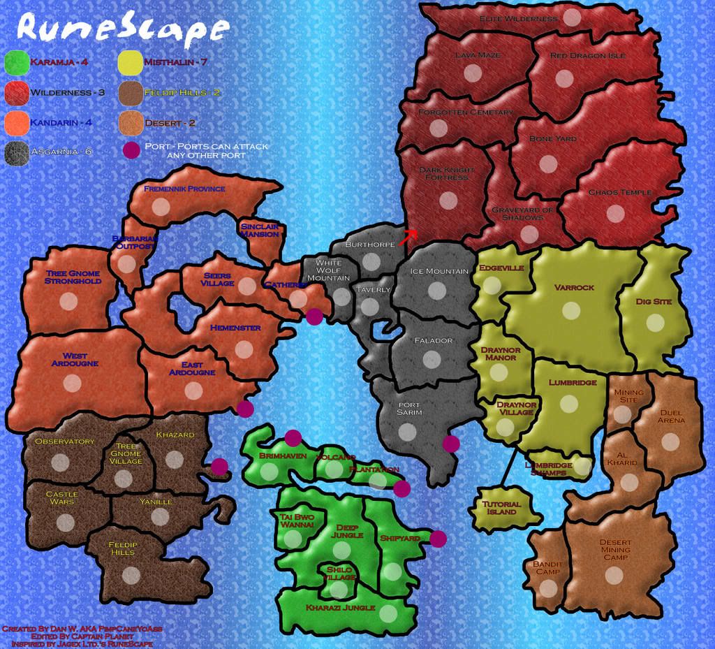
Changes
-Changed colors and added Fremennick Provine
-Added army circles
Still no word from Jagex though >_<
Posted: Sat Mar 24, 2007 2:02 am
by Samus
I have no idea if you'll ever get the go ahead anyway, but you are required to make 2 different sized maps, one 600px wide and one 800px wide. The image you have is 1024, so give it the ol' shrink ray.
More advice when I'm a little more convinced this won't be officially squashed anyway.
Posted: Sat Mar 24, 2007 2:32 am
by Wisse
PimpCaneYoAss wrote:MAP UPDATED
Still no word from Jagex though >_<
i can sent a message to them trough the system, should i do that?
Posted: Sat Mar 24, 2007 11:29 am
by PimpCaneYoAss
I was looking at the shrunken down version of the map last night and i realized that the words would have to be bigger and some other minor changes. Im going to try and get those down within the next week.
Also, about the Jagex copyright issue, sent them an email asking permission to use their map and submit it to Conquer Club. They have yet to responded. Hopefully I can get the email soon so I can see if I should continue.
Posted: Sat Mar 24, 2007 3:28 pm
by Wisse
i sented a message via my old runescape account:
-------------
Dear Jagex
I wanted to ask something
we want to make a map of runescape on
http://www.conquerclub.com (an online risk game) we wanted to ask you if we could use the world map to make the map (you can't see later that we used your map if you see the new map because we change somethings in it and change the graphics and make it playable for risk)
can we get your premission? (because it is copyrighted)
-----------
Posted: Sat Mar 24, 2007 3:50 pm
by boberz
would it help if a few of us that have accounts abandoned or not send a message or does that seem bad
Posted: Sat Mar 24, 2007 4:18 pm
by Wisse
boberz wrote:would it help if a few of us that have accounts abandoned or not send a message or does that seem bad
i think i will have an reaction tommorow as always, so i don't think it wil be needed

Posted: Sat Mar 24, 2007 5:40 pm
by joeyjordison
god this brings back memories of when i used to play. that was ages ago. i wasted so much time hitting rocks and all that crap. apparently they hav had a big graphics update so it now looks 3d.
Posted: Sat Mar 24, 2007 5:42 pm
by Wisse
joeyjordison wrote:god this brings back memories of when i used to play. that was ages ago. i wasted so much time hitting rocks and all that crap. apparently they hav had a big graphics update so it now looks 3d.
you mean classic, i never could play that one, if you hadn't already have a acc you couldn't play it anymore
Posted: Sat Mar 24, 2007 6:51 pm
by PimpCaneYoAss
Thanks for the help Wisse
I hope that they could let us know soon so that I could continue with the XML and making it smaller. Keep up the suggestions to make it better.
Posted: Sat Mar 24, 2007 8:01 pm
by PimpCaneYoAss
MAP UPDATED ON 3/24/07
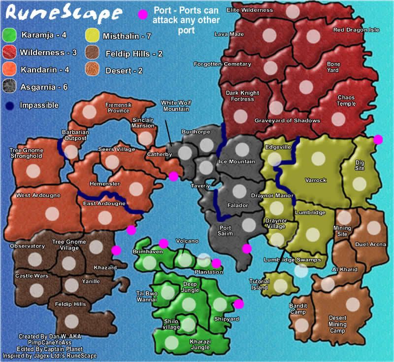

Changes
-Resized to meet Large Map criteria and Small Map criteria
-Added a new port on Dig Site
-Added impassible rivers
I playtested the map today too. I found that the bonuses for Kandarin and Karamja need to be increased. Keep helping with the comments, suggestions, and any feedback. Thanks.
Posted: Sun Mar 25, 2007 12:21 am
by PimpCaneYoAss
I added coordinates...a little off center which could easily be fixed...after Jagex responds lol
Posted: Sun Mar 25, 2007 12:23 am
by Unit_2
hey dude, all you have to do is change the names and jagex can't do a thing about it.. and i like it, its very cool
Posted: Sun Mar 25, 2007 3:56 am
by Wisse
Unit_2 wrote:hey dude, all you have to do is change the names and jagex can't do a thing about it.. and i like it, its very cool
nope thaths not how it works...
Posted: Sun Mar 25, 2007 11:37 am
by AndyDufresne
Psst, I'm still not sold on the idea, even if you get a green light. It has no appeal to me.
--Andy
Posted: Sun Mar 25, 2007 2:33 pm
by PimpCaneYoAss
UPDATED 3/25/07

Changes
-Added coordinates (recentered them)
Andy,
Is there specifically anything I can do to help make this map more favorable?
Keep the input coming.
Posted: Sun Mar 25, 2007 3:51 pm
by PimpCaneYoAss
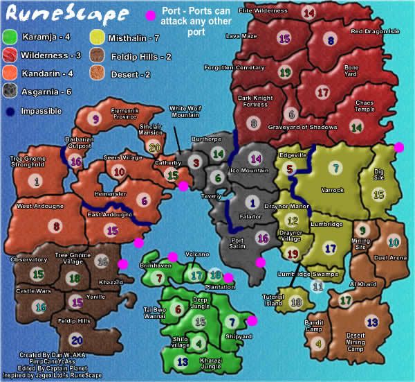
Bonus improvements?
-Asgarnia 5
-Kandarin 5
-Feldip Hills 3
-Karamja 5
How does that sound? Comments?
Posted: Sun Mar 25, 2007 4:28 pm
by Samus
The general order of work tends to go:
1. Getting the basic graphical outlay/feel
*At all times after this alterations to the graphics.
2. Major changes in regions/borders/gameplay
3. Minor tweaks in regions/borders/gameplay
4. Work out bonuses
5. Discuss with the community/Andy over graphical decisions
6. Final graphical touches
7. XML
You've got an extra step before 1 even, get permission to use the map. But even after that, you're a long way from fixing the bonuses, since the regions will probably go through drastic changes anyway.
For now the biggest things I can tell you are that the most recent update should be the very first image on the first post, going older until the oldest is at the bottom. You don't need every single update between the original and the newest, just so that you can see the progression. Also, you need to post the new image in a new post, so that people can see previous comments and how the map has developed based on them.
Also, I can only assume that the borders and pink dots for ports are only temporary. People will not take your map seriously if it looks like you just drew stuff in MS paint. Foundry standards are very high now, your map needs to look better than at least a third of the maps currently in play just to start with before most of the Foundry community will deem it good enough to grant further assistance.
Posted: Sun Mar 25, 2007 4:47 pm
by wrightfan123
The... retardedness... overwhelms me... it's too... strong!
Posted: Sun Mar 25, 2007 6:54 pm
by PimpCaneYoAss
Wrightfan123
The...retarderness of your message...overwhelms me. Is there anything constructive you can say so that maybe I can improve it instead of just saying that my map is slow.
Posted: Mon Mar 26, 2007 6:29 pm
by PimpCaneYoAss
Samus wrote:The general order of work tends to go:
1. Getting the basic graphical outlay/feel
*At all times after this alterations to the graphics.
2. Major changes in regions/borders/gameplay
3. Minor tweaks in regions/borders/gameplay
4. Work out bonuses
5. Discuss with the community/Andy over graphical decisions
6. Final graphical touches
7. XML
You've got an extra step before 1 even, get permission to use the map. But even after that, you're a long way from fixing the bonuses, since the regions will probably go through drastic changes anyway.
For now the biggest things I can tell you are that the most recent update should be the very first image on the first post, going older until the oldest is at the bottom. You don't need every single update between the original and the newest, just so that you can see the progression. Also, you need to post the new image in a new post, so that people can see previous comments and how the map has developed based on them.
Also, I can only assume that the borders and pink dots for ports are only temporary. People will not take your map seriously if it looks like you just drew stuff in MS paint. Foundry standards are very high now, your map needs to look better than at least a third of the maps currently in play just to start with before most of the Foundry community will deem it good enough to grant further assistance.
First thing: Your suggested steps
I agree however sometimes changes to the borders will affect the bonuses and vice versa. Right now i feel we are on setp 2. However, I need more "positive" input from people like you to let me know what to change. As I said before, I playtested this map and it seemed well. I added some impassible objects and questioned the bonuses.
Second thing: Posts within Topic
Fixed. I moved the maps to their respective locations chronologically.
Third thing: Ports
I agree. It was a temporary and simple icon. I will add something else when the time comes. i was also thinking of just adding port to the country name.
Thanks for all the help.
Posted: Mon Mar 26, 2007 9:34 pm
by PimpCaneYoAss
NEW UPDATE
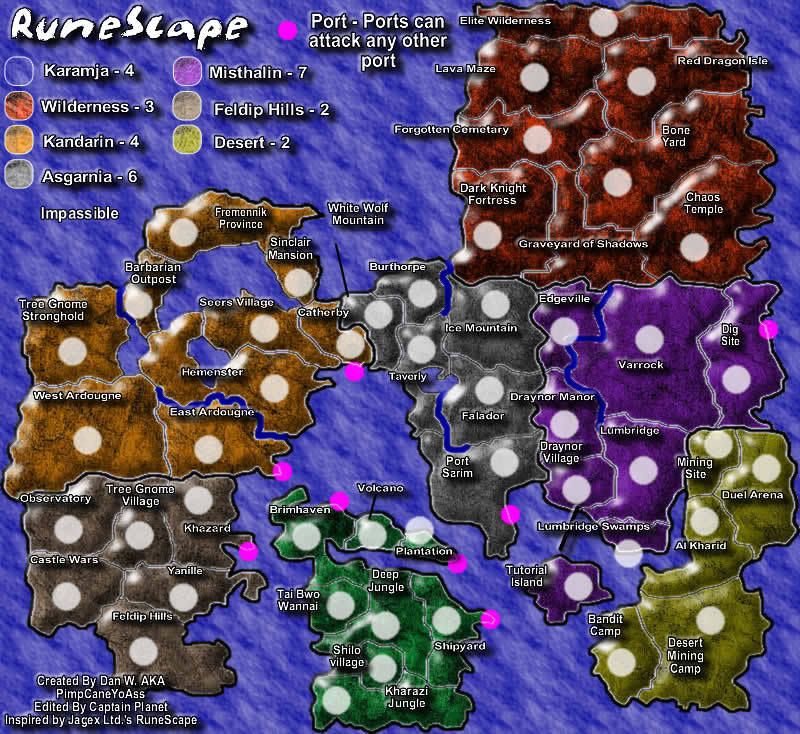
Changes
-Visual changes (color, text, rivers, texture)
-Whitened army circles
Still need to come up with an idea for ports and I forgot to add a blue dot in the key for the impassible barriers. Comment it.
Posted: Mon Mar 26, 2007 10:15 pm
by Samus
I really like the texture now, much better.
I think you should try the dark army shadows instead of the white ones, I think they would look better. Also, in a bit of irony, Graveyard of Shadows does not have a shadow.
I think you have too many ports if they can all attack each other. That would mean Khazard connects to an absurd 12 other territories total. Perhaps change Brimhaven, Khazard, and Weast Ardougne into direct connections with each other rather than ports. Maybe Plantation as well, leaving just the 4 ports. I don't know what the actual Runescape ports are or how they work in that game, maybe you can give me some background there.
The text looks good in some places like White Wolf Mountain, but looks like it's "squashed" in other places, like Feldip Hills and Ice Mountain. See what you can't do about that.
Some of the text placement makes the borders confusing, such as "Tree Gnome Village" obscuring whether Khazard and Observatory border each other or not. The other places this is an issue are Taverly and Shilo Village.
Those are the immediate things I see.