Antartica Map [Vacation]

Have an idea for a map? Discuss ideas and concepts here.

Moderator: Cartographers

Forum rules
Please read the Community Guidelines before posting.
User avatar
reverend_kyle
Posts: 9250
Joined: Tue Mar 21, 2006 4:08 pm
Location: 1000 post club
Contact:

Post by reverend_kyle »

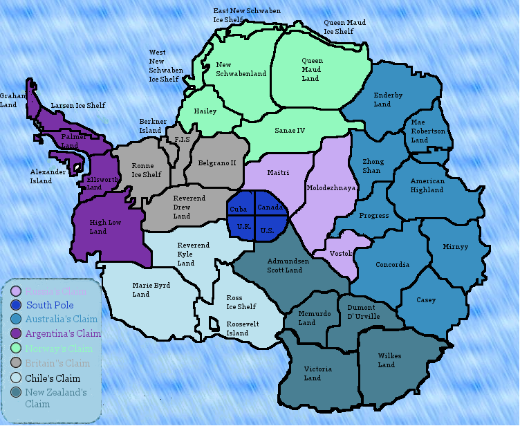
Here's a real rough draft, bag it? or Improve it?
Image

Would anyone play it?
User avatar
rocksolid
Posts: 625
Joined: Sat Mar 18, 2006 10:00 pm
Location: Mowwwnt Reeeal

Post by rocksolid »

I know it's a very rough draft, kyle, but I think it's excessively stylized. In fact, it looks exactly like the Oops - image no longer posted here icon from Photobucket. It's so stylized that people might not realize it's antarctica at all. How much is the light blue continent worth?
User avatar
reverend_kyle
Posts: 9250
Joined: Tue Mar 21, 2006 4:08 pm
Location: 1000 post club
Contact:

Post by reverend_kyle »

Image
did that work? i think i accidentally erased it because photobucket wouldnt import it full size, i could pm it to anyone who wants it.
User avatar
Bozo
Posts: 585
Joined: Sun May 14, 2006 2:18 pm
Location: Alberta

Post by Bozo »

Its Starting to look like a real map just a suggestion with all the blue its kinda looking all 'splotchy' So maybee get some different colors or change the backround
Dead to Me: New York Intellectuals, Men with Beards, California's 50th District, Heather Clark, Bowtie Pasta, Owls, CNN en Espanol, Screw-Cap Wines, Cast of Friends,
Toronto Raptors
User avatar
reverend_kyle
Posts: 9250
Joined: Tue Mar 21, 2006 4:08 pm
Location: 1000 post club
Contact:

Post by reverend_kyle »

Bozo wrote:Its Starting to look like a real map just a suggestion with all the blue its kinda looking all 'splotchy' So maybee get some different colors or change the backround
Well, i tried to make it really blue to go with the icy feeling of antarctica, if others dont think thats a good idea then i'l lchange it.
Machiavelli
Posts: 2021
Joined: Wed Feb 08, 2006 7:34 pm

Post by Machiavelli »

I would play on it.
User avatar
Jota
Posts: 634
Joined: Wed Mar 29, 2006 7:38 pm

Post by Jota »

I like the idea of the blue, but in practice, it'll be a bit difficult to tell some of the continents apart. Maybe making some into a blue-ish purple or a blue-ish green might help.

Also, unfortunately, I can't read any of the country names at that resolution, so I can't really provide much feedback on the continents and countries you chose, and least from a thematic perspective.
User avatar
reverend_kyle
Posts: 9250
Joined: Tue Mar 21, 2006 4:08 pm
Location: 1000 post club
Contact:

Post by reverend_kyle »

yeah, photobucket shrunk the picture when i imported it, any suggestions on how to get photobucket to import it full size?
User avatar
Marvaddin
Posts: 2545
Joined: Thu Feb 09, 2006 5:06 pm
Location: Belo Horizonte, Brazil

Post by Marvaddin »

Use gif or jpg image. Some little problems can appear, but at least we will have a better idea of the map. It seems interesting.
Image
User avatar
reverend_kyle
Posts: 9250
Joined: Tue Mar 21, 2006 4:08 pm
Location: 1000 post club
Contact:

Post by reverend_kyle »

Image

I tried .png apparently that is the smallest compression. It was a jpeg originally, hopefully this works. I sort of want to apply an icy texture to the land portion of the map does anyone know how that would work? But here is what i have so far. Does the purple take away from the icy feeling antarctica has?
garionoldwolf
Posts: 53
Joined: Sat May 06, 2006 8:12 am
Location: West Hazleton, PA, USA
Contact:

Post by garionoldwolf »

personally I think it looks okay, but the legend needs some work, for me I'm partially color blind so colors that are quite close(like dark blue and black) I can't tell teh difference between, and the color you have for teh top continent in your legend is too close to the background and thus I can't read it.
User avatar
reverend_kyle
Posts: 9250
Joined: Tue Mar 21, 2006 4:08 pm
Location: 1000 post club
Contact:

Post by reverend_kyle »

garionoldwolf wrote:personally I think it looks okay, but the legend needs some work, for me I'm partially color blind so colors that are quite close(like dark blue and black) I can't tell teh difference between, and the color you have for teh top continent in your legend is too close to the background and thus I can't read it.
should i type its name in black like i did with chile?
User avatar
phishn80
Posts: 123
Joined: Sun Apr 30, 2006 7:35 pm

Post by phishn80 »

looks good. i think its def worth giving a go. nice work, kyle....
garionoldwolf
Posts: 53
Joined: Sat May 06, 2006 8:12 am
Location: West Hazleton, PA, USA
Contact:

Post by garionoldwolf »

reverend_kyle wrote:
garionoldwolf wrote:personally I think it looks okay, but the legend needs some work, for me I'm partially color blind so colors that are quite close(like dark blue and black) I can't tell teh difference between, and the color you have for teh top continent in your legend is too close to the background and thus I can't read it.
should i type its name in black like i did with chile?


yea the black text is easy to see
User avatar
Jota
Posts: 634
Joined: Wed Mar 29, 2006 7:38 pm

Post by Jota »

This looks like a pretty good start. For the legend, I'd recommend making most if not all of the names black for the sake of legibility, with the color appearing just in the dot and maybe in some kind of background/highlight behind the text if you wanted.

Nice country names, overall. Are those straight from the reference materials, or did you make some of them up yourself? There do seem to be a lot of them ending in "-land", but if that's what they're really called, then that's not something you can really help. Also, the continent names might sound better without "'s Claim" tacked on: I figure most folks would understand that "New Zealand" means "the part of Antarctica claimed by New Zealand" in this context. (Although at the pole, I might actually call those four countries "Cuban Quarter", "Canadian Quarter", etc. But that's probably just me being silly and inconsistent.)

I think it's safe to say that you'll need some kind of artificial boundary work for this map, since there's very little to separate the continents right now. I'm looking for countries that aren't borders (i.e. ones that don't touch a foreign continent), and it looks like five of your continents have either none at all or just one. Given that there isn't a strong thematic differentiation between the continents, I think differentiating them with geographical boundaries is going to be especially important on this map.

Graphically, I think it might look nicer if some of the lines were a bit smoother. Also, the font used for labelling the countries looks almost typewritten; something more natural would be better, IMO. Also, as for the ice texture, have you considered importing a photograph of ice or snow and layering it behind your continent colors?
User avatar
Darklord001
Posts: 14
Joined: Thu Feb 02, 2006 11:56 am

Penalties

Post by Darklord001 »

First: cudos map looks good - though definitely needs some artificial boundaries

second - any way to do penalties? armies that aren't used (on defence) for more than one turn start to freeze and fade away?

just an abstract thought.
User avatar
Scorba
Posts: 396
Joined: Fri Mar 24, 2006 6:14 am
Location: Upon a pale horse

Post by Scorba »

Jota wrote:Nice country names, overall. Are those straight from the reference materials, or did you make some of them up yourself?


Given that one of them is called reverend kyle land, I think he may have made some of them up. :wink:
Taking an enemy on the battlefield is like a hawk taking a bird. Though it enters into the midst of a thousand of them, it pays no attention to any bird other than the one it has first marked.
User avatar
rocksolid
Posts: 625
Joined: Sat Mar 18, 2006 10:00 pm
Location: Mowwwnt Reeeal

Post by rocksolid »

I kind of like the "'s claim" names for continents - unique.
User avatar
Haydena
Posts: 634
Joined: Sun Mar 19, 2006 2:43 pm
Location: Sussex, England

Post by Haydena »

Wow... A map of antartica...

And a suggestion for names of countries, much like your France map kyle, try not to make them up, some people don't like it. ;)

How many maps have you got on the go now? 3? Maybe you should make up your mind and just focus on one of the maps...
User avatar
Phobia
Posts: 1497
Joined: Fri May 26, 2006 2:11 pm
Gender: Male
Location: Sheffield, England

Post by Phobia »

Haydena wrote:Wow... A map of antartica...

And a suggestion for names of countries, much like your France map kyle, try not to make them up, some people don't like it. ;)

How many maps have you got on the go now? 3? Maybe you should make up your mind and just focus on one of the maps...


why abuse the map? if you don't like it, don't play it, no one is forcing you. the more maps the better for me.
User avatar
PaperPlunger
Posts: 657
Joined: Sun Mar 05, 2006 3:33 pm
Location: Maine!

Post by PaperPlunger »

I like what haydena said, it's not just all about "ME ME ME" phobia
Image
User avatar
Haydena
Posts: 634
Joined: Sun Mar 19, 2006 2:43 pm
Location: Sussex, England

Post by Haydena »

Phobia wrote:
Haydena wrote:Wow... A map of antartica...

And a suggestion for names of countries, much like your France map kyle, try not to make them up, some people don't like it. ;)

How many maps have you got on the go now? 3? Maybe you should make up your mind and just focus on one of the maps...


why abuse the map? if you don't like it, don't play it, no one is forcing you. the more maps the better for me.


I wasn't abusing it... I like new maps, I'm all for it, if I wasn't, I wouldn't be creating my map of Japan would I? I just think that reverand_kyle seems to be getting bored of each project quickly and is not putting much effort into them.

I'm sure all of us would appreciate 1 great quality finished map rather than 3 unfinished maps, and his France map has the most potential, I think he should stick with it...
User avatar
reverend_kyle
Posts: 9250
Joined: Tue Mar 21, 2006 4:08 pm
Location: 1000 post club
Contact:

Post by reverend_kyle »

Jota wrote:This looks like a pretty good start. For the legend, I'd recommend making most if not all of the names black for the sake of legibility, with the color appearing just in the dot and maybe in some kind of background/highlight behind the text if you wanted.

Nice country names, overall. Are those straight from the reference materials, or did you make some of them up yourself? There do seem to be a lot of them ending in "-land", but if that's what they're really called, then that's not something you can really help. Also, the continent names might sound better without "'s Claim" tacked on: I figure most folks would understand that "New Zealand" means "the part of Antarctica claimed by New Zealand" in this context. (Although at the pole, I might actually call those four countries "Cuban Quarter", "Canadian Quarter", etc. But that's probably just me being silly and inconsistent.)

I think it's safe to say that you'll need some kind of artificial boundary work for this map, since there's very little to separate the continents right now. I'm looking for countries that aren't borders (i.e. ones that don't touch a foreign continent), and it looks like five of your continents have either none at all or just one. Given that there isn't a strong thematic differentiation between the continents, I think differentiating them with geographical boundaries is going to be especially important on this map.

Graphically, I think it might look nicer if some of the lines were a bit smoother. Also, the font used for labelling the countries looks almost typewritten; something more natural would be better, IMO. Also, as for the ice texture, have you considered importing a photograph of ice or snow and layering it behind your continent colors?


First off, the text idea is a really good idea, I like it.

Second off, most of the country names are actually names that are in antarctica, although they aren't in that particular spot necessarily but very close. there were 2 areas that just didnt have any names in them so i went with Reverend Kyle and Reverend Drew land, reverend kyle being my name reverend drew being my alias. Don't ask why. Just because i had no clue what else to name them. I think i agree with you about the continent names, and the claim part just takes up room where i could put the bonus. Which will be made once i find some boundaries to make attacks hard.

Third off, i agree about the geographical boundaries, that was the next step i was looking into, I think for mountains I am going to use iceburgs but i'm not sure how i would work that.

Text i use on everything dealing with my map is "georgia" do you have a font you would prefer? I could smooth out the lines pretty easily i think so that could be an easy thing. Also, how do you suppose i would do that using gimp.. I'm a new gimp user my photoshop trial expired.
User avatar
reverend_kyle
Posts: 9250
Joined: Tue Mar 21, 2006 4:08 pm
Location: 1000 post club
Contact:

Re: Penalties

Post by reverend_kyle »

Darklord001 wrote:First: cudos map looks good - though definitely needs some artificial boundaries

second - any way to do penalties? armies that aren't used (on defence) for more than one turn start to freeze and fade away?

just an abstract thought.
Well, i was thinking of doing something interesting for the icesheets, im not quite sure what yet. Like maybe making them easier or harder to take.
User avatar
Jota
Posts: 634
Joined: Wed Mar 29, 2006 7:38 pm

Post by Jota »

reverend_kyle wrote:there were 2 areas that just didnt have any names in them so i went with Reverend Kyle and Reverend Drew land, reverend kyle being my name reverend drew being my alias.


Why not, say, Kylia and Revedrew? Or Derkyle and Drewmanta? Or Werd and Elyk? Or... well, the creative possibilities are endless. (And this isn't even getting into looking into works of fiction set in or involving Antacrtica that might mention possible location names, or working off of some kind of ice/snow/cold wordplay, or even just polling the Foundry...)

I think for mountains I am going to use iceburgs but i'm not sure how i would work that.


I suppose mountains are mountains, whether they're stone or ice. Perhaps large fissures in the surface might the theme fit as well.

Text i use on everything dealing with my map is "georgia" do you have a font you would prefer?


Huh, that's interesting. Georgia is actually the font that I'm currently using on the blue-green hazard sign in my USApocalypse map. It was the font I was originally using for the country names as well, but everyone talked me out of it. I guess they were right :)

Alas, I'm not good at suggesting fonts (see mention above of me trying to use Georgia as well), and I've never used the Gimp, so I can't help much there.
Locked

Return to “Melting Pot: Map Ideas”