Page 10 of 12
Needs work
Posted: Sun Apr 29, 2007 8:40 pm
by Keredrex
Try not having black lines unless it is a wall...but have the colors of the territory touch another territory,,, also leave the background white and define the colors of the territories better....
Posted: Mon Apr 30, 2007 5:13 am
by Wisse
use other colors or put a bit texture in it, because this doesn't look good
Posted: Wed May 02, 2007 5:11 pm
by Will_Liam
I dont know if this has been mentioned or not, but why does orange have a bonus of 2 more than red when it only has 1 or 2 more countries(squares)?
Posted: Wed May 02, 2007 6:23 pm
by wcaclimbing
Will_Liam wrote:I dont know if this has been mentioned or not, but why does orange have a bonus of 2 more than red when it only has 1 or 2 more countries(squares)?
Red has 4 borders. EVERY ONE of oranges countries is a border.
The bonuses arent final. Any suggestions for those will be added, too.
--------------------------------
Right now I am working on changing everything so it looks better. I killed the blue background, and im looking for a good image/color scheme to go in the background.
Im thinking about making the entire map darker, so the white borders show up more. i tried it and it looks pretty good. Ill post it after a few changes.
------------------------------
I dont have much time to work on this on weekdays, because school takes up a lot of my time. I will do most of the work over the weekends, so expect most updates then

----------------------------------
Posted: Sun May 06, 2007 6:21 pm
by wcaclimbing
This is the newest version of the map. I changed a bunch of stuff, but there is still more to be done.
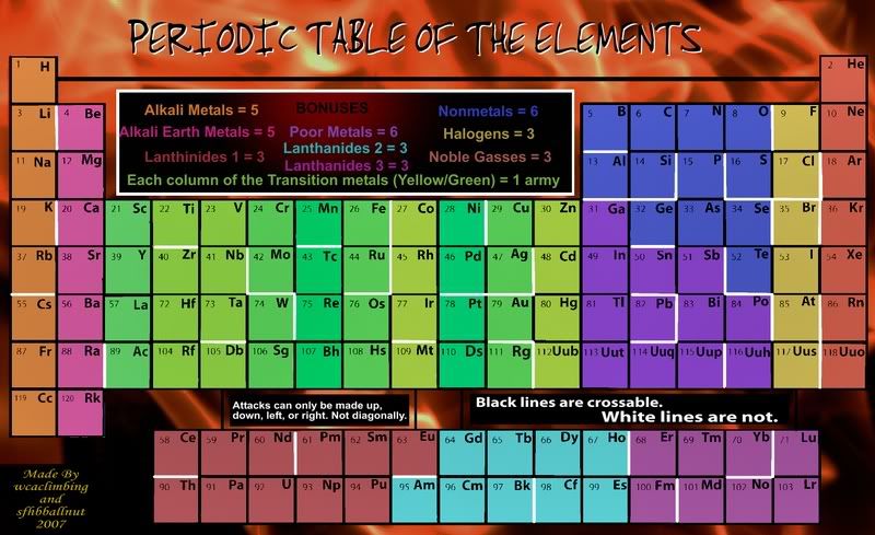
Fixed:
New Background (Fire).

Made everything a bit darker.
Easier to see white borders.
Gave all of the continents names.
Added a few more borders.
Changed title design.
Stuff to do:
Change borders designs?
Change colors of "Poor Metals" and "Lanthanides 3" in the Bonuses section.
Make the "Bonuses" title more visible.
Posted: Sun May 06, 2007 6:54 pm
by Hamster1800
I know this is my first post, but I would like to say a few things about this map.
1) It should be alkaline earth metals, not alkali earth metals.
2) There's no reason to have a separate entry in the bonuses for each of the 3 lanthanide sections (you also have a spelling error. It should be lanthAnide, not lanthinide). I say combine them into one unless they are going to have different bonuses.
3) It's a little hard, but possible, to read the text that says "BONUSES"
The new background is much better than the old one, in my opinion. Also, you have a few irregularities in the borders, so try to touch those up.
Unless there are other major problems, you will also probably want to use army circles, because it'll get quite hard to read the numbers. Army circles will also probably not look bad on this map, given that you have a large amount of free space for it in each territory.
Posted: Sun May 06, 2007 7:09 pm
by wcaclimbing
Hamster1800 wrote:1) It should be alkaline earth metals, not alkali earth metals.
Thanks. I'll fix that.
Hamster1800 wrote:2) There's no reason to have a separate entry in the bonuses for each of the 3 lanthanide sections (you also have a spelling error. It should be lanthAnide, not lanthinide). I say combine them into one unless they are going to have different bonuses.
Ill fix the spelling.
All of the Lanthanides/Actinides group being one big continent is a good idea. I'll talk it over with sfhbballnut.
Hamster1800 wrote:3) It's a little hard, but possible, to read the text that says "BONUSES"
I'll fix that.
Hamster1800 wrote:The new background is much better than the old one, in my opinion.
Hamster1800 wrote:Unless there are other major problems, you will also probably want to use army circles, because it'll get quite hard to read the numbers. Army circles will also probably not look bad on this map, given that you have a large amount of free space for it in each territory.
Already planning to do that.
------------------------------------------
THANKS FOR ALL THE SUGGESTIONS!!!
Your help is greatly appreciated.
------------------------------------------
Posted: Sun May 06, 2007 7:16 pm
by wrightfan123
freezie wrote:wcaclimbing wrote:freezie wrote:Ok...I don't like the background beeing 2 different colors.
Is the second column ( looks like pink ) even listed in the bonuses?
The background isnt 2 different colors. its blue, just light at the top to fading dark in the bottom.
Exactly. 2 different colors. Blue and lighter blue.
Just like your light red and red are 2 colors.
Said Donut
"It's not pink! I's light red!"-Donut
"There's a name for light red; it's called pink"-Grif
Posted: Sun May 06, 2007 8:01 pm
by Hamster1800
wcaclimbing wrote:Hamster1800 wrote:2) There's no reason to have a separate entry in the bonuses for each of the 3 lanthanide sections (you also have a spelling error. It should be lanthAnide, not lanthinide). I say combine them into one unless they are going to have different bonuses.
Ill fix the spelling.
All of the Lanthanides/Actinides group being one big continent is a good idea. I'll talk it over with sfhbballnut.
Sorry, I think you misunderstood me. I think a large continent would be unwieldy, but you may be able to save space in the bonuses section by saying something like "A section of the Lanthanides - 3" rather than "Lanthanide 1 - 3, Lanthanide 2 - 3, Lanthanide 3 -3," like how you did it for the transition metals.
Posted: Sun May 06, 2007 8:35 pm
by ParadiceCity9
i actually think its coming along quite well.
Posted: Sun May 06, 2007 8:45 pm
by wcaclimbing
Hamster1800 wrote:Sorry, I think you misunderstood me. I think a large continent would be unwieldy, but you may be able to save space in the bonuses section by saying something like "A section of the Lanthanides - 3" rather than "Lanthanide 1 - 3, Lanthanide 2 - 3, Lanthanide 3 -3," like how you did it for the transition metals.
O. Thats a good idea too.

Posted: Mon May 07, 2007 12:04 am
by ericwdhs
I don't mean to be picky but I feel obliged to point out that:
1. Only the top row of your Lanthanides are actually Lanthanides. The bottom row is actually made up of Actinides. The name for the whole group however can be Rare Earth Metals, though that term still generally refers to just the Lantanides.
2. Hydrogen is not an Alkali Metal. It's technically a Nonmetal, but grouping it with the Alkali Metals is acceptable.
3. Gases has one s.
4. You've forgotten the Metalloids but if you insist on keeping them out, change Al and Ge to Poor Metals.
Posted: Mon May 07, 2007 4:55 am
by haoala
i can so barely see the line between 110 and 64, and 117 and 71
in fact i wouldnt be surprised if there are more lines that i cant see right now
ps rg was formerly unununium. i suggest you put that to fit in with the rest of the 11*s. darmstadtium too.
pps. how did you decide where to put the white lines? random or brain-rackingly chosen?
Posted: Mon May 07, 2007 7:03 am
by RobinJ
ericwdhs wrote:2. Hydrogen is not an Alkali Metal. It's technically a Nonmetal, but grouping it with the Alkali Metals is acceptable.
I would like this to be changed too - Hydrogen is quite often put at the very top on its own somewhere in the middle. I think you should have it there as a non-bonus territory which could have lots of connections to other territories. This might improve playability as you wouldn't have to work your way right across the map all the time
Edit: However, I do see that this would leave you a problem with the legend
Posted: Mon May 07, 2007 3:25 pm
by wcaclimbing
haoala wrote:i can so barely see the line between 110 and 64, and 117 and 71
in fact i wouldnt be surprised if there are more lines that i cant see right now
ps rg was formerly unununium. i suggest you put that to fit in with the rest of the 11*s. darmstadtium too.
pps. how did you decide where to put the white lines? random or brain-rackingly chosen?
lol. There are more lines there. I just completely forgot to change them after I added the new background. I'll fix that.
I'm trying to use the most up-to-date names that I can find on the internet. The ones that are still named "Unun..." don't have official names, yet.
I chose the lines loosely based on the idea that elements to the left are more reactive (less borders to limit reactions) and elements on the right are less reactive (more borders to limit them). Besides that, I designed the borders in order to increase the strategic aspect of the game, making many small areas that are easy to hold that would act as a starting point for a battle.
ericwdhs wrote:1. Only the top row of your Lanthanides are actually Lanthanides. The bottom row is actually made up of Actinides. The name for the whole group however can be Rare Earth Metals, though that term still generally refers to just the Lantanides.
2. Hydrogen is not an Alkali Metal. It's technically a Nonmetal, but grouping it with the Alkali Metals is acceptable.
3. Gases has one s.
4. You've forgotten the Metalloids but if you insist on keeping them out, change Al and Ge to Poor Metals.
1. I am going to change the key so that won't matter any more.
2. Unless there is a lot of support for making it seperate, I would like to keep it with the Alkaline Metals because it would be the only country by itself and it would effect the entire continent.
3. I'll fix that.
4. If i changed Al and Ge, it would turn Poor Metals into a super-continent and would shrink Nonmetals too small. I want to keep them about equal. But again, if there is more support for moving them, I will move them.
Posted: Mon May 07, 2007 6:28 pm
by sfhbballnut
lets keep in mind that there are many ways to group the peiodic table, and there are exceptions to all of them, so nobody get to dead set on it has to be this way or that. I'm looking at a couple of continent shifts to see if we can satisfy a few more of those organizations
Posted: Mon May 07, 2007 7:09 pm
by twinfists
IUPAC are recommending that the lanthanides and actinides be referred to as lanthanoids and actinoids, since -ide suggests a one minus charge, but that is just being picky.
Posted: Tue May 08, 2007 4:06 am
by anamainiacks
Perhaps you could make Hydrogen like Alcatraz in the San Francisco Map.
Most of the black lines seem to have uneven breadth, and the white lines are too different from the black ones, kind of distracting and isn't really pleasant to the eye.
Al and Ge really need to be put under Poor Metals.
Perhaps you may also want to include the Zig-Zag line and make use of it to make the map more interesting?
Posted: Tue May 08, 2007 6:34 am
by sfhbballnut
Alcatraz is out, i hate that concept, but we are working on border consistancy and how to get thosed two back under the metals title without making the continents unbalanced. We're open to suggestions on how to use the dividing line, but our previous tries at using it came to nothing
Posted: Tue May 08, 2007 4:28 pm
by Optimus Prime
Perhaps this has been brought up before, but I'm a little confused as to how you get from that bottom group up into the main table. Is it those faint black lines between them? If so, they are really hard to see.
Posted: Tue May 08, 2007 5:26 pm
by sfhbballnut
slight mistake in the update, will be fixed
Posted: Wed May 09, 2007 9:31 am
by boberz
a quick glance tells me that the title is sloppy sorry sounds harsh
Posted: Wed May 09, 2007 3:08 pm
by wcaclimbing
boberz wrote:a quick glance tells me that the title is sloppy sorry sounds harsh
how is it sloppy?
I think it looks fine.
Is the font a problem?
Posted: Fri May 11, 2007 8:16 am
by haoala
one more thing - i think no. 57 should join to 58 and 89 - 90
Posted: Fri May 11, 2007 10:31 pm
by sfhbballnut
We played with that idea earlier and it got shutdown several times, if it picks up some support here we'd be happy to bring it back