Page 10 of 13
Re: Gilgamesh; GP, GFX
Posted: Fri Jun 19, 2009 3:18 pm
by the.killing.44
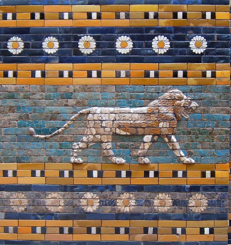
porkenbeans wrote:I just noticed the tiled lion painting. If you notice the areas that are showing cracks in the paint, You could chip away some of those "blocks" of paint to see what I am suggesting.
that might actually look very, very sweet.
.44
Re: Gilgamesh; GP, GFX
Posted: Fri Jun 19, 2009 6:44 pm
by oaktown
right... the other thing I like about the lion image is that some blocks have retained their color more than others, but this is probably the result of restoration, blocks falling out and aging differently, new replacements being made to fill gaps, etc. Still, I think I'll try brighter but with more emphasis on the cracks and worn areas.
edit... fussed around a little, made some of the colors a wee bit brighter.
[bigimg]http://i141.photobucket.com/albums/r76/ron_parodi/gilgamesh/gilgamsh27.jpg[/bigimg]
Re: Gilgamesh; GP, GFX
Posted: Fri Jun 19, 2009 11:01 pm
by porkenbeans
[bigimg]http://i665.photobucket.com/albums/vv12/porkenbeans/gilgamsh27copy.jpg[/bigimg]
Here is something like what I'm getting at. It's not perfect, and I only spent 20 min. or so on it, but you can get the idea. With the color and contrast punched up, you can see at a glance the text and boundaries much more clearly.

Re: Gilgamesh; GP, GFX
Posted: Fri Jun 19, 2009 11:15 pm
by porkenbeans
Also, by the way, there is no copyright on that kick-ass lion. It would really be sweet if you added it to the map. You could prob put it where the Gilgamesh text is and shrink the text down a bit and put it over the lion.

I also just noticed what I like about the lion that really makes it jump out, it is slightly in relief. the land areas could be done with a little bevel as to get a similar look.
Re: Gilgamesh; GP, GFX
Posted: Sat Jun 20, 2009 2:12 am
by porkenbeans
I had another idea about the mountains. (not to keen on them).
You could just make them missing tiles, if you know what I mean.

That along with the relief on the land areas that I mentioned, Would really put this map along side of your best.
Oh, and please get that lion on there.
Re: Gilgamesh; GP, GFX
Posted: Sat Jun 20, 2009 10:34 am
by saaimen
I see what you're trying to accomplish with your version, but...
I don't really dig it. It's much more tiring for the eye that everything jumps out of the picture the way it does. And no one will link this to 'ancient'. So I think the faded works better. My 2 cents

Re: Gilgamesh; GP, GFX
Posted: Sat Jun 20, 2009 10:47 am
by oaktown
[bigimg]http://i141.photobucket.com/albums/r76/ron_parodi/gilgamesh/gilgamsh28.jpg[/bigimg]
This isn't pushed nearly to the degree that porkenbeans wants, but it's definitely more colorful than my previous attempts. I find that what looks like a significant change as I'm working on it doesn't always translate into a significant change the overall effect. Overall I like how it looks - even the faded version - and I don't think over-saturating the colors is an improvement. I just want to remove the "haze" that seems to have been over the recent versions, and I hope this does it.
As for using the lion... right now everything on the image is my own creation, and I'd like to keep it that way. Even using somebody's photograph of a 4,000 year old wall requires permission, and having looked at my own photos of the Ishtar Gates I don't have any that are worthy of inclusion. The lion that I'm using for Humbaba is fashioned after the lions from the Ishtar lion anyway.
Re: Gilgamesh; GP, GFX
Posted: Sat Jun 20, 2009 12:49 pm
by porkenbeans
Yeah, I purposefully "over" punched up the color and contrast, in order for you to see how muddy, your latest version was when compared next to it. hallelujah, your compromise is almost perfect. If you could make it look like that last lion that you put up, it would in fact, ...BE perfect.
The color levels are almost there, but check the contrast, the lion has much more definition, this makes the tiles, look like tiles. If you would take a layer with the grout lines erased, then you could overlay it with a bevel and/or a drop shadow you can get the definition
You could also try lightening the color of the text and borders just a tad to contrast it from the rest. The definition comes from contrast, Check the lion, it has dark darks, and bright lights. If everything is at the same level, that is when you get the muddiness.
Well I'm off to 99 designs to try and make some doe. Come take a look, you might want to open an account. I think you would do alright.
Re: Gilgamesh; GP, GFX
Posted: Sun Jun 21, 2009 3:59 am
by FarangDemon
I like the improvement with the added contrast, it makes it a lot easier to see which places are cities than before.
I think this map is an awesome idea and I really look forward to playing it. I haven't been this excited since SuperMax: Prison Riot.
Coincidentally I looked up Ishtar yesterday on wikipedia and looked at that tile lion image, which is totally badass. I don't think anybody will sue you, but maybe you will be cursed by Ishtar.
Re: Gilgamesh; GP, GFX
Posted: Sun Jun 21, 2009 6:46 pm
by porkenbeans
Another suggestion,
Not that big of a deal, but have you tried using bridges instead of arrows for the river crossings ?
I have just got to say again, that, that latest lion picture is sooooo sharp, I wished the map looked like it.
Re: Gilgamesh; GP, GFX
Posted: Mon Jun 22, 2009 3:27 pm
by AndyDufresne
In the latest image, I actually dislike how much the bricks stand out now---the lines, especially in the light colored areas, are more overwhelming, and less a part of the background, as in previous updates.
--Andy
Re: Gilgamesh; GP, GFX
Posted: Mon Jun 22, 2009 3:30 pm
by Incandenza
oaktown wrote:This isn't pushed nearly to the degree that porkenbeans wants, but it's definitely more colorful than my previous attempts. I find that what looks like a significant change as I'm working on it doesn't always translate into a significant change the overall effect. Overall I like how it looks - even the faded version - and I don't think over-saturating the colors is an improvement. I just want to remove the "haze" that seems to have been over the recent versions, and I hope this does it.
I think you might have pushed it a bit too far, personally. I can appreciate pork's position on this, but his quick 'n dirty demo is so bright that it renders moot the map's whole theme. I think the version you had at the top of the page is a nice compromise between bright and weathered.
Re: Gilgamesh; GP, GFX
Posted: Mon Jun 22, 2009 3:36 pm
by porkenbeans
AndyDufresne wrote:In the latest image, I actually dislike how much the bricks stand out now---the lines, especially in the light colored areas, are more overwhelming, and less a part of the background, as in previous updates.
--Andy
In previous updates, Oak has listened to comments like yours, and produced a muddy map. He is not there yet, but he IS headed in the right direction. Do you NOT like the lion picture ?
Would not this map be sweet, if it were more like that picture ?
Re: Gilgamesh; GP, GFX
Posted: Mon Jun 22, 2009 3:48 pm
by porkenbeans
Incandenza wrote:oaktown wrote:This isn't pushed nearly to the degree that porkenbeans wants, but it's definitely more colorful than my previous attempts. I find that what looks like a significant change as I'm working on it doesn't always translate into a significant change the overall effect. Overall I like how it looks - even the faded version - and I don't think over-saturating the colors is an improvement. I just want to remove the "haze" that seems to have been over the recent versions, and I hope this does it.
I think you might have pushed it a bit too far, personally. I can appreciate pork's position on this, but his quick 'n dirty demo is so bright that it renders moot the map's whole theme. I think the version you had at the top of the page is a nice compromise between bright and weathered.
Three things,
First, I purposefully went "TOO" far in my example, to show, just how muddy the map was going.
Second, I only had a copy of the picture, not the layers to work with.
Three, I only spent 20 min. on it.
I had not seen the lion picture, but that is the direction that I was trying to achieve.
With the working file, I could make it look just like that lion picture. I am sure that Oak can do the same, I just wished that he would try it , and stop listening to the peanut gallery.
If CC had a map that was like that lion picture, It would be one of CCs' best, if not the best. And would probably get my vote as The "signature" map that CC has been in search of.
Re: Gilgamesh; GP, GFX
Posted: Mon Jun 22, 2009 3:48 pm
by AndyDufresne
Woah there bugger.
I'm just posting my opinion of the development of latest update.
--Andy
Re: Gilgamesh; GP, GFX
Posted: Mon Jun 22, 2009 3:52 pm
by Incandenza
porkenbeans wrote:Incandenza wrote:oaktown wrote:This isn't pushed nearly to the degree that porkenbeans wants, but it's definitely more colorful than my previous attempts. I find that what looks like a significant change as I'm working on it doesn't always translate into a significant change the overall effect. Overall I like how it looks - even the faded version - and I don't think over-saturating the colors is an improvement. I just want to remove the "haze" that seems to have been over the recent versions, and I hope this does it.
I think you might have pushed it a bit too far, personally. I can appreciate pork's position on this, but his quick 'n dirty demo is so bright that it renders moot the map's whole theme. I think the version you had at the top of the page is a nice compromise between bright and weathered.
Three things,
First, I purposefully went "TOO" far in my example, to show, just how muddy the map was going.
Second, I only had a copy of the picture, not the layers to work with.
Three, I only spent 20 min. on it.
I had not seen the lion picture, but that is the direction that I was trying to achieve.
With the working file, I could make it look just like that lion picture. I am sure that Oak can do the same, I just wished that he would try it , and stop listening to the peanut gallery.
I know you didn't just dismissively refer to me as the peanut gallery.
And you say the map is muddy. I'm not quite sure what you mean. Certainly the colors are muted, but I don't think anything is unclear or blurred. Deep saturated color won't be appropriate for every map, and IMHO I don't think it's appropriate here.
Re: Gilgamesh; GP, GFX
Posted: Mon Jun 22, 2009 3:55 pm
by porkenbeans
AndyDufresne wrote:Woah there bugger.
I'm just posting my opinion of the development of latest update.
--Andy
Yeah, I know.
hehehe

It's just that sometimes people give there opinions just to be saying something.
Re: Gilgamesh; GP, GFX
Posted: Mon Jun 22, 2009 3:57 pm
by porkenbeans
Incandenza wrote:porkenbeans wrote:Incandenza wrote:oaktown wrote:This isn't pushed nearly to the degree that porkenbeans wants, but it's definitely more colorful than my previous attempts. I find that what looks like a significant change as I'm working on it doesn't always translate into a significant change the overall effect. Overall I like how it looks - even the faded version - and I don't think over-saturating the colors is an improvement. I just want to remove the "haze" that seems to have been over the recent versions, and I hope this does it.
I think you might have pushed it a bit too far, personally. I can appreciate pork's position on this, but his quick 'n dirty demo is so bright that it renders moot the map's whole theme. I think the version you had at the top of the page is a nice compromise between bright and weathered.
Three things,
First, I purposefully went "TOO" far in my example, to show, just how muddy the map was going.
Second, I only had a copy of the picture, not the layers to work with.
Three, I only spent 20 min. on it.
I had not seen the lion picture, but that is the direction that I was trying to achieve.
With the working file, I could make it look just like that lion picture. I am sure that Oak can do the same, I just wished that he would try it , and stop listening to the peanut gallery.
I know you didn't just dismissively refer to me as the peanut gallery.
And you say the map is muddy. I'm not quite sure what you mean. Certainly the colors are muted, but I don't think anything is unclear or blurred. Deep saturated color won't be appropriate for every map, and IMHO I don't think it's appropriate here.
Is that lion deep saturated and un-appropriate ?
Re: Gilgamesh; GP, GFX
Posted: Mon Jun 22, 2009 3:57 pm
by AndyDufresne
porkenbeans wrote: Yeah, I know.
hehehe
It's just that sometimes people give there opinions just to be saying something.
Agreed, if I wanted to get my post count up, I'd spam much more than you see me doing.
Incandenza wrote:And you say the map is muddy. I'm not quite sure what you mean. Certainly the colors are muted, but I don't think anything is unclear or blurred. Deep saturated color won't be appropriate for every map, and IMHO I don't think it's appropriate here.
I think Incandenza's point here is a good one and I tend to agree with it.
--Andy
Re: Gilgamesh; GP, GFX
Posted: Mon Jun 22, 2009 4:04 pm
by porkenbeans
AndyDufresne wrote:porkenbeans wrote: Yeah, I know.
hehehe
It's just that sometimes people give there opinions just to be saying something.
Agreed, if I wanted to get my post count up, I'd spam much more than you see me doing.
Incandenza wrote:And you say the map is muddy. I'm not quite sure what you mean. Certainly the colors are muted, but I don't think anything is unclear or blurred. Deep saturated color won't be appropriate for every map, and IMHO I don't think it's appropriate here.
I think Incandenza's point here is a good one and I tend to agree with it.
--Andy
OK,
I will try to explain it once more.
Scroll back to the lion, and then scroll back to the last version before the compromise.
compare them to each other. The lion is bright, vibrant and clear. And the map looks muddy next to it. WHY ? - because the tonal and color values are the same throughout the map. It shows zero contrast. Hence "MUDDY".
Te muddy washed out look may work well if you are trying to simulate old paper. If that is the object, then loose the tile. BUT, if the object is to sim. old tile, look at the lion.
I prefer the old tile. We have maps with old paper, but none with that tile look.
Re: Gilgamesh; GP, GFX
Posted: Mon Jun 22, 2009 4:17 pm
by porkenbeans
One more thing, I never understood what is it about post count that some are so enamored with. Is it some sort of competition thing ?
If so, I personally do NOT wish to compete in that ridiculous contest.
Re: Gilgamesh; GP, GFX
Posted: Mon Jun 22, 2009 4:18 pm
by oaktown
Stop it everybody, stop it. This is my thread and only I get to decide who's 'peanut gallery' and who isn't, and I say you're all nuts.
The map: I like the muted colors, but it was beginning to look fuzzy. My intention is to lift the haze yet still make it look natural.
The lion picture: it is indeed very nice. Will this map ever look like that image? Probably not, and for two reasons. First, it's a photo of a real wall. As much as I'd like my map to look like a real wall it probably never will because I have no intention of spending another eight months working on it. Second, the demands of a CC map make it difficult to replicate that image. I need to incorporate territory text, army circles, a legend, larger bricks to keep the clutter down, distinct colors for each region, clean borders, etc. Somebody more artistic and with more time may be able to achieve the look perfectly, but not this mapmaker.
The fact that people are coming out on both sides suggests that I'm doing something right. I won't be able to please everybody, so I just have to come up with a version that I am pleased with. If you have specific concerns about the latest image - something is hard to read or too bright - let me know, as it gives me something concrete to focus on.
Re: Gilgamesh; GP, GFX
Posted: Mon Jun 22, 2009 4:21 pm
by porkenbeans
I'm a cashew, ...you?
Re: Gilgamesh; GP, GFX
Posted: Mon Jun 22, 2009 6:46 pm
by saaimen
porkenbeans wrote:One more thing, I never understood what is it about post count that some are so enamored with. Is it some sort of competition thing ?
If so, I personally do NOT wish to compete in that ridiculous contest.
Funny then how you're the only one double- (or triple-) posting in this thread
(Nothing personal, it just struck me)Edit:
I better say something about the graphics aswell.
I don't know why but I completely liked the way this map looked when it was entered for the Centerscape competition. It was a lot hazier and lighter. Agreed, it wasn't 'colourful' enough, but IMHO oak, you've gone quite far enough now. I understand the craze about the lion-wall-style, yet I don't think this is what we should be aiming at for this map. I'd keep the saturation low and make it more sand-ish or desert-rock-ish, than ceramic tile-ish. I'd even consider lightening up the main background colour (the brown-ish sand-like one) to give it even more of a scorched effect.
But to suit your needs, oak: I don't think there's any specific point that needs to be changed. Everything is very clear... Good job.
Re: Gilgamesh; GP, GFX
Posted: Mon Jun 22, 2009 7:14 pm
by porkenbeans
saaimen wrote:porkenbeans wrote:One more thing, I never understood what is it about post count that some are so enamored with. Is it some sort of competition thing ?
If so, I personally do NOT wish to compete in that ridiculous contest.
Funny then how you're the only one double- (or triple-) posting in this thread
(Nothing personal, it just struck me)Edit:
I better say something about the graphics aswell.
I don't know why but I completely liked the way this map looked when it was entered for the Centerscape competition. It was a lot hazier and lighter. Agreed, it wasn't 'colourful' enough, but IMHO oak, you've gone quite far enough now. I understand the craze about the lion-wall-style, yet I don't think this is what we should be aiming at for this map. I'd keep the saturation low and make it more sand-ish or desert-rock-ish, than ceramic tile-ish. I'd even consider lightening up the main background colour (the brown-ish sand-like one) to give it even more of a scorched effect.
But to suit your needs, oak: I don't think there's any specific point that needs to be changed. Everything is very clear... Good job.
Whats so funny, do you NOT understand English ?
I do NOT give a rats ass about who has the most posts. What in the hell does that prove anyway ?
I came here because I am on the mailing list. I will post as I see fit.

I am just trying to carry on a conversion here. lol.
Now back to the topic.
If the object is to make it look like an old map, (which is cool) I would just go ahead and loose the tiles. pick one or the other. If it were to be written 2,000 years ago on some scroll or something, it would NOT have included tiles. That may be an idea to try, make it an authentic looking scroll.