Page 10 of 15
Posted: Wed Oct 03, 2007 3:28 pm
by cairnswk
Wisse wrote:do you have a large version? that would be easier to look at
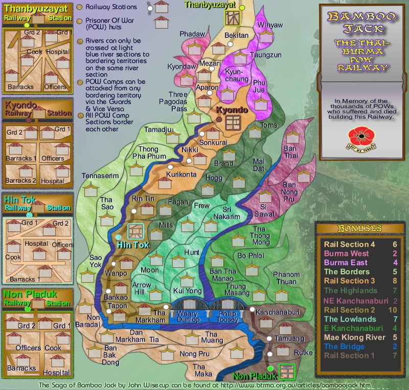
Version 18 Large
Posted: Wed Oct 03, 2007 3:38 pm
by Coleman
My complaint now with a picture!


Posted: Wed Oct 03, 2007 3:54 pm
by cairnswk
Coleman wrote:My complaint now with a picture!
Thanks Coleman...i'll attend to those in the next version.
Posted: Thu Oct 04, 2007 7:34 am
by cairnswk
Coleman wrote:Sorry for how frustrating this is going to be, but I feel there is something not quite right about it still. I don't know what.
Maybe the bottom 3 bullet points could have more space between them. The same as the top 3 doesn't seem possible, but I'd like the gaps between them to be consistent all the way down, even when they don't have picture examples. I'm not sure I like the bonuses bumping up against Tamuang and Phanom Thuan either.
All fixed in Version 19 below, thanks Coleman, including moving those terts away from the Bonus border.
Posted: Thu Oct 04, 2007 7:39 am
by cairnswk
Telvannia wrote:my 2 pence worth,
the 2 in the bonuses for NE Kanchanaburi looks different from all the other numbers in the bonuses.
And im really confused about how the railway stations work, when you attack them from a neighbouring territory are you attacking the territory at the top of the mini-maps of the station?
2...You're correct Telvannia...thanks for picking that up.
The new instructions say:
Railway Stations and Adjacent POW camps can be attacked from any bordering territory. Attacks in and out of the POW Camps occur only via the Guards.
This means you can attack into the camp bypassing the Railway Station but you can only attack the Guards before the rest of the camps.
Posted: Thu Oct 04, 2007 8:03 am
by cairnswk
gimil wrote:Cairns heres another lsit for you to look at

1. The railway sections, i feel, dont stand out enought. Maybe you could do something similar to the POW huts. Have color ouline all 4 rail sections and have that same outline round the rail road sections in the legends. oh and could you possible group rail sections 1-4 together in order?
I've put a black section behind the POW Camps on the main map.
I'd prefer not to group the rail sections, as they are regions and run left to right down the map in my usual corresponding style.
2. The legends look much better now but i still feel a light texture overlay will look the part.
I've tidied up the legend, but don't know if this now looks better.
3. the left had side where your notes are lok a little bare compared to the picture that you have under the poppy. maybe make this blue area have soft sky look with clouds and maybe even te sun? jsut a thought
Mmmm...i'd prefer to keep some "eye space" happening there and this image runs along the side of the river, so i thought a foggy appearance early morning even in the steamy tropics would be more appropriate.
Thats all for now buddy
Thanks Gimil.
Posted: Thu Oct 04, 2007 8:16 am
by cairnswk
Version 19 Update
1. Borders around the POW Camps are thicker to stand out more
2. Black rectanlge placed on the relevant territory corresponding to the POW camps on the main map.
3. "destructions" tidied up and spaced.
4. Legend space and tidied
5. Terts moved away from legend
6. POW Camps base floor made the same colour as the main map section to hopefully make tyting the two together easier.
7. Sections of borders on main map tidied.
8. POW Camps re-organised in places for easier clarity.
Small
 Large
Large

Posted: Thu Oct 04, 2007 11:53 am
by onbekende
/me likes
now to find time to review this map

Posted: Thu Oct 04, 2007 2:57 pm
by unriggable
You shouldn't post a URL on your map in case it doesn't work in the future.
Posted: Thu Oct 04, 2007 3:10 pm
by cairnswk
unriggable wrote:You shouldn't post a URL on your map in case it doesn't work in the future.
I take your point, but that can also be changed in the future, while I'm still around.
Posted: Thu Oct 04, 2007 7:58 pm
by unriggable
cairnswk wrote:unriggable wrote:You shouldn't post a URL on your map in case it doesn't work in the future.
I take your point, but that can also be changed in the future, while I'm still around.
But beyond that...
Posted: Thu Oct 04, 2007 10:11 pm
by gimil
I wondr if you would be able to position a clickable hmtl/xhtml/xml link over the URL in the XML if you know what i mean.
p.s. where the butterfly?
Posted: Fri Oct 05, 2007 1:08 pm
by onbekende
frankly the only thing I have to say is: CHANGE CROSSABLE RIVER CROSSINGS TO DARK AND NON-CROSSABLES TO LIGHT because I believe you don't have the intent to let people cross under the bridge? or do I have to rework my bonusses?
Posted: Fri Oct 05, 2007 1:23 pm
by Coleman
I'm having a hard time reading most of the territory text.
Posted: Sun Oct 07, 2007 12:23 pm
by cairnswk
Coleman wrote:I'm having a hard time reading most of the territory text.
What specifically presents the challenge for you Coleman? Please xplane.
Posted: Thu Oct 11, 2007 6:55 pm
by cairnswk
Is everyone happy with this one??? Still haven't heard from Coleman though.
Posted: Thu Oct 11, 2007 7:23 pm
by oaktown
it's a nice piece of work. I have to say that it will never be a favorite of mine simply because of the size - I'm a laptop user and even the small map fills my entire window top to bottom - but it's looking good.
Posted: Thu Oct 11, 2007 8:28 pm
by RjBeals
cairnswk - this may be my favorite map you've ever made. I can not wait to play it. It should be in history books.

Posted: Fri Oct 12, 2007 5:25 am
by iancanton
this map is completely different from the initial concept and the excellent work that has been done on the gameplay looks like really paying off.
however, the horrible yellow font used for the titles ("bamboo jack: the thai-burma pow railway" and "bonuses") has a negative effect on the thai flavour of the graphics and colour scheme. as far as i know, neither thais nor any other asians write with script that resembles this.
instead, can u use either a military-style font or something that resembles the style of thai writing? below are two examples of what thai writing looks like, from the home pages of two top bangkok universities. visually-distinctive features of thai script include little loops at the end of some letters and the occasional vowel mark above or below a letter.
http://www.dusit.ac.th/new_ver14/index.php
http://www.chula.ac.th/chula/th/main.html
i further suggest, if there is room, a minor alteration to the memorial inscription above the poppy, to acknowledge the oft-forgotten role of asian civilians who were forced to work on the railway, often in worse conditions than the pows, who had least had limited protection conferred by their pow status: "in memory of the thousands of pows
and civilians who suffered and died building this railway".
ian.
Posted: Fri Oct 12, 2007 6:03 am
by yeti_c
Not sure I like 3 of the 4 colours for the POW camps... bit garish for my liking...
C.
Posted: Fri Oct 12, 2007 6:07 am
by cairnswk
Ian thanks you for your response.
I had a siamese native look over this the other night to confirm/deny that the map was in flavour of the Siamese art style and aesthetic. He was completely happy with the map and was pleased to see the tribute.
I will follow your suggestion for the Asians who suffered and change the memorial as your say.
However, I don't beleieve the yellow title looks out of place. It uses a font called MarcoPoloSSK, which i do think is in keeping with Asian style.
I'm not in favour of using thai lettering style nor the military style but rather something theat everyone can read, and until your suggestion there was no objection to the font as everyone
can read it, apart from my colleague Coleman who hasn't responded yet to my question.
Posted: Fri Oct 12, 2007 6:15 am
by cairnswk
yeti_c wrote:Not sure I like 3 of the 4 colours for the POW camps... bit garish for my liking...
C.
Can you suggest something then?
Posted: Fri Oct 12, 2007 6:19 am
by yeti_c
cairnswk wrote:yeti_c wrote:Not sure I like 3 of the 4 colours for the POW camps... bit garish for my liking...
C.
Can you suggest something then?
Something less Garish!!!
The yellow & cyan are particularly harsh!!
How about pulling a colour from their territory?
C.
Posted: Fri Oct 12, 2007 6:25 am
by mibi
cairnswk wrote:yeti_c wrote:Not sure I like 3 of the 4 colours for the POW camps... bit garish for my liking...
C.
Can you suggest something then?
Bringing them into the cmyk gamut will take the harsh RGB edge off

Posted: Fri Oct 12, 2007 8:27 am
by Coleman
cairnswk wrote:Coleman wrote:I'm having a hard time reading most of the territory text.
What specifically presents the challenge for you Coleman? Please xplane.
It's really pixely to me. Tha Maka and anything in Rail Section 1 are the worst for me.
If I'm the only one then disregard.
I think it's the combination of black&white in the text. Is there a reason all black wasn't used?