Page 10 of 11
Posted: Fri Apr 20, 2007 9:52 am
by PimpCaneYoAss
Will do freezie.
Posted: Fri Apr 20, 2007 10:02 am
by haoala
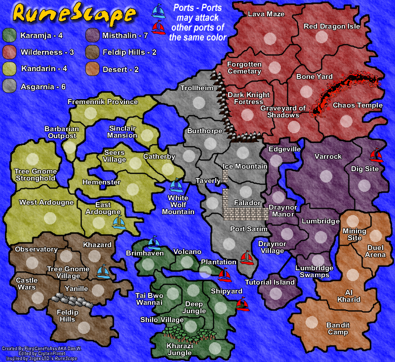
hmm i think feldip hills should have at least +3 bonus...plenty of territories and borders
Posted: Fri Apr 20, 2007 4:06 pm
by PimpCaneYoAss
It has two borders..I will look into it though. I will recalculate the borders too with the addition of Trollheim.
Posted: Fri Apr 20, 2007 4:13 pm
by Will_Liam
Add army "circle" places to the newest edit, because it has none. Also same thing with the compass as freezie said, too ragged.
Posted: Fri Apr 20, 2007 5:17 pm
by PimpCaneYoAss
Thanks but its already in the "Problems to be addressed section" of my new update.
Posted: Tue Apr 24, 2007 2:00 pm
by PimpCaneYoAss
...bump lol
Posted: Tue Apr 24, 2007 7:38 pm
by CaptainPlanet
What are you working on now?
Posted: Tue Apr 24, 2007 7:42 pm
by PimpCaneYoAss
CaptainPlanet wrote:What are you working on now?
See the "Problems to be addressed" section of the newest update on page 15
I still need feedback though before I will make an update
Posted: Tue Apr 24, 2007 7:59 pm
by CaptainPlanet
There's something about the viking ship I don't like... try doing something to that.
The Falador walls aren't really like that, unless you are just doing it like that for playability
I would add a different compass, the RuneScape compass looks like shit.
Posted: Tue Apr 24, 2007 10:13 pm
by PimpCaneYoAss
I can see what you mean about the ship.
The walls are there for playability. I could change it though.
The compass and RuneScape and does need to be slightly blurred but I like it, especially since this is a RuneScape map.
Posted: Tue Apr 24, 2007 11:17 pm
by KEYOGI
Have you still not heard back about Copyright Pimp?
Just incase you missed it, you'll probably want to take a look at the announcement at the top of the page as it covers Copyright. I'm not sure where you got your objects placed around the map from, but you may need to remove them. The rest of the map should be fine though.
A couple of points and questions about the actual map. What are the objects on the Feldip Hills/Yanille border? I think some of the territory name placements could be worked on and improved. For example, Shilo Village/Deep Jungle are confusing. I don't know which label belongs to which territory. Lumbridge Swamps is probably another one that would benefit from some small adjustment.
Posted: Wed Apr 25, 2007 1:42 pm
by PimpCaneYoAss
The images are most likely copyrighted so they will be removed.
The border in Feldip Hills has rocks...I thought it should be different than mountains. I will work on that.
The name locations could be moved as well.
A new update will come soon.
Posted: Fri Apr 27, 2007 6:48 pm
by PimpCaneYoAss
NEW UPDATE 4/27/07

Changes
-Added army circles
-Removed all copyrighted images
-Fixed Falador Wall
-Moved some text
Comments
-I had to remove the images due to copyright so I am stuck on how to add feeling to the map
-The I might be able to bring back the army circle shadows since there are no longer and pictures
-Th wall in Falador now looks more uniformed
-The text locations should be good for now.
Problems to be addressed
-Bonuses
-Glowyness
-Falador wall and how it flows
-Title
-Font choice
-Port icons
Posted: Sat Apr 28, 2007 9:36 am
by haoala
i still dont get why the bonus for feldip hills still hasnt been changed...i brought i up earlier and you said you would probably change it
i think it should have at least 3 bonus if not 4
im also concerned with kandarin's bonus. it has so many territories, the most for a continent in fact (9), but only has 4 bonus. it should have at least 6 or 7 bonus!
karamja's bonus too. 8 territories but 4 bonus instead of (i think) 5.
could you make the background a little less "glowy"?
and the title - isit meant to be like that (some edges are powdery) or was it deliberate
falador's wall - make it less "cut and paste" like

ie. make it nicer, more 3d
the other borders are really creative; keep up the good work
use a nicer font?
im excited about this map coming out since it will be so fun

Posted: Sat Apr 28, 2007 9:54 am
by spiesr
find better ports pics
Posted: Sat Apr 28, 2007 2:37 pm
by fireedud
It's hard to tell wheter the port is in catherby or white wof mountain.
Posted: Sat Apr 28, 2007 3:31 pm
by ParadiceCity9
About the compass, you need to change it. I mean, keep it, but make it less ''cutted'' around the edges.
ya i was thinkin the same thing
Posted: Sun Apr 29, 2007 12:01 am
by PimpCaneYoAss
haoala wrote:i still dont get why the bonus for feldip hills still hasnt been changed...i brought i up earlier and you said you would probably change it
i think it should have at least 3 bonus if not 4
im also concerned with kandarin's bonus. it has so many territories, the most for a continent in fact (9), but only has 4 bonus. it should have at least 6 or 7 bonus!
karamja's bonus too. 8 territories but 4 bonus instead of (i think) 5.
could you make the background a little less "glowy"?
and the title - isit meant to be like that (some edges are powdery) or was it deliberate
falador's wall - make it less "cut and paste" like

ie. make it nicer, more 3d
the other borders are really creative; keep up the good work
use a nicer font?
im excited about this map coming out since it will be so fun

I will readjust the bonuses and I honestly just forgot to do that. It will be done for the next update.
Glowyness will be taken care of.
The Falador wall will be altered to help make it flow.
I will look into the font.
Posted: Sun Apr 29, 2007 12:02 am
by PimpCaneYoAss
The port icons will be changes cause I agree. The compass has been removed due to copyright.
Posted: Sun Apr 29, 2007 12:58 pm
by Molacole
Does lumbridge swamps and al kharid connect? the font gets in the way of borders between those 2 territories.
Posted: Sun Apr 29, 2007 2:26 pm
by Wisse
i am sorry to say this but only the trees in karamja are looking good the others are just bad graphic, also use anather texture for the sea and please also for the land (try to use textures like sand for al-kharid, jungle for karamja etc. )
Posted: Sun Apr 29, 2007 3:35 pm
by PimpCaneYoAss
Wisse wrote:i am sorry to say this but only the trees in karamja are looking good the others are just bad graphic, also use anather texture for the sea and please also for the land (try to use textures like sand for al-kharid, jungle for karamja etc. )
I like the lava I think it is different and looks pretty good. The mountains are fine and the rocks in Feldip Hills could use work. The Falador Wall problem has already been suggested. The land texture is not changing. There are no maps that have various textures for the land and I dont want to use multiple textures. The sea problem has been addressed to.
Posted: Wed May 23, 2007 6:13 pm
by Lanceyboyuk
bump
Posted: Wed May 23, 2007 6:18 pm
by edbeard
Lanceyboyuk wrote:bump
dude there's no point in bumping maps like you are. contribute to maps that are currently in development
Posted: Sat May 26, 2007 11:06 pm
by PimpCaneYoAss
Sorry about no updates...kinda on vacationish lol ill see what i can do in the near future

ie. make it nicer, more 3d